Apple Watch Series 5 review
The Series 6 predecessor still impresses with an always-on display, slick UI and super-premium health features, but find out if you should buy it in our Apple Watch Series 5 review
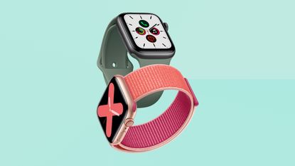

Capable of accurately tracking a host of workouts with ease as well as providing some great lifestyle features, intuitively, with a premium edge, the Apple Watch Series 5 is an awesome bit of kit. It might be living in the shadows of the latest and greatest Series 6, but the series 5 is still an amazing smartwatch compared to what else is on the market right now, and worth a purchase if you can get your hands on one.
-
+
Solid, premium design
-
+
Best health feature on the market
-
+
Gorgeous UI
-
+
Fitness options for days
-
+
Always-on screen
-
-
Battery life only one day
-
-
Still doesn't work with Android
Why you can trust T3

It might be an old model now, but the Apple Watch Series 5 is still a mighty contender in the convoluted world of wearables. When it launched in September 2019, it boasted some fresh – yet quite unusual – features, such as hearing health tracking and a, er, compass. While the latter was more of a gimmick, most of the health features in the Series 5 are super useful, including an emergency calling function that works with fall detection. If enabled, the Apple Watch automatically places an emergency call if it senses the user has taken a hard fall and remains motionless for about a minute.
Looking pretty much identical to the Apple Watch Series 4 that came before it, the Series 5 wasn’t exactly a complete overhaul but it did at least come in a wider range of colours, including two much lighter titanium models, a ceramic white model, and new special editions from Nike and Hermes.
The biggest improvement, however, was the always-on display. This was the Series 5’s blockbuster feature as it was the first time we saw this in an Apple Watch and proved a useful tool for those fed up with having to flick their wrists to check the time. Thankfully, this was something Apple decided to stick with in the launch of its most recent Apple Watch Series 6 device, which is one of the best smartwatches on the market today, in our opinion.
So if you’re in the market for an Apple Watch, but don’t fancy forking out for the brand spanking new Series 6, you can still benefit from most of the modern features, such as the Always-on Display, with the Series 5.
So is this still one of the best Apple Watch and best smartwatch buys, and does the recent price drop mean this now one of the best Apple Watch deals? Here's our in-depth review with everything you need to know.
Apple Watch Series 5: price and availability
The Apple Watch Series 5 launched in September 2019 at exactly the same price as its predecessor, the Apple Watch Series 4, costing £399 / $399.
That basic price got you an aluminium body with a 40mm screen. However, those wanting a larger screen of 44mm would have to fork out £429 /$429 – a pleasingly modest increase that doesn’t feel like it’s penalising bigger wrists.
However, Apple is no longer officially stocking the Series 5, so if you want to pick one up, you’ll have to look at third-party sellers, such as Currys, which is currently stocking the cellular 40mm version from £299 and the cellular 44mm model from £319.
The sizes are pretty generous – the screen on the 40mm model is actually larger than the screen on the 42mm Apple Watch Series 3 (still on sale, from an Apple Watch Series 3), so it's not as simple as the small one being 'for' women and the bigger one being 'for' men. It’s worth trying them on because a lot of men still find the 40mm model large enough, and more proportionate fit. There are three aluminium finishes available: Space Grey, Silver and Gold.
All models come with 32GB of on-board storage now, which is great for keeping more music on there for a long run, or anything else that needs storing on the Watch (such as offline maps for a planned hike).
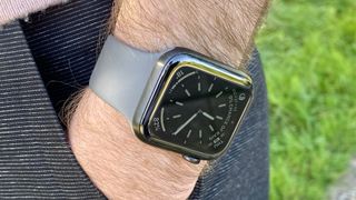
Please forgive my hairy arms, they're the only ones I've got.
Apple Watch Series 5 review: design
In terms of shape, nothing has changed in the Series 5 compared to the Series 4. That’s no surprise – the Series 4 was a drastic redesign that brought bigger screens than previous models, in a thinner body.
So, here you get a nearly edge-to-edge display, with curved corners in a look extremely reminiscent of current iPhones (without the notch).
There’s still the Digital Crown on the side, which functions as a way to scroll (in addition to the touchscreen), as well as a kind of Home button. Next to that is a side button that can be used to switch apps, or to call the emergency services.
It’s still the best-looking smartwatch overall, though its lead is certainly less than it’s been in the past. But the personalisation here is excellent – being able to choose so many different colours and finishes, plus Apple’s seasonal new strap colours, helps you get something that suits you personally.
The design is not massively thinner than other higher-end smartwatches, but does a good job of looking like it is, thanks to a uniform lozenge-like curve on the edge, and the fact that the extra thickness of the heart-rate sensor is hidden invisibly beneath it.
The only real design change is the addition of the titanium finish option. As a material, it’s lighter than steel, though heavier than aluminium, and this is reflected in the weight of the watch, which splits those two nicely.
In terms of looks, it’s also very much in-between the aluminium and steel models – the brushed finish has a smoother, higher-quality sheen than the almost matte look of the aluminium Apple Watches, but is nowhere near the shininess of the steel models.
I've been testing the Space Black titanium model, which doesn’t show up the brushed finished as much as the ‘natural’ titanium finish, which is also a really interesting colour – a rich grey with a kind of light beige tinge to it, especially as it catches the light. It’s the Watch finish that maybe looks most like pure metal, especially in lights where the brushed texture is more visible.
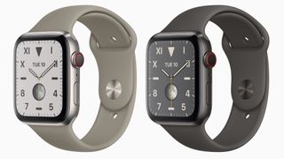
'Natural' titanium on the left, Space Black titanium on the right.
The Space Black looks more inert as a colour, but absolutely oozes quality, and if you like an all-black watch but don’t want the reflectiveness of the steel Space Black, it’s absolutely worth a look in the flesh.
One question that remains is how the titanium will age: the first thing I did when receiving this watch was put it on next to my stainless steel Series 4, for a comparison. When I took them off, I noticed that just a few minutes of occasional contact from being next to the crown of the steel watch had made some light marks on the case.
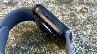
There are light scuff marks just above the top speaker hole, and down and right from the bottom. Honestly, probably no one other than me will notice these, but I still know they're there…
Of course, shiny steel gets scratched and dinged, but we know that this tends to age it fairly well. The only way to see how this titanium case will weather over time is to give it a year…
Apple Watch Series 5 review: always-on screen
So, this is the marquee new feature of the Series 5 (the other main new hardware feature is a compass, which we'll cover later). Having to raise your wrist to see the Apple Watch’s screen has been a complaint since the very first model, and it’s taken until now to achieve a solution.
There are a few key changes that enable this: a new LPTO screen material, plus a low-power screen controller, and new S5 chip that has all kinds of extra power management features.
They combine to mean that the Watch’s screen can now be run a refresh rate of just once per second (rather than the usual 60 times per second of most screens) and powered at all times without killing battery life.
In practice, what it means is that when you raise your wrist to look at the screen, you can get the display at full speed and full brightness. When you lower your wrist, the brightness drops along with the frame rate, and any large areas of bright colours on your watch face are also switched out to black (because that draws less power).
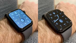
The new 'California' watch face, at full power on the left, in always-on dimmed mode on the right.
But still, the effect is here: you can now furtively glance at the time without making a show of it. You can see how long you’ve been working out for without having to move your hand from your exercise equipment.
Plus, there was the possibility I was actually most excited about: adding more of a ‘look’ to your watch that other people see. Because as much as you can choose the style of the Apple Watch, it’s still inevitably dominated by that big black rectangle on the front to other people. You get to see your choice of face, but only you. An always-on screen felt like a chance to stamp more of your own style on it.
And while that is possible, it doesn’t have quite the dramatic effect I was hoping for. Because, as mentioned, any white (or cream, or navy) faces will be turned to black when it dims, we’re still in “you can have any colour you like as long as it’s black” territory.
Other elements of your face will remain, such as your choice of complications, or the type of numerals you choose.
There are exceptions to this: the faces that are built solely on colour rather than complications and other functionality will keep a bit more of their look. The ‘Gradient’ watch face is filled with colour normally, and that colour does fade away in the dimmer mode, but it isn't completely removed – just reduced.
The chunky ‘Numeral Duo’ face is nothing but a bright, cartoony digital readout in its default style – these numbers become outlined, like a neon effect, in the dim mode, but maintain your colour choice.
In the dim mode, your complications update less often – exactly how often depends on the complication type. Some will just update when you lift your wrist, others might update once per minute or so.
If you’re in a workout, you get a special dim view of the workout mode. Basically, it stops showing the hundredths of seconds, and keeps just counting up in seconds instead. The heart-rate meter stops being live, and updates on longer intervals. Otherwise, it’s all the same info – fairly handy.
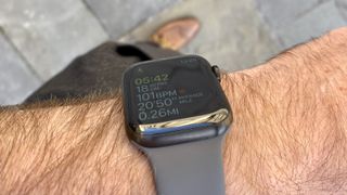
Here's a furtive glance at a walking workout with turning my wrist. This shot shows the brightness levels of the display more accurately than the shot above.
But here’s what frustrates us about it: if the last thing you were looking at was an app, when you turn your wrist, you see a small digital time read-out instead of your watch face. I don’t like this readout – it’s too small, the numbers are too thin, and it's easily lost in reflections when out in the sun. Why isn’t it larger and clearer?
This isn’t such a problem if you have your Watch set to return to the watch face after two minutes of inactivity (like I do) – this reversion still happens even in the dim mode.
But here’s where some behaviour of the Apple Watch that used to be quite handy becomes a foible now: one of the apps that causes it to go into this annoying clock mode is Now Playing, where remote controls for the music on your phone appear on your Watch automatically. I've always quite liked this, and found it useful more often than it's gotten in the way of seeing complications or anything.
But because the Now Playing app is persistent for as long as you’re playing music, it means this rubbish tiny clock effectively overrides your chosen watch face in the dim mode for as long as you’ve got music playing. So I sighed a sad sigh and turned off the automatic activation of Now Playing.
You can still bring it up manually, but now you need multiple taps to do previously one-tap things. I hope Apple will consider giving Now Playing some kind of special treatment in dim mode, the way workouts do.
Ultimately, the always-on screen is obviously, demonstrably superior to anything that came before, and it only takes a brief period of using the Series 5 before anything without the option feels comedically old-fashioned.
However, it's not such a revelation in terms of usefulness that I would recommend Series 4 owners should immediately upgrade (unless you've really got the money spare). The always-on Watch is really, really nice, but it's not an essential, and it's not a potential life-saver, like adding fall detection was in the Series 4.
Basically, if you’re a Series 4 owner on the fence about upgrading and hoping not to spend the money, do not actually try a Series 5. Because then your (perfectly fine) current Apple Watch will feel so much worse than it actually is.
Briefly – all other elements of the screen are the same as on the Series 4, including brightness and resolution. This means it’s lovely and crisp, and easily bright enough to see in bright daylight. Touch is responsive.
Everything is under a layer of toughened glass (aluminium models), or sapphire (steel and higher). I’ve owned steel models for years, and have never managed a single mark on the display. I’ve whacked my watches against metal objects accidentally many times and found myself thinking “Phew, I hit the glass, and not the more delicate metal, that was close”. Which is an odd one…
I have seen the glass on aluminium models come out more worse for wear from rough treatment, though. It definitely helps the price increase of the steel and Edition models feel better as an investment.
Apple Watch Series 5: performance
The Apple Watch Series 5 has a new processor, called S5, that replaces the S4 used in the Apple Watch Series 4 (see if you can crack that naming code).
But despite the processor having changed enough for Apple to give it an updated name, don’t expect to notice any difference from it: the new features are all about efficiency, rather than extra speed.
The changes are all focused around things like the addition of the low-power controller for the always-on screen, and other ways of saving power to balance out the extra energy usage.
The good news is that the Apple Watch didn’t actually need any extra speed, so I’m fine with this – I never found myself bottlenecked by the Series 4 when loading an app itself (though sometimes when fetching data within apps, but that’s more of a wireless responsiveness thing).
So while it would be nice to feel like we’re getting a new transformative speed boost, it’s just the same speed, which is: more than fast enough.
I just mentioned wireless performance and data loading within apps, and I have noticed an improvement there when using the Series 5, but it’s hard to say how much of that is down to hardware – watchOS 6 could be adding improvements. But I think the fact that I’m using it with an iPhone 11 Pro helps.
One of Apple’s tweaks in the new iPhone is an extra Bluetooth antenna for improved range. And I’ve seen a significant improvement in connectivity between the watch and phone in a way that is, admittedly, quite specific to me – but that is a good sign generally: I cycle to work with my iPhone in a waterproof backpack (because England), which is made from a material so robust, it stops my iPhone XS and Watch Series 4 from communicating over the three feet between them. (My own water-sack body being in the way will not have helped.)
But since testing the Series 5 and iPhone 11 Pro, the connection is maintained. As I say, I think the iPhone is doing the heavy lifting here, but since you actually notice the improvement on the Watch, I think it’s worth noting here.
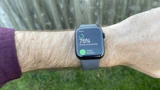
Apple Watch Series 5 review: battery life
Okay, we’ve talked about the S5 chip being geared towards energy-saving, so does it overcome the extra draw of the screen?
The answer, oddly, is both yes and no. Battery life here exceeds Apple’s claims, as it has for the last few Apple Watch models, but not by as much as the Series 4 managed.
Apple claims an 18-hour battery life, which is effectively a day of use before sleep, and is what it said for the Series 4. This assumes a mid-level use case of doing some working out and GPS usage (which are big power drainers), but mostly using it for notifications and bit of Siri here and there. Very typical, and very similar to my own usage.
With Series 4, I was taking the Watch off at bed time with 50-55% power left. If I was away from a charger, I was always fairly confident of getting through two days with it (though sometimes it fell a couple of hours short).
So far, the Series 5 has been at more like 35% at the end of the day. Still plenty left to get me through that specific day, but I won’t be confident of leaving the charger overnight any more.
That said, you can turn off the always-on display, making the Series 5 just like all previous Apple Watches, and reclaiming battery life. If you know you’re going to be in a situation without easy charging, this is a handy option to have around.
So yes, Apple’s battery life claims are very comfortably met, but the always-on screen is still bringing the total life down compared to its predecessor.
The Apple Watch has always been quite fast to charge, which is a bonus – it’s really easy to top it up while you’re in the shower or something like that.
However, the Watch comes with a USB Type-A cable in the box, which is a bit frustrating in this day and age. The iPhone 11 Pros and iPad Pros and MacBooks all comes with USB Type-C charging cables, so they can all be juiced from a single type of adapter – perfect for travelling.
But the Watch still comes with the old-fashioned connection, meaning a second type of adapter is needed. You can buy a separate USB Type-C Watch charger, for another £29, but if the high-end iPhone is moving to USB-C, we’re not sure why the Watch hasn’t.
Apple Watch Series 5 review: watchOS 6
The new version of watchOS brings a solid list of new features, several of which I cover properly in the health and fitness sections below: cycle tracking, noise level alerts, and activity trends among them.
The other most useful new features are: new watch faces, improved Siri capabilities, and some new apps.
The watch faces are, no surprise, what I've spent the most time playing with. Last year, I criticised the range of faces available in watchOS, and I think watchOS 6 is significant improvement… but I still want to see more.
Let's start with what's better. Apple has made improvements in two big areas: interesting new faces that feel like they're taking more advantage of what being digital can do; and making those faces more flexible for what you want to show.
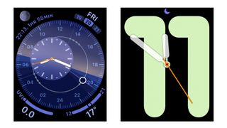
Left: Solar Dial. Right: Numerals Mono.
We already have somewhat gimmicky motion faces, but I like things like the new Solar Dial, which shows the movement of the sun in a circle around the face, with an analogue or digital face that moves with it, on the opposite side of the circle.
It's rich in colour, can fit four complications around the outside, and can only be achieved in this form on a smartwatch. I probably won't use it during winter, because it's depressing to see the sun cross the horizon before I leave the office, but I still think it's great.
Numerals mono shows an analogue face over a giant set of funky numbers that give you a quick way to see the hour. It's not for me, but again it's a fun design that can't be achieved on a normal watch.
Then there are faces like California and Gradient. Both are impressively flexible – California is quite a traditional look, but it comes in lots of different colours, lets you switch between line markers only or numerals (including a mix of arabic and roman), and you can choose to have it full-screen, or as a circle, with complications around the outside. This one face has so many looks – it's brilliant.
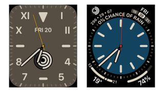
Both these faces are California – I told you it was versatile.
Gradient is simpler in that it just fills the watch face with colour, which spreads from the hands out, and shifts hue the further it gets from the hands. It's a clever effect, and you can choose from a huge range of colours, and again it can fill the face on its own, or it can be a circle with complications in the corners.
These are all huge steps in the right directions, but there are still frustrations. Meridian is a new face that's the most dress watch-like face so far, and I would absolutely use it for fancier occasions, if its only colour options weren't black or bright white. It needs some nice cream or off-white options – it's so bizarre to have such an overly limited face right next to the Swiss Army Knife of California.
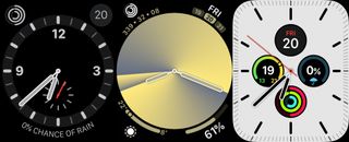
Some of the other watchOS faces I've been using, from left to right: Explorer (an older face that looks good on my titanium watch); Gradient (a new watchOS 6 face, in its circle form here); and Meridian (which I still like, I just wish I could tweak more).
But I still want more. I want more designs that go bolder with standard watch elements, and more designs that are totally out there. This watch is a blank canvas, and I don't feel like the most is being made of that still.
But that's been my gripe since the first Watch – I'm much happier with the faces on offer this year, and I think it's easier than every to find something that suits you, especially if you like to tinker.
Siri's extra capabilities are pretty functional – you can now ask it what song is playing and get an answer, and it can now fetch answers to questions from the web, and give you links to open web pages in a browser right on your little watch screen.
This can be really useful if the answer is in the snippets from the pages that Siri pulls out, but if you have to open the web pages themselves then… well, you know how much crap covers the actual content on the web these days? Now put it on a tiny screen. Yeesh. But hey, it's an option.

Left: Siri returns a useful website. Right: Tapping on the website proves it is maybe less useful than hoped.
Of the new apps from Apple, the Voice Memos app maybe has the potential to be most useful, especially if you set a shortcut to it from a complication. You can just jump in and start recording notes, if you've got something worth saving for posterity. Not everyone is a forensic pathologist or starship captain who needs to log these things, but it could get more people into the habit, and you might like it.
The new Audiobooks app could very handy, assuming you get audiobooks from Apple's Books store. It syncs between from wherever you last were easily, and you can pick right up.
The Calculator app obviously can also be useful, but a) finding it from the Watch's tiny bubbles app list when you need it is more hassle than just pulling out your phone (though there is an improved list view for your apps, too), and b) I'm furious Apple didn't make it look like a classic Casio calculator watch. Instead, it looks like the Calculator app on iPhone. Whatever.
Adding and removing apps has had a big upgrade in watchOS 6 – not only is there an App Store on the device itself, but you can also delete most system apps now too, clearing more clutter.
The flip side of there being an App Store on the Watch itself is that it's now been removed from the Watch app on iPhone (though there's still a tab for it, oddly). It seems a bit of a shame to totally ditch the option to browse on a bigger screen with an actual keyboard.
There are also some invisible improvements for developers that will result in slicker, better apps – especially ones that use audio, such as podcast apps, which will be able to stream audio directly from the internet.
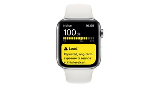
You'll just get a little nudge if the noise levels break the warning threshold – no need to worry if it's just a momentary sound.
Apple Watch Series 5: health
The main new feature for health-watching is noise detection. If you're in an environment that exceeds 90 decibels, you'll get a notification warning of that fact, with a note saying what length of exposure at that level will cause hearing loss.
Think of this just like the elevated heart-rate notifications: it's not intended to nanny you, and if you get that notification when a motorbike races past, you can just ignore it.
But if you find that this warning comes up a lot when you're somewhere you can't avoid, like your workplace, maybe it's something you should address.
You can change the threshold for the alert, if you want, to something higher or lower, and you can also just use the new noise app (and complication) to keep an eye on the levels around you at any time.
Apple emphasised that the noise app doesn't record any sound at all – it's just looking at the level.
The other new health feature is more of a software addition, on both iPhone and Watch: period tracking. There's a dedicated app for it on Watch, and it's rolled into the new-look Health app on iPhone (more on that in a bit).
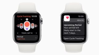
The Cycle Tracking app focuses a lot on the timing element of your menstrual cycle, aiming to make it as predictable as possible.
You have to set it up on iPhone, telling it when your last period was, and how many days your cycle is usually. Then you can add in information on a day-by-day basis to do with what's actually happening: how heavy the flow that day is, and any other significant symptoms, such as spotting, increased acne, tiredness, breast tenderness, and a bunch more.
On the Watch, the app basically gives you a faster way to input this information, and to see your predicted cycle progress. And perhaps the most useful part: you'll get a notification when you're within seven days of a predicted start of your next period.
Fertility tracking is an optional part of all this – you can also have it tell you when your likely most fertile times are, so you can, uh, act on it.
The Health app won't make any medical recommendations of all this – the point is to give you information you can mix in with your other Health data to get a better idea of how your body behaves. You might find that you get headaches a lot during your period, but maybe not on days when you exercise in the morning (or vice versa) – it's just about being able to cross-reference everything easily.
Now, I'm not exactly the target market for this, so I ran it by someone with an actual menstrual cycle. She couldn't talk about whether it works well long-term, because that would take months, but she's still given it a test.
Before trying it, she thought it was something she wouldn't bother with, but having set it up and dived into the options, she felt really positive about being able to get all the data and see if there were any definitive patterns with particular discomforts and timings (or activities).
She said the apps were usefully and logically laid out, and the warning about likely start dates particularly appealed, since it gives you a chance to make sure you're stocked up on supplies everywhere you need them.
There's nothing here that other cycle tracking apps haven't done in the past, but having it built into the Health app and Watch is a boon, and Apple is about as trustworthy with your data as companies get in 2019.
Elsewhere, watchOS 6 adds warnings about irregular heart rhythm taken from the optical heart rate sensor – meaning you don't need an ECG to detect it any more. That said, the ECG is built into the Series 5 (like the Series 4), and is definitely your next port of call if the Watch does think its spotted an irregular rhythm. It's extremely simple to use – you just open the app and have a sit down while holding your Watch, basically.
The fact that it can spot an irregular rhythm without the ECG is more of a bonus to older Watch models than anything useful in the Series 5, but it's still a good upgrade all-round.
The Series 4's other major health innovation, fall detection, is here again. If you have a rough tumble, your Watch will ask if you're okay via a notification. If you don't respond, it will call the emergency services, and ping a message to your emergency contact.
This is a such a fantastic feature. Obviously, you hope it'll never have to be used, but we're talking an actual life-saver here.
You can also still call the emergency services using the Emergency SOS feature from the side button – again this sends your location to your emergency contact, and can be triggered with a single button hold, so no fiddling required.
The Series 5 does have one extra innovation here: cellular models of the new Watch can contact the emergency services internationally – it doesn't matter where you bought the Watch, it will call the local services for wherever you are, even if you haven't activated a cellular plan.
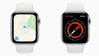
The compass does exactly what it says on the tin, which has not always been a guarantee in these kinds of devices…
Apple Watch Series 5 review: outdoor activity
The only hardware change in the Series 5 other than the always-on screen is the addition of a compass and altimeter. The altimeter is a new, upgraded version that Apple hasn't used before: all its previous devices could detect changes in elevation (ie, how far you've climbed or descended), but not your absolute elevation (ie, what height you started from).
The Watch Series 5 can just straight up tell you how far you are above or below sea level, which is great for tracking yourself on hikes ands seeing exactly what you've achieved, or just if you're curious at any time.
Now here's the key thing we need to tell you about the compass: it's actually good. Like, really.
The magnetometer compasses built into phones (including iPhones), have always been a bit iffy, frequently several degrees off your orientation, and twitching around even when you're not moving.
This does not do that. It points. It points consistently and, as far as we've seen, correctly.
It's not a flashy feature, but it makes using the Watch for walking navigation infinitely more useful. In fact, with these two new options, Apple suddenly seems to be gunning for Garmin.
The likes of Garmin's Fenix range have all kinds of other features (and much longer battery life), but for your average hiking holiday, the Watch just became a seriously capable companion.
Well, it will be, once the specialist apps with walking maps get updated to include compass support – we've been testing pre-release and immediately after release, so it's been too early for them to include the feature just yet.
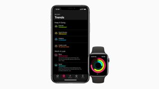
The 'Trends' screen gives you more nuanced information than just the pass/fail of hitting targets.
Apple Watch Series 5 review: fitness
There are no hardware changes for fitness, or even significant software changes in terms of usable features.
However, Apple has made some key changes in both the Health and Activity apps that drastically improve them, so even though it can't take in any new kinds of fitness data, that data is now much more helpful.
First up is trends in the Activity app. You now get told not only how you've been doing recently, but also how that compares on average with recent periods. So you can now see in the app that, for example, you've been doing 31 minutes of exercise per day recently, which beats the targets. But you were doing 40 minutes of exercise per day.
Having this context is so useful – it's a reminder that hitting your targets doesn't automatically mean everything is as good as it was before. If you're drifting downwards in an area, you can now identify that and correct it before you start struggling.
The Health app's redesign is all about a new Summary feature, and we absolutely love this. You choose which kinds of information that the app stores that you're most interested in, and this is all shown right up front – no need to dig through sub-menus.
Because the Health app can draw from so many different sources, this can be tailored in specific ways. If you want to lose a few pounds, maybe you have weight tracking from your smart scales, plus graphs of your active calories burned and your food intake, all next to each other.
If you're worried about stress, maybe you have your blood pressure taken from a smart gauge, resting heart rate graphs, and sleep tracking, and a note of how often you did your breathing exercise.
Maybe you're training for a cycling tour. You could bring in your VO2 Max, overall heart rate, cycling distances tracked via workouts, resting energy…
You can still browse everything that's in the Health app through all its many categories, but we think this Summary feature is a game-changer – it makes Apple's health push about you, not about some more abstract version of healthy living.
Again, none of this is specific to the Apple Watch 5, but if you're thinking buying any kind of Apple Watch, it's important to know about.
Apple Watch Series 5: Verdict
The Apple Watch Series 5 might have been forgotten about since the launch of the Series 6, but that doesn’t mean it’s not still an awesome bit of kit. It’s capable of accurately tracking a host of workouts with ease as well as providing some great lifestyle features, intuitively, with a premium edge.
However, those who own an Apple Watch already, especially the Series 4, are unlikely to find anything compelling enough with the Series 5 to justify an upgrade. Although if you’re coming from a Series 3 or older, it might be worth upgrading to the Apple Watch 5 as the always-on display is quite a game-changer.
In terms of downsides, expect an average battery life of one day and support limited to Apple devices only. Saying that, these aren't massive negatives. Even with the Series 6 overshadowing it, the Apple Watch 5 is a relatively amazing smartwatch compared to what else is on the market right now.
Apple Watch Series 5 verdict: should you upgrade from Series 4?
Let's make this easy for people who bought the Apple Watch Series 4: Apple Watch Series 4 owners should feel free to skip this model.
The Series 5 is better than the Series 4, naturally, but the new features aren't transformative enough for us to recommend the change. There's a good reason why it has replaced the Series 4 in the line-up rather than the Series 4 staying around with a drop in price: this is the ultimate evolution of that design.
There are some potential exceptions: if you really want it to be a hiking companion, if you really (really) want a titanium watch, or if you have money to burn. And even then, we'd have to ask: are you sure you want to spend the money?
Apple Watch Series 5 verdict: should I upgrade from Series 3 or earlier?
Yes! This is the perfect time for an upgrade, in fact – you'll get a new design that's marginally more comfortable than the old one, a bigger and better screen with this always-on tech, all the new health tech… it'll feel like a huge, huge step up.
The Series 3 is still a great watch, with impressive battery life and plenty of speed. It's only a marginal one of the lot here – we would say no one will regret upgrading from the 3 to the 5, and you'll absolutely notice the difference, but it's the one you could stick with without feeling like you're falling behind.
For Series 1 and 2 owners, we 100% recommend upgrading. This is the best version yet of the best smartwatch – we love it.
- Apple Watch Series 5 vs Apple Watch Series 4
- Apple Watch Series 6 vs Apple Watch Series 5: what's new and which should you buy?
Upgrade to smarter living
Get the latest news, reviews, deals and buying guides on gorgeous tech, home and active products straight to your inbox.
Matt is T3's former AV and Smart Home Editor (UK), master of all things audiovisual, overseeing our TV, speakers and headphones coverage. He also covered smart home products and large appliances, as well as our toys and games articles. He's can explain both what Dolby Vision IQ is and why the Lego you're building doesn't fit together the way the instructions say, so is truly invaluable. Matt has worked for tech publications for over 10 years, in print and online, including running T3's print magazine and launching its most recent redesign. He's also contributed to a huge number of tech and gaming titles over the years. Say hello if you see him roaming the halls at CES, IFA or Toy Fair. Matt now works for our sister title TechRadar.
-
 Oppo's next foldable flagship could spoil Samsung's year
This could be a killer foldable phone
By Sam Cross Published
-
 Future Apple Watch models could ditch the battery and get power from a surprising source
The future of wearable batteries could be no battery at all
By Carrie Marshall Published
-
 Sneaker style blossoms with the HUGO x Flowers for Society GO-2 collaboration
HUGO and Flowers for Society unveil the GO-2 sneaker with a hiking twist and a floral pop-up
By Matt Kollat Published