Apple iPad Air (2020) review: a gorgeous, sleek and powerful tablet
The new iPad Air 4th-gen is an iPad Pro with the more niche pro features removed… but that does make it a more premium price
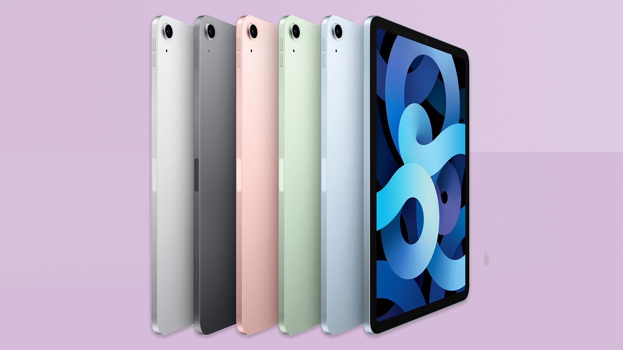
The iPad Air (2020) offers a great screen, supremely powerful processor, premium design and great Apple Pencil support… it's simply excellent. It's a shame the price has crept up, but it's still the tablet to beat.
-
+
Sleek design in great colours
-
+
Detailed screen
-
+
So fast and slick
-
+
Apple Pencil 2 support
-
+
Impressive spatial audio
-
-
Mediocre cameras
-
-
No 120Hz or OLED screen
-
-
Screen only medium brightness
-
-
Notable price jump from previous version
Why you can trust T3

Welcome to T3's iPad Air (2020) review. The iPad Air 4th generation (as it's also known) is Apple's mid-range tablet, drawing elements from the iPad Pro range, while also keeping some elements closer to the more budget 10.2-inch iPad (8th gen) – it's a fine balancing, and one that keeps this iPad high in our list of the best tablets.
Apple's 'Air' products tend to be the ones it's targeting at most of its buyers, giving you enough high-end features to feel premium, but with a few corners cut from its 'Pro' ranges to keep the price down.
• Best iPad deals – top prices on all models
A change in design from the previous iPad Air (2019) is the flashiest feature here, giving it a look closer to the new iPhone 12. But there's more going on, including unbeatable speed, improved Apple Pencil support, and an upgraded movie-watching experience.
There's also been a price hike, so let's dig into where things have changed, and where they could still do with some tweaking – and don't forget to check out our iPad mini (6th Gen) review, which features the same design and most of the same features as the iPad Air, but actually beats it in some regards!
Apple iPad Air (2020) review: Price & release date
The new iPad Air (4th gen) is available to order now, with a release date of October 23rd 2020.
It starts from a price of £579 / $599 / AU$899, which gets you a Wi-Fi only model (no 4G) and 64GB of storage. This is a jump from the previous iPad Air (3rd gen), which started from £479 / $499 / AU$779 for the same amount of storage.
You can also step up to 256GB of storage instead in the new Air, which raises the price to £729 / $749 / AU$1,129. 256GB is the maximum here, though – if you want to go bigger, you'll need to move to an iPad Pro.
If you want to add 4G connectivity (no 5G this time, sorry) that will add some extra cost (not including the data plan you'll need) – the 64GB Wi-Fi+Cellular model costs £709 / $729, while the 256GB option costs £859 / $879.
The previous iPad Air got such a strong recommendation from us in part because of its sub-£500/$500 price. Adding roughly 20% to the cost is a pretty significant step up, and while we wouldn't say the new iPad Air feels overpriced, it's no longer in the slam-dunk territory of the previous model.
It now much more evenly splits the prices of the £329 / $329 / $499 cheapest iPad (8th gen) and the £769 / $799 / AU$1,329 iPad Pro 11-inch, and given that it has the high-end feel of the pro and many of its useful features, it takes that middle ground quite comfortably.
Apple iPad Air (2020) review: Design
The new iPad Air is the first non-Pro iPad to get Apple's new tablet design, with rounded corners, squared edges, and a futuristic feel overall. Even the iPhone 12 is now following the same philosophy (though you might say Apple was drawing from its own iPhone 5-era designs here, so the circle is complete).
The back is a big flat piece of aluminium, with the exception of a bump where the camera is. The back comes in five colours, including classic silver and dark grey, now with pastel pink, green and blue options. I've got the green option, and I absolutely love it. It's different, it's classy but fun, and it raises a smile after years and years of iPads in the same limited colours.
On the two shorter edges, you've got vents for the stereo speakers (though they're only stereo when you're holding it in landscape), and at one end is the USB-C port, which replaces the Lightning port of the older model. This can be used for connecting a broader range of accessories easily, including external storage, cameras, microphones, screens, connection hubs and more… and it's also used for charging.
There is, however, no 3.5mm jack this time, which will be a disappointment for musicians – it was an advantage of the old iPad Air compared to the iPad Pro.
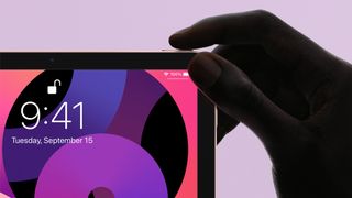
On one side of the iPad Air are a couple of volume controls, while just around the corner is the new Sleep/Wake button, which doubles as a Touch ID fingerprint sensor.
I was, I readily admit, hugely skeptical of this working well from an ergonomic standpoint – having it one corner of one edge just seemed like a hassle to keep track of on a tablet that intentionally looks the same on all sides.
But I was wrong – it works really well. For a start, Apple cannily asks you to register two fingerprints from different hands during setup, which it never did for the old style of Touch ID (though you could register more optionally). This immediately gives you the ability to unlock it, whichever side it's on, without hassle.
When you tap to wake the screen, an on-screen indicator also tells you where the button is. And finally, all you do to unlock the iPad and go to the Home screen or the app you were on is hold your finger on the button without pressing anything for half a second – no swipe up on the screen is required, unlike Face ID devices.
It's not perfect – I have found the accuracy a bit weaker than the traditional front-mounted Touch ID button on the first touch, though a quick lift and re-placing of the finger sorts it – but I prefer it to the Face ID option on the iPad Pro so far. Face ID there is superior if you're using the tablet in a laptop-replacement mode where it sits facing you neatly… but this is tablet! If you're grabbing it to noodle around with while it sits on a surface, or on your lap, this is much better.
It's slightly more fiddly than just having a nice clear button on the front, so for kids the iPad (8th gen) and its classic Touch ID button may be preferable in that sense.
Finally, the new design means the iPad Air (2020) supports the second-generation Apple Pencil, which again connects to the iPad's edge magnetically, and charges wireless from that spot.
This is a big step up over the first-gen Apple Pencil supported by the previous model – not in terms of drawing accuracy (which is the same), but simple usability. The Pencil is always to hand and charged when you need it because it's stored on the side of the iPad.
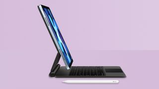
The new design also means that the iPad Air includes Apple's 'Smart Connector' for attaching keyboard cases, including the Magic Keyboard, which basically turns the iPad Air into a laptop when connected.
The Magic Keyboard is an… interesting product. It works brilliantly in its job of adding keyboard and trackpad control to the iPad, and while some keys have to be squished to fit in the small footprint of the iPad Air, it's a really comfortable and accurate keyboard overall, and trackpad works flawlessly, though is maybe a tad on the small side.
But the grey colour is so sad to clad your bright, beautiful iPad Air in, and it's so, so hideously expensive. It is £299 / $299 / AU$499. For a keyboard and trackpad case. It's extremely well engineered, don't get me wrong, but good lord.
I also found it a bit awkward for viewing angles – I'm over six feet tall, and when I use it on my usual desk, I can't angle the screen far enough back to avoid a bit of dimming of the screen due to the viewing angle.
Like I say, functionally there's little complaint with it, but you need to be a) feeling pretty flush, and b) ideally shorter than me.

Apple iPad Air (2020) review: Screen & speakers
The change in design means a change in the screen from the previous iPad Air too – instead of a 10.5-inch display, you've got a 10.9-inch screen though in effectively the same size body, because the larger bezels (and the Home button) have been dropped.
The screen has a resolution of 2360x1640, which is 264 pixels per inch. This is easily sharp enough for the average distance you'll hold a tablet from you in our experience, though is some way behind the 460ppi that the new iPhones offer.
It's an LCD screen, rather than the OLED screen you'll find in the iPhones, or in the likes of the Samsung Tab S7 (which is slightly more expensive than the iPad Air). OLED screens give richer contrast than LCDs, and are generally preferable, though rarely find their way into screens bigger than phones or smaller than TVs – only very few laptops use them, for example.
OLED's better contrast makes it ideal for movies – especially in HDR – and while we do wish the technology was available in iPads, including this one, we didn't miss it badly here. The iPad Air is capable of fairly solid contrast anyway, and its 500 nits of brightness is quite visible in any light condition.
That brightness is a little lower than the the iPad Pro, which reaches 600 nits, and that does make a difference. Not so much in standard apps or when web browsing, but movies and photos are clearly more vibrant on the Pro despite both tablets supporting the same wide P3 colour gamut. Contrast is richer on the Pro too – the extra brightness has a material difference in these cases. As I say, though, it's not as noticeable in less artistic apps.
Both are laminated to bring the pixels as close to the surface as possible, which helps with visibility and reflections compared to the iPad (8th gen), which has the screen slightly deeper under the glass.
However, I did notice that the iPad Air's screen dims and picks up a slight colour cast when viewed off centre more quickly than the iPad Pro's, again perhaps a result of the less punchy brightness. This isn't much of a problem overall, and was most noticeable when I had the iPad Air in Apple's Magic Keyboard case, where I was more limited in the angles I could use – outside of that, I'd tend to just hold it at the most optimal angle anyway.
The screen is 60Hz, rather than up to 120Hz on the iPad Pro. Again, this is fine. The Samsung Tab S7 also does up to 120Hz, and it's another thing we'd love to see – it not only makes everything look smoother when animated, but it also makes the Apple Pencil as responsive as possible, because you see the results of your drawings quicker, which makes it easier to be accurate.
But it works fine as is – for casual drawing or note-taking, the responsiveness is absolutely fine. Professional artists would benefit from stepping up to the iPad Pro, but that's why it exists.
One key thing for us is that the screen supports True Tone, which is Apple's display tech to match the colour balance of the screen to the lighting of the room your in, so white on-screen looks closer to what a white object in the room looks like. It so much more pleasant on the eyes than using a blue-tinted screen in a room with standard warm yellow lighting. It makes it more pleasant to read and work on documents on these screens. It's been Apple's secret weapon for a while for people who've tried it, and we're happy the iPad Air retains it.
The speakers, as with everything else, split the quality difference between the iPad Pro, which has four speaker that adjust their output cleverly depending on orientation, and the iPad (8th gen), which has two speaker at one end.
When you have the iPad Air in landscape, speakers at each end give you stereo with really impressive control over the width of movies sound especially. Sounds move around the screen, or blast right out past your ears depending on the action – there's a distinct sense of direction to things.
The actual sound balance is merely solid – it can't offer much in the way of bass – but the precision is really strong, so you can hear with clarity what's going on. And it can go really damn loud, which is a blessing and a curse depending on who's currently using it, I suppose.
Apple iPad Air (2020) review: Performance & battery
iPad Air (2020) benchmarks
Geekbench 5
Single-core: 1582
Multi-core: 4305
Compute: 12325
Antutu
CPU: 180051
GPU: 261425
Memory: 110987
UX: 96496
The iPad Air was the first product announced with Apple's new A14 Bionic processor (until the iPhone 12 followed shortly after), which is the company's most powerful yet… which makes it the world's most powerful tablet/phone processor, since Apple is way ahead in this regard.
And in benchmarks, it immediately shows just how capable it is. The Geekbench 5 single-core score (the majority of computer tasks only require one core at a time, so this is generally the most important measure) we measured is fully 40% higher than the score we got for the 2020 iPad Pro, which uses an Apple A12Z chip. That is one hell of a score. It is about 20% faster than even the recently upgraded MacBook Pro 13-inch.
The Geekbench 5 multi-core score (for intensive, multi-part tasks) is also incredibly strong, coming in 8% behind the iPad Pro, which was designed around having bigger, beefier multi-core performance. And it's similarly only marginally behind the MacBook Pro 13-inch.
Put simply, this is small, thin beast when it comes to theoretical performance.
In practice, most users won't even hit the limits of what the iPad Air can do, and that's okay. I found everything I wanted to do was handled incredibly quickly and smoothly. Loading apps is rapid, running two apps side by side causes no issues, even things like unzipping files is instant.
I went to push it by creating an image with multiple layers with transparencies and just pasting in layer after layer, but didn't hit a limit on layers or any performance slow-down with the image canvas a medium size.
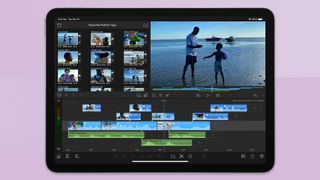
I started editing a video with multiple tracks of 4K video layered on each other, and again no slowdown in playback at all. In iMovie, I built a movie with 4K videos and added filters to everything, and still no slowdown at all.
It all means that you have a machine that's really future-proofed – having Apple's latest and greatest chip means you'll get years and years of software support, and very few people will hit the limit on what its level of performance can achieve in that time.
When it comes to battery life, Apple aims for all iPads to basically match each other at around 10 hours of light web browsing use, and as with other iPads (and most Apple devices) that estimate seems a little pessimistic – you should get at least 10 hours of that kind of use, in our experience.
Intensive apps, such as games, will bring that down a lot. How bright you have the screen will affect it as well, though in our experience you'll mostly want the screen at or very near full brightness unless you're sitting in a dim room.
For a specific real-world test, we streamed a movie from Netflix for two hours with the brightness at full, and the volume at around 20%. The iPad Air lost 23% in that time – very respectable. We also tested the 2020 iPad Pro 12.9-inch alongside it, which lost 26%.
Nothing out of the ordinary for battery life then – really good longevity overall, and very similar to other iPads.
The iPad Air does come with a power adapter, unlike the recent iPhones and Apple Watches. It's a 20W model, which recharges at a good pace, though going from 0 to 100% will still take a few hours.
Apple iPad Air (2020) review: iPadOS
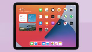
The iPad Air comes ready with iPadOS 14, the latest version of Apple's operating system, which span away from iOS last year to become its own separate thing. Of course, it's still very similar to iOS, featuring the same look at gesture controls – an important thing with this new iPad Air design, and its lack of Home button.
As with the iPad Pro or iPhones, you swipe up from the bottom of the screen to go back to the Home screen, or can use gestures including three-finger swipes left and right to switch between recently used apps.
On top of that, you can have multiple apps on-screen at the same time, either in split screen or by having apps over in window over apps in the background, or both. In terms of simple functionality, it works well – the iPad Air can handle the workload, and apps resize themselves neatly for whatever size of window you open them into (though not all apps support this still, we should note).
However, I still find the flow of this somewhat awkward, even after a few years. You swipe up from the bottom to reveal your Dock of apps, and can drag one to the position on the screen you want, though getting the drag right takes a little practice. The difference between dragging to a spot to open in split-screen rather than the floating window over the top is kind of finicky too – as is dismissing the floating windows once they're up there.
The system does have some more slick benefits, including easy drag and drop between apps, and the ability to have two instances of the same app open side-by-side, the latter of which has really helped to make the iPad a more capable work machine.
However, more broadly, the iPad Air is easy and largely intuitive to use, with the more fiddly option most reserved for those who want to push a bit harder. For most people one app at a time is just fine.
The iPad's array of apps designed specifically for the larger screen remains one of its primary benefits compared to Android, where there are nowhere near as many apps that really make good use of the space, either within the apps or in the operating system.
Support for the Apple Pencil 2 – and its always-on-hand magnetic nature – makes using iPadOS 14's new stylus-friendly features more tempting, too. Apple has made it possible to now handwrite in any text field, with the results understood by the system, which can often me more convenient than setting the iPad down to use its on-screen keyboard.
You can also now make lengthy handwritten notes and drawings in note-taking apps, and you can manipulate what you've written in various ways, including copying sections of handwritten text, copying and pasting it into an email or document app as typed text – or just moving it around in your notes, so they end up in a more sensible order than when they initially flowed out of your head.
The size of the screen and lightness of the device all make it perfect for this – it's a bit bigger than a notebook, but weighs little more, and is easy to hold in one hand while annotating furiously with the other. Not everyone will want to bother with this, but we like that Apple wants to give you as many ways to interact with the iPad as possible, so you can find the way that works best for you.
Speaking of which, mouse and keyboard support is here as well, and we got to try the iPad Air with the Magic Keyboard, which is really the optimal way to try its point support, because the trackpad also supports gestures, so you can swipe through apps and so on without touching the screen.
The pointer implementation in iOS is generally smart – it's a blue dot, but changes to other shapes depending on situation, and even surrounds and highlights some buttons when it gets close to them, 'snapping' to them slightly. It very quickly feels natural to use the iPad this way, and keyboard shortcuts in particular are really well worked into the system, giving power users the instant options they crave so much.

Apple iPad Air (2020) review: Cameras
The iPad Air has a single front camera, and a single rear camera, and neither is great, frankly. There is some fancy tech on the rear camera especially, including 4K video recording at 60fps with Apple's 'Cinematic video stabilisation' which does a genuinely incredible job of making handheld video look smooth without cutting down quality.
However, the quality in the first place – whether stills or video – is fairly washed out, lacking in the punchy colours and contrast you get from iPhones. Detail is similarly subdued.
In clear sunlight, it does better, but in more realistic conditions, it feels like a camera from years ago. There's no Portrait mode, either. It is perfectly functional, of course, but it really isn't up to much artistically.
It's a similar story on the front camera, which also looks muted and a bit smudgy on detail. Apple has also followed what it did with the iPad Pro and has put the camera on one of the short sides of the iPad, meaning that if you video chat in landscape, you're off centre and looking nowhere near the camera. Given all of Apple's cases hold the iPad in landscape, and zero of them even has a portrait option, this seems a very odd decision. The camera would be much more useful half way along one of the long edges.
Apple iPad Air (2020) review: Verdict
The iPad Air is an excellent tablet, with a beautiful design and ultra-slick operating system, aided by bags of power (and, therefore, future-proofing). In this price range, it's the tablet I think most people should go for, when looking at the overall mixture of experience and features.
It's so fast and smooth to use, the design is infinitely pleasing in the new colours, the size is perfect, and we love the integration of Apple Pencil in both the hardware and software.
But following the price rise, it needed just a few extra boosts to feel worthy of our five-star Platinum Awards. A screen that matches the iPad Pro (and iPhone 11, incidentally) for vibrancy in movies and photos is one thing; a rear camera that matches the iPhone SE at least is another.
If you think you won't mind about the screen and camera (and, let's be clear, it's by no means a bad screen as it is) then the iPad Air is a slam dunk. Even if you would prefer than both be a bit better but the iPad Air is in your price range, I doubt you'll be unhappy with it at all.
Apple iPad Air (2020) review: Also consider
If you want the improved camera system and screen I just whined about above, the easy (albeit more expensive) solution would be to step up to the iPad Pro 11-inch. You get the same design (but not in such fun colours) and essentially the same screen size (it's 0.1 inches larger for some reason), but with a dual-lens camera system more akin to what's in the iPhone 11, and the noticeable extra vibrancy of a bright screen. You'd also get 120Hz support in the screen (making it even better for drawing) along with a 3D depth sensor that helps for accurate augmented reality, Face ID for authentication instead of Touch ID (but, if you'll mostly use it as a tablet instead of on a desk, we prefer Touch ID), and even more powerful and full speakers that blow away even the impressive Air speakers. For the base cost of £769, you also get 128GB of storage.
If you want to spend less, the iPad 10.2 (2020) is obviously a solid option. The screen is still a good size and is pretty much just as detailed, but doesn't have the wide colours of the Air and is a little more prone to reflections. The design is also more old-fashioned, with the Touch ID button on the front, but not everyone will mind that (and it comes with a 3.5mm jack still!). The camera is more basic too, and it works with the less slick first-gen Apple Pencil. However, the operating system works exactly the same, the app selection is just as good, and its A12 processor is more than powerful enough for general use, and will stay relevant for a while. Read our full iPad 10.2 (2020) review.
For Android, the Samsung Tab S7 is the biggest tempter. The screen is a lush OLED display, and looks fantastic for movies in particular – that's its big advantage. It also comes with a stylus (you have the buy the Apple Pencil separately), which also sticks to the tablet magnetically. However, it's a less ergonomic stylus, and the way it attaches to a small groove on the back is less elegant than the iPad's system. But the main issue is that Android (even with Samsung's nice-looking overlay) isn't as well suited to tablets, and the app selection is much weaker – thought the big hitters are there, of course. If you're looking for a tablet that's a media machine first, it's a good option. We'd still take the iPad, because it gives you more options for the future beyond that.
Sign up to the T3 newsletter for smarter living straight to your inbox
Get all the latest news, reviews, deals and buying guides on gorgeous tech, home and active products from the T3 experts
Matt is T3's former AV and Smart Home Editor (UK), master of all things audiovisual, overseeing our TV, speakers and headphones coverage. He also covered smart home products and large appliances, as well as our toys and games articles. He's can explain both what Dolby Vision IQ is and why the Lego you're building doesn't fit together the way the instructions say, so is truly invaluable. Matt has worked for tech publications for over 10 years, in print and online, including running T3's print magazine and launching its most recent redesign. He's also contributed to a huge number of tech and gaming titles over the years. Say hello if you see him roaming the halls at CES, IFA or Toy Fair. Matt now works for our sister title TechRadar.
-
 Hublot debuts first-ever multicolour ceramic watch – but you won’t get one
Hublot unveils Magic Ceramic material, and it claims to be a world’s first
By Bethan Girdler-Maslen Published
-
 New iPhone Fold details suggest Apple's first foldable will be very different to rivals
This could be a real shake up for the foldable phone market
By Sam Cross Published
-
 Xbox confirms the console war is over, but could still be the ultimate winner
Xbox boss Phil Spencer has given up on trying to convert PlayStation fans
By Rik Henderson Published