iOS 7 review
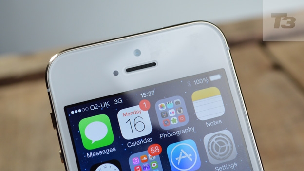
Apple iOS 7 has been completely re-designed with a brand new interface

-
+
Beautiful parallax scrolling
-
+
Control Center
-
+
Strong performance
-
-
Too colourful for some
Why you can trust T3


Apple's iOS operating software is six years old, so no wonder it needed sprucing up. The new OS is bright and colourful, but is it still more intuitive than the competition?
Unlike rivals Android and Microsoft, Apple updates its mobile operating system, used in iPhones and iPads, on an annual basis. And as soon as it's released, it's adopted by the majority of customers very quickly.
This is also very unlike Android. Apple will hope that last year's pickle over Apple Maps on iOS 6, which held many back from updating until the Google Maps app became available will prove to be a one-off.
Assuming it was, chances are that most Apple customers with iPhones from the iPhone 4 onwards, and tablets other than the first iPad, will be on the new OS within weeks. Of course, the new iPhone 5s and 5c have iOS 7 from the off, but if you're using an older model, like the iPhone 5 or iPhone 4S, should you upgrade? Article continues after the video.
iOS 7: Design
When Apple hardware guru Jony Ive was brought in to update Apple software, things were always going to get interesting. And the prospect of hardware and software being masterminded by one person was especially appetising. The result is especially clear with the iPhone 5c, available in bright colours that match the new software's eye-popping palette.
It's unmissably bright, leading some to say it's childlike - my first iPhone - and offputtingly gaudy. But give it time and it quickly becomes familiar.
There are big differences here, and it suddenly feels like it was designed from the ground up, not built and then added to over six years. Spotlight, the Apple onboard search system, has moved. Previously it sat off to the left, launched by swiping left from the first home page, for instance. Those actions get you nowhere now. Instead, you swipe down on any home page from anywhere except the very top.
This has a logic to it as the search box within apps such as Mail is off the top of screen, so this matches. Even so, Apple knows this is a big, unguessable change and has placed an information box onscreen the first time you launch your updated gadget.
The new software is not so much flat, as it has been called elsewhere, as layered. Swipe up from the bottom of the screen and you reveal the new Control Center - about which more later. It's a translucent panel that floats above whatever page you have open, allowing the image underneath to shine fuzzily through.
And there's a beautiful parallax effect that greets you when you turn the phone on. On the lock screen and beyond, the phone separates levels, so they seem to float independently.
On the home screen this looks stunning: tip the phone and the app icons hide and reveal parts of the wallpaper behind as though there's considerable distance between the levels. It's a unique and deeply attractive effect that can become faintly addictive to watch.
Tabs in the browser, Safari, have the same cool effect that makes them look like sheaves of paper leaning towards the camera, revealing their contents as you tip them.
Those app icons, by the way, now come in a subtly changed shape: still a square with rounded corners, but the curves are more pronounced. And the design of the updated icons has been controversial. We like the simplicity of new items like Game Center and Weather, but we're less keen on the cluttered look of Newsstand or the dull grey of Camera.
You'll have your own favourites and dislikes. And remember there are still plenty of apps to be updated - the iBooks icon is still the old one, though this will change and quickly.
iOS 7: Updates
There are many new elements in iOS 7. One of the updates is, er Updates. No longer do you have to update every app individually. You can set iOS 7 to do it all for you. Apple is catching up with Android here, but better late than never.
Other changes include a much more elegant multitasking effect. Still launched by a quick double-tap, apps now appear as smaller versions of their latest pages sitting happily in a row. Touch one to go to that app or flick it off screen (rather like in Palm's late OS) to quit it.
Siri has been updated, not only so it looks slicker - though the microphone icon is still deliberately old-fashioned - but so it can do more. You can control the screen brightness with your voice. US users have a new voice for Siri, two in fact, but there's still only the old one for UK customers. However, expect this to change.
iOS 7: Features
There are a lot of new features here. Among the standouts are an improved Find My iPhone, which enhances the already excellent system for tracking down your lost or stolen phone, making it harder for thieves to do anything with your phone (except feel remorseful and return it).
There's Control Center: swipe up from the very bottom of the screen to reveal easy access to airplane mode (at last!), toggle wi-fi and Bluetooth on and off, activate Do Not Disturb and toggle portrait orientation lock. It also has shortcuts to the camera, calculator, timer and even a torch. All very useful.
Oh, and AirDrop: there's no NFC in the iPhone so you can transfer content from one iPhone to another (though not, sadly, to or from a Mac) using AirDrop which creates an ad hoc wireless connection. It's very neat.
Swiping from the top of the display reveals an improved Notifications Center with calendar, stocks and weather, for instance, on show on the same translucent background.
Other features include FaceTime Audio - like the FaceTime video calls, but without the pictures. So this is a voice call that goes via a data route, not the 2G voice connection. Using it over a 3G signal, the sound was clear, crisp and full. Excellent.
There are many more features than this, some minor, some major, but these are the most central and radically altered ones.
iOS 7: Performance
On the new iPhone 5c and 5s, it's hard to compare performance between iOS 6 and iOS 7 as they only run the latest. Both phones are fast and run the OS without pause, especially the super-fast 5s.
Running the software on earlier models is still successful, with no sense of the phone being overburdened or slowed down beyond usability, though certainly the iPhone 5 runs faster than the 4S, for instance.
iOS 7: Verdict
The new iOS 7 operating system is gorgeous and pleasing. Unless you think it's childish and gaudy. Of course, you don't have to upgrade to it. But it's undeniably better-featured, consistent and well-constructed. And to look at it the other way: if you do like the look of iOS 7 it's like you get a whole new phone, free.
There are benefits, which every user will want: automatic updates, Control Center, better Find My iPhone and more. Though some will miss the baize background to Game Center, many more will cheer its absence, and that of the Passbook shredder, calendar accoutrements and many more.
This is a fun, capable and largely very appealing update that is likely to win over most Apple users.
iOS 7 release date: 18 September 2013
iOS 7 price: Free
Sign up to the T3 newsletter for smarter living straight to your inbox
Get all the latest news, reviews, deals and buying guides on gorgeous tech, home and active products from the T3 experts
-
 Hublot debuts first-ever multicolour ceramic watch – but you won’t get one
Hublot unveils Magic Ceramic material, and it claims to be a world’s first
By Bethan Girdler-Maslen Published
-
 New iPhone Fold details suggest Apple's first foldable will be very different to rivals
This could be a real shake up for the foldable phone market
By Sam Cross Published
-
 Xbox confirms the console war is over, but could still be the ultimate winner
Xbox boss Phil Spencer has given up on trying to convert PlayStation fans
By Rik Henderson Published