Windows 8 review
Windows 8 is Microsoft’s big gamble on a touchscreen future, but does it deliver?
-
+
Gorgeous new live interface
-
+
Apps finally on Windows
-
+
Great on older hardware
-
-
The steep learning curve
-
-
Fledgling app eco-system
-
-
Clunky on traditional laptop
Why you can trust T3

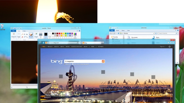
When Microsoft changes Windows it sets the agenda for the next four years and with Windows 8 it means serious business
The lifespan of Windows 7 has seen the iPad, Android and smartphone transform the technology landscape, and for Microsoft, Windows 8 is the time to shine.
In a world where minor operating system updates come and go weekly, new versions of Windows are still global events. Like the World Cup, Microsoft has stuck to a four-year refresh cycle and when a new version is released, it sets the agenda.
Microsoft doesn't make regular incremental updates, like we're used to with OS X Mountain Lion, Android 4.0 Jelly Bean and iOS 6. Yes, the system is regularly maintained, as anyone who has turned on their PC to be confronted with 36 new updates and two reboots will atest, but these never come in the form of new features. When Microsoft changes its OS it doesn't mess around.
Windows 8: Updates
Underneath, Windows 8 closely resembles its older brother Windows 7, but it has been given a fine tuning, meaning that it will run just as well on equivalent hardware. Gone are the days of expensive upgrades for the latest version of Windows and Microsoft says that Windows 8 will run better on the same hardware as its predecessor.
The minimum spec required for Windows 8 is surprisingly low, with Microsoft stating that a 1 GHz dual-core processor, 2GB of RAM and a graphics card capable of DX9 is all that's required. That puts any machine from the last 5 years in its sights, so there are no performance headaches for upgraders.
Microsoft has also changed its pricing significantly, and at £24.99 for an upgrade copy until January next year, Redmond is going all out for widespread adoption.
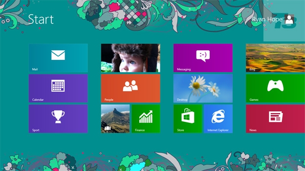
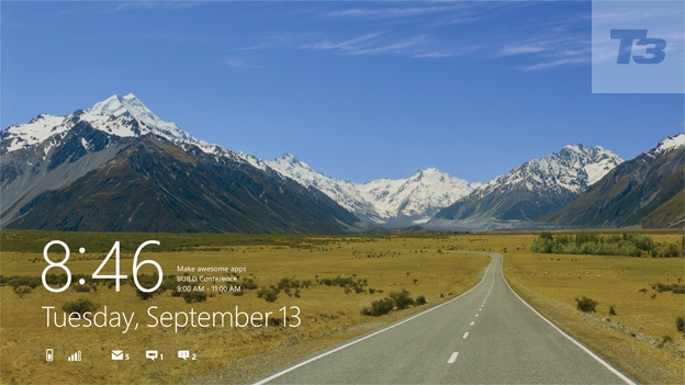
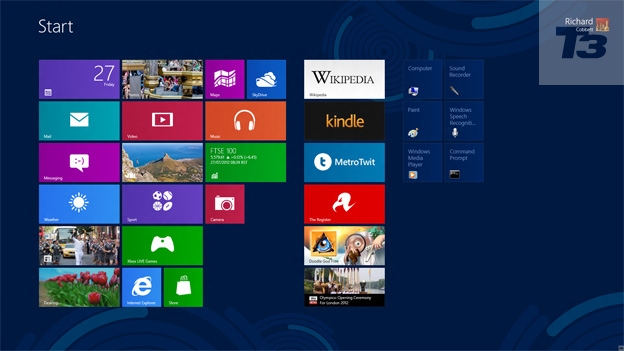
The most noticeable upgrade to Windows 8 is the Start screen, which has been given a radical rethink. The emergence of touchscreen has governed its design, so a brightly tiled interface dominates Windows 8.
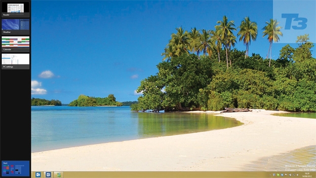
It commands the entire Windows experience and takes the place of the old Start Menu, and the bottom left hand corner of the traditional desktop is now without that familiar round orb.
The new user is a rich HTML 5 experience at the heart of the traditional operating system, and it heralds a major change in PCs that has long been preserve of Microsoft's competitors: apps.
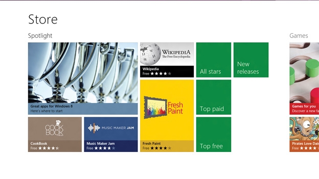
A huge addition to Windows 8 is the Windows Store, its inaugural app area, which Redmond hopes will become as populous and vibrant as the Apple App Store and Google Play. At launch it is far from full, with a handful of big name apps such as Angry Birds Star Wars available to buy, but don't expect a winter wonderland of incredible offerings this Christmas, as it's going to take time to build.
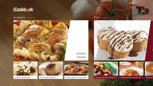
The current crop of apps isn't fantastic either. They are fast, slick and attractive, thanks to HTML 5 and there's plenty of potential for some great functionality. However, with a few notable exceptions the launch line-up only offers basic functionality and dubious quality.
That's not to say that Windows 8 hasn't got the potential to play host to some fantastic apps but Microsoft needs to get developers on-board fast. The good news is that a predicted 300 million installs of Windows 8 by the end of 2013 means that it shouldn't be hard to get the Windows Store thriving.
The final headline change to Windows 8 is the introduction of Windows 8 RT, the first version of the operating system to work on ARM-based processors. This means that Windows now has a home on tablets that can rival the iPad and Android army for size, weight battery life and power.
The general appearance of Windows RT is identical to its full-fat x86 cousins, but you won't be able to run classic desktop applications from the internet.
That means that RT users are limited to running apps Windows Store. It's has the potential to cause huge confusion, especially as devices like Microsoft Surface, Asus Vivo Tab and Samsung ATIVsmart PC are available in both x86 and RT flavours.
Windows 8: Interface
The biggest change to Windows 8 is the Start Screen interface. Like the old Start menu it shows you the apps and programs installed on your PC, but unlike the tiny menu tucked in the bottom corner of your desktop, the Start screen takes the whole screen.
It looks fantastic and works a treat, showing every app or program as a tile, which is easy for touch and mouse and keyboard alone. The tiles are also 'live' which means they turn and twist to show off information, such as new emails, photos, contacts, news headlines and even travel updates.
It's a world away from the bland, static interface of Mac OS X Mountain Lion, or even the app focused iOS 6, and it's truly refreshing to see your laptop or tablet alive with your personal information.
The problem is, however, that sometimes Windows doesn't even know how to behave.
A case in point is when inserting a USB key. As soon as it's plugged in you're whisked to the old desktop, and when you double tap a picture, you go back to the new interface.
However, if you now want to add it to your pictures library, you're heading back to the desktop again. It's confusing, and it's as if the old and new Windows are fighting against each other, and you're only option is to adapt the way you work.
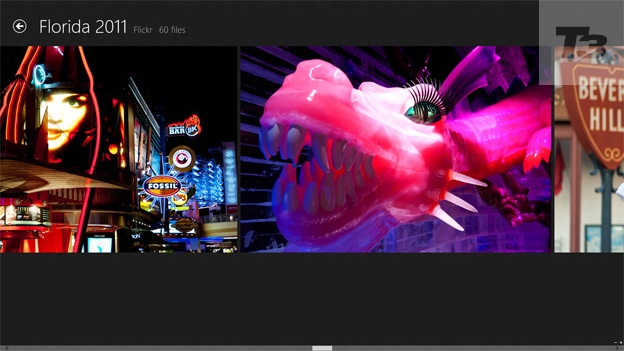
Windows 8 also connects with the cloud and Microsoft SkyDrive powers the back end. It's been a mediocre service for a long time, but it does a great job of powering Windows 8, silently getting on with its job of storing files and information- although transfer speeds really need a shot in the arm.
While Start screen is a triumph of design it's likely to be the biggest cause of disconcertion with Windows 8 from consumers. You're forced to adopt it from the moment you boot to the time you shutdown.
Yes, you can drop back into classic desktop but to love Windows 8, hell, even use it effectively, you have to embrace the new interface 100%. The problem is that with a mouse and keyboard, that's not an easy thing to do.
Windows 8 works wonderfully with the range of gestures with touchscreen devices and it's one of the most complete and effortless operating systems to grace the tablet form. That's a bold statement, but it's easy to master and enables you to access what you need far more easily than any mobile OS.
The Charm bar, accessible from the right hand edge, enables you to search any part of Windows 8 from files, apps, settings, the Windows Store and even the internet. It ties the whole Windows 8 experience together and once you start using these new parts of the OS, things start to come together.
While this might be intuitive via touch taking to the mouse will even leave the most technically savvy user bemused. Like OS X, Windows 8 revolves around a series of hot corners, such as the bottom right for the Charm bar, which handles operating system wide searching, settings and sharing, and top left to see a list of open apps and windows.
It's a steep learning curve and without migrating to touchscreen it's never 100% comfortable.
Windows 8: Features
While the Windows Store is one of the biggest additions to the new OS, there are plenty of apps pre-installed, which bring tonnes of new features to Windows 8.
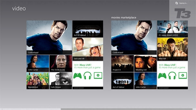
The most notable of these is the Xbox Video and Xbox Music apps, which as the name suggests, plugs into the already thriving ecosystems available on the console.
These apps provide a natural home for MP3, video and media stored on your PC or tablet, but they also you to buy and rent media from your PC. In fact, the Xbox Music Pass offers ad supported streaming of 30 million tracks, with a premium version allowing downloads on five devices available.
While we fear that few will be excited about these services with the prevalence of services such as Spotify, Netflix and Lovefilm (all of which are available in Windows 8), the apps are well built, full of content, and thankfully, Microsoft dropped its bizarre points payment system, to make Xbox Video and Music genuinely compelling.
Functionality is basic, when compared to the social sharing and playlist creating which is engrained in the likes of Spotify, however, it brings free, streamable music to the masses and we like it.
There's also a modern user interface version of Internet Explorer 10 built into the start screen. It differs from the traditional Windows version, which is still accessible from the old desktop, by being touch-friendly, clear and vibrant. However, like many of the new apps we found it to be buggy, often not displaying web sites correctly, and rendering incoherently when scrolling through web sites.
Amusingly, the Modern UI version of Google Chrome is much better and shows what the slick new interface is capable of.
Windows 8: Performance
One of the most noticeable improvements in Windows 8 is its performance, and having tested the final build across a host of devices, including the Sony VAIO Duo 11, Asus Vivo Tab RT, the Samsung ATIVsmart PC, the Dell XPS 27 Touch and the Lenovo IdeaPad Yoga 13 and we haven't found once noticed annoying glitches or drops in speed.
The Start screen is responsive and glides from side to side, with the animated gesture menus sliding from the left and right with iPad-like aplomb. Searches are performed almost instantaneously, and it's obvious that Windows 8 is a finely tuned re-thinking of the classic Windows build.
Even Windows RT, the ARM based skew of the operating system for mobile processors, performed extremely well, and easily outscored the iPad 3 in Sun Spider benchmark tests and matching the iPhone 5 for raw browsing speed.
The most noticeable improvements have been around connected devices, and gone are the long, sluggish recognition of USB drives, external storage and peripherals. Connect a device by USB and it fires into life, and we enjoyed improved transfer speeds while copying files and folders.
Windows 8: Verdict
Windows 8 is a well rounded operating system that looks great, feels fresh, and most of all, really works. It's hard to master and the Windows Store needs a serious shot in the arm over the coming months, but it's a solid start and an enormous leap forward to Microsoft.
It's clear that Windows 8 is an operating system that looks to the future, and still may be ahead of its time. While it's a triumph on touch displays it's hard to master on laptops and desktops and its biggest detractors will be those unwilling or unable to change the way they work. It's truly a case of adapt or die.
Microsoft should be applauded for its brave and single-minded support for a touchscreen future. By pandering to the mouse and keyboard it would have castrated Windows 8's effectiveness in the years ahead. It begs for manufacturers to build touchscreen devices, and now they must patiently wait for the world to catch up - and pray that it doesn't move on.
Windows 8 release date: 26 October 2012
Windows 8 price: £24.99 (Upgrade from an existing Windows product until 31 January 2013)
Sign up to the T3 newsletter for smarter living straight to your inbox
Get all the latest news, reviews, deals and buying guides on gorgeous tech, home and active products from the T3 experts
-
 Is this about to be Prime Video's sauciest movie of all time?
Another Simple Favor looks steamy
By Max Freeman-Mills Published
-
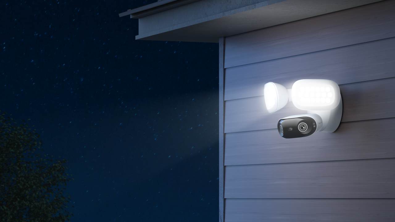 Reolink takes on Arlo with its own floodlight camera – and it looks like E.T.!
Reolink’s new Elite series could give home security giants a run for their money
By Bethan Girdler-Maslen Published
-
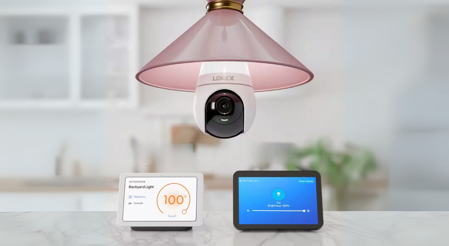 This smart bulb quietly doubles as an indoor security camera – I need it in my house
Smart home tech or spy tech?
By Lizzie Wilmot Published