Apple Watch review updated a year on: still the best smartwatch around
We’ve revisited our original Apple Watch review a year on, it’s still the most desirable, stylish and functional smartwatch going
-
+
Great design
-
+
Lovely screen
-
+
Accurate voice recogntion
-
-
Hard to learn interface
-
-
Limited useful apps
Why you can trust T3
The Apple Watch certainly wasn't the first smartwatch, but it was the most well-known and popular.
We've been wearing one the best part of a year now, and it's changed significantly since then. In fact, the sector as a whole has changed. So we've decided to revisit our original review of the Apple Watch.
How is the aging smartwatch doing?
Apple Watch design
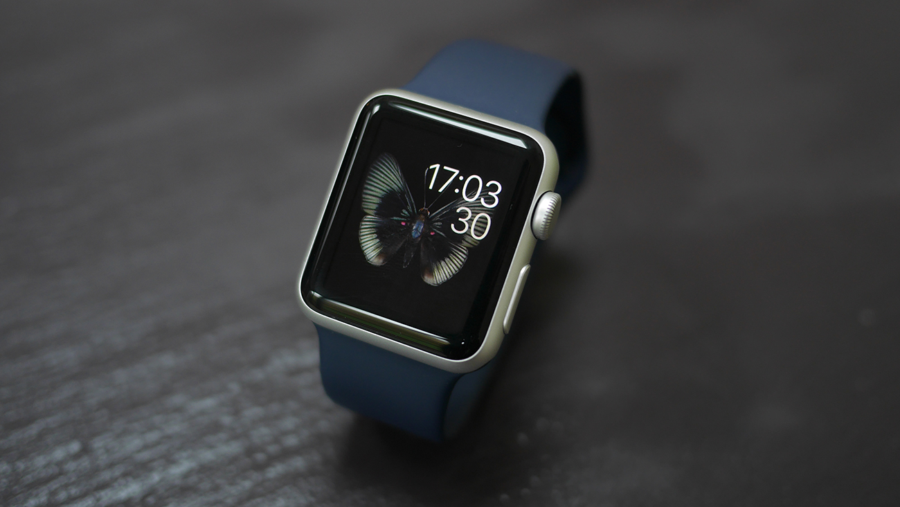
The Apple Watch is both the best looking and best feeling smartwatch available. Still. Period.
Even when you start at the bottom end: the Apple Watch Sport which comes with a selection of jazzy rubberised (technically fluoroelastomer, but trust me, nobody will be impressed if you tell them that) straps that say 'hey yeah, I'm sporty and stuff' and not, 'I didn't want to spend loads on a new smartwatch'.
They look great, and the fluoroelastomer is incredibly comfortable. Thanks to recent range updates from Apple, there are plenty of colours and different materials to choose from.
We've also tested the stainless steel Watch, with the Milanese chainmail-style band, and the latter is definitely the one that got more attention. It looks more like a grown up watch for a start, and as it uses frickin' magnets to clip onto your wrist it's a perfect fit each time.
The straps are super easy to switch over, with a simple clip to poke letting you slide different designs and materials in.
Most of the time I'm wearing an Aluminium Apple Watch with Brown Leather Ullu strap.
It's easy to create a unique looking Watch to suit your tastes.
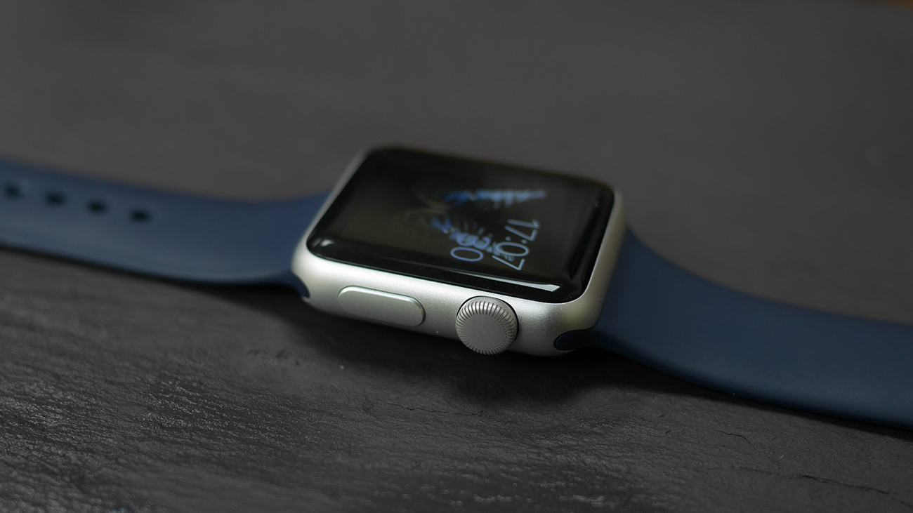
In terms of design, the digital crown is the obvious bit, sticking out at the top of the right-hand side.
The Digital Crown is the main UI innovation here, it clicks in to help make selections and switch apps, and scrolls to help you navigate through menus without having to swipe with a finger.
This means you don't have to cover the display with your chubby fingers.
It's something at Android Wear devices haven't really cottoned onto yet, but the excellent Apple Watch rival - the Samsung Gear S2 - mimics with the rotating bezel.
Below the digital crown is the imaginatively named 'Side Button' which acts as both the power key, and also launches your favourite people section.
We don't use it much in either capacity.
In terms of weight and size, Apple is giving you the option between a 38mm and 42mm size for your daily smartwatch needs - some have categorised this as 'female' and 'male', but in reality it's just giving you the option for your style.
Neither feels particularly weighty on the wrist, but the steel Apple Watch weighs more than its Sport counterpart, so should be checked out on the wrist before purchase.
Another key aspect of the design is how it ages, and after a year of constant use we've only got good things to report. The aluminum Sport model is flawless, with no scratches on the metal case or screen, which we think is very impressive.
The steel model is prone to scratching a little easier than aluminium, but this can be buffed out.
Apple Watch display
The display is beautiful - it looks clear with great contrast ratio and nearly everything looks great on the smaller display, whether it's the 38mm or 42mm option you go for.
The only annoying thing about it is the face it's not on all the time - you have to raise your arm to see what's going on. This is mostly fine as Apple has made the motion so accurate, but when lying down or in a meeting you'll have to tap the Watch just to find the time.
Apple Watch interface
Originally weren't taken by the methods Apple's put together to help you flick through your new digi-timepiece. It was a tremendously high learning curve for something made by the Cupertino brand, and not what we expected.
But of course, you quickly become used to these things, and now we're navigating around watchOS like pros.
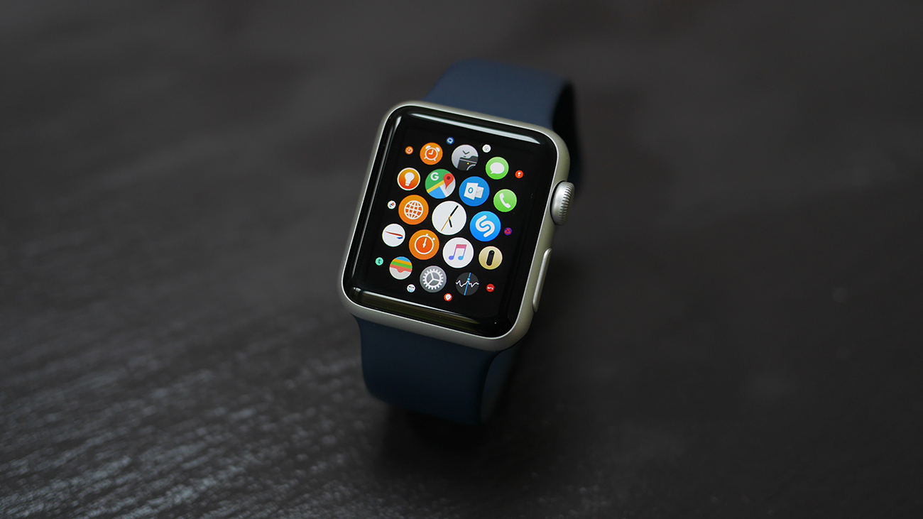
A couple of key things to remember: When in the clock app (the default view) you can drag down to see notifications, and drag up to see 'Glances'- which are the most widget-like thing Apple's ever made.
Tap the digital crown and you're taken into the spherical realm of all the apps you've got installed on your Watch - scrolling will zoom in and out, and a simple finger touch lets you move around, with a tap taking you in.
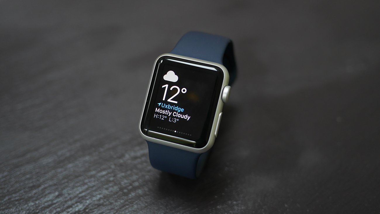
But the Glances and notifications are only available when in the time app, not pervasively as I'd expected.
In September Apple released watchOS 2.
This brought with it Apple Pay, custom watch faces, third party complications and improved Siri.
What really strikes me is the number of features I DON'T use. Social functions, fitness tracking and even apps seem almost completely irrelevant.
Maybe I'm the odd one out, and others LOVE those features, but it proves that smartwatches are very complex, and Apple's blunderbuss approach pays off -- pleasing as many people as possible. But maybe it's also the death knell for smartwatches...
Apple Watch apps
Apple's been spent a decent amount of time in its labs recrafting the Watch apps to be something, well, a bit more Watch friendly. On top of that, we're getting reams more entering the fray every day as brands and developers try to nab a slice of the wrist action that's on offer.
Apple's versions are the most interesting, though, with the messaging app the most intriguing. When you get a message on your Watch a tap opens it up - and the watch then works out whether there's a clever retort that won't need loads of effort to use.
So if someone says: 'Do you want fish or chips for dinner?' the Watch will work out that the options should be 'Fish' or 'Chips' and let you reply as such.
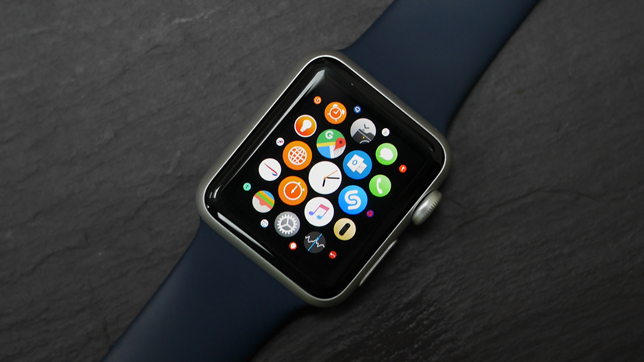
Although there's no option for 'both', so it's not that smart. Everyone loves fish and chips. Siri is also an option, and the voice dictation accuracy really is superb, getting the right message nearly every time.
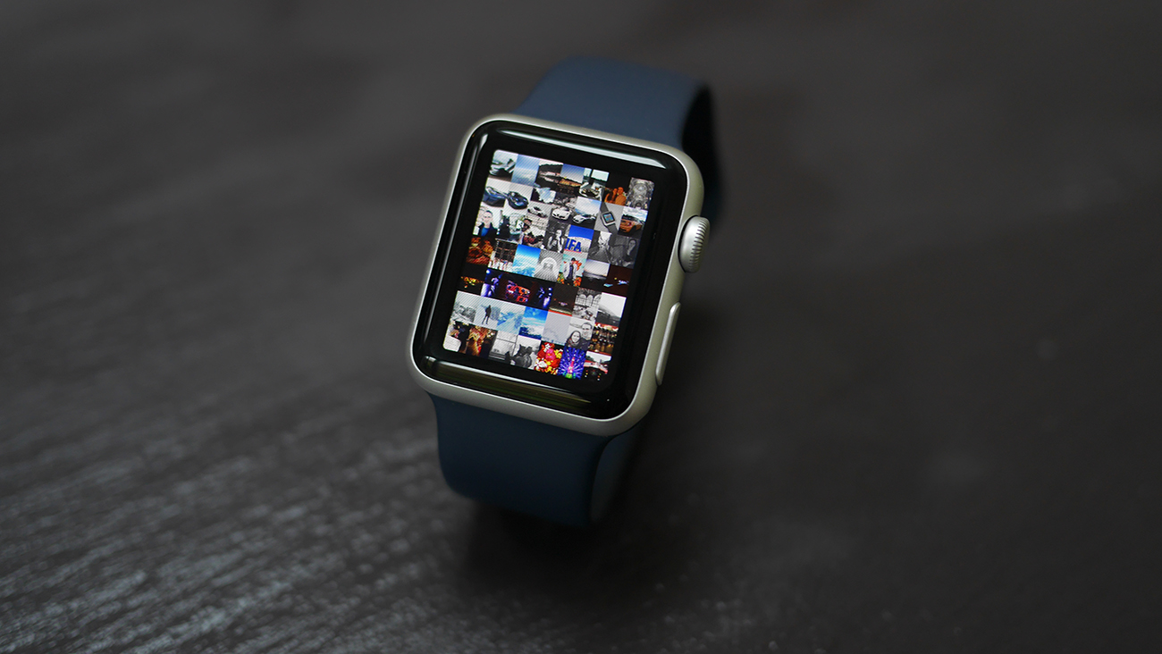
But if your friend has an Apple Watch too, then the merriment is magnified. Press the side button and you're taken into a clock face of all your favourite people - and with those that have a Watch you'll see a little finger icon below.
Tap this and you can poke the screen a few times, press with two fingers and you can send a heartbeat (and there are already countless sites where people are posting their email addresses to receive anonymous beats). It's a weirdly intimate experience and while the heart rate monitor isn't as accurate as you'd hope a lot of the time, it's a fun trick. But one that will soon fade after the novelty wears off (and it does, quickly).
The other option is to send a digital sketch to a Watch-wearing chum. And we know what you're thinking. And yes, it's mostly just weirdly-proportioned sketches of male genitalia. (Well, apart from a certain previous member of the T3 team who would occasionally send a note simply saying 'Kill'.) Again, we can see this being an early novelty for anyone that fancies picking up a piece of Apple wrist jewellery, but after that, it will be consigned to the dust.
It makes the need for a side a button a little pointless. The ability to make and receive a call is possible from here too, with the mic and speaker allowing you to chat like the boring Dick Tracy reference that most smart watches seem to inspire. It's fine, but only something you'd use for very quick chats and when you're hopefully alone.
Apple Pay is also another big feature that many (including us coffee-hungry lot at T3) are looking forward to getting their hands on, with the inbuilt NFC in the Watch allowing you to mimic a contactless card and pay for goods up to £30 without even needing the phone present.
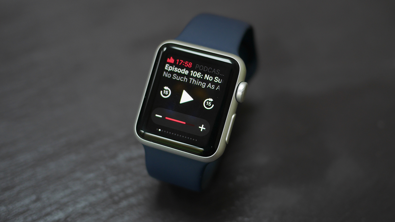
The number of quality third party apps available for the Apple Watch are second to none (much better than Android Wear's offering). But as we've previously mentioned, I don't find myself actively opening apps, at all…
Notifications are the killer smartwatch function, and even Pebble does them really well.
Apple Watch battery life
Let's get this clear, you're going to charge the Apple Watch every night. And while that may seem like a lot of effort at first, after a year you get into a regular schedule. I've got a Griffin charger by my bedside, every night I plug in my iPhone and put my Apple Watch on charge. Once you get into a rhythm it's simple.
We were actually quite impressed with the battery life on the Apple Watch, as we expected it to be abysmal. It's like seeing the film 'Hitch' for the first time - our expectations were so low we were rather impressed by Will Smith's mad romp through the treacherous dating scene of New York.
Tim Cook was like the trailer - making it seem that it wouldn't last long / be any good, before delivering the goods on the wrist. This metaphor is falling apart faster than Smith and Eva Mendes relationship two-thirds the way in, so we'll end it there. (Spoiler: it's all alright in the end).
Let's talk numbers: the quoted time is 18 hours before needing to be tethered to a charger, but, in reality, we never got to the end of the day with no power left.
Using the exercise function was the biggest suck of power, but nothing major. Even a two-hour run saw it keep going just fine.
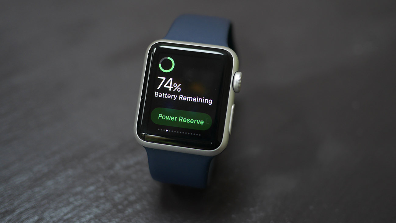
There is a touch of the 'Nokia syndrome' here: like the Finnish Symbian phones, the battery life is good because after a while you stop playing with it idly because it doesn't do a lot.
Even if you get to the end of you juice, Power Reserve will kick in so you can tell the time by a press of the Side Button - but that's it, and it takes an awfully long time to actually see the time when pressed.
Props for the magnetic charger: it's cool. Magnets are just generally cool. Science, innit.
One thing that is annoying about the battery life is when your schedule gets disrupted when you're travelling for example. I don't bother taking Apple Watch away on weekend trips because then it becomes a hassle.
Apple Watch fitness tracking
One of Apple's favourite things to tout about the Watch is its ability to help you get fit, with the brand parading Christy Turlington-Burns on stage at the March launch to tell us all about how she's using the new gadget to help her train for the London Marathon.
The myriad options on the Workout app are good, with the ability to track everything from an outdoor run to a session on a stepper machine, with the accelerometer taking the brunt of the work.
This is because the Watch doesn't have GPS onboard, which makes it slightly redundant for running for anyone serious about learning their distance.
It can pair with your iPhone though, meaning it can hook into the location info from your handset to get a more accurate reading.
What's more, it will learn about your stride rate over time, which means the Watch itself will become more accurate when you lose the handset and go out wearing nothing but your wrist buddy (clothing is recommended though). In tests it seems that the Watch is mostly decent at working out how far you've gone - but not perfect. Even with the iPhone tethered the distances run are a little generous, and without it you're into something of a lottery if trotting long distances.
Check out T3's scientific video below:
There's no way to get fitter though using the Watch - Apple's not given any training plans on there, and the only information you can grab from the small display when starting up the Workout app are beating your previous best time / calorie burn / distance.
In terms of poking you all day long, the Apple Watch is adept there too. We mean that the activity ring, which encourages you to get 30 minutes exercise, stand for a minute 12 hours in the day and burn a certain amount of calories is there as your constant life coach.
It's more annoying than helpful though, with the Watch constantly telling you to stand throughout the day - even at times when just having sat down. It's a nice idea, to stop the world being so sedentary by encouraging them to stand up, but after a few days you'll start missing a few, fail to hit your goal, then probably give up altogether, with the constant pokes to stand nothing more than an annoyance.
The heart rate monitor is also something we'd hoped would be a bigger part of the mix. It'll take readings from you at regular points throughout the day, placing this information in Apple's Health app, but again it's not as accurate as we'd like.
During runs, it sometimes struggles to get a fix, and although it seems OK at taking readings during the day, it's not something we'd rely on for accurate info.
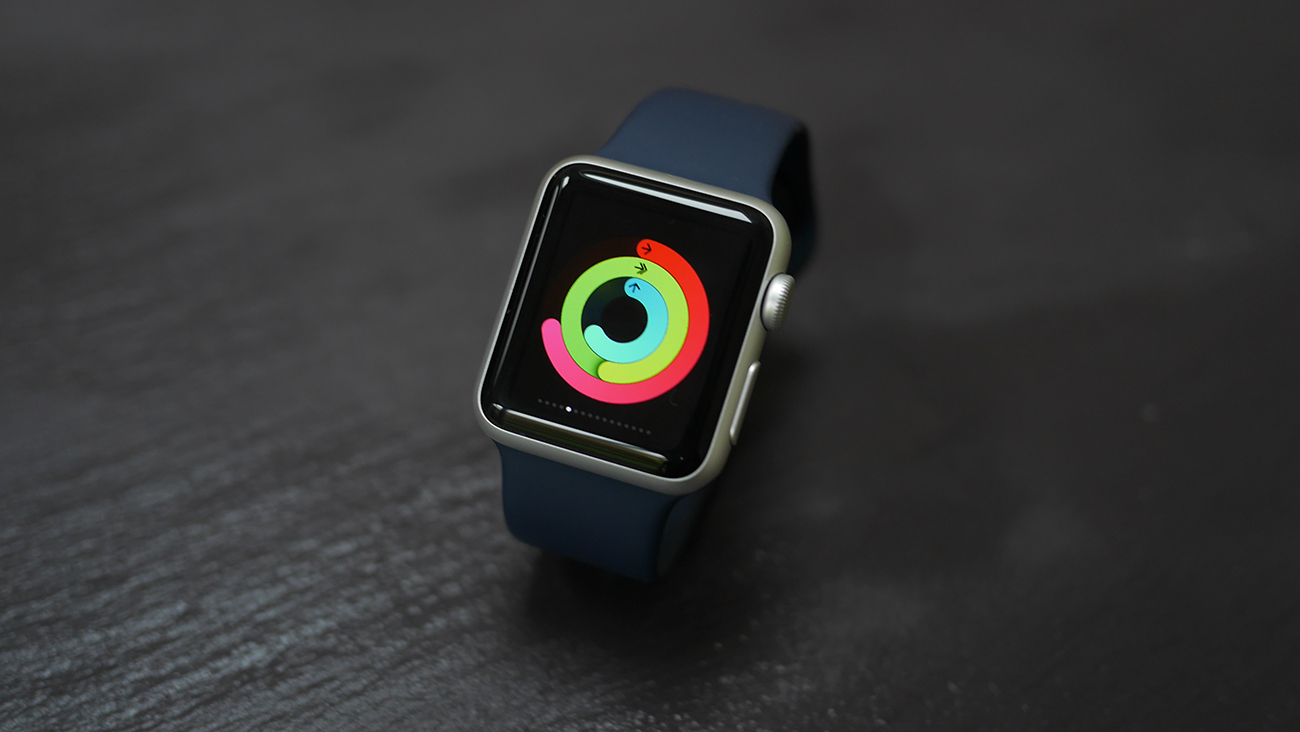
The third party apps (and there are lots of them) are what will make the health and fitness side of the Apple Watch worth buying into, but without the additional sensors like GPS on board, it's hard to see the first generation Watch being the device that achieves that peak of fitness zen.
For people uninterested/beginning their fitness journey though? It's perfectly acceptable.
Verdict
Apple has definitely made the smartwatch appeal to the mainstream in a way that Pebble and Android Wear didn't.
A year on and the Apple Watch is still the best smartwatch available. Apple has put a huge amount of work into the craftsmanship of the device - it looks the part, and once the world has got its head around smartwatches (it still hasn't) you'll be proud to have this on your wrist - more so than any other device available.
We love the clear and crisp OLED screen which is still the best around. And everything is just a little less annoying than other smartwatches.
It's not a device you spend ages starting at and using, it melts into your routine.
There are a few things wrong with it, but really? They're issues with smartwatches in general, problems with the whole wearable category which, despite being around for over three years, has still failed to come up with a killer app or feature.
Should you wait for the Apple Watch 2? We don't think so. It's hard to see how Apple can improve the Watch 2 -- improved sensors, better battery life, a FaceTime camera? None of those are necessary…
It's possible the Apple Watch may just be the best smartwatch that will ever be made…
Depressing, we know.
Sign up to the T3 newsletter for smarter living straight to your inbox
Get all the latest news, reviews, deals and buying guides on gorgeous tech, home and active products from the T3 experts
T3.com is one of the UK's leading consumer lifestyle websites, visited by over 10 million people every month. You can follow us on Twitter, Facebook and Instagram. We present products in helpful buying guides and carefully curated deals posts across style, living, auto, smart home, watches, travel, fitness and more. We also have a monthly magazine which you can buy in newsagents or subscribe to online – print and digital versions available.
-
 New Nothing phone does something iPhone and Samsung don't – but there's a catch
You have to live in a certain country to benefit
By Britta O'Boyle Published
-
 The Last of Us season 2 isn't the best, according to viewers
Critics and viewers are at odds with The Last of Us season 2's premiere
By Mike Lowe Published
-
 Campfire Audio’s new Alien Brain IEMs are a hi-fi, sci-fi glass act
Campfire promises "close encounters of the Hi-Fi kind"
By Carrie Marshall Published
