Moto 360 review: this Android Wear watch is loveable but still flawed
Much more refined, but there's still room for improvement
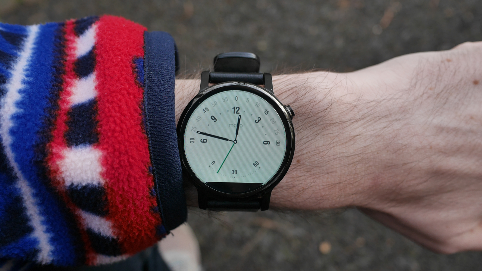
-
+
Best design
-
+
Great specs
-
+
Customisation options
-
-
Black bar is back
-
-
Screen is worse than rivals
-
-
Battery life so-so
Why you can trust T3

Despite having rather significant flaws, the original Moto 360 was the most popular Android Wear smartwatch. Has Motorola learnt from their previous mistakes, or is the second generation just as flawed as the first?
We wore the new Moto 360 for several weeks, so here's the verdict.
- Don't forget, there's also a Moto 360 Sport, too
Design, Screen and Battery
We loved the design of the original Moto 360, it was sleek, stylish, futuristic, and of course, round.
The 2015 version follows on in the same vain. Although the design is very similar, there are some slight improvements.
The home button has been moved around the bezel to a more ergonomic location, the strap attaches to extended lugs (so they can be changed easily), and it now comes in black, silver, and gold.
The watch also now comes in two sizes, a 46mm watch face (the same as the original, but 0.1mm thinner, at 11.4mm) and a new, smaller 42mm watch face (again, measuring 11.4mm thick).
I've tried both on and much preferred the smaller version. It feels like a more natural size for a watch, and doesn't hamper usability. There's also a new 'for Women' version, which features a slimmer strap, and more blingy bezel.
The Moto 360 is very comfortable to wear, the size is fine for men's wrists, and just about passes for women. It's also reasonably lightweight, so you won't suffer from watch fatigue.
In terms of design, it's probably one of the best looking smartwatches around.
The 42mm watch has a 35mm screen with 263ppi, and the 46mm watch has a 40mm screen with 233ppi. It's bright and quite sharp, but compared to the Moto's competition, the screen is washed out, the blacks aren't as deep, and it's not as sharp. The Huawei Watch and Samsung Gear S2 are much better in this respect, but it's definitely a big improvement over the previous version (the original has 205ppi).
Motorola claims this has the highest screen to case ratio of any smartwatch on the market, there's practically no bezel in sight and that's quite impressive. It does, however, mean the 'flat tyre' at the bottom of the screen remains. This didn't really bother me while reviewing the watch, but it could be a deal breaker for some.
We also like the various design options provided by Moto Maker. It's back and bigger than ever with choices for case material, bezel material, and a variety of straps. There are some very tasteful combinations which can be created, others aren't so great, but it's always nice to have options.
The casing is now water resistant, with an IP67 rating.
Battery life is also improved, with a 300mAh in the 42mm and a 400mAh on the 46mm. This provides around 1.5 or 2 days use respectively. It's good, but it's not as good as the Samsung Gear S2 or Pebble Time.
The device features wireless charging, similar to the previous model (but chargers are not compatible). It's a slick dock, and one of the best we've seen.
Hardware
The old Texas Instruments processor really held the original 360 back, both in terms of performance and battery life. The 2015 model runs on Qualcomm's Snapdragon 400 chip, a 1.2 GHz quad-core CPU and 512 MB RAM. That brings it on par with the Huawei Watch, with is one of the more expensive Android Wear watches.
The Moto 360 (2015) felt suitably snappy as we swiped through the various menus around the UI.

The Moto 360 makes use of the standard sensors, including a gyroscope, accelerometer and heart rate sensor, and the wearable also includes Wi-Fi so it can work semi-remotely from a smartphone (as long as both are connected to a Wi-Fi network).
There's no GPS, but Motorola is bringing out a sportier version of the Moto 360 as well. This model is made from a rubbery material, and does include both a heart rate sensor and GPS, so it could be the best attempt at a smartwatch-cum-running watch we've seen yet.
I only tried a dummy Sport model on (the screen wasn't working), but I found it very comfortable.
The Sport also includes an 'AnyLight' display, which combines transmissive and reflective displays to ensure it's readable under any lighting condition, including bright sunlight. Again, we couldn't test this function.

Software
The Moto 360 still runs Android Wear, which has come on leaps and bounds recently.
With updates adding iOS support (yes, the new Moto 360 is a true Apple Watch alternative for iPhone users), interactive watch faces, and watch-to-watch communication.
The UI, with Google Now Cards, seems better suited to small screens than the Apple Watch OS, which can be fiddly at times.
Of course, Android Wear also comes with its own limitations, sometimes there can be too much swiping and tapping required to navigate around the UI.
As we previously mentioned, the Moto 360 (2015) will also be compatible on devices running iOS 8.1 and higher. Functionality is slightly reduced (no 'OK Google' commands, for example), but it's great to have options.
Verdict
The Moto 360 comes at an interesting time for Android Wear. The platform has seen some big improvements recently, it's really matured, the UI is sleeker, and the feature set is expanding.
The Moto Maker customisation options are great, the new smaller size is perfect for smaller wrists, and the hardware is now on par with other high-end Android Wear smartwatches.
Motorola has taken a lot of care to correct the mistakes of the original Moto 360. Although the 'flat tyre' remains and the screen isn't as impressive as its rivals. But despite that, the new Moto 360 is a very lovable watch regardless of its flaws, just like the original.
It's not a perfect watch, but the design and charm make it desirable, and that's very important when choosing a wearable.
- Shopping for a smartwatch? These are the best
- Or perhaps you're looking for something more traditional? Here are the best mechanical watches
Sign up to the T3 newsletter for smarter living straight to your inbox
Get all the latest news, reviews, deals and buying guides on gorgeous tech, home and active products from the T3 experts

As the Style and Travel Editor at T3, Spencer covers everything from clothes to cars and watches to hotels. Everything that's cool, stylish, and interesting, basically. He's been a part of T3 for over seven years, and in that time covered every industry event known to man, from CES and MWC to the Geneva Motorshow and Baselworld. When he's driving up and down the country in search of the greatest driving roads, he can be found messing around on an electric scooter, playing with luxury watches, or testing the latest fragrances.
-
 Chris Hemsworth’s personal trainer shares a simple dumbbell workout to build massive arm muscles
This six-move workout from Celebrity trainer, Luke Zocchi, will add serious muscle to your biceps and triceps
By Bryony Firth-Bernard Published
-
 Say goodbye to baggage fees – Roka's new collection is the travel hack of the summer
Introducing the Gatwick collection...
By Lizzie Wilmot Published
-
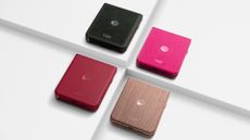 Motorola Razr 60 Ultra shown in leaked promo material, looks like a Z Flip beater
And it's running flagship hardware too
By Britta O'Boyle Published