Ugliest gadgets ever: the most eye-bleedingly bad tech ever brought to market
10 fug-ugly gadgets that needed to be put down for crimes against beauty

Get all the latest news, reviews, deals and buying guides on gorgeous tech, home and active products from the T3 experts
You are now subscribed
Your newsletter sign-up was successful

Intro
For every Alfa Romeo Brera and Samsung Galaxy S6 Edge Plus that gets released into the market, there are also a horde of 'inspired' and 'visionary' new products that get let out of their lab cages to die a swift and public death. These are products that assault the consumer with their bubonic aesthetics, grotesque price point and monstrous hype factor, with their makers either oblivious to their product's gross deficiencies or actively hoping that they can despoil some rube's wallet irregardless.
Simply put, these pieces of tech needed to be beaten to death with an ugly stick. Here at T3 we have a particular aversion to bad, ugly technology, so have rounded up some of the worst offenders for public naming and shaming.
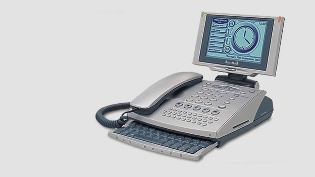
Amstrad E-m@iler Plus
Arrgh! My eyes! We start this grotesque gallery with a real ugly piece of tech, Lord Alan Sugar's Amstrad E-m@iler Plus. Released in 2002, the E-m@iler Plus was supposedly 'the must have product for home and office' according to Amstrad, offering a telephone with built-in email, Internet and polyphonic ringtones.
Asides from looking like some Frankenstein's monster hybrid of a phone, fax and PC, what was most monstrous about the E-m@iler Plus was its use of a mandatory premium rate phone line for all of its activity, repeatedly charging its user a small fortune to email, phone or send text messages. Unfortunately, Lord Sugar's ruse was swiftly cottoned on to and the E-m@iler was brutally put down by a massive lack of uptake, leading to Amstrad's Amserve company to suffer massive financial losses.
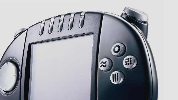
Gizmondo
Next up is a piece of tech from a category that never fails to disappoint in terms of horrendous, fug-ugly products, the gaming handheld Gizmondo. Gizmon-what? Exactly! The Gizmondo not only looked bargain-basement cheap - despite retailing for a heinous £229 - but was also released in the UK with just a single, solitary game at launch.
According to Tiger Telematics, the device's Dr Frankenstein, the Gizmondo was so trailblazing that it was going to sell 4,500 units within its first hour of going on sale at the company's flagship Regent Street store. In reality, its total lack of gaming heritage, appalling visuals, outrageous price point and shocking lack of actual games saw the Gizmondo sink like a bag of kittens thrown into the canal. Tiger Telematics didn't even make it a year before going bankrupt and the Gizmondo was taken out back and shot through the back of the head.
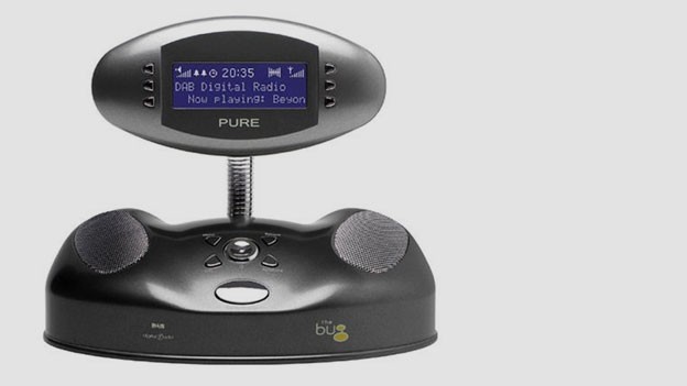
Pure Bug DAB digital radio
Ok, seriously, who was the person who woke up one morning and said that Pure's next radio should be inspired by an insect? Pure tend to make decent radios but the Pure Bug DAB digital radio just looks awful. It's brash and crude in the way most failed modern art is. In no way do I want my radio to look like some Lost In Space prop reject and, what's worse, even if I did I don't know where I'd put this toy-like device, with its garish, childish aesthetic clashing with every room I own.
The fact that this range of radios sold well when released a decade ago is a fact that should shame humanity.
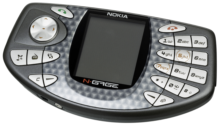
Nokia N-Gage
Ah, the Nokia N-Gage, what a truly hideous piece of tech bilge you were. So ugly and so functionally useless, it is truly amazing that the N-Gage ever came to market. Part phone, part handheld gaming console, the N-Gage did neither and did neither spectacularly poorly.
What happens if you use buttons designed for a phone on a handheld gaming console? That's right, they act like phone buttons and make gaming a trying experience. Also, what happens if you use a handheld gaming console form factor chassis for your phone? That's right, you end up looking like a berk every time you hold it to your ear.
Nokia thought the N-Gage would be a massive hit, predicting it would ship six million units by the end of 2004 (the N-Gage launched in October 2003). Unfortunately, the device sold under 10,000 units in the first two weeks on sale and, despite lingering on the market until 2005, soon after had a bullet put through its nasty 176 x 208 screen.
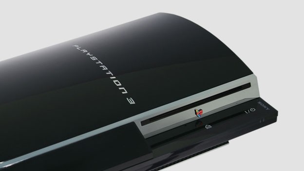
Sony PlayStation 3
Arrgh! The hubris! Boy did Sony drop the ball on the PlayStation 3. I mean sheesh, what a horrible, obnoxious mess of a console. This is what happens when you roll off the back of the most successful console of all time, only to take undeserved credit and back slap yourself into a pool of your own ignorant, head-in-the-sand, oozing hubris. You get a $600 at launch console that looks so bad and costs so much that you end up alienating a vast proportion of the people who made your last machine a phenomenal success.
Ugly in a way only a committee can realise, the PS3 went on to lose Sony an entire generation, throwing away almost all of the good work of the previous generation to Microsoft, who - despite producing another ugly machine and one that was prone to ridiculous red ring of death failure rates - went on to absolutely dominate the market and, crucially, the gamer mind share.

Microsoft ViewSonic Smart Display
Long before Apple was 'introducing' the tablet computer, Microsoft and its OEM partners were already doing it, with Bill Gates introducing the concept as early as 2002. Of course, what they then introduced in early 2003 almost permanently killed the tablet market, with products like the ViewSonic Smart Display delivering such an ugly, janky piece of technology, that consumers turned away in droves.
The problems with the Smart Display were numerous - including serious performance hitches - however its crass, plasticky design made it look like a toy Etch A Sketch and was a huge factor in its inevitable demise. Within a year of its celebrated launch, the Microsoft Smart Display was taken out into the dense forest of Aokigahara, Japan, and left to die.
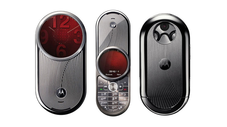
Motorola Aura
Take a good look at the Motorola Aura just above there. Yep, take a really good look. Now, I've got a question for you, would you spend $2000 on it?
No, I guessed not. And so too did basically everyone else in the world as the Aura didn't give off a good aura and absolutely tanked when it hit the market. Maybe it was the ludicrous price, maybe it was the naff quasi-Star Trek design, or maybe it was the dodgy swivel form factor, but whatever it was it killed it good, with the Aura lasting mere months.
Aura was going to be a series of phones for Motorola, however the first one ended up also being the last.

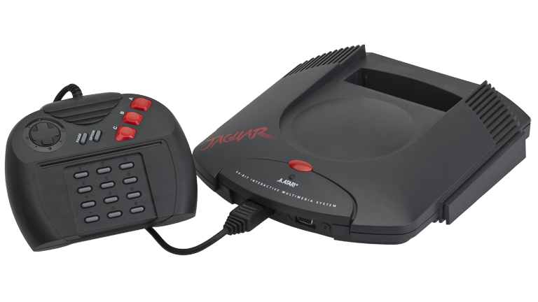
Atari Jaguar
There have been some real stinkers in the home console market over the years, but one of the absolute worst in terms of looks and performance has to be the Atari Jaguar. I mean, just look at that controller! That was released a year after the Super Nintendo Entertainment System had launched in the UK. What were they going for? Plasticky, cheap, two-way radio? And the less said about the console the better - at least in this shot it doesn't have the even uglier Jaguar CD add-on installed.
Unsurprisingly, the Jaguar's detestable aesthetics, small catalogue of games and poor technical specs led to the system to fail massively at market, selling less than 250,000 units over its entire lifespan (the SNES sold over 49 million units). By the end of 1995, with over 100,000 units gathering dust in Atari's warehouses, the Jaguar was swiftly pushed off a cliff.
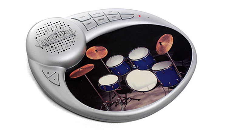
Finger Beats Drum Mousepad
If you were to make a list of things a mousemat should provide, do you think the ability to reproduce bass and snare drum sounds would be high on the list? Heck, it wouldn't be on the list at all, right? Well, the visionaries at Blue Sky Designs definitely disagreed with us, as the Finger Beats Drum Mousepad's unique selling point is the ability to drop that mouse and start jamming right there on your mousemat.
Seriously! Just look at the thing. That bulbous plastic speaker. Those cheap plastic buttons. The off-any-shape design. No, just no!
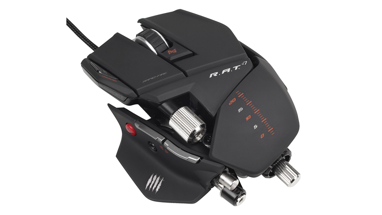
R.A.T 7
Wrapping up this celebration of the visually abhorrent is the R.A.T 7 gaming mouse from Mad Catz. 'But T3,' you may say, 'the R.A.T 7 is a good gaming mouse that many people bought.' Well, we agree with you. But what we don't agree with is its absolutely ridiculous design - a design that is so outlandish and fragmented that it is hard to look past it to the good gaming mouse beneath.
In fact, the R.A.T 7's design is so crazy that reviewers have said that maybe, just maybe it crosses out the other side of mad and bad and circles back round to genuinely inspired. Then again, just look at it. Who could have known that a mouse could look like the work of Jackson Pollock.
Yeh, it's not an inspired design, it's just crap.
Get all the latest news, reviews, deals and buying guides on gorgeous tech, home and active products from the T3 experts

Rob has been writing about computing, gaming, mobile, home entertainment technology, toys (specifically Lego and board games), smart home and more for over 15 years. As the editor of PC Gamer, and former Deputy Editor for T3.com, you can find Rob's work in magazines, bookazines and online, as well as on podcasts and videos, too. Outside of his work Rob is passionate about motorbikes, skiing/snowboarding and team sports, with football and cricket his two favourites.