
Apple's latest update to OS X, El Capitan, takes its quirky name from a vertical rock formation in Yosemite National Park. Like its namesake, El Capitan rises from Yosemite, the version of OS X it replaces, building upon its solid foundation to deliver a stronger operating system that's packed with feature enhancements.
In many ways, El Capitan is like a modern version of Snow Leopard, the 2009 version of OS X in which Apple introduced hardly any new features. Instead, it rewrote underlying code and focused on improving performance for the long term. However, that doesn't mean there are no new features in El Capitan. Far from it. There are some real gems to discover, both in plain sight the moment you start using it and as you dig deeper – but you don't need to go looking because we've picked out dozens so you can make the most of your new system right away.
You can add all sorts of things to the new Notes app, from audio recordings to checklists to website links, making it far more capable as a scrapbook. Mail works much better in full-screen mode. And, Safari gives you a way to silence intrusive sites and to pin open sites you use often, so they're accessible in an instant with a keyboard shortcut.
Changes in the Photos app, introduced into OS X in early 2015, make it more convenient and more powerful, not least thanks to the new ability to use third-party editing tools within it. This saves you the hassle of haivng to exporting pictures when you want to do anything remotely ambitious with them.
The Mac also takes great strides in window management thanks to a much improved Mission Control and the all-new Split View mode, which enables two apps to run side by side, hiding other Desktop distractions so you can focus more clearly on the task at hand.
There are many great new things to learn about in OS X El Capitan, so let's get started…
Spotlight
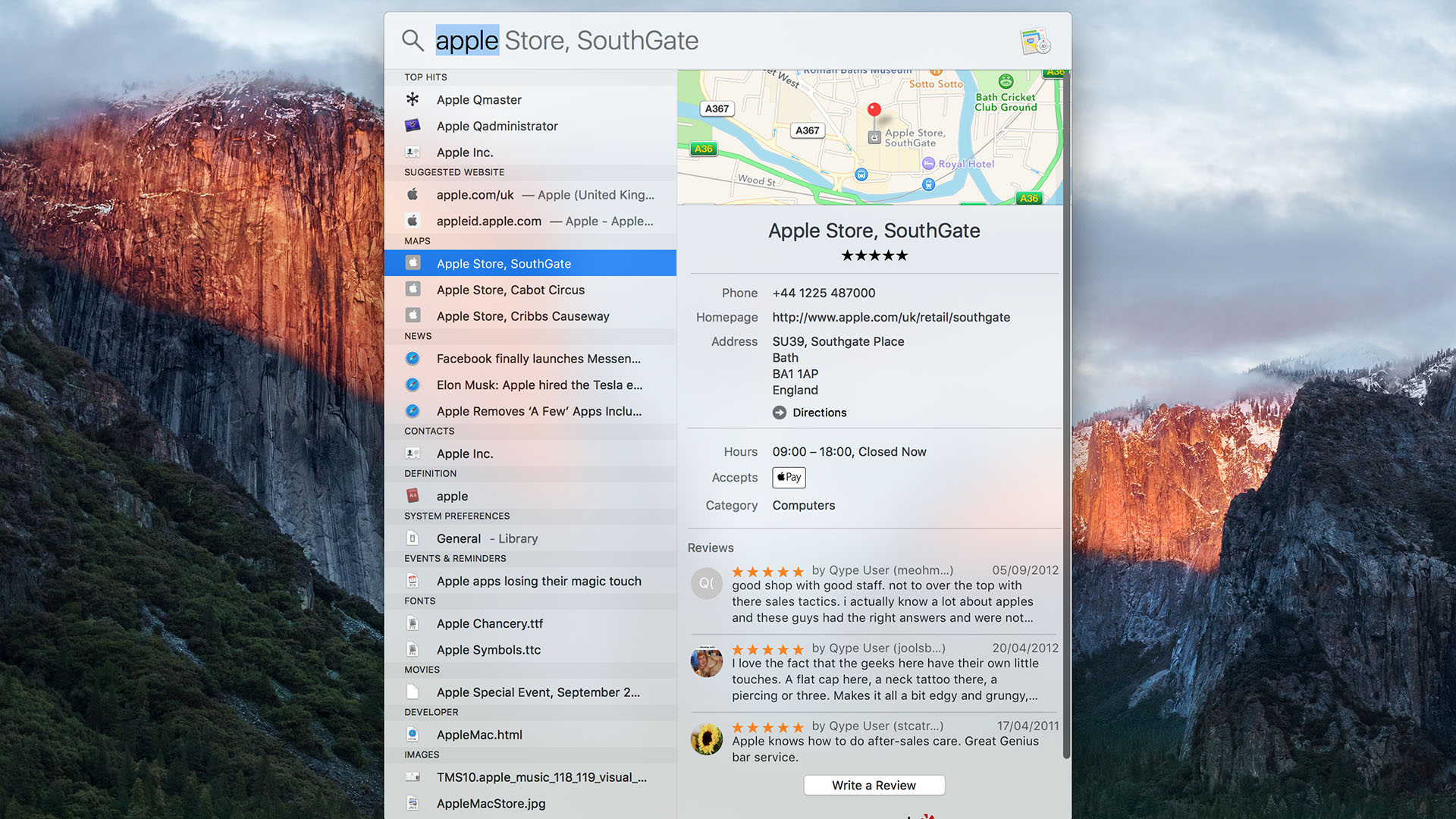
Apple is determined to make Spotlight the go-to place for finding anything using your Mac. Not just files and folders, but also online information, weather reports, your contacts and much more.
In recent years, Apple has started to blend search results from the internet with the ones from your Mac, adding a few new sources to make Spotlight more effective at answering a range of questions.
Sign up to the T3 newsletter for smarter living straight to your inbox
Get all the latest news, reviews, deals and buying guides on gorgeous tech, home and active products from the T3 experts
El Capitan gives you the ability to find certain things – files, folders and email – by expressing yourself using natural language.Spotlight then interprets your meaning to give you more accurate results, such as files you worked on a week ago when you want to continue a project.
One small but very welcome improvement is that you can also move the Spotlight window around. Once the window is showing results, you can resize the window's height to show more results – important now that Spotlight can search many more sources, including various online services.
Among them is weather – you only need to enter that word to get results for your current location, though you can easily look up the forecast for other locations, too. Like Siri on iOS devices, Spotlight can look up team standings and upcoming fixtures when you enter the name of your favourite football team. It even looks up stock values, though how useful you'll find that depends on your opinion of the iPhone's equivalent app.
While Siri remains lamentably absent from OS X, you can use your Mac's Enhanced Dictation feature – and either a double-press of a key or, thanks to a returning feature from Yosemite, a spoken key phrase to trigger it – to open and control Spotlight. Read on to find out how to do all of these things…
1. Move and resize
Spotlight's window is no longer a fixed in size or position. First press [Command]+[Spacebar] to open Spotlight, then enter your request.With some results shown, you can click and drag from the areas either side of the search field to reposition the window. The window can be resized from its top or bottom edge (remember that you can hold [Alt] to resize in both directions at once).
2. Reset Spotlight
After you have repositioned it, the box will appear in the same place the next time you press [Command]+[Spacebar]. To reset the window's size and position, click and hold on Spotlight's icon in the menu bar.
3. Find files using natural language
Rather than using arcane syntax to restrict the kinds of files that Spotlight returns, the Mac's built-in search engine is now smart enough to infer some meaning from what you enter. It can make sense of phrases like 'photos from last week' or 'messages to Kate'.
You can also express yourself this way in Mail. However, Apple only states that you can use natural language there and for file searches in Spotlight; you might find that you can use specific phrases in other contexts (see next step), but we've found that Spotlight isn't quite intelligent enough to recognise simple variations.
4. Weather and other info
Weather, stock prices and sports fixtures and results are key categories that have been added to Spotlight's search results. Just enter 'weather' to get a ten-day local forecast for your local area, or specify a location, such as 'weather in Glasgow'.
Spotlight isn't so flexible here as it is for file searches; deviate too much and it won't understand. It returns sports fixtures and match results when you type a team name, but only for American and Premier League football, basketball, ice hockey and baseball.
To look up stock market information, enter the word 'stock' followed by a company name or its stock symbol – AAPL, BT or TSCO, for example.
5. Web video
Search results can include videos from the likes of YouTube, Vimeo and Vevo under the Web Videos category (but only if 'Allow Spotlight Suggestions…' is on in Spotlight's preferences). With one of these results selected, the video's description, duration, date uploaded and number of views are displayed. Clicking the result takes you to the video in Safari.
With so many different kinds of result shown in Spotlight, keyboard navigation can be more important than ever before. So, remember that holding [Command] when pressing the up or down arrow keys jumps to the first result in the next category in the corresponding direction.
6. Speak your terms
The continued absence of Siri on the Mac is disappointing. A trick to smooth things over is to combine Spotlight's natural language search with OS X's Enhanced Dictation feature, so you can speak your search terms directly into Spotlight.
First turn on Enhanced Dictation in System Preferences > Dictation & Speech. When the required download completes, press [Command]+[Spacebar] to open Spotlight, and double-tap [Fn] to open to open dictation. Speak your search terms and results will appear; you can keep saying words to refine them. Double-tap [Fn] again to stop dictating and use Spotlight's keyboard shortcuts to browse the results.
7. Voice control
Saying what you're looking for isn't the limit of using your voice to interact with Spotlight. El Capitan includes new Dictation Commands for navigating the Spotlight window. In System Preferences, go to Accessibility > Dictation > Dictation Commands and check the box labelled 'Enable advanced commands'. This adds additional commands to the Navigation category, for selecting the next or previous result, opening the one that's selected, and for scrolling up and down through the preview shown on the right of Spotlight's window. Click a command in this pane to see variations on the listed phrase that you can use instead.
A new look for Notes
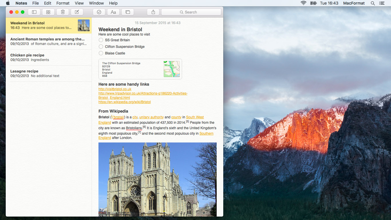
El Capitan's revised Notes app enables you to add almost any kind of file to your notes.
8. You can even add audio and video files directly inside a note, and play them back there too.
9. A neat trick is to record audio notes in QuickTime and attach them to notes. They show a play button, and they work on iOS.
The Attachments Browser enables you to view every file and piece of media you've attached to your notes. This makes it easy to find things visually. The browser's tabs enable you to switch between viewing documents, photos and videos, sketches, maps, websites, and audio.
10. Click an item to select it and then press the spacebar to preview it in a Quick Look window, or double-click to open it in an appropriate app.
11. You can add a location directly from the Maps app to a note. Click the Share button then choose Notes. The Share sheet offers a choice of adding the location you're looking at to a new note or an existing one. You can add items from many other apps from the Share menu too, including web pages from Safari, which display the page title, the site address, a two-line summary and an icon or an image from the page. The Quick Look and double-click shortcuts work on maps and websites, too.
12. You can style the text in your notes using a range of predefined text styles: Title, Heading and Body, as well as three different types of lists: bulleted, numbered and dashed. These styles make the app a far more effective tool for structuring long notes, making them an easier read.
13. Click the button that shows a tick in a circle and a circle will appear at the start of the paragraph you're editing. This enables you to add a checklist of items, just like you can in Reminders. Each time you press [Return], a new item is added to the list.To stop adding items, add an empty line and press [Return] once more.
One slight disappointment is the lack of sketch facility in the Mac version of Notes. In iOS 9 you can draw sketches in Notes, but on OS X you can't create or edit them; double-clicking a sketch opens it in Preview as a non-editable file.
14. Deleted notes are now moved to a Recently Deleted folder rather than being wiped immediately. You aren't prompted to confirm 'deletion'; pressing [Backspace] or the button that shows a trash can moves a note to Recently Deleted, from which it's permanently deleted after 30 days.
15. Like in Mail, a long swipe left while the pointer is over a note in the list will delete it.
16. If the 'On My Mac' account in the folder list is redundant for you because all of your notes are synced to iCloud, it can be hidden from Notes' application menu.
Split View multitasking
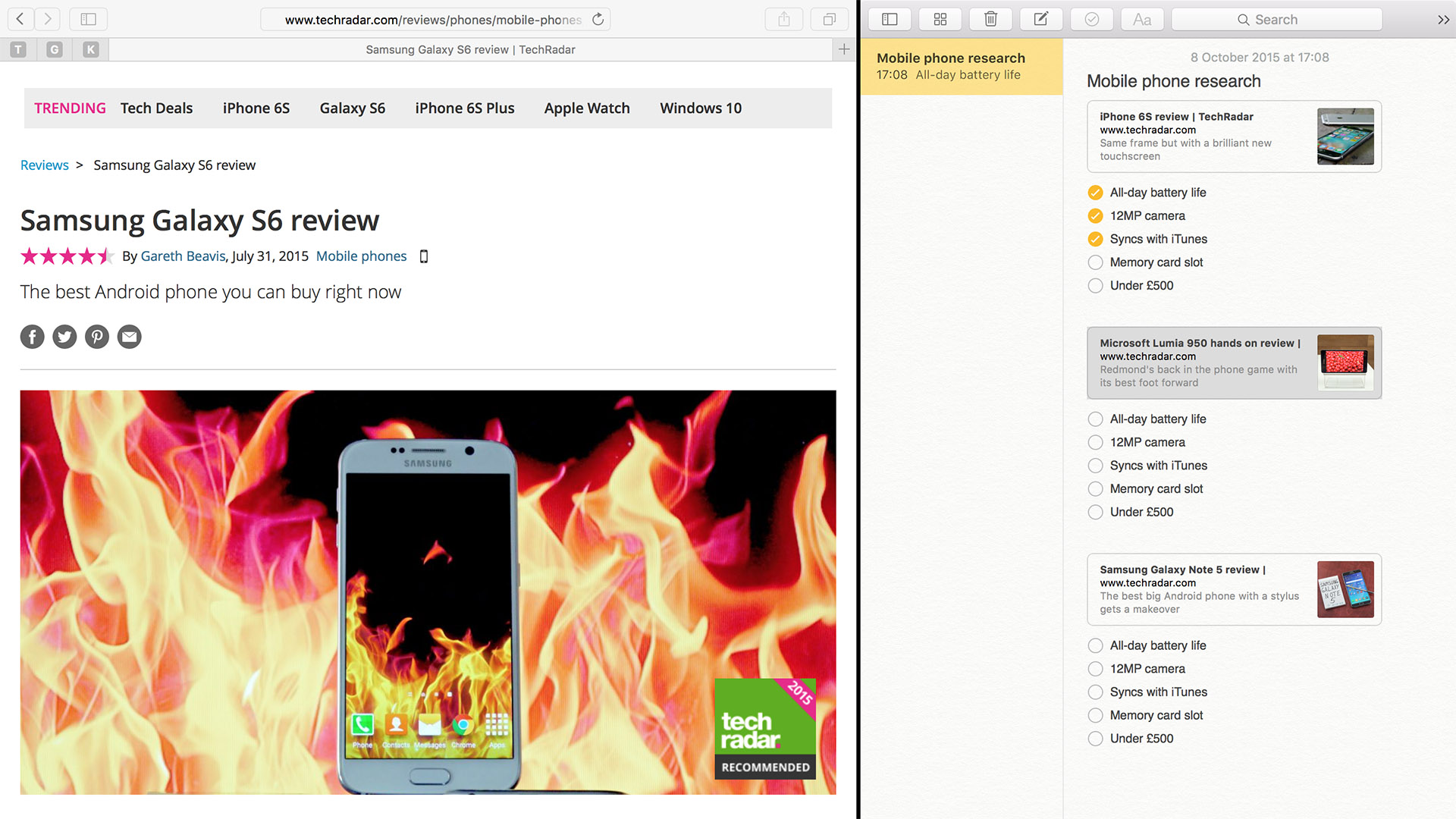
Split View enhances full-screen apps by enabling you to display two apps side by side. Full-screen mode has always made sense on devices with small screens, like iPads and the MacBook Air, but its usefulness was less convincing on an iMac or other large display. Split View is designed to make it more practical on them as well, and it makes it much easier to work with two apps on any screen size.
Like full-screen mode for a single app, Split View hides the Dock and the menu bar, so you make use of all available space and remove many distractions. Rather than using a gesture to move back and forth between two full-screen apps, Split View improves productivity; you might put a text editor on the left and Safari on the right when researching a subject.
There are multiple ways to enable Split View.
17. Click and hold the green button at the top-left of any window that can be switched to full-screen mode. You'll notice half of the screen displays a blue overlay (which depends on which side of the screen the pointer is on). Move the pointer to the side on which you want that app to appear, then let go. Other windows that are capable of switching to full screen then appear in Mission Control fashion on the other side of the screen. Click one of them to set it as the other half of that Split View workspace.
18. If you already have one app in full-screen mode, simply open Mission Control and drag a window from the centre over the Spaces bar at the top of the screen; when it expands to show previews of your spaces, drop the window onto an app that's already in full-screen mode to combine the two in Split View mode.See the page opposite for additional details of how Mission Control works in El Capitan.
19. To take one app out of Split View, move the pointer to the top of the screen to reveal the menu bar and both apps' title bars, then click the green button at the top-left of the title bar of the app you want to make a window again. The other app remains in full-screen mode.You can adjust the space dedicated to each app by placing the pointer over the dividing line between them, so the cursor changes to show either a single-headed or a double-headed arrow. Drag this left and right to adjust the space allocation
20. OS X automatically assigns what it thinks is a sensible split of the screen based on the apps you've combined. Whether you've adjusted the split yourself or you dislike OS X's assumption, double-clicking the divider snaps to an even 50% split.
Irrespective of the apps you combine and the width of your display, Split View can display no more than two apps together.
The one sour note for Split View is that it requires apps to support full-screen mode. Older versions of Adobe apps and Microsoft software doesn't support it.
Window management
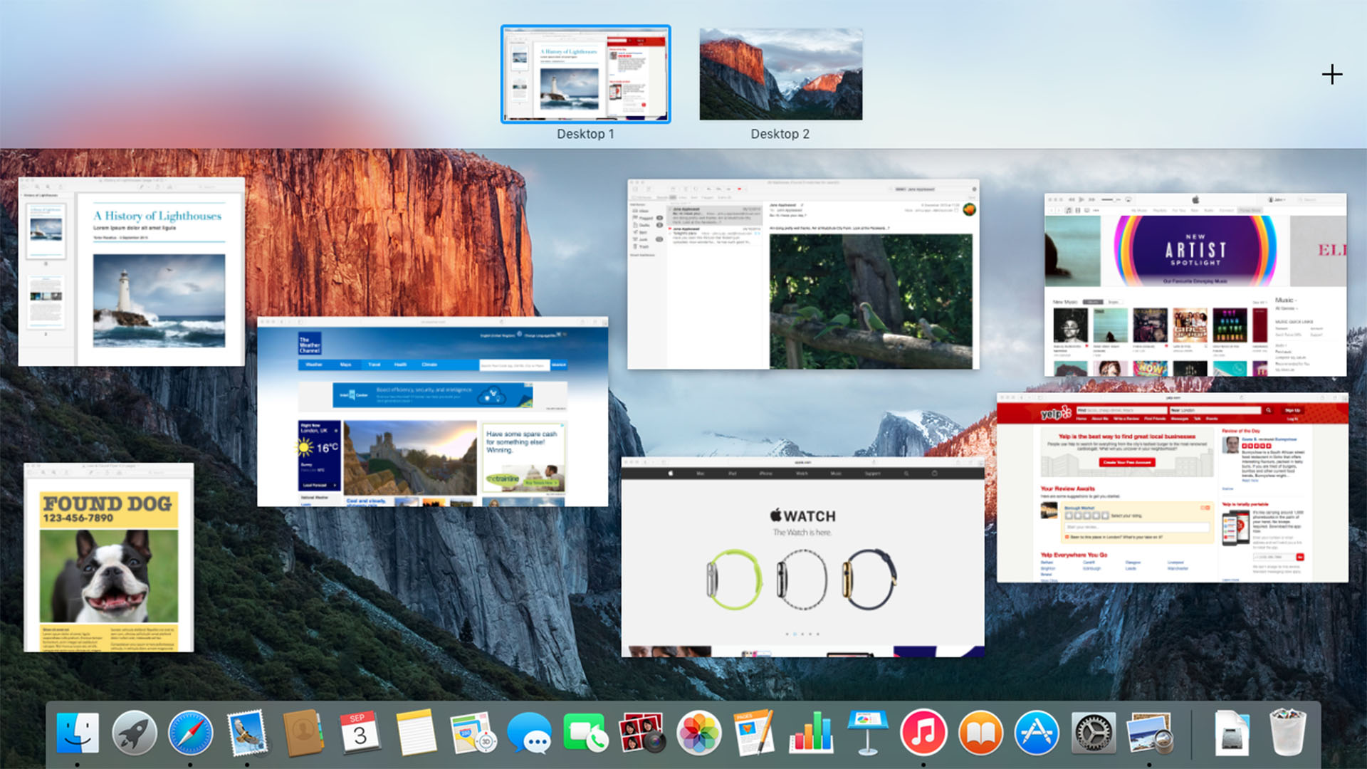
Apple has reintroduced a more helpful layout as a default setting for Mission Control. Windows are now spread out, with no overlaps, rather than stacked up according to the app they belong to, making it easier to find the one you want.
21. You can return to having windows stacked up (Yosemite's default) by turning on 'Group windows by application' in System Preferences > Mission Control.
22. A new gesture for opening Mission Control cuts the number of steps for moving a window to a new space; try dragging it past the top of the screen. The Spaces bar at the top of the screen has changed to initially display only the names of your desktops and full-screen apps. This gives more space for the window previews below. Moving the pointer up to the top of the screen reveals graphical previews of each space, as does dragging a window. As in previous versions of OS X, dropping a window onto another desktop moves it there. However, there are subtle changes to what happens when you drop a window onto empty spaces or full-screen apps in the bar.
23. Previously, dropping a window onto an empty area would make a new desktop and move it there. Now you must explicitly drag it to the space that slides in at the right of the bar, marked with a +, because El Capitan reserves the empty areas for another purpose.
24. Drag a window belonging to an app that supports full-screen mode over an empty part of the bar and a new space named after that app to appear, then let go to switch the window to full-screen mode.
Similar actions work as a shortcut to Split View.
25. Merge two apps by dragging a window or an app that's already in full-screen mode onto another full-screen app in the Spaces bar. As before, placing the pointer over a space and click either the cross down Control enables you to remove Spaces from Mission Control. Any windows that are in that space are moved to their previous desktop.
26. Holding down the [Alt] key while the pointer is hovering over the Spaces bar at the top of Mission Control reveals a close icon for each space (as it did in earlier versions of OS X). Apps that are in full-screen mode or Split View display two arrows pointing towards each other; when clicked, those apps are switched back to being windows on the desktop on which they originated.
Messaging with Mail
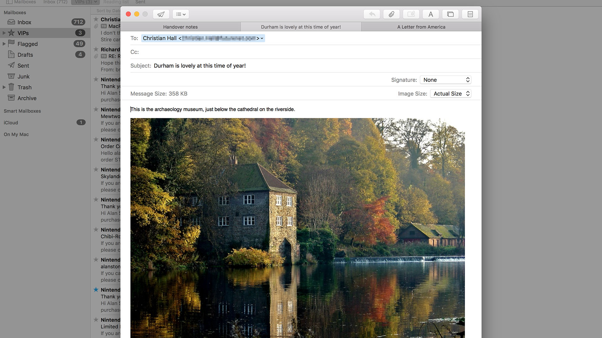
Many of Mail's new features are focussed on make working it more practical to work with in full-screen mode, especially when composing messages.
New messages are still created in a panel that's displayed in the middle of the screen, but you no longer have to save the message as a draft before you can look at other messages.
27. However, clicking outside of the pane now causes it to slide out of the way to the bottom of the screen. Click on the small bar down there to bring the composition panel back into view. This is more convenient for copying and pasting text or dragging attachments from one message into a new one.
It isn't just Mail's main window that can be made to take over the whole screen.
28. Any message window can be switched to full screen from its green button, enabling you to compose a message on one side of the screen and refer to something else – even an other message – on the other in Split View.
You can also have several part-composed messages on the go, without having to save them as drafts.
29. Each time you create a new message (by pressing [Command]+N or clicking the corresponding button in the toolbar), a new tab is added to the pane. Rather than reach for your mouse or trackpad, you can switch tabs using [Shift]+[Command]+[ and [Shift]+[Command+].
Managing unread messages is easier with gestures that have worked their way across from iOS to OS X.
30. Swipe to the right while the pointer is over a message in a mailbox's list to mark it as unread, or swipe to the left to trash or archive it. Do this with two fingers on a trackpad, or one finger on a Magic Mouse.
31. If you prefer to archive mail, the latter gesture can be switched from Trash to Archive in Mail > Preferences > Viewing > Swipe Left To.
32. Mail inspects incoming messages for contacts and events to add to your calendar. If someone emails you with information about an event, Mail will search for details (time, date, location, and so on) and suggests that you add it to Calendar.
33. Similarly, it looks for new contact information, filling out phone numbers, emails and addresses for people in your contacts (and suggests when to create a new contact record). In both instances, you'll see a prompt at the top of the message. Click the blue 'add…' word at the right of that row to add or update an item in the related app.
34. One small addition that's easily overlooked is the strikethrough button in Mail's Format bar (which is revealed by clicking the 'A' button in the toolbar), rather than having to open OS X's built-in Fonts window. This is helpful for indicating changes or suggestions when collaborating on text.
Power up Photos

35. Photos' editing capabilities take a big step forward with support for extensions, which enable third-party developers to make image-editing tools from their own apps available inside Photos (much like on iOS). This saves you exporting an image, editing it elsewhere, and bringing it back into Photos. Open a photo and click Edit > Extensions > More to view those available on your Mac. Extensions are bundled with apps from the Mac App Store.
36. Faces has an improved interface. Click Albums > Faces and you can now select multiple photos (holding [Command] to build a selection) and then drag them onto a face in the middle of the screen to identify all of them as being that person in one fell swoop. This greatly speeds up how quickly you can name people that the app identifies in your photos, and in the process you more quickly guide its identifications in the future.
37. One of the great things about snapping photos with an iPhone is geolocation tagging, which lets you know where photos were taken. Photos now enables you to manually attach location data to photos that lack it, and modify it on those that do. Select an image and open the Info window ([Command[+I) and you'll see a row labelled Assign a Location at the bottom of it. Type a place name or postcode and pick one from the app's suggested matches.
38. In Yosemite, the app's Info window only enabled keywords to be set on multiple photos at once, but in Photos 1.1 you can simultaneously add the same title, description and, of course, location data for all photos in your selection. If you then choose to export photos that have the same title using that title as their filename, those past the first one will have a number in brackets appended to their name.
Surfing with Safari
We spend more time in Safari than most other apps, so it's fitting that Apple's web browser has received more new features than other app in El Capitan.
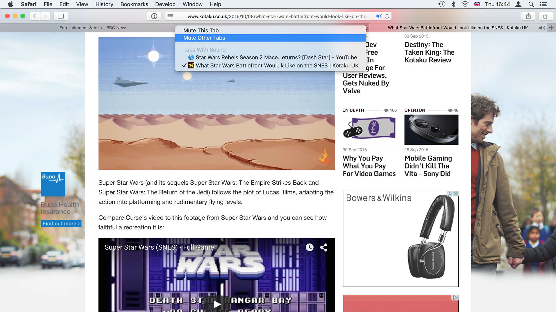
Probably the most welcome addition is the ability to mute the audio content from a website. Sites are increasingly auto-playing video and having the accompanying audio (usually an advert) blasting out from your Mac is excruciatingly annoying. Any tab that is playing audio displays a blue speaker icon in the Smart Search field – filled in when the audio is coming from the current tab, and an outline when it's from another tab.
39. Click this blue icon and the sound from the current tab will be muted. Hold [Alt] when clicking it to mute all other tabs. Be aware that muting audio does not stop the video portion playing.
40. If you have multiple tabs open, a small black audio icon appears on the right-hand side of any that's playing audio. Clicking one of these mutes that specific tab, or you can hold [Alt] while clicking to mute all other tabs.
41. Hold [Ctrl] and click a tab's speaker icon to see the same options to mute that tab/others, and the titles of all tabs that are playing audio.
42. you can click one of these titles to jump straight to that tab.
Safari goes further in improving how you interact with online media. AirPlay Video lets you stream video content to an Apple TV without having to mirror the whole of your Mac's display.
43. Compatible video on a website displays an AirPlay icon to the right of its volume control. Clicking this lists AirPlay video receivers on your network and selecting one (typically an Apple TV) sends the video directly to your television.
Safari's Reader feature, which presents a clean view of only the text and images that are the real content of a page, offers presentation settings beyond resizable text.
44. Open Reader by clicking the paragraph icon at the left of the Smart Search field when viewing a suitable page, then click the AA icon on the field's right side to open Reader's appearance settings, which include four background colours (white, sepia, grey and black), eight fonts, and the old font size adjustment options.
Pinned Sites gives you quick access to sites you use often.
45. Pinning a site couldn't be easier: choose Window > Pin Tab, or click on a tab's title and drag it to the left of the tab, or [Ctrl]-click a tab and choose Pin Tab. The tab becomes a small square on the left side of the tab bar, showing only a site icon. They remain open when you close and reopen Safari, and the sites in them run in the background, so you'll hear sounds such as message alerts.
Some of Safari's keyboard shortcuts have changed. Previously, [Command]+1, [Command]+2 and so on opened bookmarks from corresponding positions in the Favorites Bar.
46. These shortcuts now switch between tabs you have open, including pinned ones.
47. Now, also holding down [Alt] loads an item from the Favorites Bar (even if the bar is hidden).
48. These two sets of shortcuts can be reversed by turning off 'Use [Command]-1 through [Command]-9 to switch tabs' in Safari > Preferences > Tabs.
49. Extensions now require developers to be part of the paid-for Apple Developer program, the upsides being that their code must be signed by Apple for security, and they can update themselves as long as Safari > Preferences > Extensions > Automatically update… is enabled.
Practical pointers
El Capitan may not have had a radical refresh, but it contains plenty of interesting and practical tweaks that improve your time spent using it.
50. One that we adore is that you can quickly locate the pointer just by shaking it. This enlarges it temporarily to help you spot it on a busy or large desktop. If you find it annoying, perhaps because you fidget with your mouse or trackpad, the behaviour can be disabled by turning off 'Shake mouse pointer to locate' in System Preferences > Accessibility > Display.
51. If you previously used Yosemite and turned on its option to reduce transparency effects, consider turning it back off again (in the Accessibility pane, under Display). Many of the more objectionable instances of it have been toned down, such as text scrolling behind semi-opaque foreground elements, which affected legibility.
52. Invaluable on small displays is the ability to hide the menu bar until you need it, just like you've been able to do with the Dock for years. You can enable this in System Preferences > General.
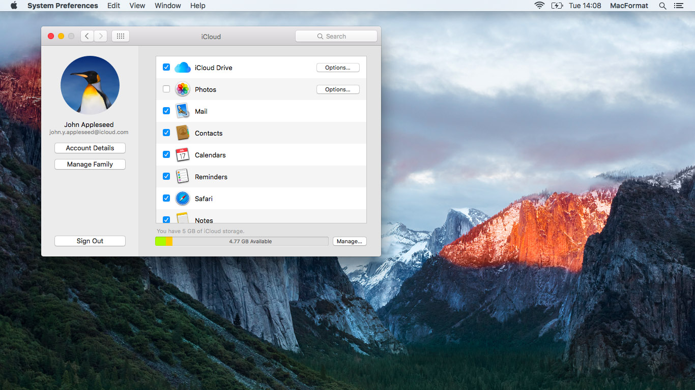
53. The Share menu has gained actions to add what you're looking at to Reminders or Notes. If you can't see these options, click on Share > More and ensure that they're checked. They're handy for keeping track of web pages as part of research notes, to remind you about things like event tickets going on sale, and you can add copies of documents from Pages, Numbers and Keynote to your notes, too. Note that the first time you open Notes you'll be asked to upgrade to a new format for storing them in iCloud; only do this if all your devices are able to run El Capitan or iOS 9.
54. Stop the fake clicking noise that Force Touch trackpads make by turning on Silent Clicking in the Trackpad preferences pane.
55. A Find My Friends widget can be added to Notification Centre's Today view. Click Edit at the bottom of that view and then click the plus in a green circle next to the widget. Find My Friends will display a location warning; tap Allow to enable it to use your current location. You might find this useful to know, say, when to set out to pick up family or friends.
56. Safari now lets you clear your browsing history in a less disruptive fashion. Open either its application menu or the History menu and then hold å to append “…and Keep Website Data” to the option that covers your tracks. This preserves cookies, which might contain settings for web apps, for example.
57. It's easier to manage your downloads on the fly now, rather than ending up with a burgeoning folder full of them. Open Safari's General preferences, click the pop-up menu labelled 'File download location' and choose 'Ask for each download'.
58. In OS X's colour picker (accessible in apps such as TextEdit using [Command]+[Shift]+C), the Crayons tab is replaced with a Pencils tab with a broader selection of colours. With text selected, the appropriate pencil pops up out of the arrangement to remind you which colour you applied to it.
Finder
Even Finder has a few new features. One feature that will be welcome if you're not used to the fairly subtle convention of selecting a file or folder and then clicking its name or pressing [Return] to rename it is...
60. The addition of a Rename option to the contextual menu that appears when you [Ctrl]-click the item instead.
If you use Terminal or programming tools in which you need to refer to a file or folder, typing the whole path to it is tedious and prone to error, but you don't have to run the risk.
61. Instead, [Ctrl]-click the item and then hold down [Alt]; you'll notice that the usual Copy command in the menu changes to 'Copy as Pathname'. With Terminal, you could already preview achieve this by dragging an item onto its window to insert its path into the command line, but the ability to copy it to the Clipboard provides greater flexibility over what you do with that information – and it's also easier than dragging a file from one space into another if you prefer to run Terminal in full-screen mode.
Yosemite already puts progress bars on each file being synced with iCloud Drive. However, you might find yourself saving not just the odd small document now and then, but much larger amounts of data between your Macs and possibly iOS devices too.
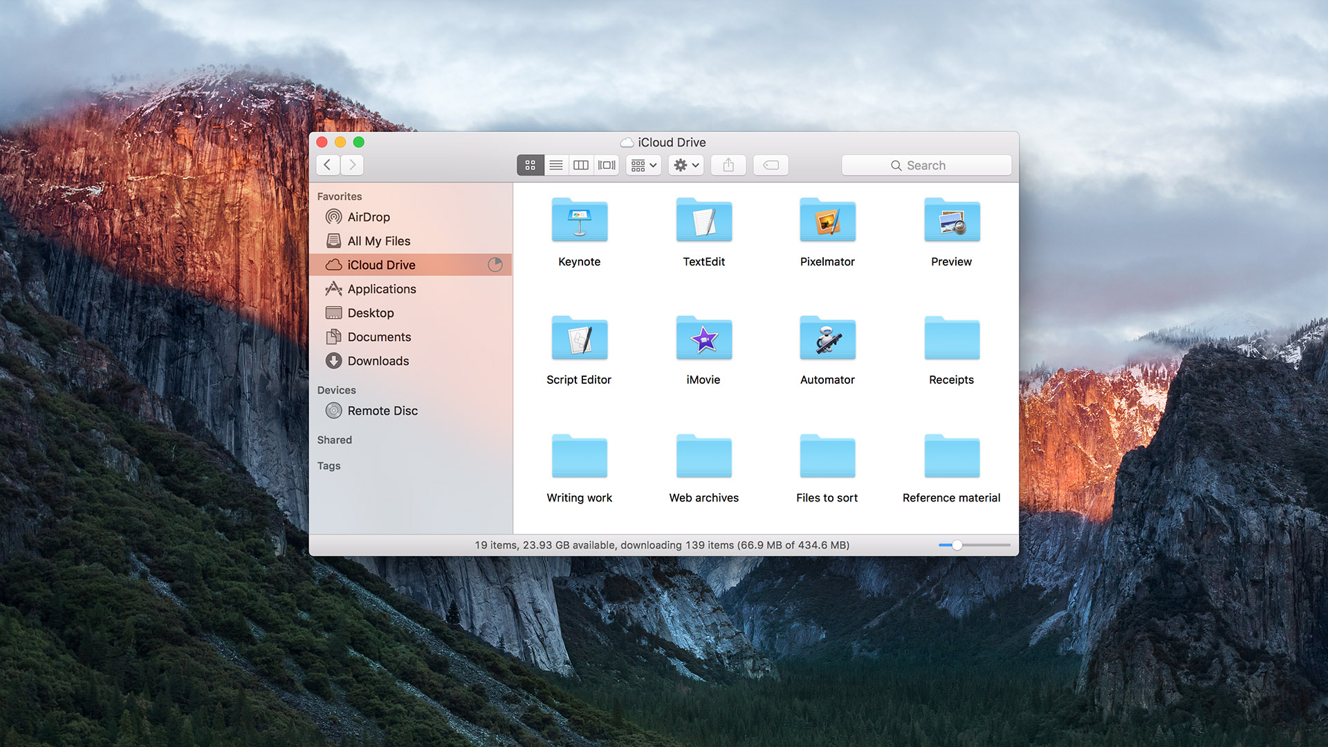
62. To be sure that syncing activity between your Mac and iCloud Drive has completed, Finder's sidebar displays a circle next to iCloud Drive (if you've removed it, go to Finder > Preferences > Sidebar to get it back) which gradually fills to reflect progress. This is helpful if, say, you need to get some files onto a MacBook before departing. Open up a Finder window, watch the progress indicator and only close the lid once the circle disappears, telling you the sync is complete.
With an especially large amount of data transferring to or from iCloud Drive, the circle in the sidebar might fill pretty slowly. So, Finder has a second, more detailed progress indicator available.
63. Turn on its path bar (View > Show Path Bar) and then browse to iCloud Drive (Go > iCloud Drive). At the bottom of the Finder window you'll see an indication of how many items are being copied, the total amount of data being copied, and an updating total of how much has copied across so far. Note that the figure to the left that shows remaining capacity isn't indicative of your iCloud Drive space; that's referring to your Mac's free space.
Disk Utility
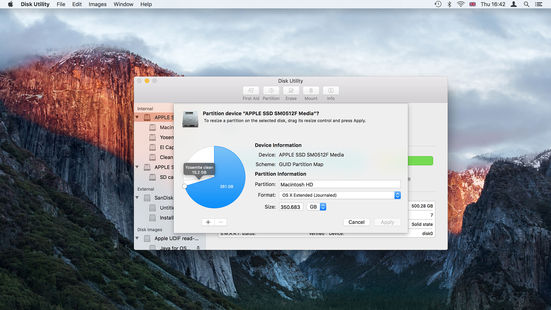
Disk Utility has a new, more approachable look, though features such as writing a disk image or folder to a CD or DVD have been dropped.
64. Its left-hand pane now categorises disks as internal, external and disk images, reducing the chance you'll mistake, say, an SD card and a USB flash drive of the same size and erase the wrong one.
65. The right-hand pane is now purely informational, showing details of whatever you've selected on the left in a colour-coded breakdown of its contents, much like the one for iPods and iOS devices connected to iTunes.
Operations are now invoked solely from button in the toolbar. Some will be greyed out, indicating they're not applicable to your selection on the left.
66. First Aid is equivalent to Repair Disk in older versions, checking for low-level structural issues. The option to repair permissions is gone because El Capitan is supposed to check and repair them silently for you.
67. The Partition feature now shows a disk's structure as a pie chart. The order of partitions on a disk starts from top-centre and works clockwise around the chart. When partitioning a disk, the app will split whichever is selected (blue after you click it) when you click the + button.
68. If you need to restore the contents of a disk from an image, or another drive, that option is still available – but in the Edit menu, not Images.
The little things
For all the improvements each version of OS X brings, there's always room for improvement – whether that's in options for putting notifications in an order that works for you, protecting your Mac App Store account against accidental purchases, or assuring you that the website you're designing will look great on computers and mobile devices alike. El Capitan takes steps to make existing features work better.
69. iBooks has the same presentation options as Safari Reader. You can set the page background to white, sepia, grey or black, each with complementary but automatically-chosen font colours, and select from eight fonts, including Apple's new San Francisco font that's used throughout OS X, iOS and watchOS.
Whether you're a parent or simply concerned about making accidental purchases from the Mac App Store,
70. open the App Store pane in System Preferences and look at the bottom of it to find new password settings that define how soon after making a purchase – and entering your password – the Mac App Store will request your password for subsequent purchases – immediately or only after 15 minutes. Free downloads can require your password every time, or not at all.
71. Traditionally, OS X would 'zoom' a window to a best fit for its content when you double-clicked the window's title bar. More recently, that action has minimised windows into the Dock – a sensible change for anyone coming from Windows, which also behaves that way. In fact, Yosemite gave a choice of these two behaviours, but as a checkbox that made it unclear to inexperienced Mac users what behaviour – if any – you would get when the box was unchecked. Apple has cleared up this ambiguity with a pop-up menu that explicitly lists the zoom and minimize options.
72. Notification Centre now offers three sorting options, up from two in Yosemite. The first setting, Recents, puts your notifications in reverse chronological order from the top of the tab down. The second one, Recents by App, groups notifications by application, so when you receive a notification from Mail, say, all of that app's items move to the top of the list, even if that means some newer notifications from other apps will appear below Mail's. The third setting, Manually by App, groups items similarly to the second one. However, when this option is selected, apps in the list shown in the Notifications preferences pane can be dragged up and down the list to set the order in which they're listed in Notification Centre. So, you can set Calendar or Reminders, say, to always appear at the top so you don't miss anything.
73. Image Capture includes a new feature that helps to organise photos imported from multiple cameras, rather than dumping them into one folder. Connect a camera to your Mac and then click the Import To pop-up menu near the bottom of the app's window, then select 'Make subfolders per camera' to create folders named after your camera or its storage card.
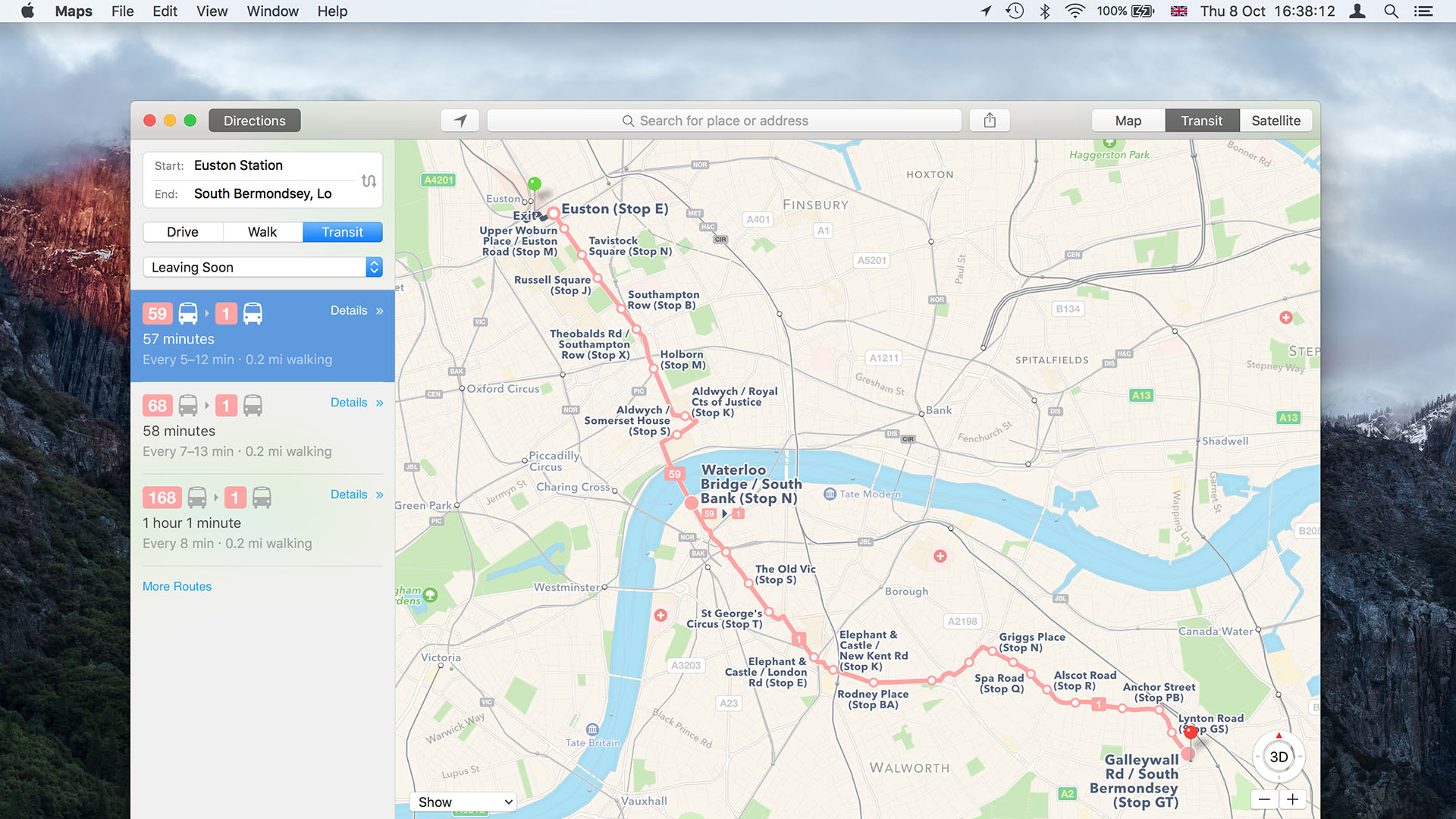
74. Maps can now provide directions that use public transport, though only in a few cities. Choose which vehicles are included in route suggestions under View > Transit Directions.
75. If you design web pages, you'll want to enable Safari's Develop menu (from its Advanced preferences) and then choose Responsive Design Mode from that menu. This feature is intended to help ensure your pages look good on mobile devices as well as large displays like your Mac's. It places controls above the page you're viewing that enable you to switch to various screen resolutions and iOS devices, then choose Responsive Design Mode from it to reveal controls that show how the current page will look on various screen resolutions and iOS devices. Switch between landscape and portrait orientations by clicking the device icons.
T3.com is one of the UK's leading consumer lifestyle websites, visited by over 10 million people every month. You can follow us on Twitter, Facebook and Instagram. We present products in helpful buying guides and carefully curated deals posts across style, living, auto, smart home, watches, travel, fitness and more. We also have a monthly magazine which you can buy in newsagents or subscribe to online – print and digital versions available.


