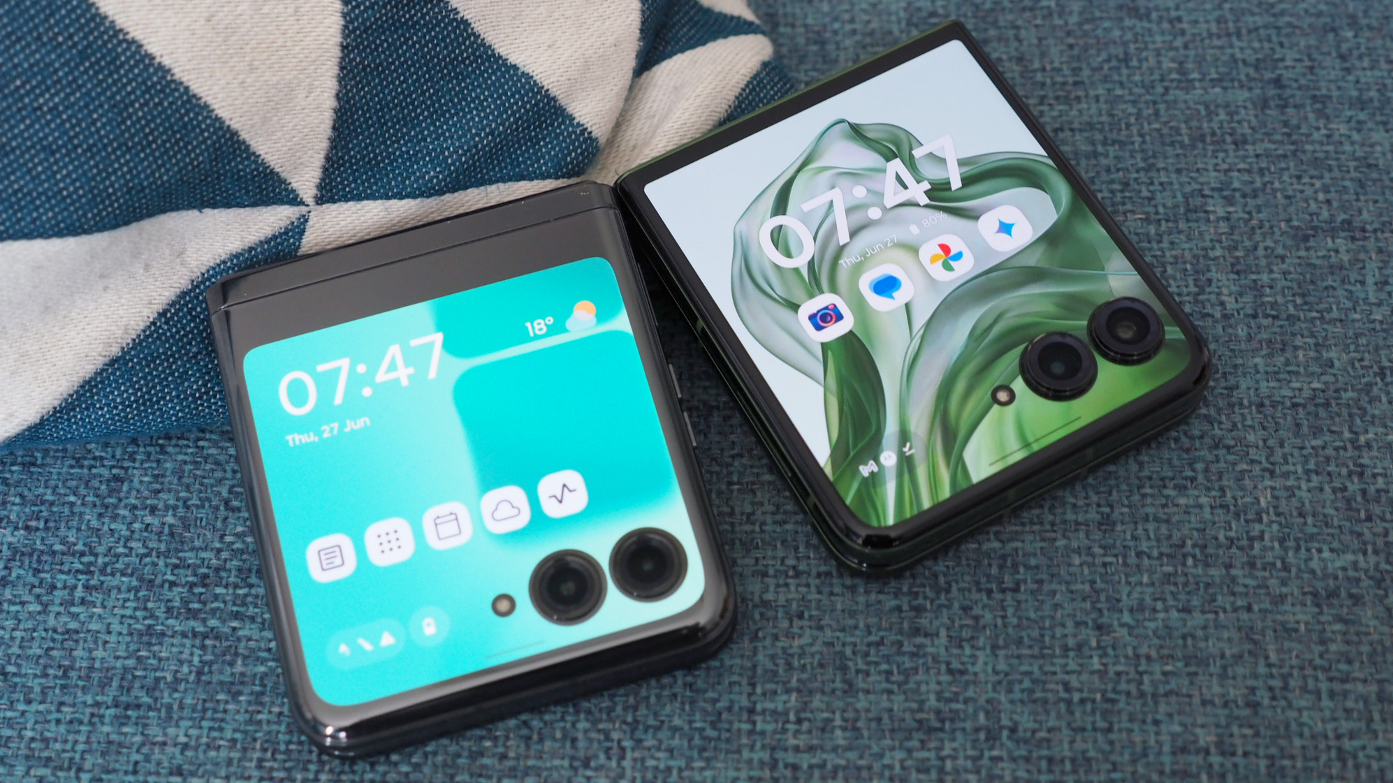
This week Motorola revealed its latest flip phone, the Razr 50 Ultra (or the Razer Plus (2024) as it's known in the USA). While I attended the launch event – not just for Paris Hilton's DJ set, Hot Pink handset fully on display – and have already highlighted my three favourite features of the phone, I also set about comparing the new Razr against its predecessor.
I don't mean in a specs-only way either: I had packed the older Razr 40 Ultra in my bag ahead of the launch event and, once I had receipt of the Razr 50 Ultra, I walked the streets of Brooklyn to test the cameras, see how the screens differ in sunlight, and gain an understanding of battery potential and the software differences too.
So is the Motorola Razr 50 Ultra, with its new and much larger cover display, now the obvious go-to option when it comes to the best folding phones? There are lots of upgrades, no doubt, some of which are obvious winning points, but here I'll highlight the differences that really matter between these two generations of flip phones – good, bad and other.
Cover display
| Row 0 - Cell 0 | Motorola Razr 50 Ultra | Motorola Razr 40 Ultra |
| Size | 4.0-inch OLED | 3.6-inch OLED |
| Refresh rate | 165Hz | 144Hz |
| Resolution | 1272 x 1080 pixels | 1056 x 1066 pixels |
| Peak brightness | 1400 nits | 1100 nits |
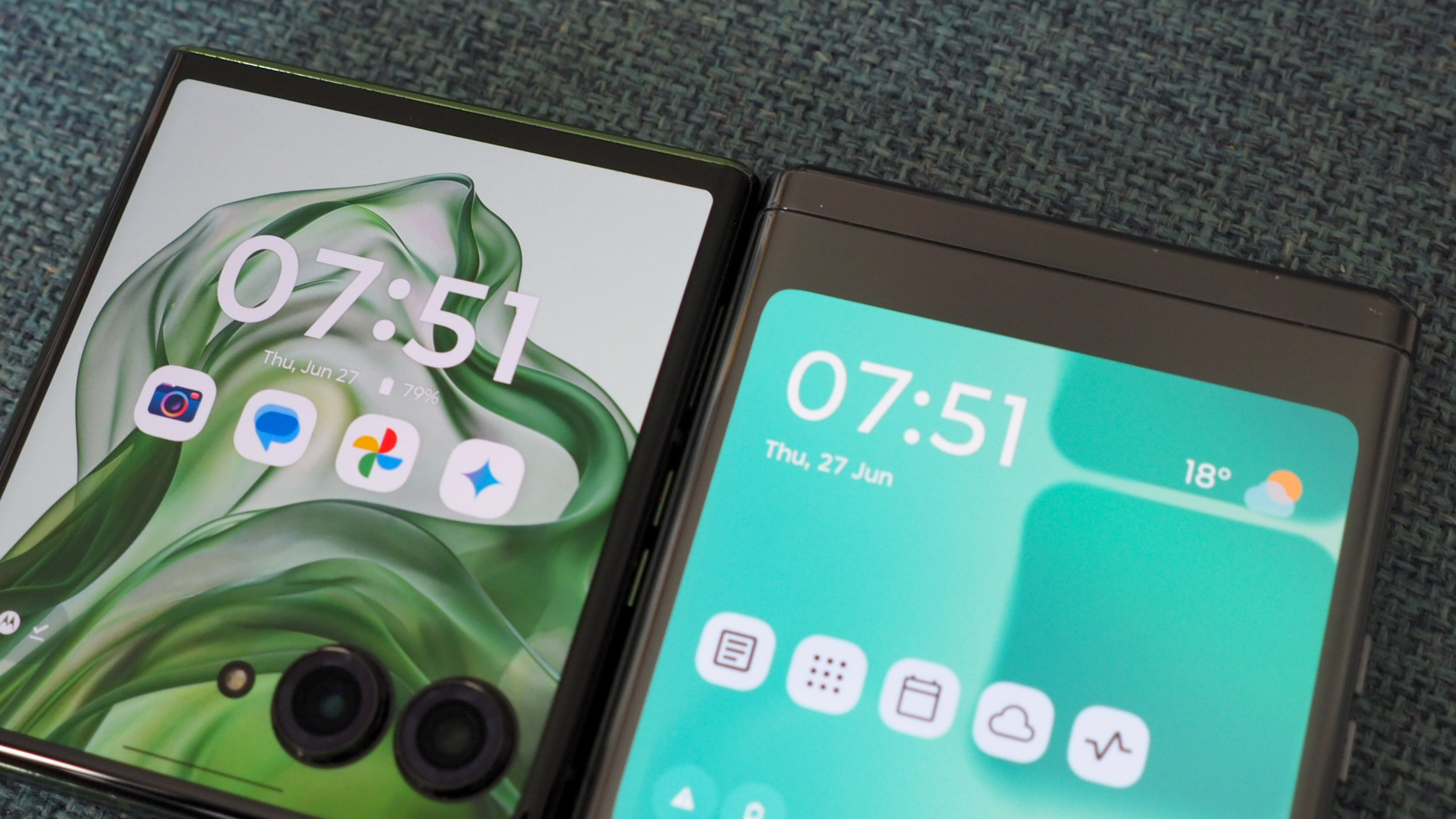
It would be remiss not to begin with the cover display, as the Razr 50 Ultra features the largest one you'll find on any flip phone right now. That includes its nearest competitor, the Samsung Galaxy Z Flip 5, which is also expected to imminently produce a next-gen upgrade to that series.
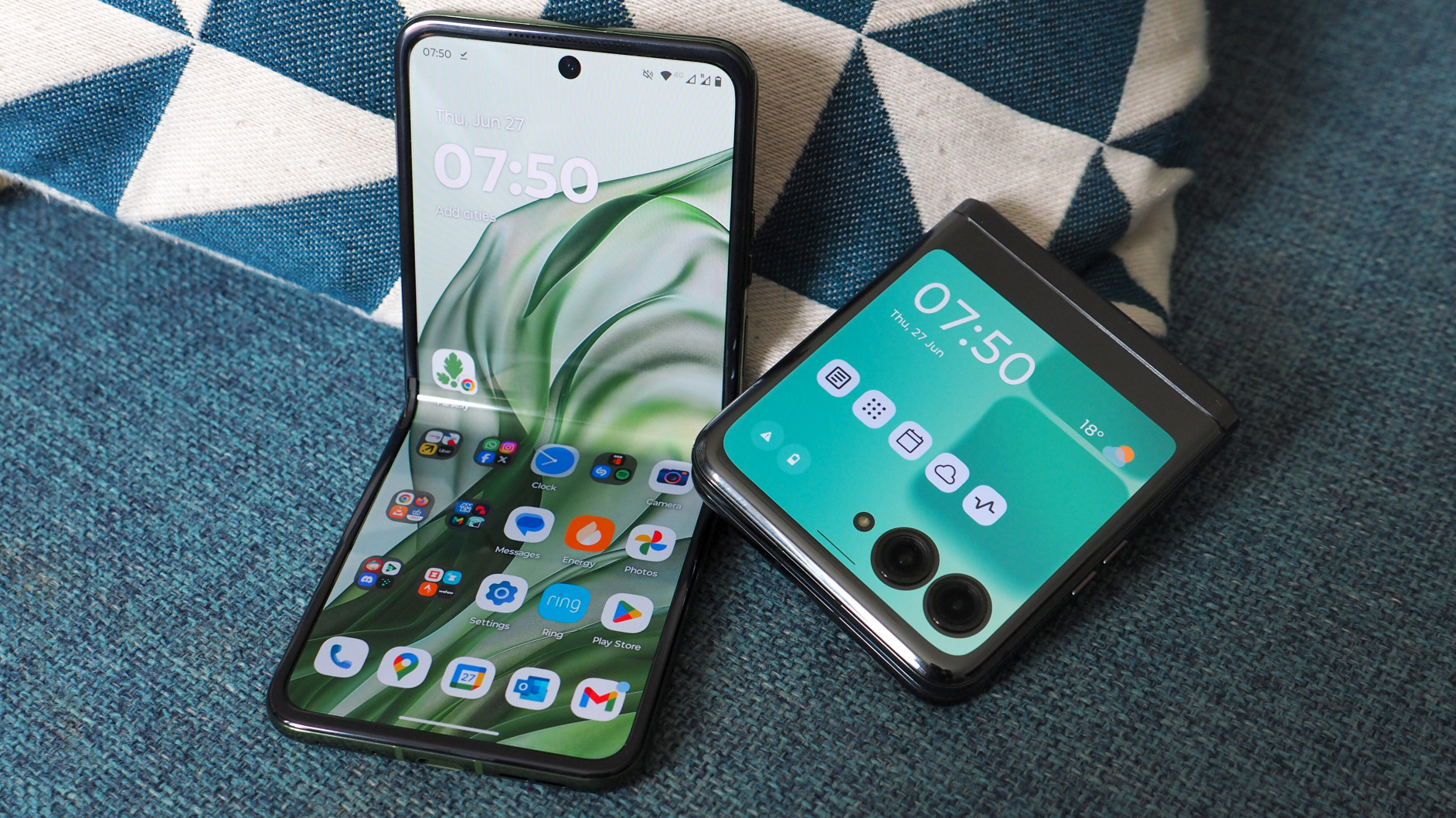
The Razr 50 Ultra, despite being almost identical in size to the Razr 40 Ultra, features a 4.0-inch cover display, a significant increase over the 3.6-inch panel of the older model. It doesn't sound like a lot, arguably, but it is: on the newer model the display fills almost the entirety of the front.
In both handsets the cameras protruding through the OLED screen's surface can be a hindrance at times. By default apps on the cover display don't open 'full screen', meaning they don't wrap beyond where the cameras are. You can force any app into 'full screen', though, but in the case of Whatsapp, for example, that means part of the type box and entirety of the send button are covered by the cameras - rendering it less than ideal.
It is a choice factor, though, and I'd much rather have the availability of all the phone's front to be screen, even just from a design perspective - the Razr 50 Ultra looks much more complete and polished than the 40 Ultra thanks to a display margin that pushes closer to the hinge edge.
Sign up to the T3 newsletter for smarter living straight to your inbox
Get all the latest news, reviews, deals and buying guides on gorgeous tech, home and active products from the T3 experts
It's been made possible thanks to a major hinge redesign, which has decreased the hinge itself by 40%, Motorola told me in a behind-closed-doors briefing. That's made it possible to add additional display. And that increased real-estate is just simpler to interact with in my view.
There are further differences too: while I don't think the 165Hz versus 144Hz refresh rate makes any difference to my eyes, the brightness increase is a notable bonus for the newer flip phone. In a dark room, side by side, I couldn't spot much of a difference. But max out the brightness - which is automatic but can be manually adjusted too - and in sunlight (which was plentiful in Brooklyn's 32C heat) and it cuts through all the better.
In the case of both phones the OLED display is Gorilla Glass Victus covered, so it's durable and avoids the same degree of reflection that the internal displays suffer (a result of being plastic-covered OLED, as in any flip phone).
Main display
| Row 0 - Cell 0 | Motorola Razr 50 Ultra | Motorola Razr 40 Ultra |
| Size | 6.9-inch OLED | 6.9-inch OLED |
| Refresh rate | 165Hz | 165Hz |
| Resolution | 1080 x 2640 pixels | 1080 x 2640 pixels |
| Peak brightness | 3000 nits | 1400 nits |
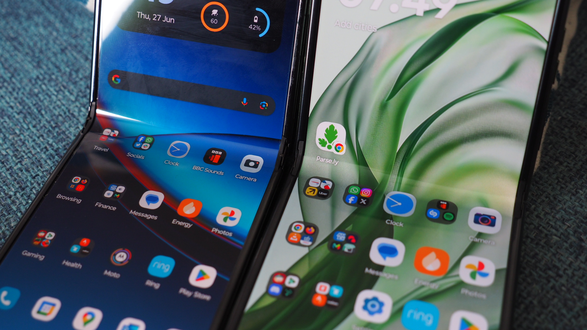
Despite the Razr 50 Ultra featuring a larger cover display, on the inside the display is the same 6.9-inch and 22:9 aspect ratio as the previous Razr 40 Ultra. But just so I'm clear: they're not the same displays, with the newer flip phone benefitting from that new hinge design and offering much greater brightness too.
I still think one of the biggest downsides to any folding phone is the nature of the folding screen: whether covered in plastic or glass, the reflective nature of these panels just can't compete with the best phones of today. There's also an inevitable crease that's present in any foldable - albeit to differing levels of visibility.
Motorola claims there's an improvement in the crease visibility of the 50 Ultra. To my eyes, having flexed both phones side-by-side, the difference is marginal. The bigger difference for me - and this could depend on my 40 Ultra being older and more extensively used - is the way the crease feels. As it's a smaller hinge in the newer model, the joinment is less noticeable to a finger running over it.
The other obvious bonus to the Razr 50 Ultra's display is a brightness boost that's far, far more punchy than its predecessor - as in double. You won't want to pump out the maximum brightness all the time, of course, but for when the sun is shining and to help negate reflections it's a much better experience in the newer flip phone. A needed upgrade that, in my opinion.

Cameras
| Row 0 - Cell 0 | Motorola Razr 50 Ultra | Motorola Razr 40 Ultra |
| Main | 50MP, f/1.7, 24mm (wide), 1/1.95", OIS | 12MP, f/1.5, 1/2.55", OIS |
| Zoom | 2x optical, 50MP | N/A (digital only) |
| Ultra-wide | N/A | 13MP, f/2.2 |
| In-display | 32MP | 32MP |
Like any phone manufacturer, with permission Motorola collects data. Interestingly data suggests Razr users are far more likely to snap portrait shots than other Motorola users. Which was a key reason for adding a 2x optical zoom camera to the Razr 50 Ultra - something the older-generation device lacks (with digital-only zoom in its Camera app).
Flipping the script in this way does, however, mean that the newer handset entirely foregoes an ultra-wide lens - which I tend to use when shooting, say, tall buildings or landscape scenes. There's certainly not the space to have squeezed three lenses onto the Razr 50 Ultra, but its zoom lens gain is an undeniable wide-angle loss.
In theory most Razr users will welcome this change though: and the option to zoom in 2x (or 4x using digital zoom) directly in the app with the simple press of a button, is nicely implemented. The Camera app looks tidier and if you're taking actual portraits then a Portrait mode (available for both generations of device, I must add) can apply software-derived bokeh for blurred backgrounds.
In general the Razr 50 Ultra produces the better shots, too, thanks to a massive increase in resolution that sees both its sensors offer 50-megapixels apiece. The main sensor is physically larger than the 40 Ultra's version, too, to further bolster image quality. You can check out my side-by-side shot comparisons above - while at full scale they don't look staggeringly different, cropping or zooming in shows the improvements in the newer handset.
Battery life
| Row 0 - Cell 0 | Motorola Razr 50 Ultra | Motorola Razr 40 Ultra |
| Capacity | 4000mAh | 3800mAh |
| Wired charging | 45W | 30W |
| Wireless charging | 15W | 5W |
The biggest pain point for any phone user is battery life. In a flip phone that's often poorer than many of the best Android phones can offer, too, because of limited space, where the battery is placed in relation to components, and the heat implications of additional displays. The Razr 40 Ultra was fine enough in the battery department based on my testing, but that's all relative compared to other folding phones.
The Razr 50 Ultra increases the battery capacity, which is certainly welcome, but with brighter screens to cater for that's not necessarily going to mean immediate longevity improvements. I'm not deep enough into my testing of the latest to truly define whether it's much of a leap forward.
However, seven hours into my 04:00 wake-up call to catch an early flight back from the launch event and the Razr 50 Ultra's battery is near to 50% - and that with me having done some gaming at the airport and been Bluetooth tethered to my Sonos Ace headphones for the majority. A 15 hour life per charge sounds agreeable to me. And the charging is faster this generation, which is a welcome bonus.
Software
| Row 0 - Cell 0 | Motorola Razr 50 Ultra | Motorola Razr 40 Ultra |
| Cover customisation | Yes, plus widgets | Yes |
| Always-on cover | Yes | No |
| Base | Android 14 | Android 13 |
| Updates | 3yrs (+4yrs security) | 3yrs (+4yrs security) |
While the Razr 40 Ultra launched on Google's Android 13, the Razr 50 Ultra comes with Android 14 (which the older model should update into at some point) and the newer Motorola 'HelloUX' over the top. I'm not going to get into the minutea of software differences here, but there are some major points between the two handsets.
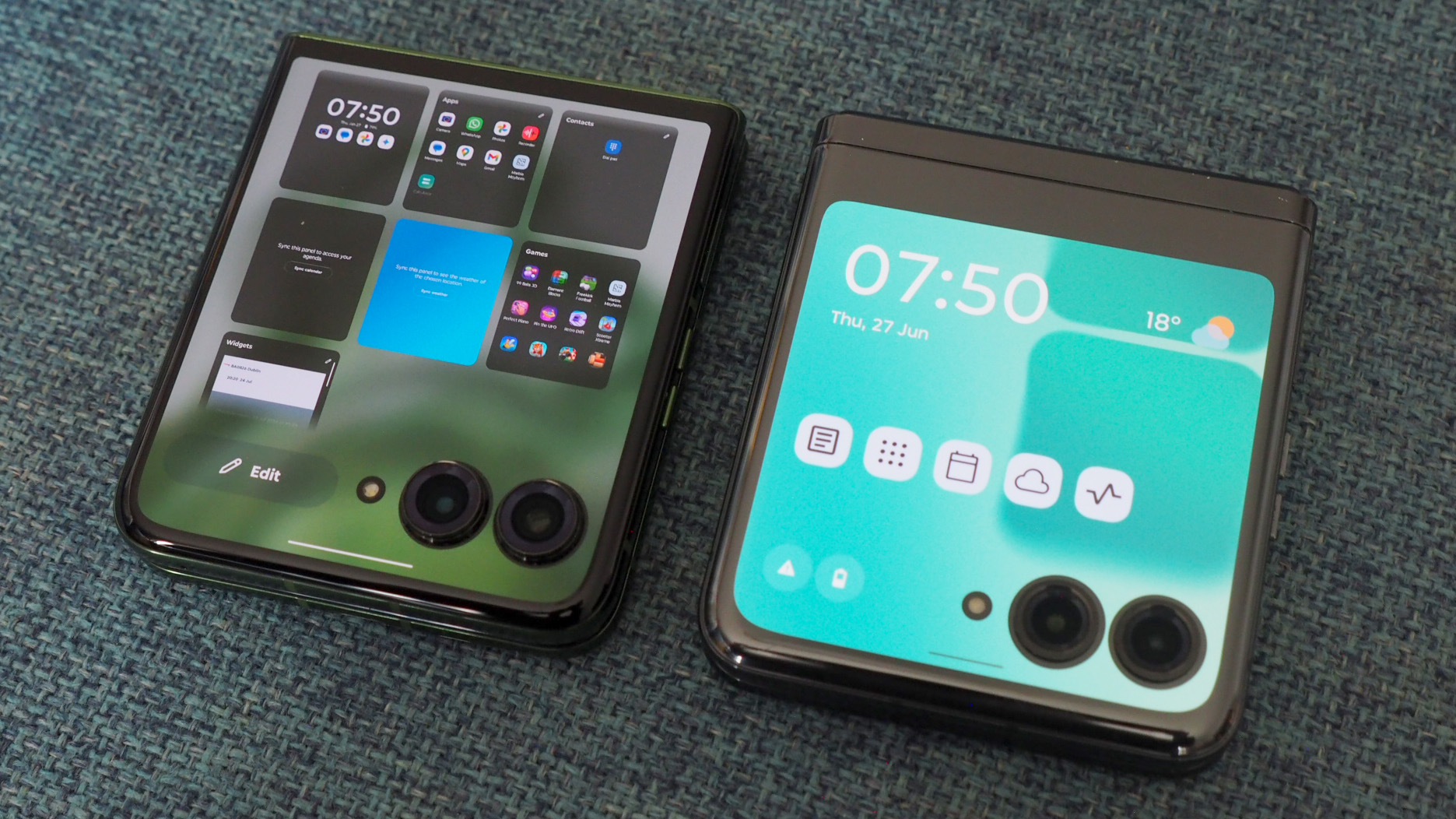
The majority of which concern the cover display: in the 50 Ultra you can have an always-on setting; and a revamped customisation means home screen, lock screen and panels are more advanced in the newer handset. In the 40 Ultra you'd get Google News, Home, Apps, Calendar, Weather, and other options by default. In the 50 Ultra, however, you get a far freer way of selecting and arranging your panels.
The new software means you can have not only apps and folders on any given panel - which are easily swiped between, left or right - but also the ability to eploy Android widgets. I rarely use widgets as they use up a lot of space, but in a cover display context the appeal for me is much greater - as glimpses into specific apps is a great idea that many people will find useful.
It's also worth noting Google Gemini is available from the Razr 50 Ultra's cover display, meaning the AI can run without needing to open or specifically unlock the phone. Whether its integration will be revolutionary for your use is a 'TBD' moment for now, though, as many of Motorola's AI enhancements will only arrive later down the road.
I find the new Motorola flip phone to deliver the most usable cover display experience of anything on the market. Not only is it fully customisable, it doesn't walk that line of restricting what users can do. That open nature means the cover display becomes a panel of great potential. Although, I must muse: does having such a panel negate the need to open the phone as often (and is that solving a problem or creating a new one)?
Design
| Row 0 - Cell 0 | Motorola Razr 50 Ultra | Motorola Razr 40 Ultra |
| Colours | Spring Green, Midnight Blue, Peach Fuzz, Hot Pink | Infinite Black, Glacier Blue, Viva Magenta, Peach Fuzz |
| Dimensions | 88.4 x 74 x 15.1mm | 88.1 x 74 x 15.3mm |
| Weight | 189g | 185g |
| Storage: | 512GB only | 256GB/512GB options |
| Processor: | Qualcomm Snapdragon 8s Gen 3 | Qualcomm Snapdragon 8+ Gen 1 |
| Case included | Yes, plus carry handle | Sold separately |
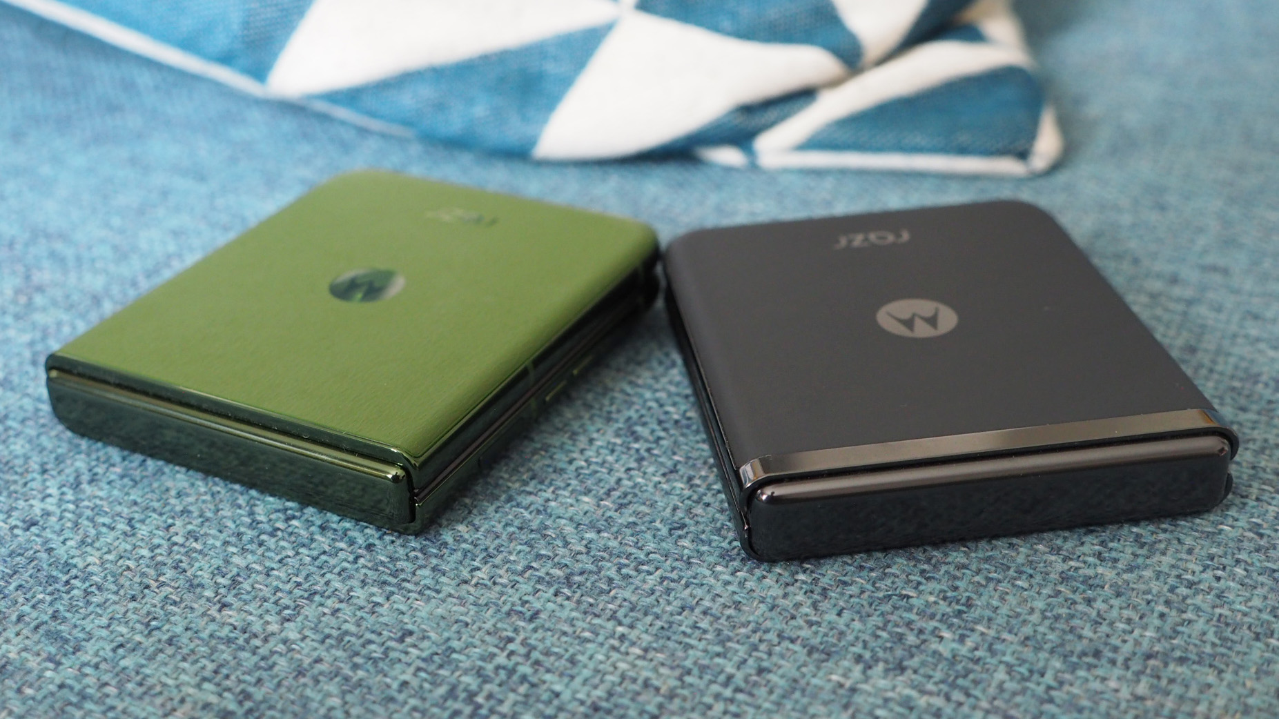
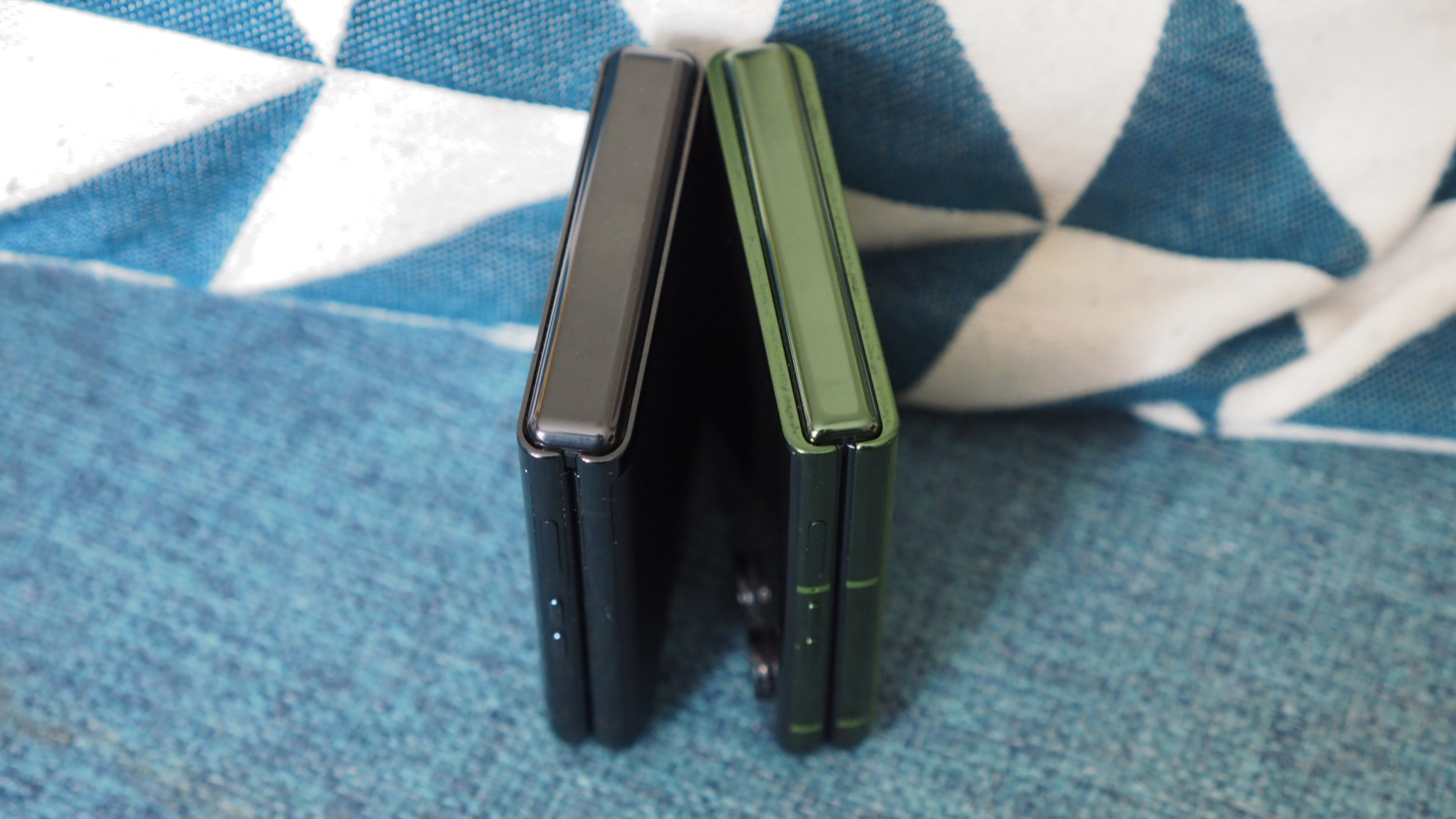
As I said before: the size of the Razr 50 Ultra is almost identical to its predecessor, so you're not going to notice any difference between the two on that front. Same with the weight: the four additional grams aren't going to tip anyone's scales.
However, the newer flip phone's upgraded hinge design does mean a much smaller, neater join - and that's especially visible to the rear and, of course, in providing more cover display real-estate too.
There are new colours generation to generation, with new finishes adding a softer, lustre-like finish to the 50 Ultra's options. It's a subtle difference though.
The case included in the 50 Ultra is also interesting: its colour-matched to its respective phone's finish, and comes with a carry handle, turning the device into an almost miniature satchel or handbag-style product. Sadly, however, the case 'catches' and I don't think it was tested thoroughly enough to be fit for purpose - others at the launch event had also noticed this.
It's also worth noting that the cameras of the Razr 50 Ultra protrude more from the body, and the paint had scratched from their extremities within my first day of use - something the smaller camera protrusions of the 40 Ultra haven't suffered over a much longer time period.
Conclusion
| Row 0 - Cell 0 | Motorola Razr 50 Ultra | Motorola Razr 40 Ultra |
| Price (at launch) | £999 | £1,049 |
Overall, then, the Razr 50 Ultra is a clear upgrade compared to its predecessor. It's also cheaper for its day-one on-sale date, with a sub-four-figure asking price being a keen position to take. Sure, the 40 Ultra is cheaper now, given its age, but there's more reason to buy the newer handset.
The larger cover display, brighter main display, increase in battery life, redesigned hinge, and software benefits are clear wins for the Razr 50 Ultra. The cameras will be better for most people too - despite the absence of an ultra-wide being an obvious omission this time around.
All that adds up to what I think is the best flip phone experience on the market. It's more advanced than the Samsung Galaxy Flip 5 in many ways, so it'll be interesting to see what Samsung does about that in early July with its all-important successor. Because, right now, Motorola is back on top - and I'm impressed with how much the 50 Ultra advances over the earlier 40 Ultra.

Mike is T3's Tech Editor. He's been writing about consumer technology for 15 years and his beat covers phones – of which he's seen hundreds of handsets over the years – laptops, gaming, TV & audio, and more. There's little consumer tech he's not had a hand at trying, and with extensive commissioning and editing experience, he knows the industry inside out. As the former Reviews Editor at Pocket-lint for 10 years where he furthered his knowledge and expertise, whilst writing about literally thousands of products, he's also provided work for publications such as Wired, The Guardian, Metro, and more.
-
 Technogym brings its signature touch of luxury to Pilates with latest home gym equipment launch
They've also introduced a new premium line of strength equipment and cardio kit
By Bryony Firth-Bernard
-
 This bodyweight EMOM workout cranks up your metabolism and builds muscle endurance
20 minutes and a little grit is all you need
By Bryony Firth-Bernard