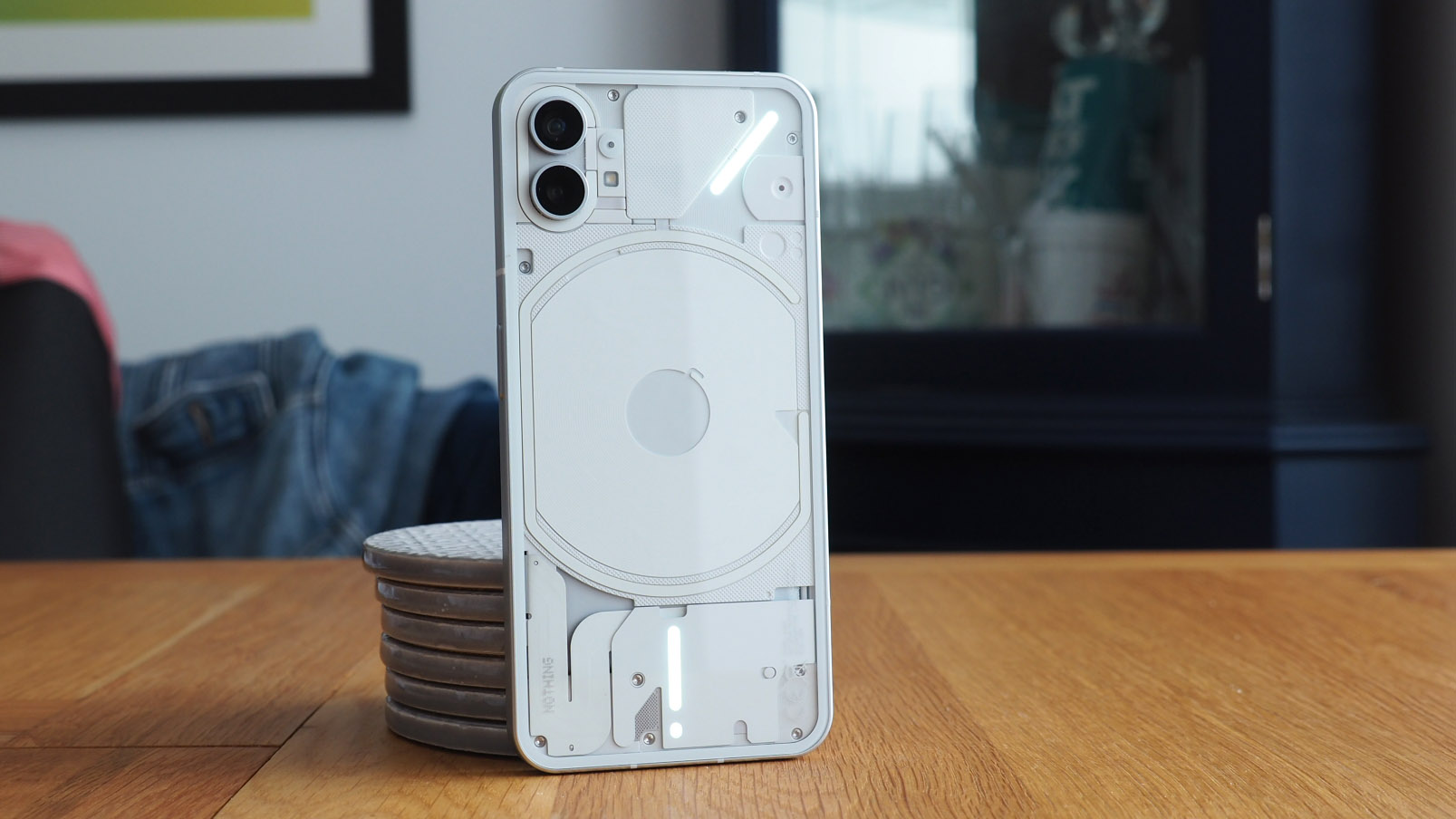
Here it is: the Nothing Phone 1; also known as the most anticipated Android phone launch that I can recall for a generation. It's almost weird to type that, given how many phones have passed through my hands to review over the years, but rarely has there been one to get people as hyped as Nothing's first phone venture already has.
I've been fortunate enough to be using the Nothing Phone 1 for over a week, running it from Thursday 7 July through to now, the Phone 1's official review embargo date of 15 July (I'm late on that one, full piece coming soon). I was in attendance at Nothing's big reveal event in central London, UK, though, to further build the excitement.
Maybe that's part of the reason for the hype: London is the brand's home; a rare location for any electronics company's headquarters to be based. Nothing's founder, Carl Pei, was the same chap who co-founded OnePlus, and we all know how well that's done. Nothing's funding rounds have got big names on board, too, from YouTube star Casey Neistat to former Google Ventures capital. Not to forget the excitement around the Nothing Ear 1 earphones' design, which was the first step in getting people geared up for this phone's design language.
But does the Nothing Phone 1 have a shot at being one of the best Android phones or, indeed, best affordable phone in 2022's market? While I get some more intense use under my belt with this phone as my daily driver, here are my first impressions – the good, the bad, and the other.
Nothing Phone 1: The good
1. Partially transparent design
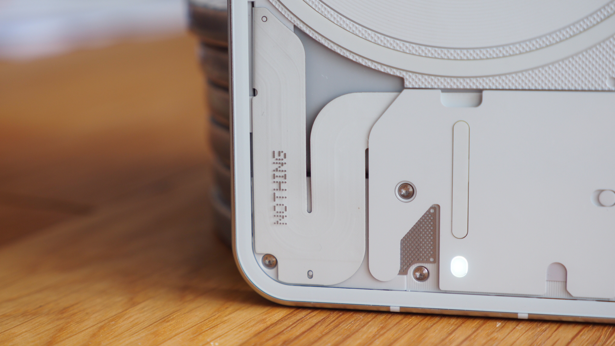
You only need take one glance at Nothing Phone 1's design to have a bit of a wow moment. It's unusual, that's for sure, embodying the partially transparent design language that the Nothing Ear 1 earphones first presented, just in a phone format.
That doesn't mean the Phone 1 is entirely see-through, though, as that would just look downright messy. I think Nothing has done a good job with positioning components into a sensible arrangement, so you can see the wireless charging coil on the rear.
It comes in two finishes, white or black, each with a transparent exterior to the rear. I've got the white one and am yet to set eyes on the black model, although I suspect the latter will hold the greater appeal for me personally.
Sign up to the T3 newsletter for smarter living straight to your inbox
Get all the latest news, reviews, deals and buying guides on gorgeous tech, home and active products from the T3 experts
2. Notification lights like no other
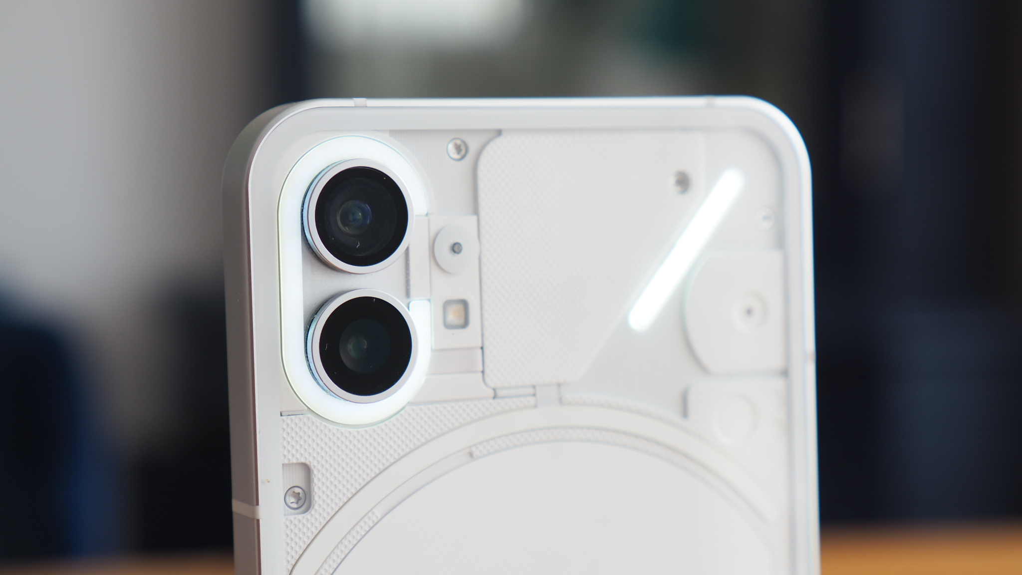
A big part of the reason for that transparent design's purpose, however, is a four-light arrangement: one around the cameras unit; one surrounding the wireless charging core; one above the USB-C charging port; and another to the upper right corner at a 45-degree angle.
Nothing calls this Glyph lighting, which you can dig into to perform different things. There are 10 different patterns that you can assign to individual contacts and notifications, for example, to attach specific call signs. It can dance to music, too, if you want.
Ultimately this is Nothing's 'fun factor' moment. And it is fun. But is it useful? Well, spoiler, it's also the reason you'll find Glyph lights in the not-so-good section of this initial assessment. Maybe after more time I'll chance my mind, we shall see...
3. It's affordable
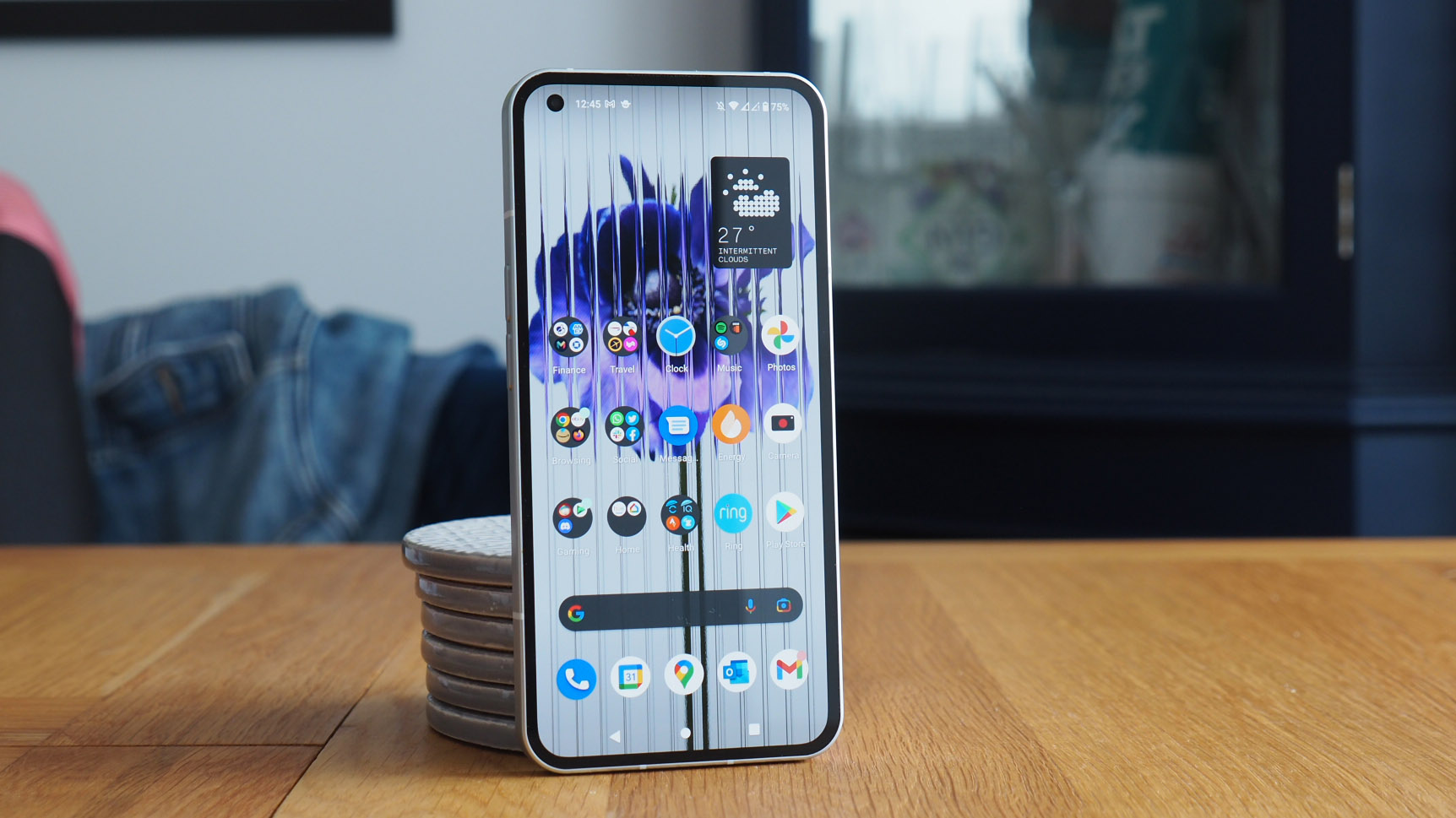
Nothing hasn't come in all guns blazing and chucked a Samsung Galaxy S22 competitor into the market in the hope it'll stick. Quite the opposite really: the Nothing Phone 1's starting price, for the 8GB+128GB model, is £399.
That's a square-off against the likes of the OnePlus Nord 2. It's like old friends (or enemies?) meeting anew in that regard. Pei knew the market to hit with OnePlus and it looks like he's wanting to attack that once more. Flagship this is not (as the Qualcomm Snapdragon 778 attests).
That's well priced considering the overall specification though: there's a pair of 50-megapixel rear cameras (wide and ultra-wide), with none of the throwaway low-resolution or macro guff that so often adorns such devices at this end of the market. It's splash and dust resistant too (well, IP53). There's dual stereo speakers. Fingerprint unlock. 5G connectivity. A 6.55-inch 120Hz display. All the main things you'd need at a good price point – if not more than I'd expect, really.
Nothing Phone 1: The not-so-good
1. So-so battery (so far)
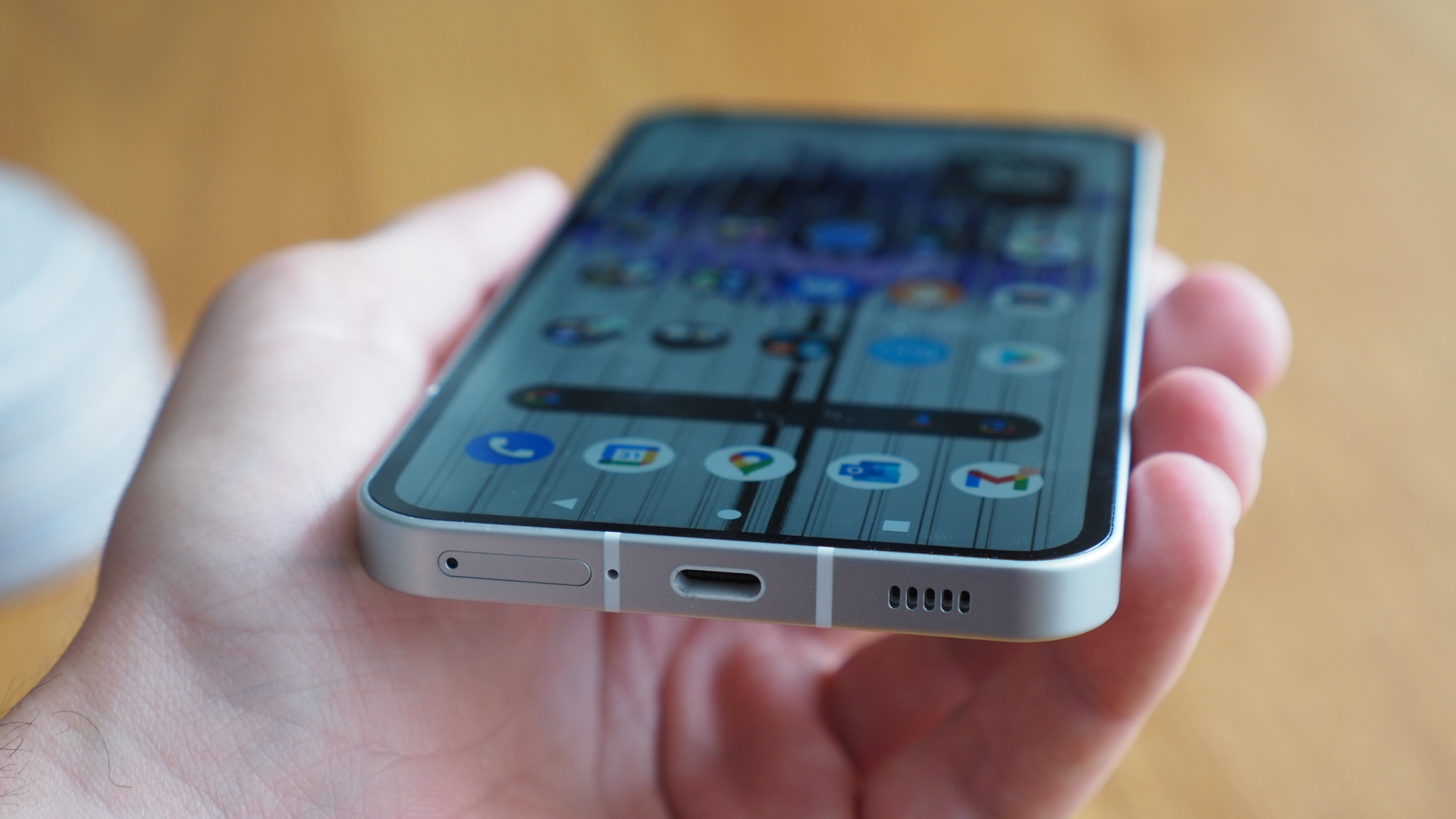
However, I don't think that Nothing Launcher, the company's skin over Android, is quite perfected as yet. It seems a little heavy in terms of battery consumption, more so than various other devices I've been using in recent years, so the claimed "18 hours" per charge that Nothing makes is currently a long way off what I'm getting.
With a 4,500mAh battery at its core, the Phone 1 is not yet delivering to my expectations. I'm struggling to get all the way through a working day with this device, which is unusual. Given the thickness of this phone (it's 8.3mm but as it's so square-edged in build it feels like more) I get the sense that more battery could have been muscled into the available space.
2. Do I really need lots of lights?
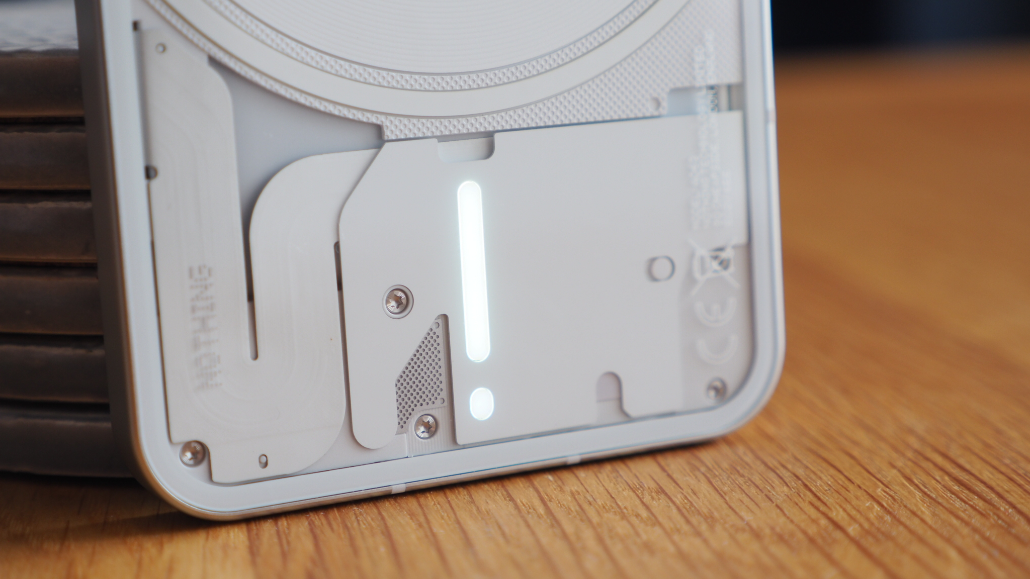
Yes, I know, killjoy moment. Sorry, not sorry. I've already said that the Glyph lights are fun. However, fun doesn't always equal practical. You don't watch a football match whilst driving a car, as it'd end in disaster. And here's the thing: even after telling Glyph to switch off for bedtime (22:00-07:00) it was still putting out various middle-of-the-night flashes that are anything but fun, let me tell you.
I'm not concerned around the battery implication of Glyph, to be honest, it's more the practicalities of its use-cases. I'm not yet convinced I need various patterns to tell me things. I can just look on my phone instead, as I'm used to doing.
Oh, and the built-in alarms and sound effects are so brain-gnawing that I'd suggest changing those pronto. I didn't at first. Then when setting an alarm for the first time the next morning I thought I was stuck in the Tron movie and about to get annihilated by digital bad guys.
Nothing Phone 1: First impressions
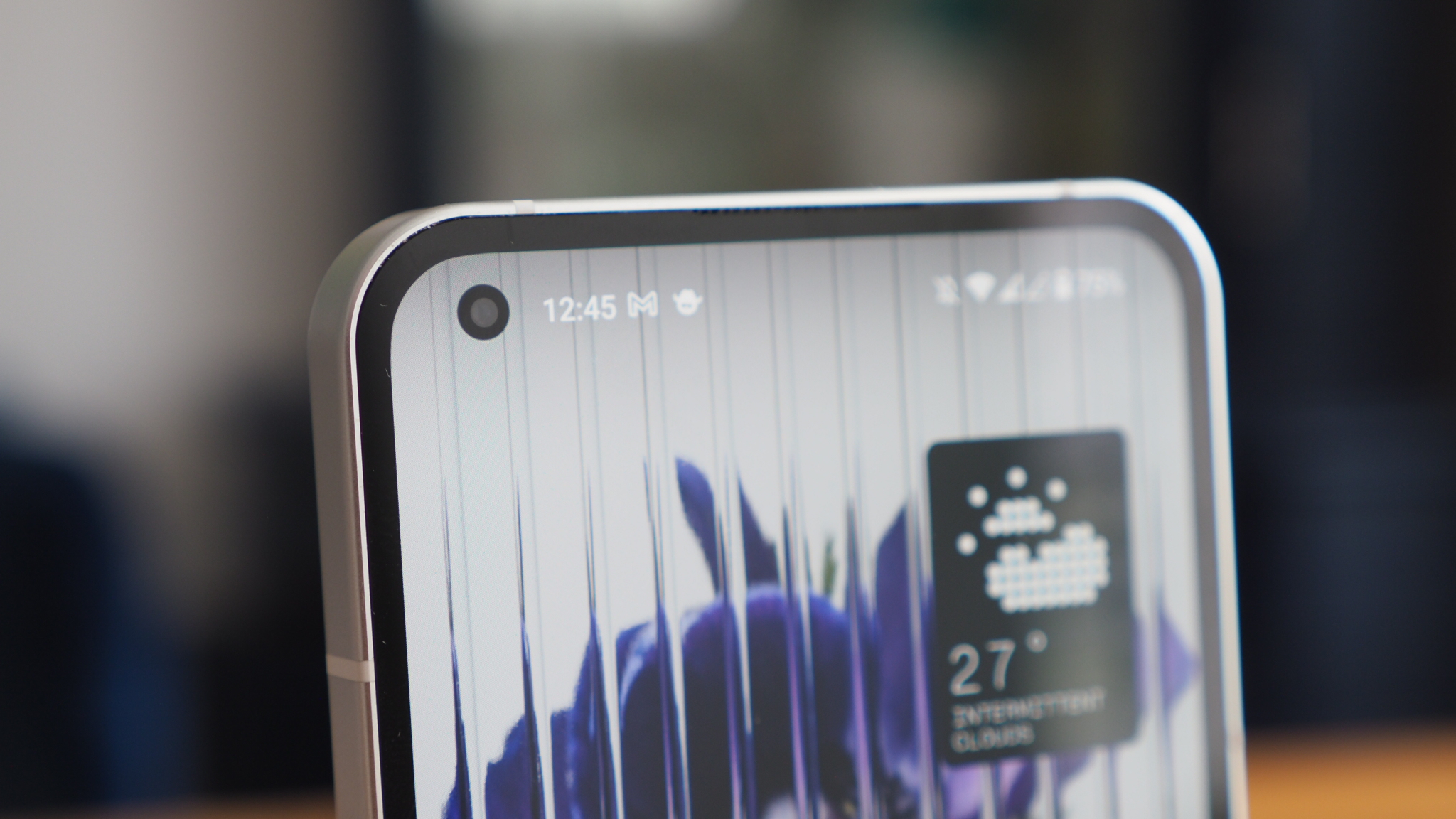
So where do I stand on it all: is the Nothing Phone 1 the most overhyped phone launch of 2022 or something genuinely new and exciting? Here's my on-the-fence moment: it's a bit of both, really, but is that so bad?
I'm loving the build-up and hype that Nothing has managed to bring to its Phone 1 launch; that the device is interesting, well priced, avoids common gimmicks of so many competitors, and has pushed a visually engaging invite and ad campaign.
It all comes down to how you feel about Glyph lighting effects, really, and whether this new approach brings excitement to how you can receive and visually see notifications, or if that's nothing but a turn-off feature for you.

Mike is T3's Tech Editor. He's been writing about consumer technology for 15 years and his beat covers phones – of which he's seen hundreds of handsets over the years – laptops, gaming, TV & audio, and more. There's little consumer tech he's not had a hand at trying, and with extensive commissioning and editing experience, he knows the industry inside out. As the former Reviews Editor at Pocket-lint for 10 years where he furthered his knowledge and expertise, whilst writing about literally thousands of products, he's also provided work for publications such as Wired, The Guardian, Metro, and more.
-
 Garmin’s on a mission to update your wrist into oblivion as 100+ tweaks land on Fenix and Enduro watches
The latest beta update looks comprehensive
By Matt Kollat Published
-
 5 reasons you should be excited about the brand new Samsung Bespoke AI Jet Ultra
Not sure if it’s obvious... but I can't wait to try it
By Lizzie Wilmot Published