While the iPhone 15 is expected to launch sometime next month, it's not the only upgrade which users will get. These events are usually packed full of all sorts of software and hardware updates.
One of those is iOS 17. The latest update to Apple's phone operating system looks set to bring a host of useful upgrades, like Contact Posters and changes to the AirDrop functionality.
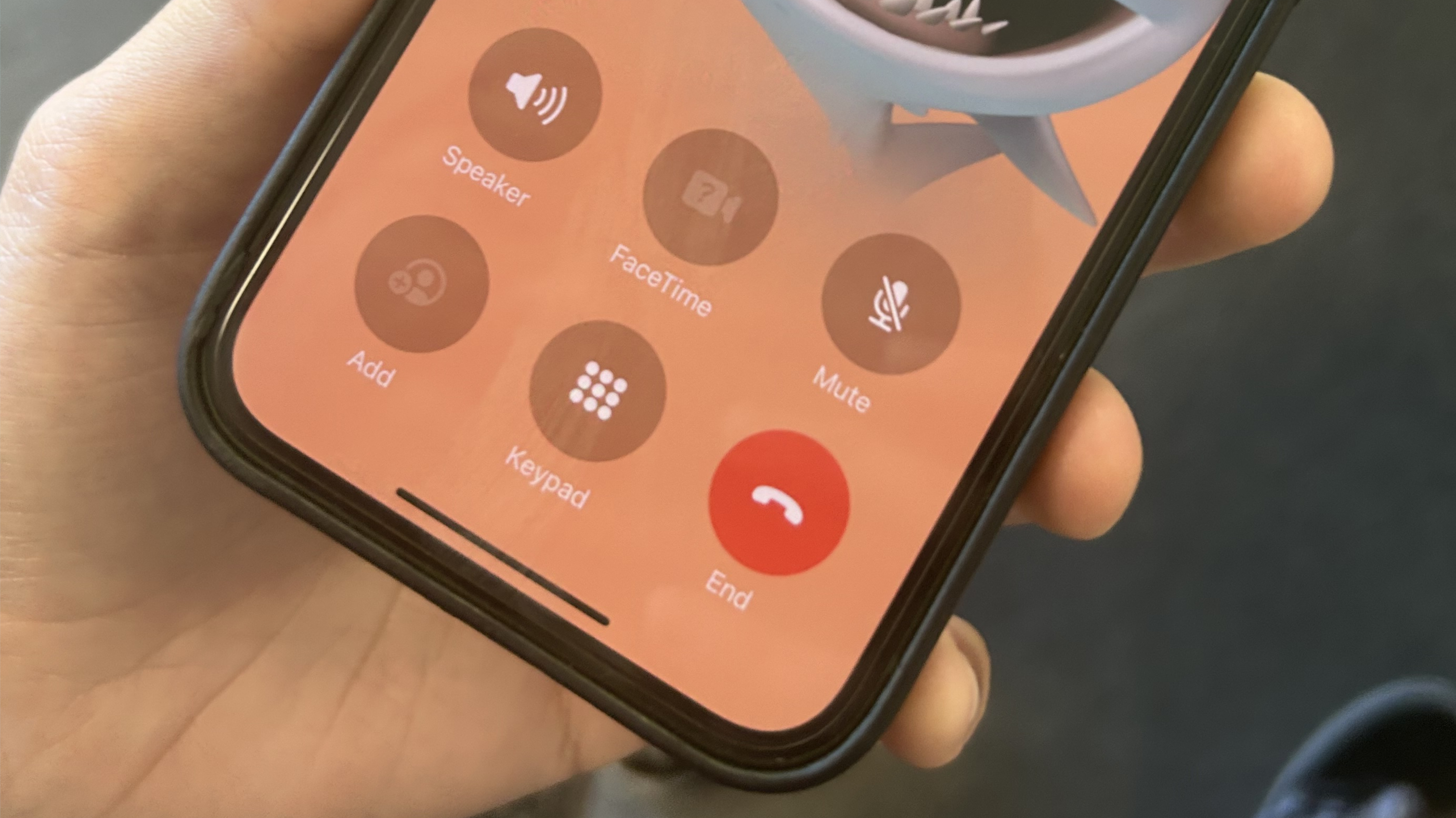
The system is currently in beta testing. During that time, one feature has really riled up the iPhone user base more than any other – the changed position of the end call button. After years of being sat centrally at the bottom of the device, Apple opted to move it to the right hand side of a six-button grid. The internet was not best pleased.
Controversially, I really enjoyed it. I pretty much always take calls with the device in my right hand, so the positioning was perfect for quickly hanging up at the end. It also just looked more sleek and in keeping with the Apple aesthetic in general.
Which is why I'm really sad to see that it won't be sticking around for long. As part of iOS 17 beta 6, the button has moved again. It reverts back to a central position this time, on the bottom row of the same six-button grid.
Now look, I'm well aware this isn't a game-changing feature – we're talking about a centimetre or so difference. But as someone who found the right-hand positioning beneficial, it feels like a step backwards.
I'd love to see it become a user-configurable option in the future, though I won't hold my breath. For most people, the central position is the preferred option and I suspect that will be good enough for Apple.
Sign up to the T3 newsletter for smarter living straight to your inbox
Get all the latest news, reviews, deals and buying guides on gorgeous tech, home and active products from the T3 experts
The only other change worthy of note comes in the iMessage app. That got a redesign in iOS 17, which changes how the apps for adding things like photos is accessed.
Users we're slightly miffed that adding images to messages now took a couple of extra steps – you had to click the plus button and then photos rather than just the gallery icon. Now, if you tap and hold the plus button, the gallery selection will appear. Sure it's not quite as seamless as it was in iOS 16, but it's a decent enough compromise.
If you want to test out this and all of the other new features in iOS 17, you can! Check out this guide for details of how to sign up to the beta version.

Sam is an award-winning journalist with over six years of experience across print and digital media. As T3’s Senior Staff Writer, Sam covers everything from new phones and EVs to luxury watches and fragrances. Working across a range of different social media platforms alongside his written work, Sam is a familiar face for fans of T3. When he’s not reviewing snazzy products or hunting for stellar deals, Sam enjoys football, analog photography and writing music.
-
 I tried a Snapdragon feature that's a game-changer for Netflix, Amazon and more
Moises Live can isolate and enhance audio in real-time using the Elite X's NPU
By Mike Lowe
-
 Under Armour's new sneaker doesn't play by the old rules
If this is the future of the brand, it's off to a running start
By Matt Kollat
-
 Apple's Severance computer may have been a joke, but the keyboard is coming for real
Tell us where we can sign up!
By Britta O'Boyle
-
 Apple Watch is set to get Apple Intelligence this year, but only with a little help from a friend
Bring on watchOS 12
By Britta O'Boyle
-
 iPad reportedly getting major makeover and your current model could benefit too
Apple is said to be making a change that iPad power users have been wanting for years
By Carrie Marshall
-
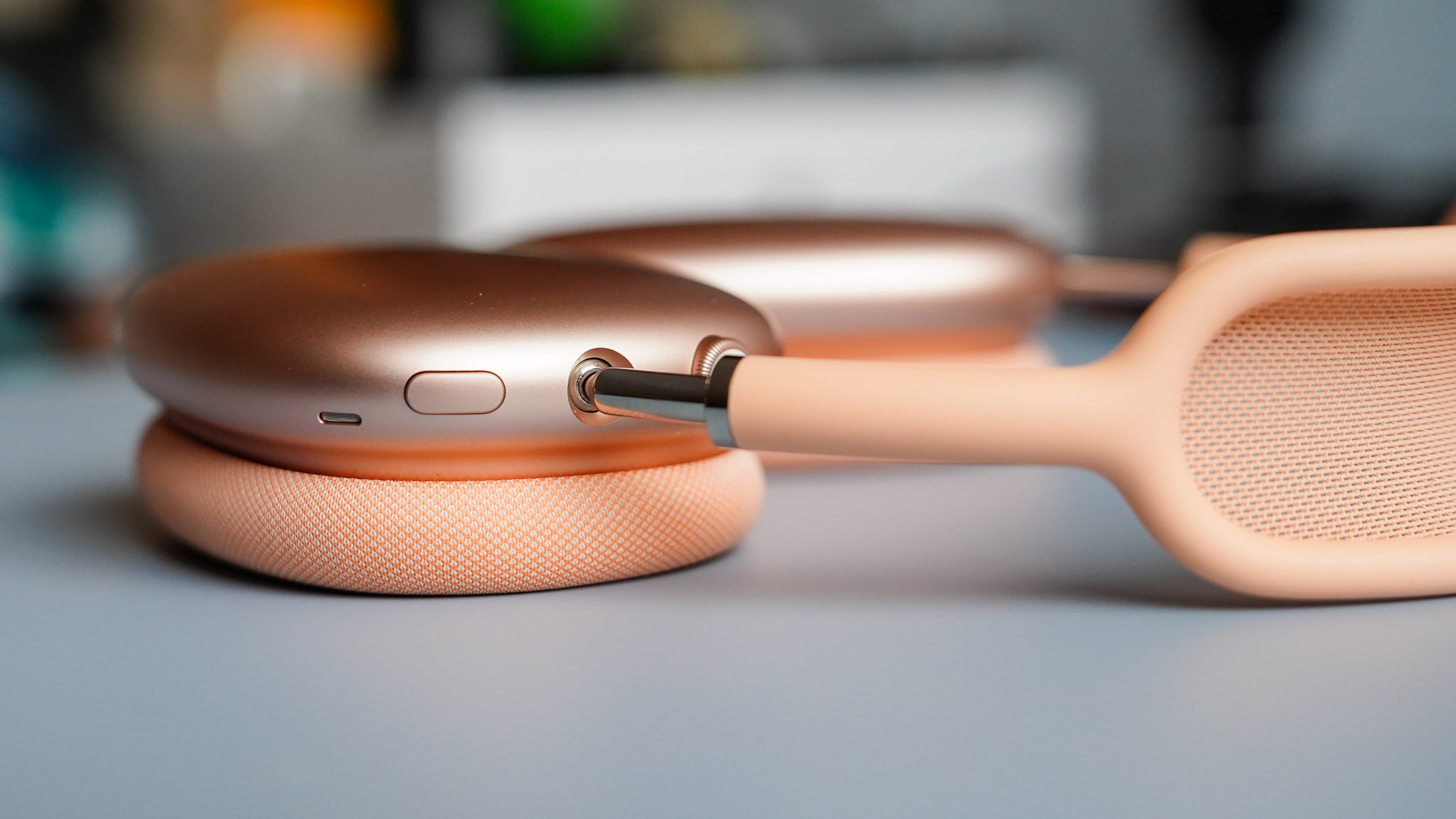 AirPods Max finally get the great free upgrade Apple promised
Here's how to make sure your headphones are running the right firmware
By Britta O'Boyle
-
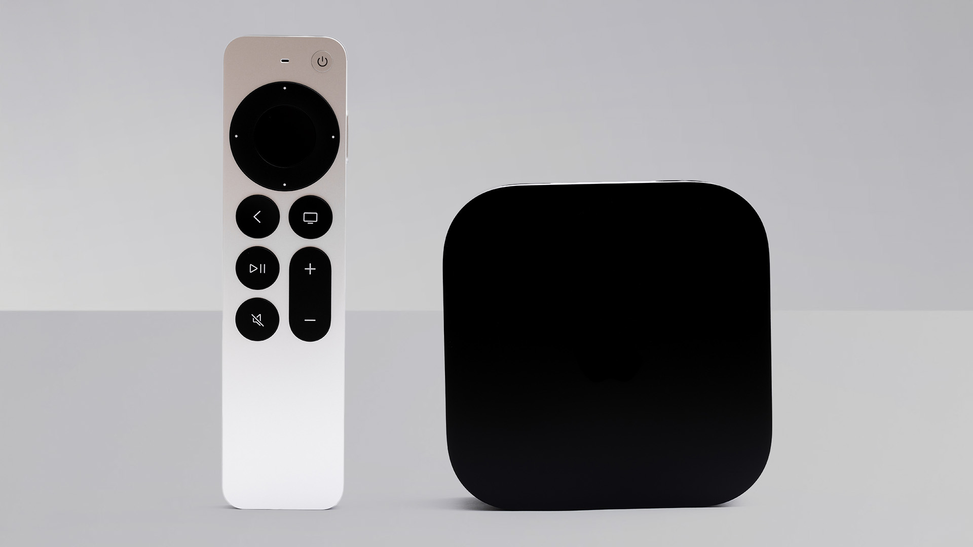 Apple TV gets a free update that makes it more simple to use
Apple has released tvOS 18.4 with a few design tweaks for its TV boxes
By Rik Henderson
-
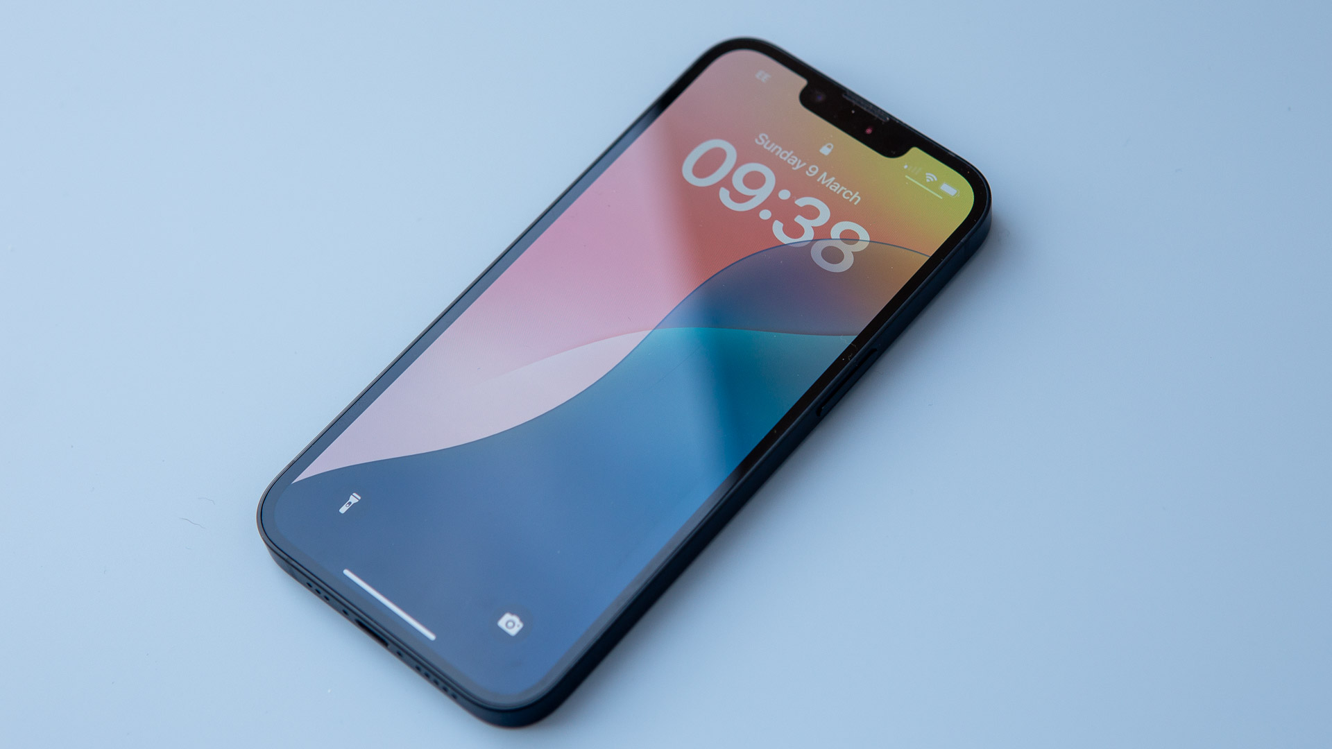 Your iPhone gets some new tricks - here’s what it can do now
The new emojis and priority notifications are probably our favourite
By Britta O'Boyle
-
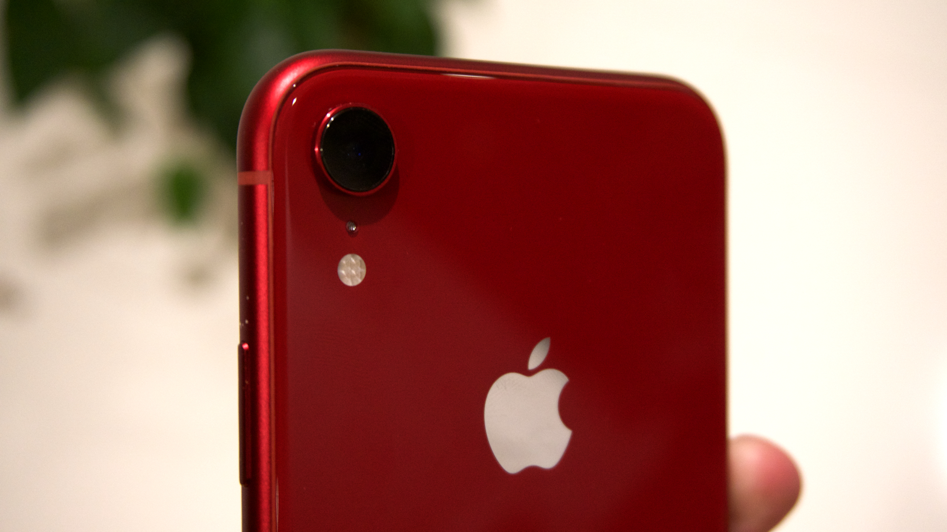 Older iPhones at risk of being left behind when iOS 19 arrives – is your device one of them?
Apple will reportedly drop three iPhone models when it comes to the iOS 19 update
By Carrie Marshall
-
 Your next MacBook Pro could be a game-changer for three good reasons
Apple will reportedly upgrade next year's MacBook Pro in three major ways
By Rik Henderson