Top 10 most beautiful phones in the world… ever
Hot on the heels of the LG G4 we run down the most beautiful phones of all time

Get all the latest news, reviews, deals and buying guides on gorgeous tech, home and active products from the T3 experts
You are now subscribed
Your newsletter sign-up was successful
Introduction
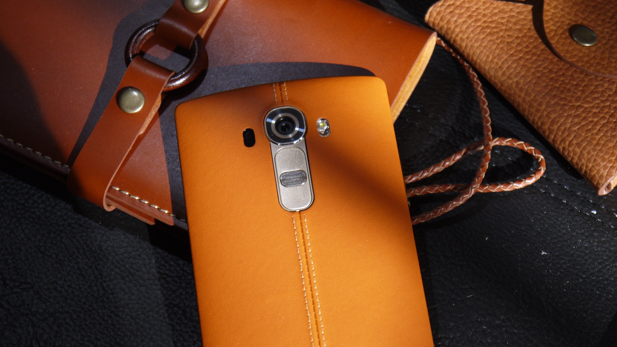
LG has really gone all-out with the design of the LG G4. It's not often you see a phone with a backside made of genuine leather, not to mention the whole rainbow of colours you can get it in.
Do you love it or hate it? Like just about any bold design move, you can draw a pretty clear line between LG G4 lovers and haters.
We think the LG G4 is a bit of a stunner, in the right colour, but which are the best-looking phones of all time? These are the phones we think deserve a spot in the mobile phone design hall of fame.
Nokia Lumia 800
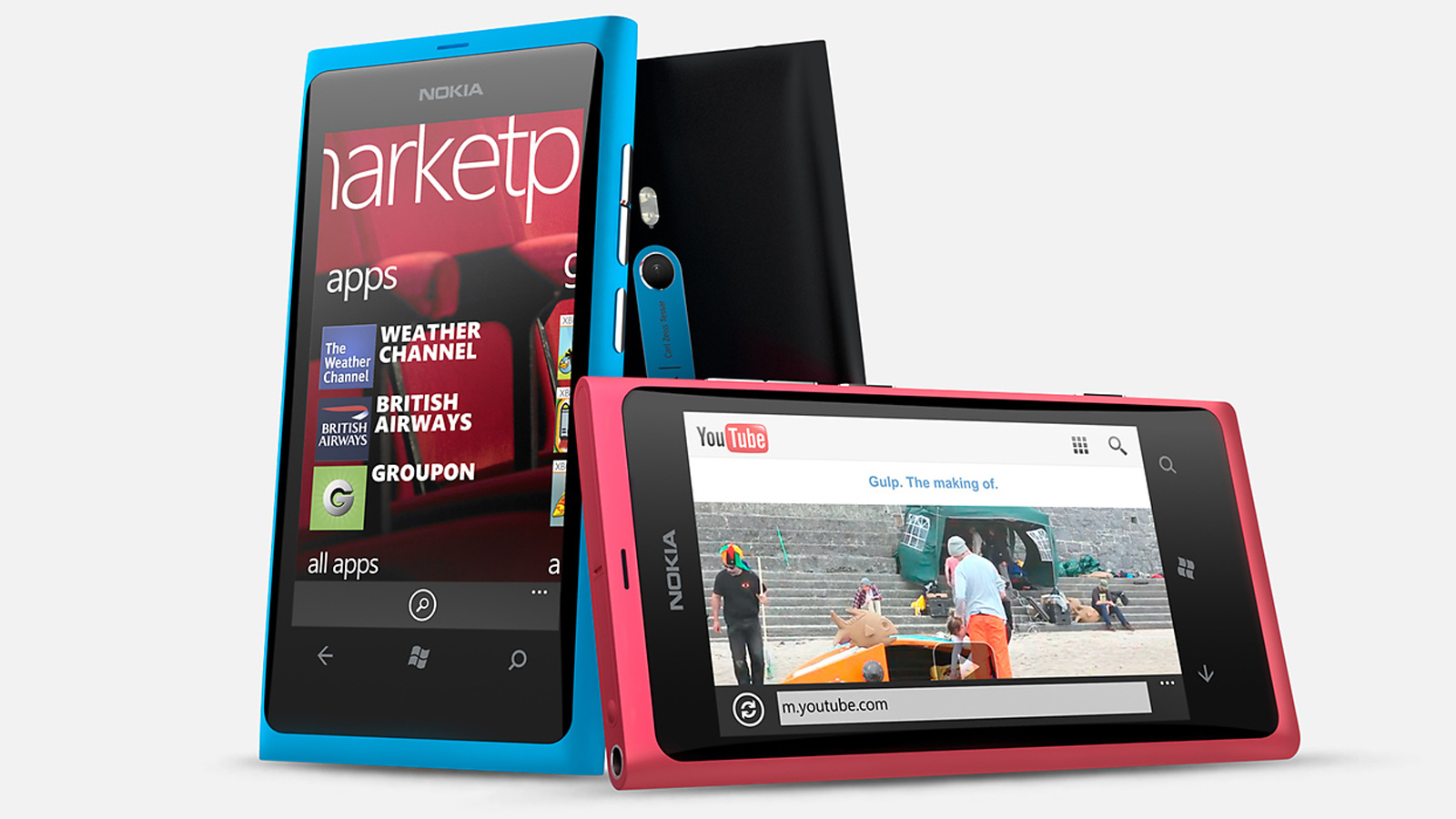
Nokia was the company that made plastic phones cool again. The one that really established the Luimia style was the Nokia Lumia 800.
Nowadays it seems familiar. Polycarbonate body, curvy sides, straight back and front. But we should recognise this as a beautiful blueprint that offered an alternative to the 'more is more' pec-kissing antics of phone companies like Samsung. This style was part of what let Nokia hack a significant chunk out of the Android and iOS for Windows Phone. Sure, it wasn't the Lumia 800 that did it, but every Nokia and Microsoft phone that follows was inspired by this design classic.
Released: 2011

DyncaTAC 8000X
Some phones aren't beautiful because they look good. Some bring a tear to the eye because they're just so darn important. Take the DyncaTAC 8000X. It was the first mobile phone to be released commercially. It is the precursor to everything we use now. HTC, Samsung, Sony: the lot. And it cost $4000, or $9800 in today's money.
Sure it looks like a brick with a chin that'd outdo Bruce Campbell, but it's a design that belongs (and is) in museums, rather than on someone's list of ugliest phones. It setup a design style that we'd see replicated for years, and would become the recognisable phone archetype we'd in films like Wall Street, and hundreds more. It's time to doff the cap.
Released: 1983

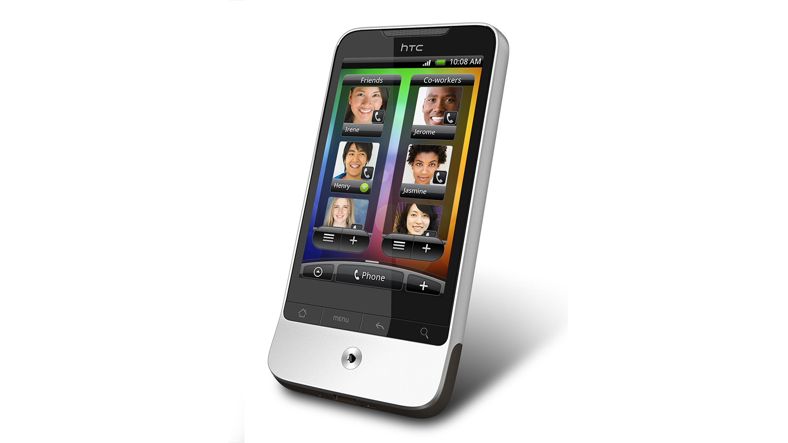
HTC Legend
They don't make 'em like this anymore. The HTC Legend was one of the first Android phones to bring a true high-end look and feel to a phone not all that expensive, at around £350/$400. A curvy aluminium unibody design with a stark-but-friendly two tone finish, HTC was scurrying back to the design principles of the HTC Legend when it made the HTC One M7.
Nowadays it seems hopelessly tiny and a bit chubby at the same time, but without looking at the specs of its curves, you have to agree: it has aged pretty well, hasn't it?
Released: 2010
iPhone 5
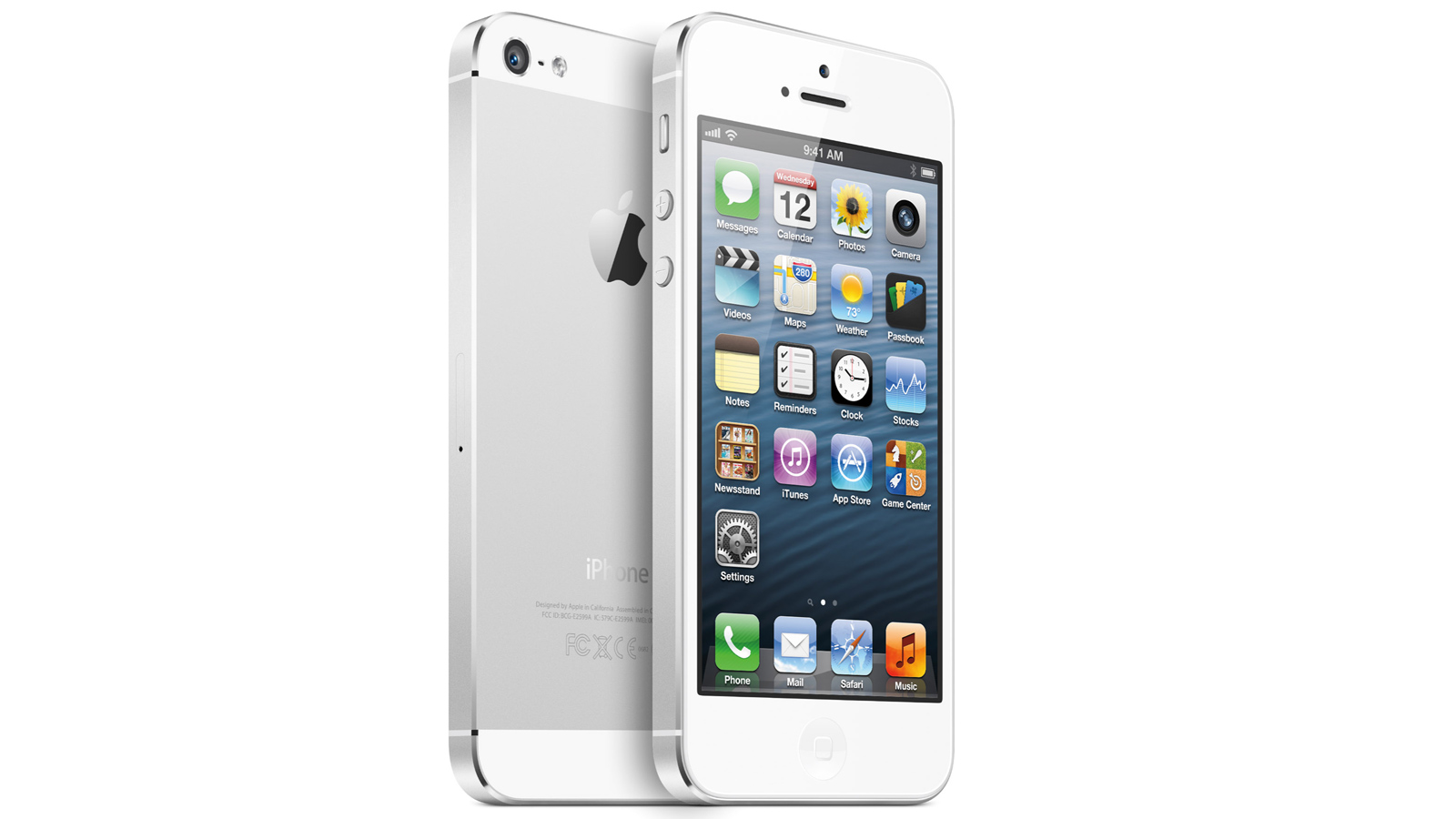
There's more than one reason why it took Apple so long to let go of tiny, palm-size phones. One was that they are very easy to use. That's the obvious one.
The other is that with a smaller phone, Apple didn't have to make annoying things like practicality get in the way of gorgeous hardware design. Just look at the iPhone 5/5S next to the iPhone 6 or iPhone 6 Plus and we wouldn't blame you for thinking the old phone is a bit nicer-looking. Those masterful severe sides, all that aluminium. It's enough ti make you come over all peculiar.
Released: 2012
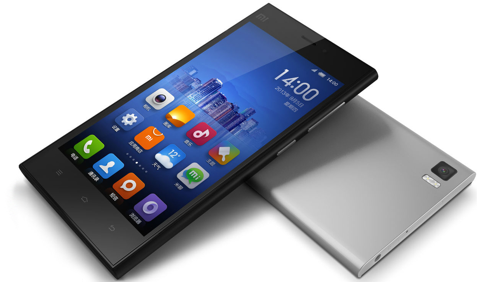
Xiaomi Mi3
Xiaomi is a company more people need to know about. It has been called the Apple of China, and it's not just because its phones are incredibly popular over there.
The Xiaomi Mi3 is the sort of phone we might have seen Nokia create if Microsoft hadn't taken over the company, concentrating more and more on profit margins and less on design experimentation.
It has an incredibly tasteful body. Minimal as you like, but made of magnesium alloy rather than plastic or aluminium. It's a risk. Why? Magnesium alloy can feel a bit plasticky, but this magnesium-aluminium alloy feels as high-end as you like while looking like it deserves the top spot on any Western phone-maker's roadmap. It's not too expenses either, available for around £200/$250 on import.
Released: 2013
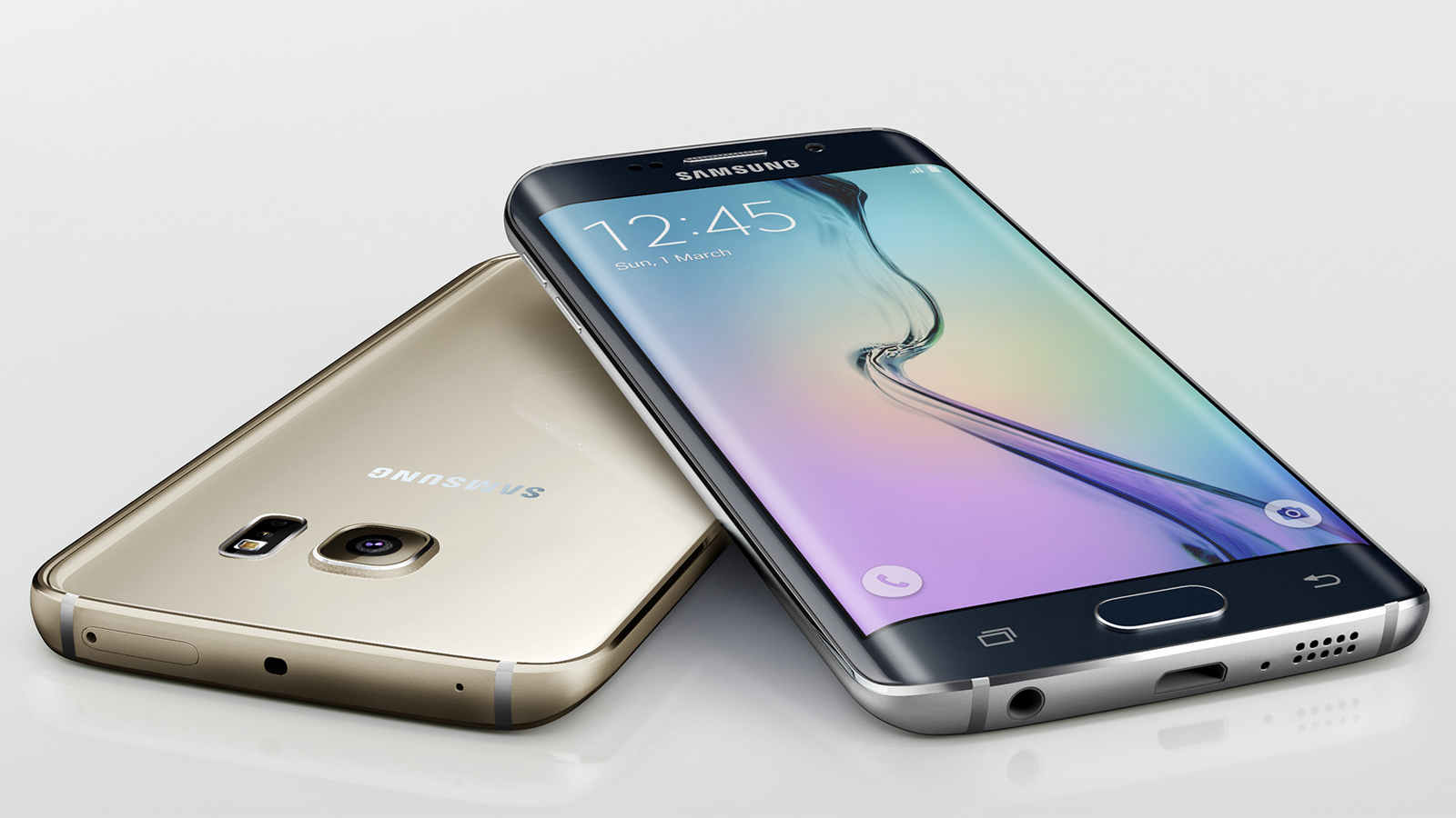
Samsung Galaxy S6 Edge
The LG G4 seems to have people divided this year. Is a leather back classy, or does it smack of the cigarette smoke-soaked leather dashboard of an old fat guy's Jaguar? However, everyone we've talked to seems to love the look of the £600 Galaxy S6 Edge.
It's the first phone to have a glass front that curves around smoothly at each side. Does it add much? Not really, but it looks fantastic. Corning produces the Gorilla Glass that makes this all possible, and you can expect to see many a curvy phone in the coming year or so. We doubt whether many will be as pretty as the Edge, though.
Released: 2015
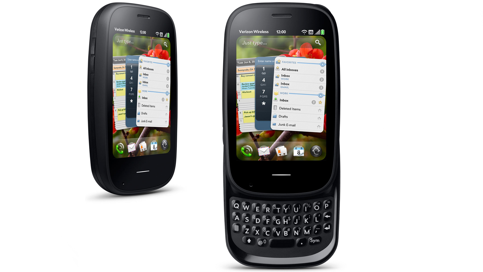
Palm Pre
When Palm stumbled its way into the smartphone market in 2009 it was a complete flop. Hardly anyone bought one of the Pre mobiles. It was borderline embarrassing. But that doesn't mean there was anything wrong with the actual phones.
The Palm Pre was a frankly amazing effort by a company mid-wane to claw its way back to relevance. While it didn't work, the handset itself is a thing of beauty. An incredibly elegant keyboard, a lightly curved screen front and palm-hugging ergonomics made it something to desire. It may have been too little, too late, but it was still great.
Released: 2009
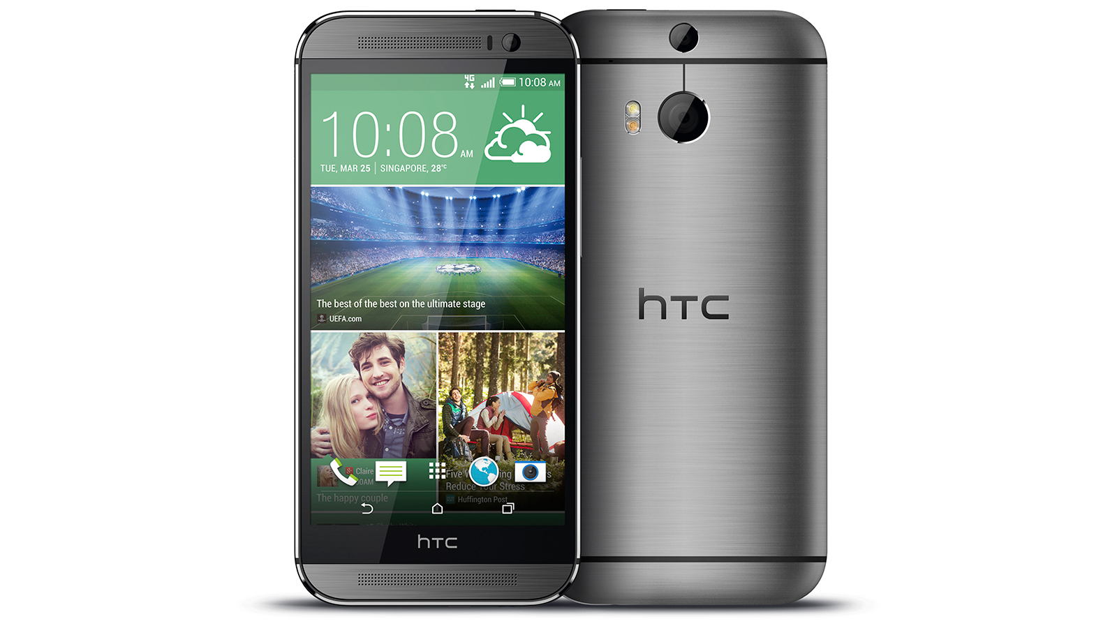
HTC One M8
The HTC One M8 and M7 were the phones that convinced companies like Samsung that how a phone looks and feels really does matter. It was such a good design that HTC basically carried on using it this year with the HTC One M9.
A curvy shell of lightly brushed aluminium and curves that just won't quit made it our phone of the year 2014. Sure, it doesn't seem like look design alone is doing to see HTC sail through and win this year's top phone award with the One M9. But the year is not over yet. Maybe HTC has another new stunner up its sleeve.
Released: 2014
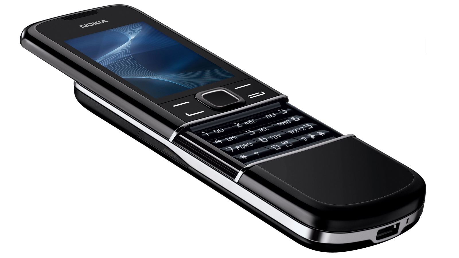
Nokia 8800 Arte Carbon
Remember The Matrix? Only the embarrassingly young get let off for this one. Well, in The Matrix, Neo used a phone, and at the time in 1999 it became an object of desire for thousands of young nerds mimicking Neo's finger flicking taunt in their bedrooms. It was the Nokia 8100.
Well, nowadays the Nokia 8100 doesn't look quite so hot. However, Nokia revisited the design eight years in 2007 with the Nokia 8800 Arte. Similar phone, but a much sleeker, more luxurious style, with a body made of stainless steel. Considering it launched just a couple of years before the iPhone, it barely does anything and cost even more at £600. But it sure is a looker.
Released: 2007

Motorola Aura
Here's an oddity. Motorola has made all sorts of strange phones over the years. But one that really raised an eyebrow back in day the day was the $2000/£1300 Motorola Aura.
It was one of the first phone to really brag about the high ppi screen style that has become the norm, and it has a totally round display that wouldn't look out of place on a smartwatch today. It had a Retina display two years before the term was coined. The screen part worked as the pivot for a sort-of next-gem flip phone. Was it a success? At over a grand of course it wasn't. But whip one out today and it'll still raise as many eyebrows as an Apple Watch.
Released: 2008
Get all the latest news, reviews, deals and buying guides on gorgeous tech, home and active products from the T3 experts

Andrew is a freelance tech and entertainment journalist. He writes for T3, Wired, Forbes, The Guardian, The Standard, TrustedReviews and Shortlist, among others.
Laptop and computing content is his specialism at T3, but he also regularly covers fitness tech, audio and mobile devices.
He began writing about tech full time in 2008, back when the Nintendo Wii was riding high and smartphones were still new.