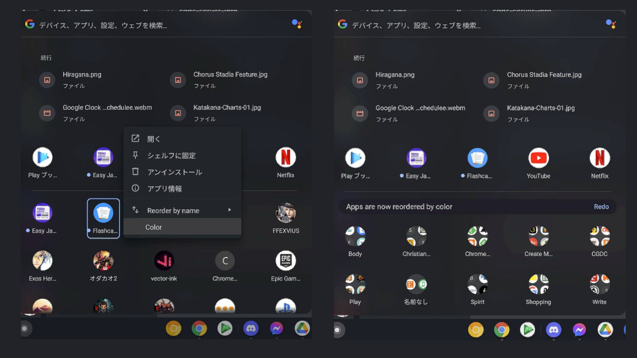

The best Chromebook laptops are dependable workhorses – simply put, they always get the job done. Thanks to a recent update to the Chrome app launcher design, accessing your apps and web apps is now even easier. Like any software update worth its salt, we're still continually learning what it has to offer, which brings us to a nifty little feature within the new productivity launcher that finally lets you sort your apps by their color.
It may not sound like much, but Chrome OS was once without any meaningful way of sifting through your apps, forcing users to sort and arrange their apps manually against Chrome creating new pages in the launcher seemingly at random. This was no easy task, especially when dealing with computer clutter and heaps of barren folders. Thankfully, the new app launcher brings this untidy chapter to a much-needed conclusion, with its newly-acquired ability to arrange apps by color smartening up your scruffy desktop.

App color-sort function (via Chrome Unboxed)
Google is big on accessibility and the redesigned launcher finally brings better app sorting features to the user experience. As spotted by the folks over at Chrome Unboxed, right-clicking anywhere in your app grid on the Productivity Launcher on Chrome OS Canary will now allow you to select “Color”. Automatically sorting your apps by their color is not only visually appealing, but it also arranges your desktop in an orderly fashion by assigning colors with "folders remaining on top, and all icons in those folders sorted in the same manner while being contained."
In much the same way as alphabetization, users can now distinctly identify what items are where, as well as improving the Chrome OS experience to make it far more mouse-friendly. It's a mystery as to why Google has waited this long to put app sorting into practice, and it's just one of the many good things that have come as part of the company fixing the broken app launcher tool.
Technicolor tidiness
Another great aspect of the new sorting feature is that all of your loose apps are also sorted by color below the folders instead of missing out on all of the color-grading action. It means everything is gleefully ordered without any bits able to escape the cluthches of the productivity launcher's sorting mechanism.
The Productivity Launcher is now available to most users, and it already offers bags more functionality than its rather tiresome predecessor. Your Chromebook's results are yielded in front of you neatly arranged on the screen, visible and searchable. It doesn't hog screen space, using only a fraction of the screen – and what's more, is that it's now is glistening technicolor that's aesthetically rather lovely and equally useful. Not a fan of Chromebooks? Then check our our best laptop and best 2-in-1 laptop guides for other stellar computing alternatives available right now.
Sign up to the T3 newsletter for smarter living straight to your inbox
Get all the latest news, reviews, deals and buying guides on gorgeous tech, home and active products from the T3 experts
Luke is a former news writer at T3 who covered all things tech at T3. Disc golf enthusiast, keen jogger, and fond of all things outdoors (when not indoors messing around with gadgets), Luke wrote about a wide-array of subjects for T3.com, including Android Auto, WhatsApp, Sky, Virgin Media, Amazon Kindle, Windows 11, Chromebooks, iPhones and much more, too.
-
 Ninja’s new indoor grill can cook 10 burgers at a time – but you might not get it
Ninja supersizes its Sizzle Pro indoor grill
By Bethan Girdler-Maslen Published
-
 What new TV Licence rules mean for Netflix and Prime Video subscribers
Hint: nothing yet, but that may change soon
By Britta O'Boyle Published