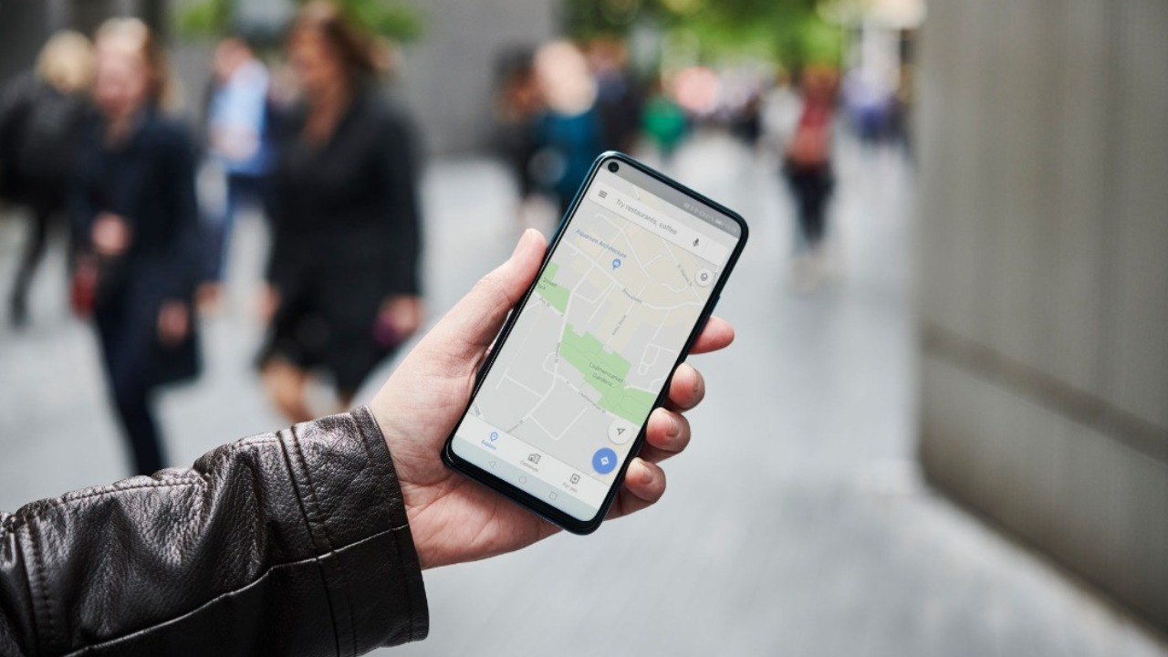

Google Maps is getting a cool new Insights tool that provides deeper stats about users’ travels, with a new feature that lets you keep a track of your movement over a period of time.
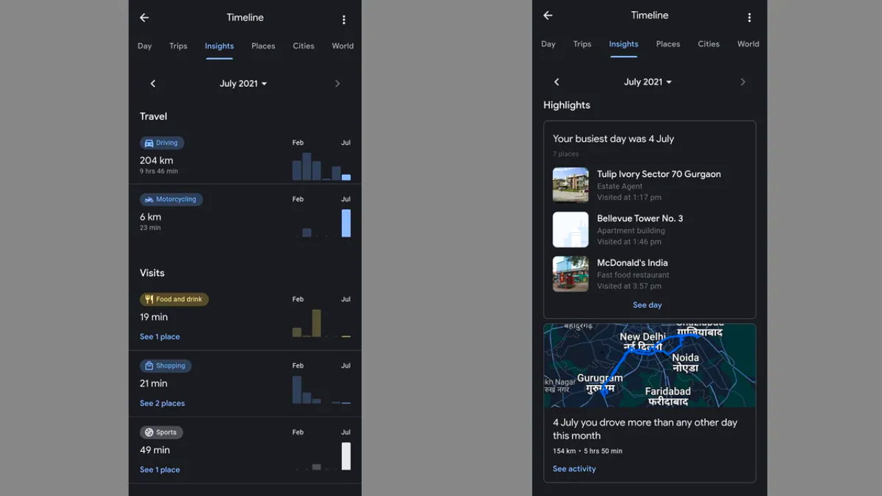
As per the name, Google Maps' Insights feature provides valuable information around users' Map-related behavior, giving them the opportunity to then use this data to make more informed choices when planning their journeys, or even fine-tuning their daily commute.
- OnePlus flagships to receive three major Android OS updates
- WhatsApp may finally let you send videos in high resolution
- Google Chrome gets colorful — thanks to Android 12 'Material You' redesign
Insights is a part of Google Maps' timeline menu, offering an overview of your month-to-month movements, and also helping users to keep a record of the places they've visited over time. Though it may sound invasive, the metrics are arguably more universal than, say, Apple Watch's fitness tracking as most of us have to travel every day. Currently, the Insights tool is only available for a select number of users, with Android Police noting that the tool is expected to "reach everyone sometime soon."
To access the tool, select users can tap the profile icon in the top right-hand corner of their Timeline in Google Maps’ pop-up menu. From there, Google Maps’ Timeline offers six category filters: Trips, Day, Insights, Places, Cities and World. Google Maps’ Insights tool can only be viewed in the UK and Germany, and it currently only runs on Android. There doesn’t appear to be any information as to when iOS users will get the feature, at the moment.

Google has free reign to tap into is its extensive catalog of users' location history that it uses to populate Insights. You can see your travel history every month, along with what types of transport were used throughout that particular time period.
Other data available to users is the kind of leisure places that a person visits most: these are categorized via food, drink, attractions, shopping, hotels, airports and more. The best part is that this data is neatly presented into bar graphs for easy reading, with Google Maps also providing data around time spent at the places within each category.
Sign up to the T3 newsletter for smarter living straight to your inbox
Get all the latest news, reviews, deals and buying guides on gorgeous tech, home and active products from the T3 experts
Luke is a former news writer at T3 who covered all things tech at T3. Disc golf enthusiast, keen jogger, and fond of all things outdoors (when not indoors messing around with gadgets), Luke wrote about a wide-array of subjects for T3.com, including Android Auto, WhatsApp, Sky, Virgin Media, Amazon Kindle, Windows 11, Chromebooks, iPhones and much more, too.
-
 OnePlus 13T design leaked with iPhone-like design
A flurry of leaks have revealed the OnePlus 13T in the flesh
By Chris Hall Published
-
 12 Easter-inspired fragrances for men and women 2025, from Tom Ford, YSL, Mugler and more
From chocolate to apricots, here are T3’s top picks for Easter-inspired scents
By Bethan Girdler-Maslen Published