Apple iPhone 14 Pro Max review: unrivalled power and performance
The iPhone 14 Pro Max provides more than just a Dynamic Island, bringing huge advances in its screen, camera and processor to the new flagship model

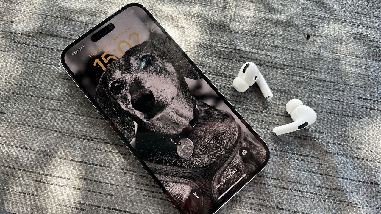

The iPhone 14 Pro Max is the ultimate iPhone and boasts three killer features that make it worth the upgrade. The new 48MP camera is truly impressive, the always-on display is really useful and the Dynamic Island is not only a feat of hardware and software collaboration but actually adds to the user experience.
-
+
48MP camera is the best yet
-
+
Always-on display
-
+
Dynamic Island
-
-
Still no USB-C or fast charging
-
-
New features will use more battery
Why you can trust T3

The iPhone 14 Pro Max sits at the pinnacle of the iPhone range. It's the biggest, the most powerful and the most sort after. If you want the very best iPhone possible, this is your go-to. The question is, does it offer enough to tempt users to upgrade from their iPhone 12 or iPhone 13 models? In this review, I intend to find out.
There's no doubt that the iPhone 14 Pro Max offers an upgrade. The specs show advances in almost every area of the phone, from the brighter always-on display and new 48MP camera to the A16 processor and longer life battery. But the iPhone 12 Pro Max and iPhone 13 Pro Max are still very impressive, so the new 14 Pro Max has to offer something exceptional to convince these users.
Having used both previous models extensively, I knew what a task this would be for the 14 Pro Max. The good news is that not only is the iPhone 14 Pro Max one of the best phones on the market, but it also provides features that will appeal to even current 13 Pro Max users.
I tested the iPhone 14 Pro Max, using it solidly for over a week as my main handset day-in, day-out. For more information on T3's reviewing process, take a look at our how we test page.
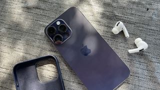
The iPhone 14 Pro Max in Deep Purple
iPhone 14 Pro Max review: price and availability
The iPhone 14 Pro Max was revealed in the Apple event on 7 September and went on sale on 16 September. Prices start from £1199 / $1099 / $1899 for the 128GB version. However, it is also available in 256GB, 512GB and 1TB models, topping out at £1749 / $1599 / AU$2769.
That's a significant price for a smartphone, though not the priciest by any means. The Samsung Galaxy Z Fold 4 ranges from £1,649 ($1,799) to £2,019 ($2,159) for its top capacity. Though the prices remain almost unchanged from the iPhone 13 Pro Max in the US and Australia, for those of us in the UK, the price has risen by between £150-200. This is presumably due to currency fluctuations, but is likely to cause users to question their upgrade a little harder.
Of course, buying the phone outright isn't the only option, with the various networks offering enticing monthly deals to provide the phone for a reduced cost and Apple also offering a 24-month payment plan from £49.95 /$45.79 a month. Plus there are also trade-in deals when you surrender your old phone that that get you up to £625 / $720 off the new price.
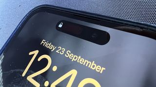
The Dynamic Island
iPhone 14 Pro Max review: features and what's new
There's a surprising amount to talk about in the new features of the iPhone 14 Pro Max. This is because there have been improvements in just about every area. Starting on the inside, there's a new A16 Bionic chip. Like the A15, this runs with a 6-core CPU, a 5-core GPU and a 16-core neutral engine but it's faster and uses less power. This is a new 4nm chip (compared to the 5nm used for the A15 and older) and only features on the new 14 Pro models – the regular iPhone 14 models still use the A15 chip.
Thanks to the more power-efficient chip, the battery life is also longer, giving up to 29 hours of video playback – an hour more than the iPhone 13 Pro Max. Apple's specs don't give any details on the size of the battery but despite the extra life, it is believed to be slightly smaller than the former, at 4,323mAh (though only by 29mAh).
There are new safety features built into the phone to help in emergency situations. The crash detection uses the phone's sensors to recognise when you are involved in a car crash and automatically contact emergency services. For more remote emergencies, the phone is also now able to connect to satellites to send your details and location using the Emergency SOS function.
On the rear of the phone, the camera array has seen significant changes with the main camera moving to a new 48MP sensor. This allows both 48MP images and superior 12MP images by combining four pixels into one. The ultra-wide camera is also new, with a larger sensor and the new Photonic is designed to better process the images.
The new Super Retina XDR display is brighter than the previous model, providing a peak brightness of 1600 nits (compared to 1200 nits on the 13 Pro Max) in HDR, and a new outdoor mode that boosts it up to 2000 nits. The screen also now has an always-on function, much like the Apple Watch, to show the clock and important widgets when in standby mode.
The last and perhaps most noticeable change is the new Dynamic Island. The housing for the front-facing camera and sensors now forms a pill-shaped cut-out in the display rather than the former notch at the top. This otherwise dead space has been incorporated into the user interface, turning the 'island' into a centre for notifications and alerts, growing and shrinking as required. It is perhaps the most impressive software solution to a hardware problem I've ever seen and is not only beautifully deployed but is actually useful.
iPhone 14 Pro Max review: design
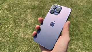
Slightly unusually for Apple, the design of the iPhone 14 Pro Max has changed very little from the 13 Pro Max, and the 12 Pro Max. Holding the three phones next to each other, the only clear differences come in the shape of that notch or Dynamic Island and the exclusive colours that each year brought (deep purple, Alpine green, Sierra blue and Pacific blue).
In previous years the iPhone has undergone a more physical change at least every two years, with the model in between often being an 's' version. I'm actually glad that Apple didn't decide to change the design this year, as I really like the current shape. The flat edges make the phone more tactile than in previous modes and the overall size and weight of the Pro Max are very satisfying and it doesn't feel unwieldily despite the 6.7-inch screen size.
In fact, the iPhone 14 Pro Max is very slightly wider, deeper and heavier than the 13 Pro Max. It is 77.6 mm or 3.05 inches wide (+0.5mm / 0.02 in), 7.85 mm or 0.31 inch deep (+0.2mm / 0.01 in) and weighs 240 grams or 8.47 ounces (+0.28g / 0.01 oz). Not that you'd notice in the hand. The added depth is actually due to a slightly larger rear camera protrusion but it's still the same width and height, so should still fit the same cases.
As with previous models, the 14 Pro Max uses a ceramic shield on the front display for strength and strengthened matte back glass, plus a colour-matched stainless steel band around the edge. It retains its IP68 rating, which gives dust, splash and water resistance down to 6 metres for up to 30 minutes. The days of worrying about dropping your phone in water are long gone – though you'd be brave to throw this phone in the water on purpose.
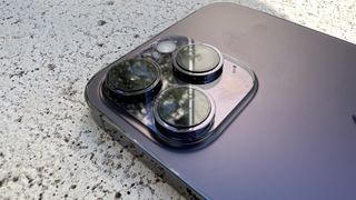
One important decision for any iPhone buyer is the colour, and the iPhone 14 Pro Max comes with four options. The black – or Space Black – is slightly darker than last year's Graphite model, while the silver (white) and gold models remain unchanged. This year's key colour is called Deep Purple, a name that I'm sure made a few old rock fans smile. It's a subtle and slightly dusty shade of purple that verges on a royale or midnight tone. It takes the right light to see the colour properly and actually the name is fitting.
One change for US iPhone users is that there is no SIM tray on US models. This means that users have to use an eSIM. Setting up an eSIM is now easy to do in the US, as it is in the UK. To change handsets you simply need to call your network operator or drop into a store and any switch over is complete within hours. For models outside of the US, the SIM tray remains, and so you still have the choice of using either physical or eSIM.
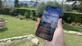
Even in bright light, the display is easy to see thanks to the 1600 nit peak brightness and 2000 nit outdoor mode.
iPhone 14 Pro Max review: display and Dynamic Island
Having previously opted for the iPhone 13 Pro over the max, the iPhone 14 Pro Max screen is noticeably larger, even if the phone doesn't look that much larger when placed side-by-side. The new screen is the same 6.7-inch size as the 13 Pro Max, though it does have a few more pixels – 18 pixels in height and 6 in width – which come thanks to the smaller space the Dynamic island takes up compared to the notch.
There are two real differences with the iPhone 14 Pro Max screen: the brightness and the always-on functionality. The peak brightness in regular HDR mode now goes up to 1600 nits, compared to the previous 1200 nits. There's also a new outdoor mode (which isn't HDR) but offers a 2000 nits brightness.
If you've ever tried to use a smartphone or laptop outside, you'll know that sometimes it can be really difficult to see. That's simply not the case with the iPhone 14 Pro Max. Even in direct sunlight, the screen was still really easy to view, even to evaluate photos and videos.
The always-on display is a function that iPhone users have wanted for a long time and the way it works on the iPhone 14 Pro Max is even more impressive than many hoped for. The ProMotion display allows for adaptive refresh rates up to 120Hz but thanks to the new A16 chip, it can go as low as 1Hz. When placed into standby mode, the lock screen image dims and the refresh rate drops right down, leaving just the clock and widgets from the new lock screen clearly visible and a very subtle image. This is similar to the Apple Watch display and works just as well here.
As Android users are quick to point out, always-on displays are nothing new, and neither is the ability to customise the clock and widgets on your lock screen. That doesn't stop them being a very welcome addition to the iPhone. The new lock screens are a massive improvement and I've very quickly got used to not having to wake my phone to see the time or my notifications. I'd be very surprised if this always-on display doesn't appear on all iPhone models next year but for now, it's yet another reason to choose the pro models.
Some users have commented that the always-on display can be a battery drain. I'll talk about battery life generally later on, but I can say that I haven't found this to be a big issue. My activity shows the lock screen accounts for around 7% of my battery life in the past week. Yes, turning the always-on feature off will save you battery, but that's the same for som many useful features.
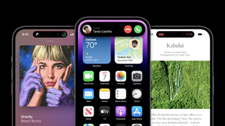
I was somewhat sceptical about the Dynamic Island when it was first announced. To me it felt like it was overcompensating for what is a very definitely punch hole in the screen. The Dynamic Island solution is a software solution to a hardware problem but it's done so elegantly that it feels purposeful.
Rather than being a static hole, the Island expands to include notifications and alerts. It grows wider to show a lock symbol or that AirPods are connected, or that music is playing – even showing a tiny version of album art. It grows into a large square when using FaceID, or a big rectangle with a FaceTime call. Small lights in the centre of the Island (between the sensors and the camera) show when the camera and microphone are being used.
The Dynamic Island becomes the place from which all phone notifications come from, like a personal assistant within the phone's UX. It feels very Apple, in that it's very graceful and feels premium to a level that many developers wouldn't bother to go to.
The true potential of the Dynamic Island is still to come though, as Apple has only recently announced the ability for developers to show their live activities in the Dynamic Island. This will mean that everything from car share arrivals to sports scores can be shown. This is much less distracting than typical notifications and means you can continue what you are doing without distraction.
iPhone 14 Pro Max review: camera and video
The cameras on the iPhone 14 Pro Max got a big boost this year, with new units in three of the four offerings. While the big number changes are on the back, the front-facing TrueDepth camera also got a boost. This now has a wider f/1.9 aperture, allowing more light onto the sensor and, for the first time, autofocus. The results are sharper and more detailed. This stands out even more when using Portrait mode.
On the rear, the main camera has been upgraded to a 48MP sensor, from the 12MP models we've seen on iPhones since the iPhone 6S. Of course, 48MP still isn't huge by smartphone standards – there are plenty of 50MP sensors out there, as well as some now topping 100MP – but it's not just the number of pixels that counts.
The new main camera sensor is 65% larger than that on the iPhone 13 Pro (Max). The 12MP sensor on the 13 Pro was a 1/1.65in sensor, with each pixel at 1.9µm. The new 48MP sensor is a 1/1.28in sensor, with each pixel at 1.22µm. This is a physically bigger sensor than the 108MP sensor on the Samsung S22 Ultra and the 50MP sensor on the Google 6 Pro.
Apple also acknowledges that most images don't need to be much larger than 12MP (as most will only ever be viewed on a screen). So for normal shooting, it groups the pixels into fours, producing a 12MP image from the 48MP sensor. The advantage of this is that you have four times the data for each pixel, so you get more accurate colour and detail.
The aperture on the new main camera isn't quite as wide, at f/1.78 (previously f/1.5) but with the added sensor size, this shouldn't be noticeable. It's also fractionally wider, with an equivalent focal length of 24mm compared with a previous 26mm.
The ultra-wide camera is also new. While this still has a 12MP, the sensor is now a 1/2.55in (compared to 1/3.5in), which is around twice the size. This means each of the pixels is larger, resulting in great colour and detail. This still has a 13mm equivalent focal length (120-degree field of view). Like the main camera, its aperture is also a little smaller at f/2.2 rather than f.1.8, however, due to the larger sensor, the effect is negligible.
The third camera on the rear – the telephoto – remains unchanged from the iPhone 13 Pro Max. This is still a 1/3.5in 12MP sensor with an f/2.8 aperture and a 77mm equivalent focal length. Due to the new Photonic engine, the results are expected to be 2x better from this camera too – though as should the cameras on any iPhone upgraded to iOS 16.
With the 48MP sensor on the main camera, it is able to offer a fourth focal length, using a 12MP cropped-in area. This is a 2x zoom, equivalent to around a 48mm focal length – a focal length popular with many portrait photographers.
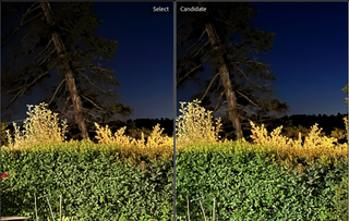
The iPhone 14 Pro Max (left) holds more detail in night shots than the iPhone 13 Pro (right).
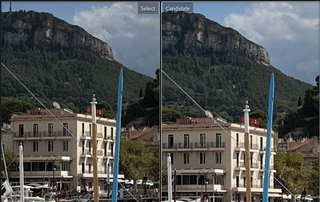
iPhone 14 Pro Max (left) showing increased detail over the iPhone 13 Pro (right).
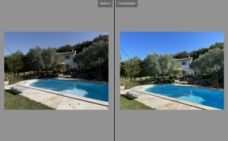
The RAW DNG file (left) retains more image data and appears flatter than the JPEG (right), which makes it better for editing.
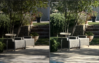
The close crop shows more detail in the 48MP RAW file (left) than the 12MP JPEG (right)
The new camera system is really impressive, so to give the results some context, I compared a few images with identical ones taken on the iPhone 13 Pro (which has the same camera as the 13 Pro Max). Even with iOS 16 on the 13 Pro, the night shots taken on the iPhone 14 Pro Max looked better. However, in daylight when shooting in 12MP JPEG using the main camera, the differences are harder to spot.
Where the main camera really comes into its own is in the 48MP RAW mode. Here you can see the extra detail that resolution gives very clearly. When downloaded to a computer, these files have much more room for adjustment too, as they retain more detail. A word of warning though, each 48MP DNG RAW file is between 90-100MB each (compared to 4-5MB for the JPEG files), so saving these will quickly fill your phone.
Portrait shots look really good both using the rear and the front cameras, and the Portrait mode, which intelligently blurs the background really helps to make the subject stand out.
Though I questioned the use of the sensor crop to provide an additional focal length, it's actually a very effective tool. As this isn't a digital crop, the results at the 48mm or 2x magnification, look just as good as the other focal lengths.
I did expect to see an increase in noise with the increase in resolution but even in the RAW files, this seems to be very well controlled. The JPEG processing (in standard settings) produces a punchy but balanced image that maintains all the highlights and shadows, even in tricky conditions – the Photonic engine is certainly working well. The only giveaway that the images aren't taken with a dedicated camera is in the natural out-of-focus areas, which can look a little muddy, compared to the natural bokeh of a premium DSLR lens, for instance.

The various focal lengths now available on the iPhone 14 Pro Max, clockwise from top left: 3x (77mm), 2x (48mm), 1x (24mm), 0.5x (13mm).
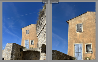
The 1x (left) and 2x (right) focal length options on the main camera.

The ultra-wide camera is great for dynamic portraits
For video, there are some more improvements on the iPhone 14 Pro Max. Not only does the 4K video take advantage of the new 48MP sensor on the main camera, and the larger ultra-wide sensor, but there's a new second-generation optical image stabilisation system on the main camera, for better stability plus a new Action Mode that goes one step further.
Action mode uses the full area of the sensor to provide digital stabilisation. As the shooting resolution is a maximum of 2.8k (2816x1584) there's lots of space around the image on the sensor, allowing it to compensate for any movement. The result is a much smoother video that seems to glide as you walk with the camera.
To really try this out, I ran around a small village both with and without the Action Mode turned on. The difference in the footage, which you can see below, is huge. Even when running up and downhill with the phone in my hand, the footage stays really level. It's as if I was using a gimbal.
Another big improvement is that the Cinematic Mode now able to in 4K at 30fps or 24fps. Previously limited to 1080P, the cinematic mode gives you much greater control over focusing (like a Portrait mode for video) and allows you to easily switch focus between people in the shot, either automatically, manually or while editing.
For pro shooters, there's still the option to record in ProRes format, in 4K at 30fps or 1080P at 60fps. Like the DNG RAW format for photos, the ProRes video format maintains all the image data making it better for editing but produces huge file sizes, so is best avoided for casual clips.
iPhone 14 Pro Max review: performance and battery
The iPhone 14 Pro Max (and the 14 Pro) use Apple's latest A16 chip. This is not only a progression from the A15 but is actually brand new architecture, being a 4nm rather than a 5nm chip as the previous models.
The new A16 Bionic chip has 50% more memory bandwidth than the A15 and is 10% faster, and yet uses less power. To gauge what this means, I ran the Geekbench 5 reports on the 14 Pro Max and got a CPU multi-core score of 5490 and a GPU metal score of 15374. These are significant improvements on the average 4675 / 14203 of the iPhone 13 Pro Max.
The new chip is also what makes the always-on display possible, allowing the refresh rate to drop as low as 1Hz, as well as the slick motion that runs as part of the new Dynamic Island. This year, with the iPhone 14 and 14 Plus not getting the new A16 chip, it makes the Pro models even more appealing.
Though the battery is more power efficient, it also has more demands on it. The always-on display, while low on power use, still requires some input and the animation behind the Dynamic Island must make some extra demand on usage. However, the iPhone 14 Pro Max battery remains impressive.
In the first few days of heavy usage, I was seeing around 27 hours of battery on a single charge. I then ran the Google Translate app, performing a live translation of French into English for a solid two and a half hours and still had around 40% charge at the end of it. Now I'm finding that under normal conditions I have around 50% charge still left at the end of the day, which is very similar to the iPhone 13 Pro Max. I suspect it would go a full 48 hours, and that's while still using the always-on display and background updates.
Of course, if you really wanted to save battery, you can turn off the background activity and the always-on display, and reduce the screen brightness. This is likely to save you at least 20-30% of the battery, or another half a day. Unless you are in the middle of nowhere, this feels unnecessary though and removes a lot of the enjoyment from this phone.
iPhone 14 Pro Max review: verdict
At first glance, the iPhone 14 Pro Max might not look like much of an update but under the skin, this is a hugely improved device. It contains three main updates that even alone would be a reason to upgrade. The always-on display, while by no means a revolution, is extremely pleasing. The Dynamic Island functions beautifully and is likely to be even more useful as apps incorporate their live activities.
Finally, the camera updates are some of the biggest yet. The 48MP main camera is really impressive, not just for stills but also for video with the inclusion of the Action Mode stabilisation. If you want the ultimate iPhone, this is it.
iPhone 12 Pro / Pro Max users will see a big change when upgrading here, and due to the features mentioned above, I feel iPhone 13 Pro Max users will too.
As with the iPhone 13 Pro and Pro Max, the only difference lies in the screen and battery size. This means that while the Pro Max offers the very best of everything, the more pocketable (and hand-friendly) iPhone 14 Pro may be more suitable for some. Having used the Pro Max for just over a week now though, I'm not sure I'd want to go back to a 6.1-inch display.
iPhone 14 Pro Max review: also consider
The natural alternative to the iPhone 14 Pro Max has to be the iPhone 14 Pro. It's essentially the same phone, with a smaller screen and a slightly smaller battery. The advantage is it fits slightly nicer in your hand and costs £100 / $100 / AU$150 less. However, you do have to live with the fact that there's a slightly better model out there in the Max.
The really interesting option this year though is the iPhone 14 Plus. This phone promises the same 6.7-inch size screen as the 14 Pro Max (though without ProMotion or always-on). While I will miss the iPhone mini option, I feel that the iPhone 14 Plus will be an extremely popular choice, especially considering its much lower price.
Sign up to the T3 newsletter for smarter living straight to your inbox
Get all the latest news, reviews, deals and buying guides on gorgeous tech, home and active products from the T3 experts
As T3's Editor-in-Chief, Mat Gallagher has his finger on the pulse for the latest advances in technology. He has written about technology since 2003 and after stints in Beijing, Hong Kong and Chicago is now based in the UK. He’s a true lover of gadgets, but especially anything that involves cameras, Apple, electric cars, musical instruments or travel.
-
 The travel gadget I won't leave home without just got an upgrade in the AirFly Pro 2
As a frequent flyer, Twelve South's AirFly products are invaluable to me for wire-free listening with my own headphones
By Mike Lowe Published
-
 Nespresso adds a pretty pop of pink to its Vertuo line – and it's perfect for spring
Get ready to add a splash of colour to your coffee routine
By Lizzie Wilmot Published
-
 Apple TV+ won the sci-fi battle, now The Studio is winning the comedy fight too
Seth Rogen's Apple TV+ comedy, The Studio, is off to a hot start
By Mike Lowe Published
