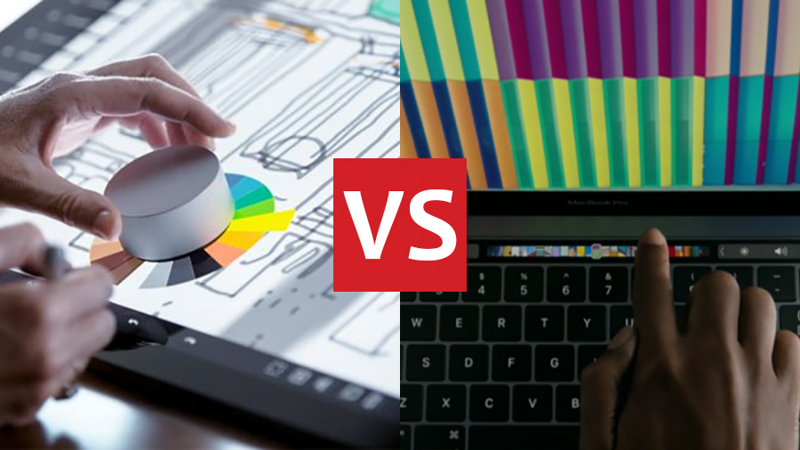

Microsoft and Apple both have new laptops on show and both have a rather special add-on too: the versatile Surface Dial in Microsoft's case and the Touch Bar extension that now sits above the keyboard and trackpad on the higher-end 2016 MacBook Pros models.
There's a lot more to the new Surfaces and MacBook Pros than these accessories, of course, but with both these innovations appearing at almost the same time they give us a useful way of comparing just how forward-thinking these two tech giants are right now.
Microsoft and Apple's new hardware
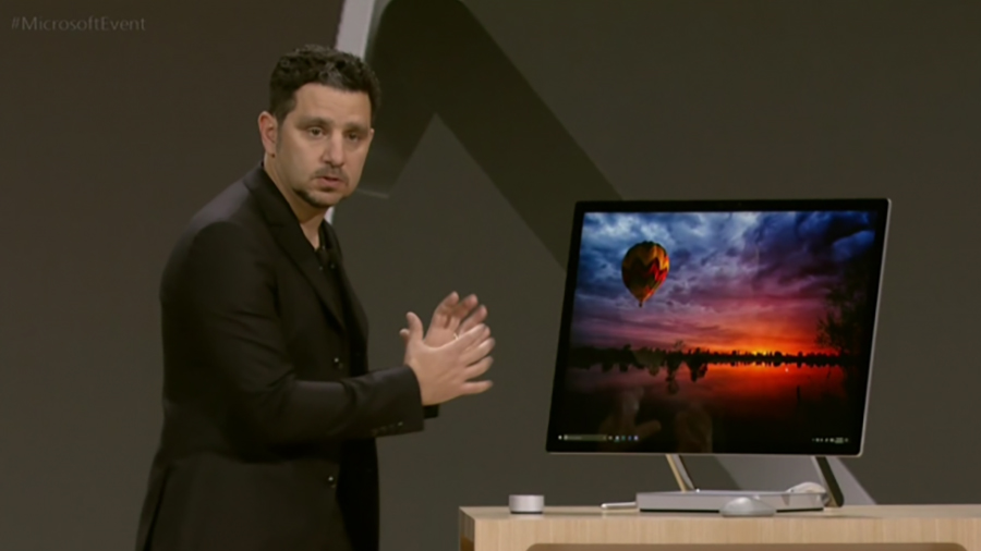
How fast and how well Microsoft and Apple are innovating isn't just down to the Surface Dial and the Touch Bar, but they're useful points of reference: both new add-ons designed to kickstart fresh interest in the traditional computer form factor.
It's perhaps no coincidence that Apple and Microsoft both announced product refreshes within two days of each other - Apple has obviously been at the hardware game for a lot longer, but the Surface Pros and Surface Books and Surface Studios that Microsoft now has are going to become increasingly important to the company in the future.
The Touch Bar was part of a long-overdue update to the MacBook Pro line - faster processors, a thinner and lighter design, and support for Touch ID (thanks to the Touch Bar, of which more in a moment).
Meanwhile, over in Microsoft's part of the world, it gave us a new Surface Studio and an updated Surface Book, with more power and better battery life. Microsoft also showed off a new peripheral called the Surface Dial, which will work with the Studio, Surface Pro 4, and Surface Books.
What is the Surface Dial?
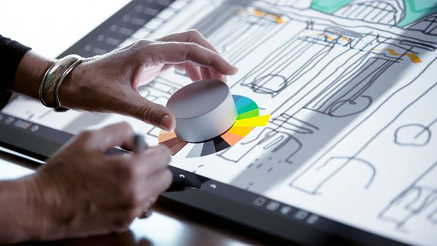
The puck-shaped, Bluetooth-enabled Surface Dial drops on top of a Surface Studio, Surface Pro 4 or Surface Book touchscreen and brings up a variety of context-sensitive options depending on the application running underneath.
Sign up to the T3 newsletter for smarter living straight to your inbox
Get all the latest news, reviews, deals and buying guides on gorgeous tech, home and active products from the T3 experts
One of the example uses Microsoft has showed off was a digital artist using the Surface Dial to bring up a colour palette, changing the brush colour without having to open up a menu or select it using the Surface Pen.
Like the Touch Bar, though, it's still early days for the Surface Dial - it can be used to do pretty much anything app developers want to do with it, but we might not see a lot of integrations straight away.
You can also use the Surface Dial on a desktop to twist settings like volume or brightness or playback speed up and down. Again, it depends what developers have planned.
The Surface Dial comes as a separate accessory which will set you back $99, and pre-orders are now open. As yet there's no word on a UK release date or price, but that works out at roughly £81.
What is the Touch Bar?
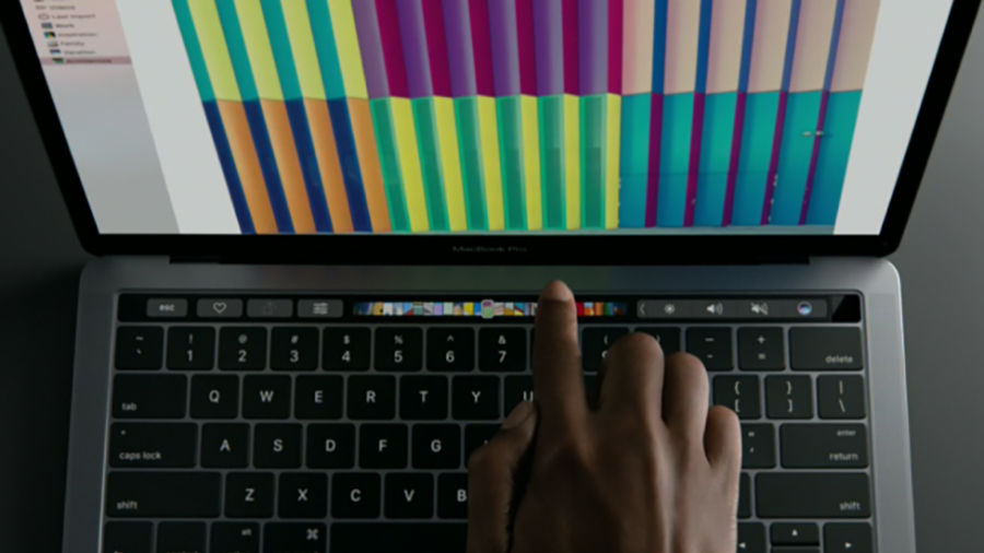
The Touch Bar is an integrated accessory - you get it with the newest 15-inch MacBook Pros and as an option on the newest 13-inch models too.
Like the Surface Dial, its uses can change depending on the application on screen, and in fact some of the use cases are the same: quickly flicking through a series of photos, for example, or adjusting the volume with a tap in applications like Spotify.
Developers digging deeper into the new Touch Bar code have found it's basically an adapted Apple Watch system, allowing you to drop in emojis or select sections of a video clip. Touch ID integration is included too for unlocking your Mac with a finger press.
As with the Surface Dial, it's up to those coding the applications to decide exactly how it's used (though Apple has issued guidelines, as you would expect).
Microsoft has already been showing off some ideas about how the Touch Bar will work with Office: you get shortcuts to text formatting options, PowerPoint presentation controls, Excel formulas and more.
It looks the part too - Apple has done a good job of integrating the Touch Bar unobtrusively in the overall keyboard layout.
Surface Dial vs Touch Bar
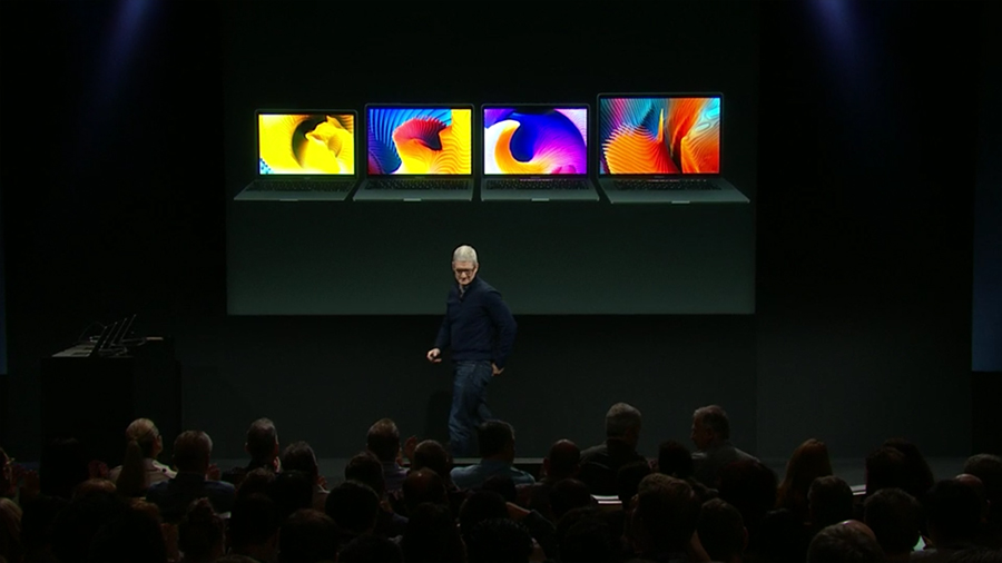
To give credit to Microsoft and Apple, both the Surface Dial and the Touch Bar are stylish-looking bits of kit that are sure to appeal to many a laptop user in the coming years, irrespective of their choice of OS.
The Surface Dial - being an external accessory - is more flexible and looks to have more potential with its ability to dial up and down and click (and double-click). We think it's going to really change the way some people use their computers, but it might not appeal to many outside the creative industries.
The Touch Bar is perhaps less exciting but more useful to the average MacBook Pro user. It's a more conventional idea (keyboard buttons you can reprogram) but that also makes it more handy in all of the apps you're going to be using day to day, even if you're not in graphic design or a similar job.
Ultimately the onus is on the developers to show us what the Surface Dial and Touch Bar can do - and how innovative they really can be - but we're looking forward to giving them both a whirl in the years ahead.
Dave has over 20 years' experience in the tech journalism industry, covering hardware and software across mobile, computing, smart home, home entertainment, wearables, gaming and the web – you can find his writing online, in print, and even in the occasional scientific paper, across major tech titles like T3, TechRadar, Gizmodo and Wired. Outside of work, he enjoys long walks in the countryside, skiing down mountains, watching football matches (as long as his team is winning) and keeping up with the latest movies.
-
 Driven to distraction: the ultimate luxury cars to sit in the back of
When you’re being driven rather than driving, these are the cars that will let you arrive in style
By Mat Gallagher Published
-
 I tested every new Tudor at Watches and Wonders – my favourite caught me by surprise
The Rolex sister brand had a lot to offer
By Sam Cross Published