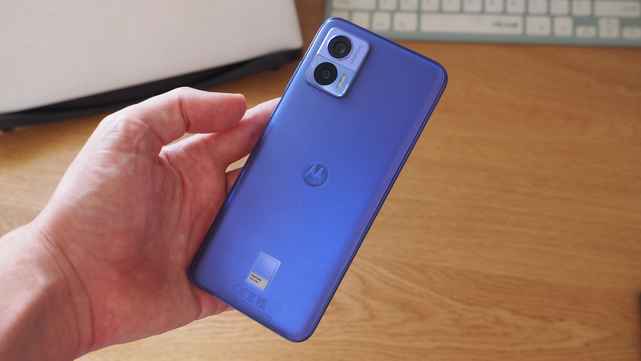
When it comes to buying a new phone it's often a case of picking a black slab. Or maybe grey. It might be a very nice-looking black-or-grey slab, granted, but uninspiring nonetheless. Motorola clearly wants to change that, as the company has just announced an exclusive Pantone partnership to bring exciting new colours to its future devices.
That alliance starts with the Moto Edge Neo, pictured above in its Pantone Very Peri finish. That, by the way, is 'Pantone Color of the Year 2022', because Motorola wants to be as on trend as possible – and identifying current and future colour trends and palettes is a big part of what Pantone does as a company.
I think that for a phone such as the Edge Neo, which is relatively low-end priced at £349.99 (check out T3's best budget phones guide here), that the Pantone Very Peri finish is everything: it's a point of difference, an attractive finish that you won't find anywhere else (except, perhaps, for future Motorola phones) given the ongoing deal between the two companies.
Moto + Pantone: So what's the hitch?
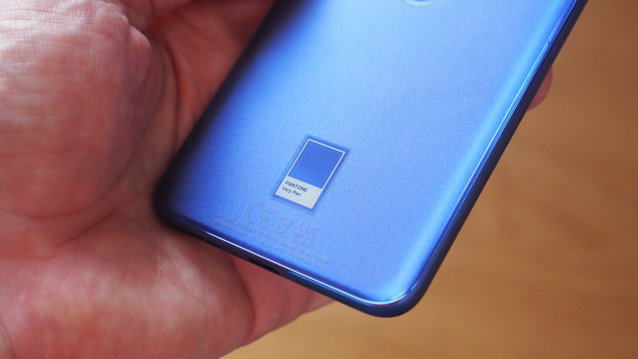
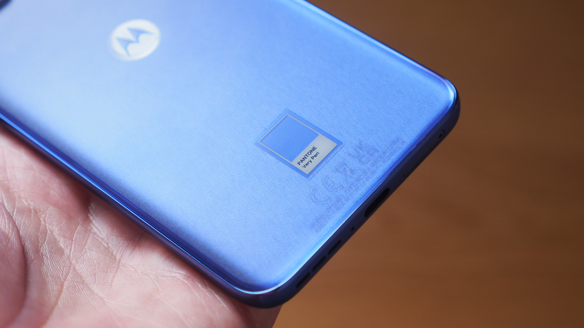
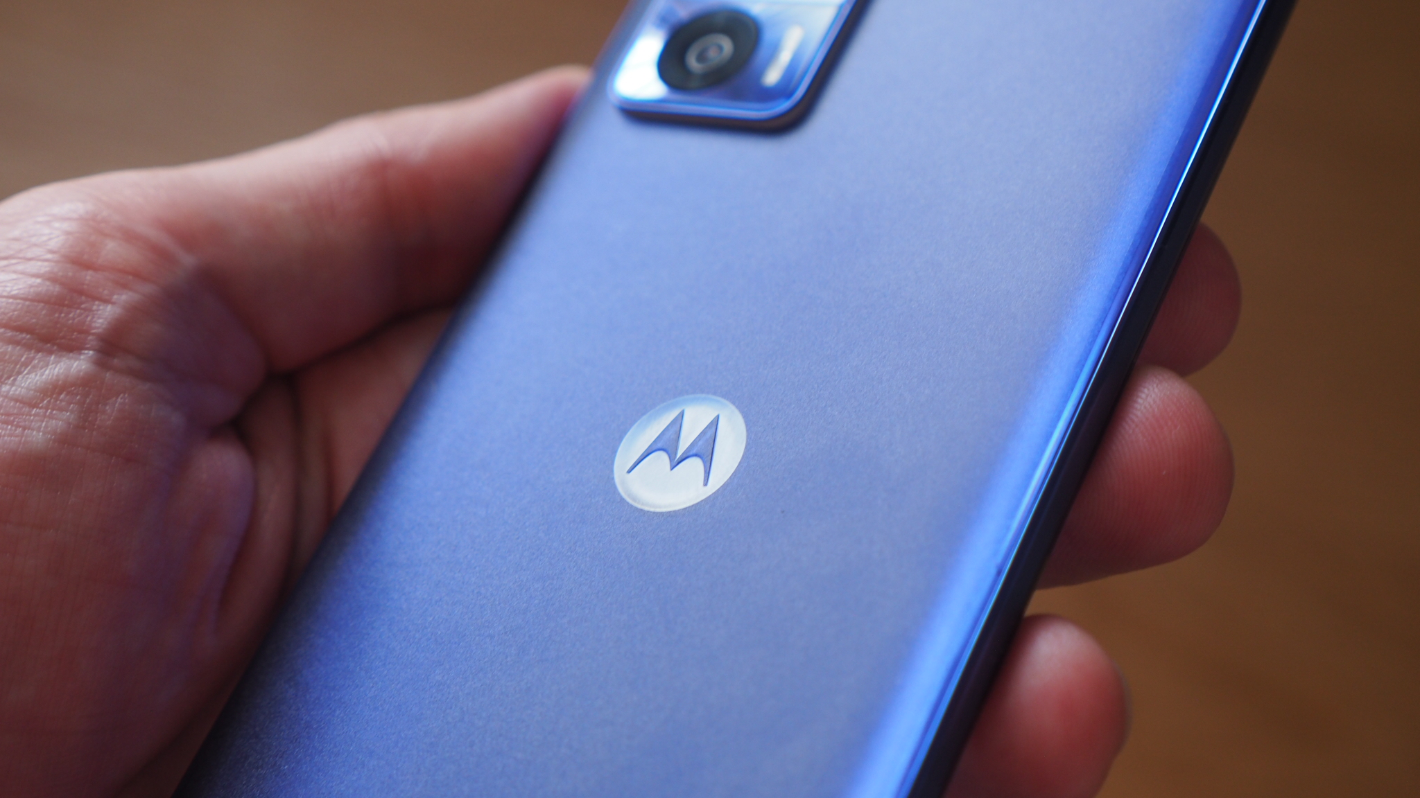
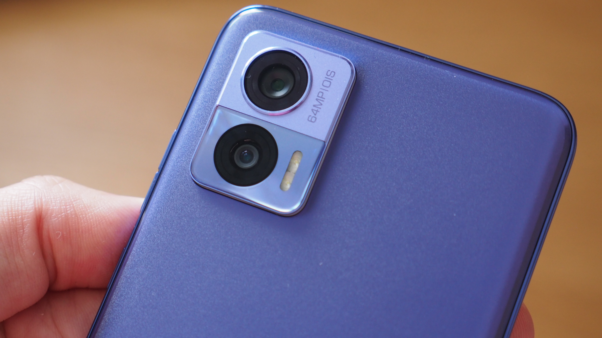
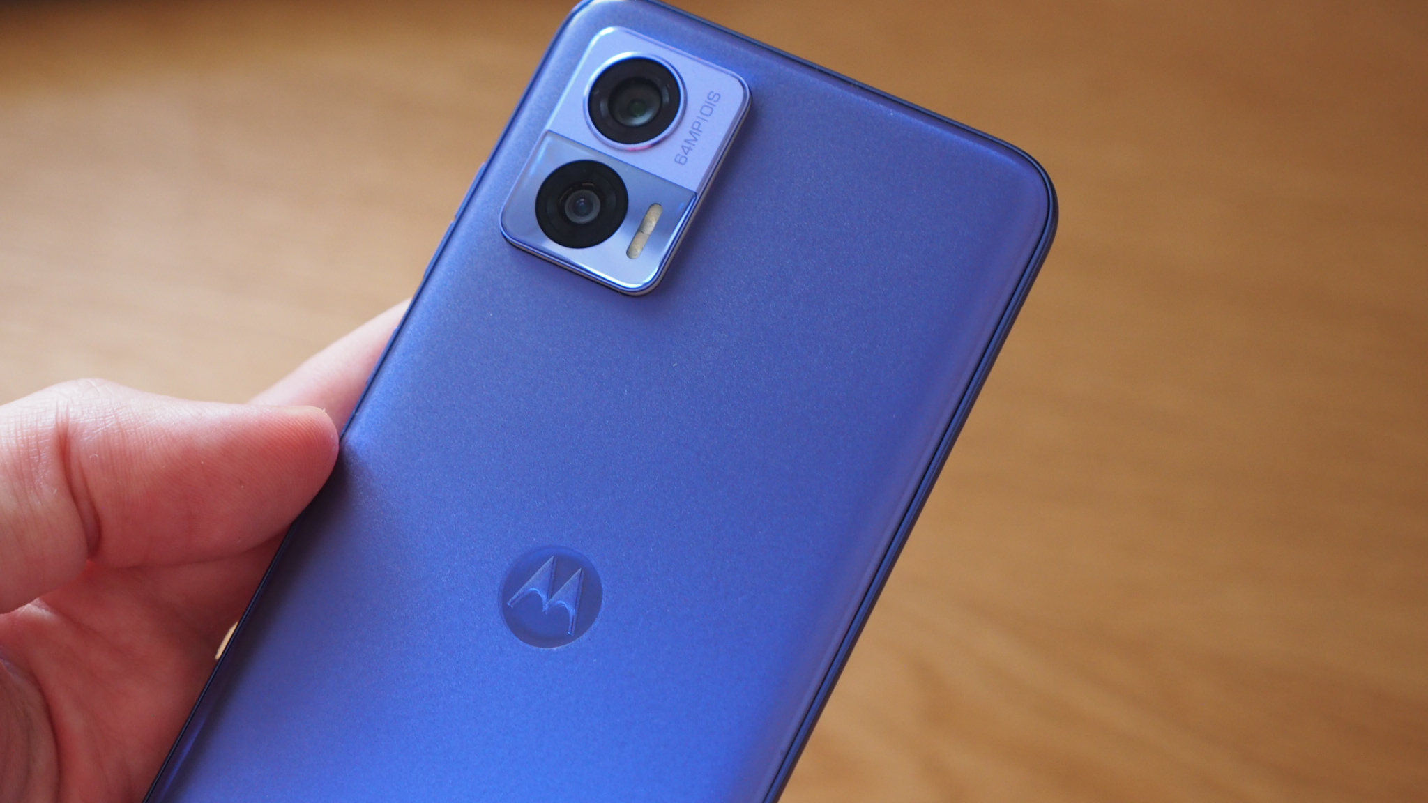
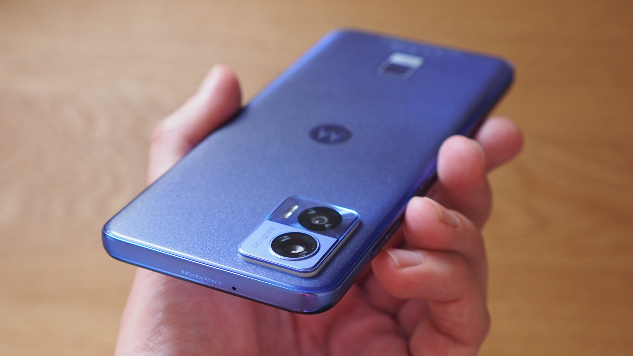
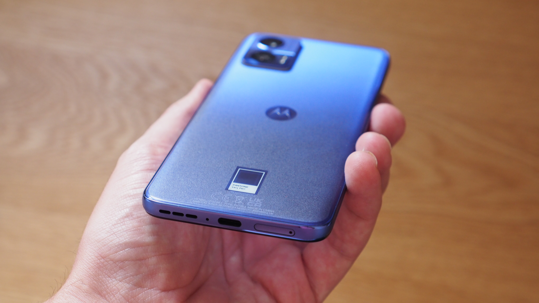
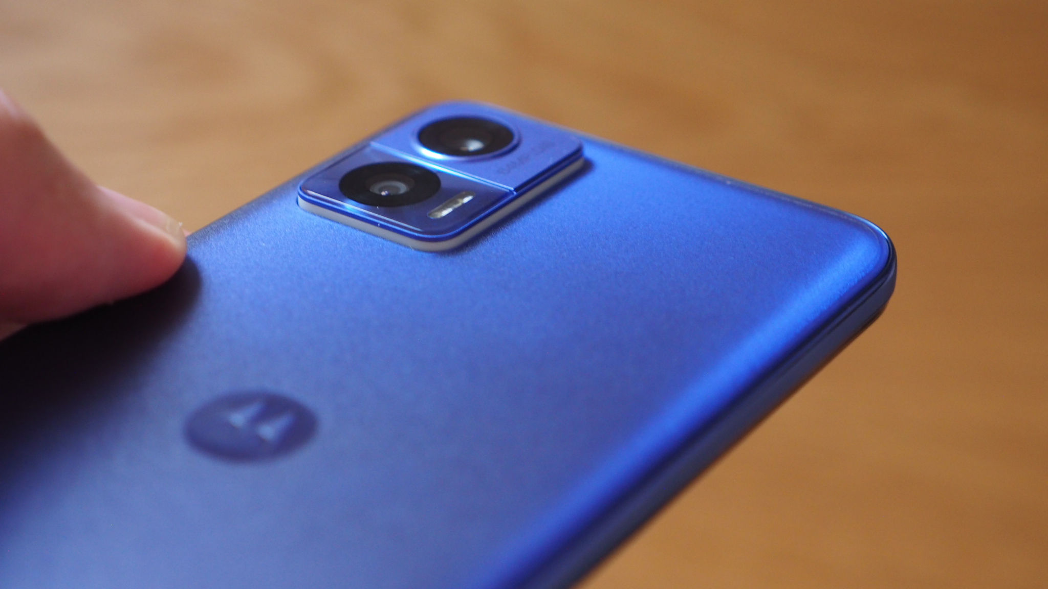
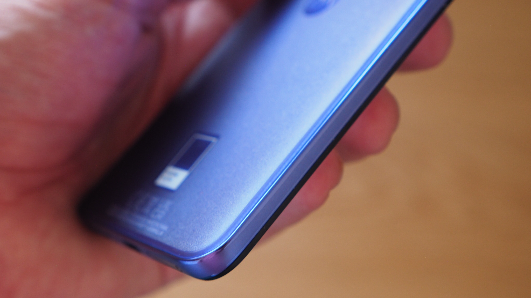
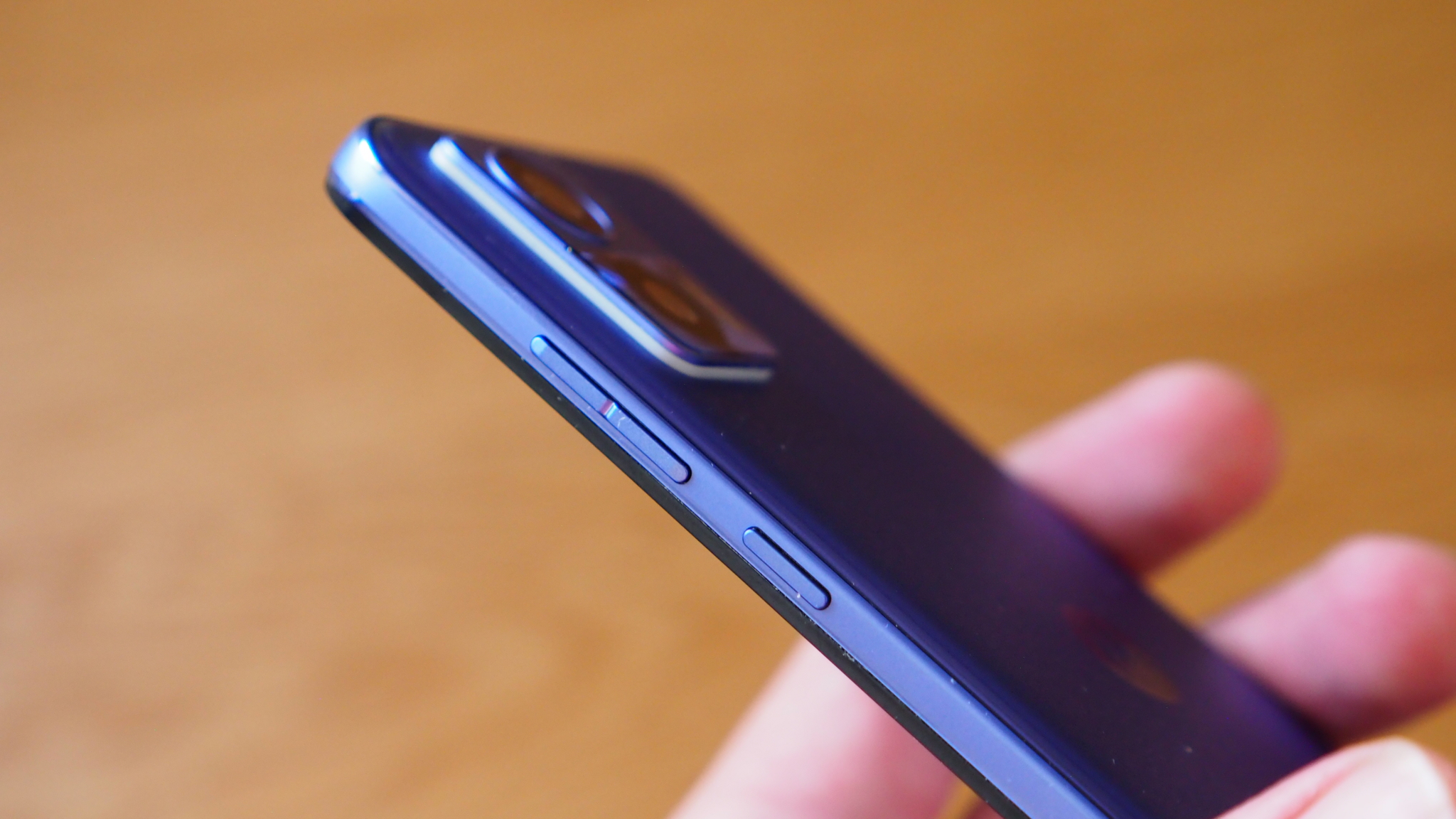
But much as I love the purple colour and the way it reflects in the light, I have one big problem with a specific detail – why is there a Pantone emblem on the rear of the phone? It looks like a sticker, but I can assure you it is not, it's baked into the phone as part of its identity. Check out my gallery of images above.
When I queried Motorola officials on this very point, i.e. whether it was a Pantone stipulation to require its branding to appear in such a way, the answer was quite the opposite: Motorola has chosen to take on the Pantone branding, in this sticker-alike format, and include it as part of the design. At least that's the case for the Edge Neo, it may change for future handsets.
Perhaps it's just me, maybe others will love the Pantone emblem on the rear, but to me Pantone is a colour company, not a fashion label. The colour should therefore do the talking, not the company name. If I went shopping for a Farrow & Ball paint, looking for a high-end finish to stand out, I wouldn't finish painting a wall in my house and then stick the paint can's frontage pride of place afterwards.
It's also not the first time the world has seen a Pantone collaboration with a mobile phone maker: Huawei famously had a tie-in way back in 2017, when 'Color of the Year' was Greenery. And, yes, the Huawei P10 in this finish did look like something you might cough up during a bout of unwanted illness.
Get all the latest news, reviews, deals and buying guides on gorgeous tech, home and active products from the T3 experts
Fortunately, insofar, Motorola's collaboration with Pantone and the use of Very Peri is far more favourable – although it's exclusive to Currys and Carphone Warehouse in the UK. I think this colour is everything on the Edge Neo, save for that one outlined design detail. Here's looking forward to more in the future though.

Mike is T3's Tech Editor. He's been writing about consumer technology for 15 years and his beat covers phones – of which he's seen hundreds of handsets over the years – laptops, gaming, TV & audio, and more. There's little consumer tech he's not had a hand at trying, and with extensive commissioning and editing experience, he knows the industry inside out. As the former Reviews Editor at Pocket-lint for 10 years where he furthered his knowledge and expertise, whilst writing about literally thousands of products, he's also provided work for publications such as Wired, The Guardian, Metro, and more.
