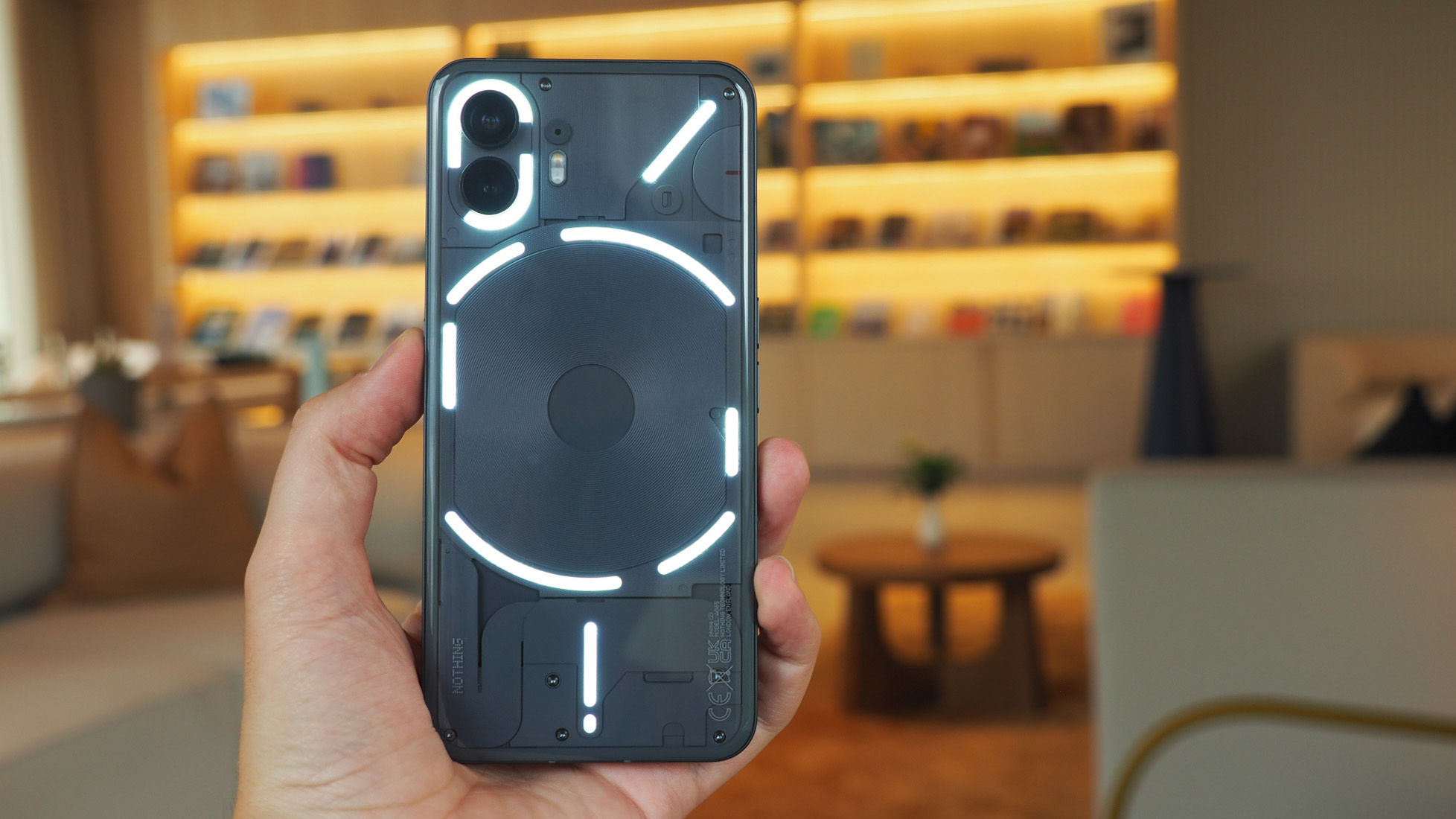
It's official: the Nothing Phone (2) has been revealed in full. Well, it kind of already was, really, wasn't it? In the run-up to Nothing's launch event we've had the full design shown off, results from the new camera setup displayed over social media, and the full specs shebang revealed ahead of time.
However, I've been using the Nothing Phone (2) for almost two weeks, but due to various bits of paper I've signed I'm not allowed to actually review the handset (yet). Nonetheless, given how excited I am about this device and the fun angles it takes compared to the best Android phones competition, I wanted to highlight three unique features in the new Nothing Phone that I already can't help but wax lyrical about.
I'm talking about the kind of features that have really grabbed me, not the battery capacity increase over the Nothing Phone (1), for example, nor the boost to power with the Snapdragon 8+ Gen 1 processor, but rather the advances in Glyph lighting, customisation and individualisation options, and the advancement in Nothing's stylised software.
1. Dynamic LED lighting
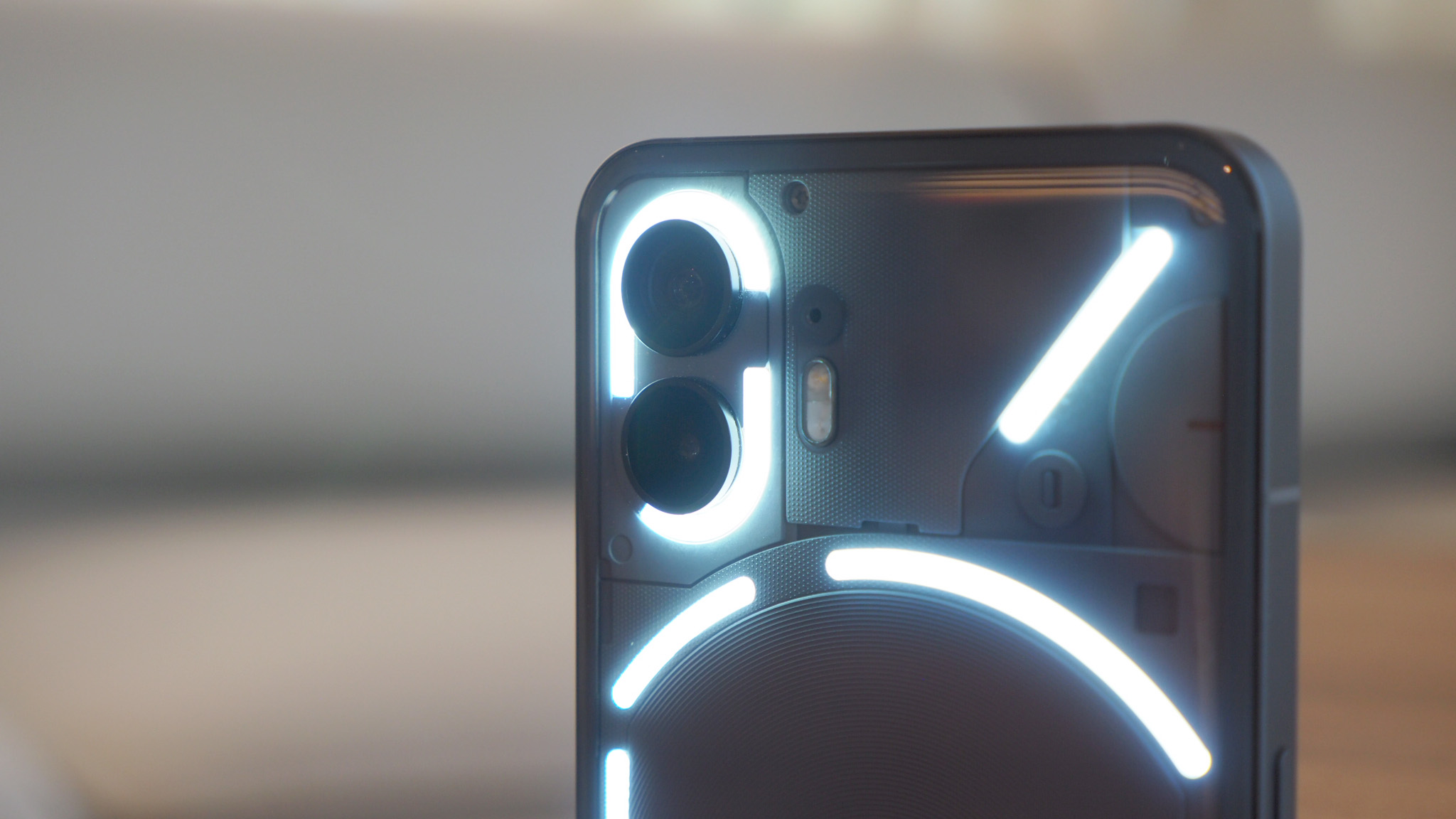
For those who know the Nothing Phone (1), you'll be well aware that its most unique proposition is its Glyph lighting on the rear of the device. That returns for the Nothing Phone (2), but it's oh so much more advanced.
The critical difference between the original and new device is that Phone (2) has a dynamic LED section (the Glyph to the upper part of the wireless charging coil). This means rather than just being off or on, it can dynamically adapt.
Why's that useful? It can do a number of cool things. Firstly, if you set a timer, the light bar will illuminate and then deplete (from right to left) for the duration of your countdown, removing the need to look at your phone's screen. But, even more potentially practical than that, is a feature called Glyph Progress, which uses the same theory but can tie-in with third-party apps – at this stage only Uber, but you can see the progress of your Uber to your destination without looking at the app or on-screen notifications.
2. Compose your own Glyphs
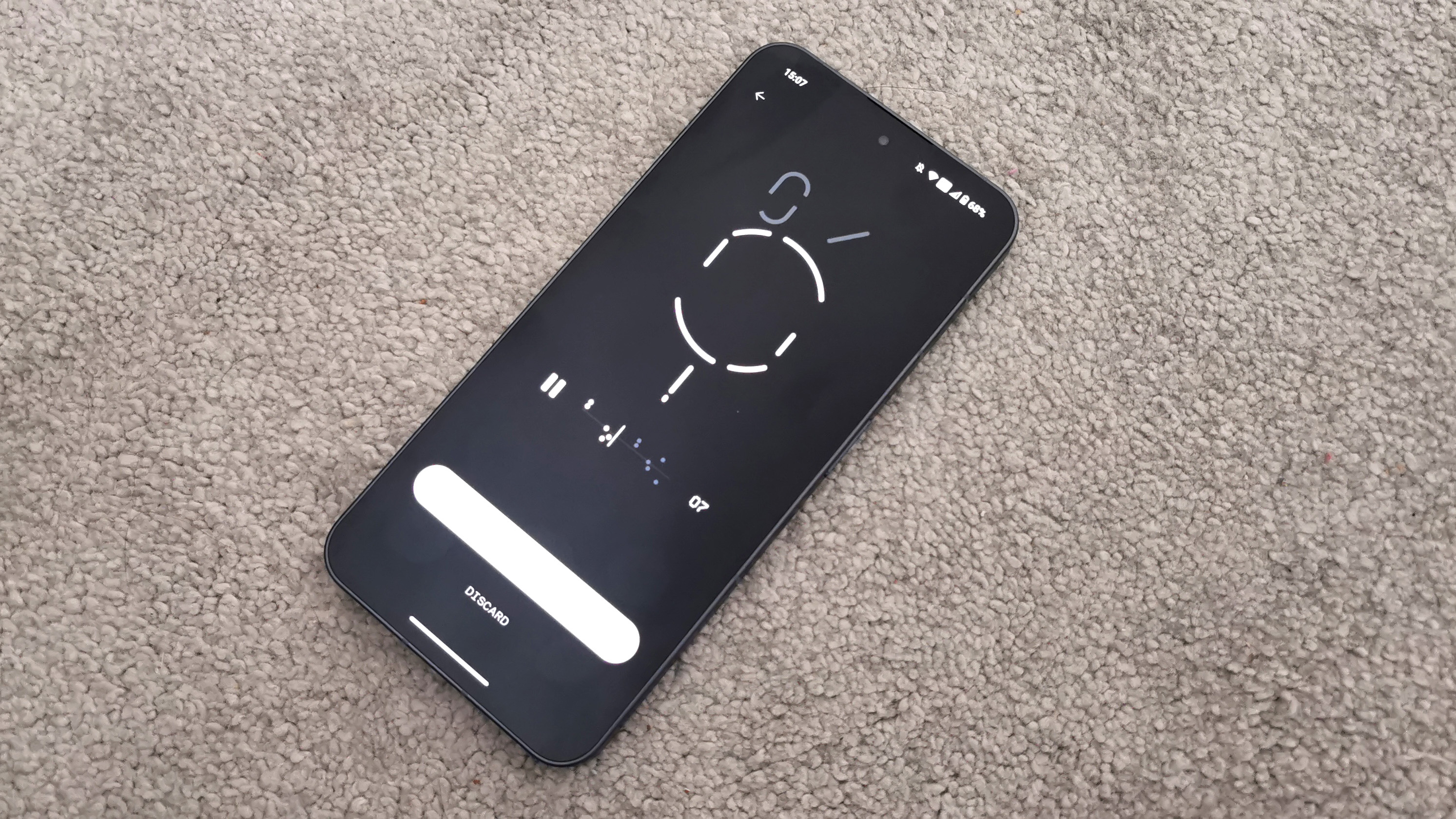
Of course Glyphs can do all that fun new stuff above, but are also able to flash in sequences to give you specific alerts related to, say, app notifications, even certain people in your contacts. While the original Nothing Phone (1) had five LED panels in four distinct sections, the Nothing Phone (2) ups the game to 11 LEDs in the same four sections. It's therefore more complex, despite looking similar, and even has dynamic brightness automation if you switch it on.
Sign up to the T3 newsletter for smarter living straight to your inbox
Get all the latest news, reviews, deals and buying guides on gorgeous tech, home and active products from the T3 experts
Making the most of those features in my view is the all-new Glyph Composer, which allows you to make miniature live musical compositions using pre-loaded sound packs. Compose your own alarm. Compose your own unique ringtone. Or just compose by messing around because it's weirdly fun. There are even artist tie-ins, such as the forthcoming Swedish House Mafia pack. I can't review how it works just yet, but check out the embedded Tweet below for a preview of the functionality:
Nothing x Swedish House Mafia@swedishousemfia have composed an exclusive Glyph Sound Pack for Phone (2), giving you a taste of what's coming up.With the new Glyph Composer, you can personalise and remix Swedish House Mafia's custom sounds. Tap the pads to trigger different… pic.twitter.com/ODbtj04AAmJune 26, 2023
3. Customisable interface like no other
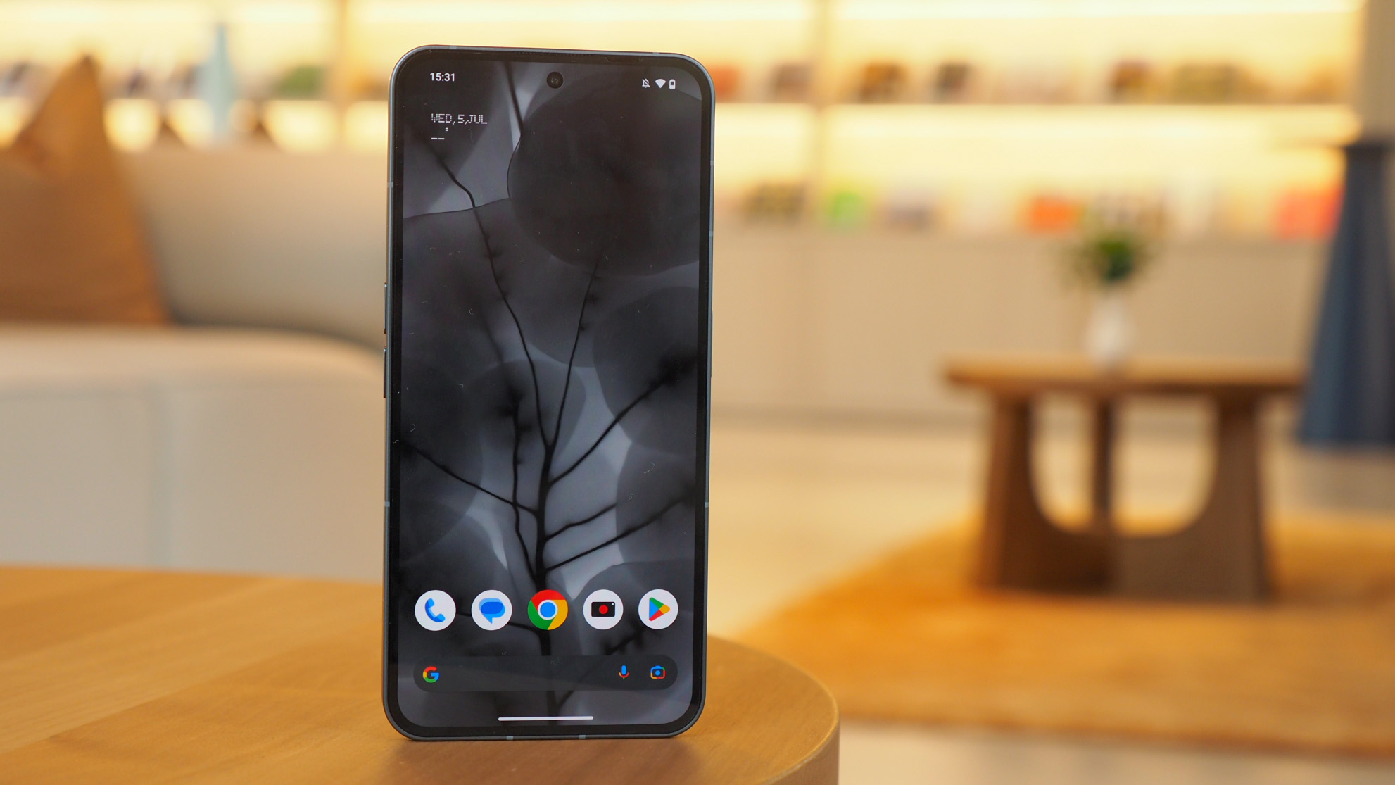
Lastly, I think that Nothing OS 2.0 – which is the company's reskin of Google's Android 13 – adds a heap of distinction that sets the Nothing Phone (2) apart from its most obvious Android phones competition.
The features I find most compelling here are a full black-and-white icon pack which turns app icons into super-reductive visuals. You can also remove app labels, so there's no abundance of text on screen, making for a further reductive visual. The dot-matrix-style for widgets is also really eye-catching.
All of this just really brings the visual sense together for the way the Nothing Phone (2) looks from its distinctive see-through rear, right through to the way the software matches on the screen. It's like nothing else I've ever seen – which is entirely the point.

Mike is T3's Tech Editor. He's been writing about consumer technology for 15 years and his beat covers phones – of which he's seen hundreds of handsets over the years – laptops, gaming, TV & audio, and more. There's little consumer tech he's not had a hand at trying, and with extensive commissioning and editing experience, he knows the industry inside out. As the former Reviews Editor at Pocket-lint for 10 years where he furthered his knowledge and expertise, whilst writing about literally thousands of products, he's also provided work for publications such as Wired, The Guardian, Metro, and more.
-
 Google's Pixel 9a does one simple thing that could tempt me away from iPhones after a decade
Google's played a blinder here
By Max Freeman-Mills Published
-
 Samsung's foldables get Android 15 (One UI 7) at last, but there's a catch
You might have to wait a bit longer for the full release
By Chris Hall Published
-
 Honor suddenly adds Samsung-rivalling upgrade that'll last for years
It's a big change, and a welcome one
By Max Freeman-Mills Published
-
 Your older Samsung phone could finally get Android 15 on these dates
You could get a significant upgrade in the coming months
By Sam Cross Published
-
 Photoshop's getting a surprise free upgrade on iPhone – and Android's next
The full experience is coming to mobile
By Max Freeman-Mills Published
-
 You can now use a Samsung Galaxy SmartTag with any Android phone, but there's a catch
There's a clever way to get your Galaxy Tag working on other Android phones
By Chris Hall Published
-
 Here's when Android 16 will be officially detailed – Google I/O 25 date revealed
We're soon going to know a lot more about Google's plans as I/O 2025 is announced
By Chris Hall Published
-
 This Android phone is more Kindle than Pixel, and that's intriguing
Bigme's E Ink Android handset is a very different kind of budget phone
By Britta O'Boyle Published
