Nothing Phone (2) review: everything you could want and more
The Nothing Phone sequel is a sensation that gets the basics right and adds a dollop of fun along the way too

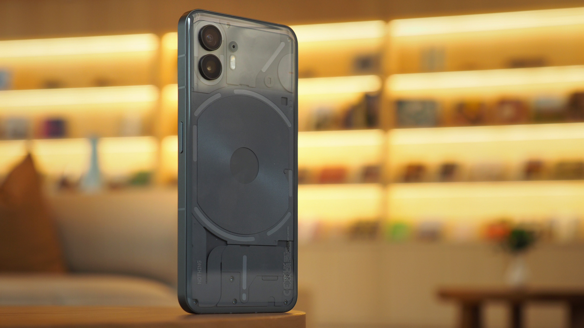
The Nothing Phone (2) impresses threefold: first it's so comfortable to hold and use, with a distinctive design; two, the improvements to everyday essentials, such as battery life and screen quality, are a real mark of quality; third, it adds a dollop of fun on top all of that, with features such as Glyph lights not just being a throwaway gimmick. Sure, it's pricier than its predecessor, but I think it's worth it and, for me, this is a rare moment of unexpected Android phone joy.
-
+
Refined & lightweight design with unique aesthetic
-
+
Distinctive software visuals & features
-
+
Glyph lights aren't just a gimmick
-
+
Strong performance & battery life
-
-
Cameras won't outsmart Google Pixel
-
-
Glyph lights won't be for everyone
-
-
Price jump over original Phone (1)
Why you can trust T3
When Nothing was first introduced, as the plucky London-based upstart, I was originally left scratching my head a little: could a newcomer really succeed in this bustling consumer electronics market? Early signs were so-so from my point of view, too, delivering what I saw as curious design ideas in the Nothing Ear (1), and a fun-but-not-quite-there mobile handset in the Nothing Phone (1).
But my oh my has Nothing doubled down in the last year, pouring mass resources into its software and, as I'll get to in this Nothing Phone (2) review, upping its hardware game too. I also have to give a nod to the excellent Nothing Ear (2) that evolved the original earbuds into a 5-star super-product sequel – a sign of things to come on the phone front?
In short, yes. I'm a full two weeks into living with the Nothing Phone (2) as my own and, frankly, I'm loving the experience. What's impressive is how much it improves upon the original handset when it comes to the all-important basics, while adding a dollop of fun along the way. Sure, the price is higher, but I still think it's mighty competitive and a strong contender as one of 2023's best Android phones. Here's why.
Nothing Phone (2): Price & Availability
The Nothing Phone (2) starts at £579/$599 in its most basic form (with 8GB RAM and 128GB storage). That's certainly a step above the original, but in a year of mass inflation, and with plenty of hardware upgrades included, it's still well-pitched against the most obvious competition, such as the Google Pixel 7.
The Phone (2) will be Nothing's first mobile handset in North America, with pricing that I think is keen – it has to be, really, for a first-time bash at a notoriously difficult-to-crack market. You'll also find the device in Australia and across Europe, in three configurations, which I've assembled into a price table below for easy reading.
| Row 0 - Cell 0 | UK | USA | AU | EU |
| 8GB/128GB | £579 | $599 | AU$1049 | €649 |
| 12GB/256GB | £629 | $699 | AU$1149 | €699 |
| 12GB/512GB | £699 | $799 | AU$1249 | €799 |
Nothing Phone (2): What's new?
When I first pulled the Nothing Phone (2) from its box – which took a little while, as you can see from my Twitter embedded unboxing below, thanks to fun pull-strips on the cardboard and text-adorned coverings around the phone – I thought that, visually, it looked a lot like the original Nothing Phone (1).
That's by and large a good thing: the brand has a visual identity that it's kept intact with the sequel, but actually the Phone (2) is considerably different to its predecessor, as we delve into in T3's Nothing Phone (2) Versus Nothing Phone (1) feature.
Finally — the Nothing Phone (2) from T3’s Brand of the Year @nothing @getpeid pic.twitter.com/4fjNNWVKl1July 11, 2023
Which brings me to the 'what's new?' aspect. Well, quite a lot as it turns out. Firstly, the Phone (2) is slightly larger than the original, in part thanks to a screen size upgrade (from 6.55-inch to 6.7-inch) which also brings increased brightness performance.
Secondly, the rear glass is curved to the edges which, despite the size increase, makes the device somehow feel smaller than the original. That glass allows the uprated Qualcomm Snapdragon 8+ Gen 1 processor (it's not a Snapdragon 8 Gen 2, but it's much more powerful than the older device).
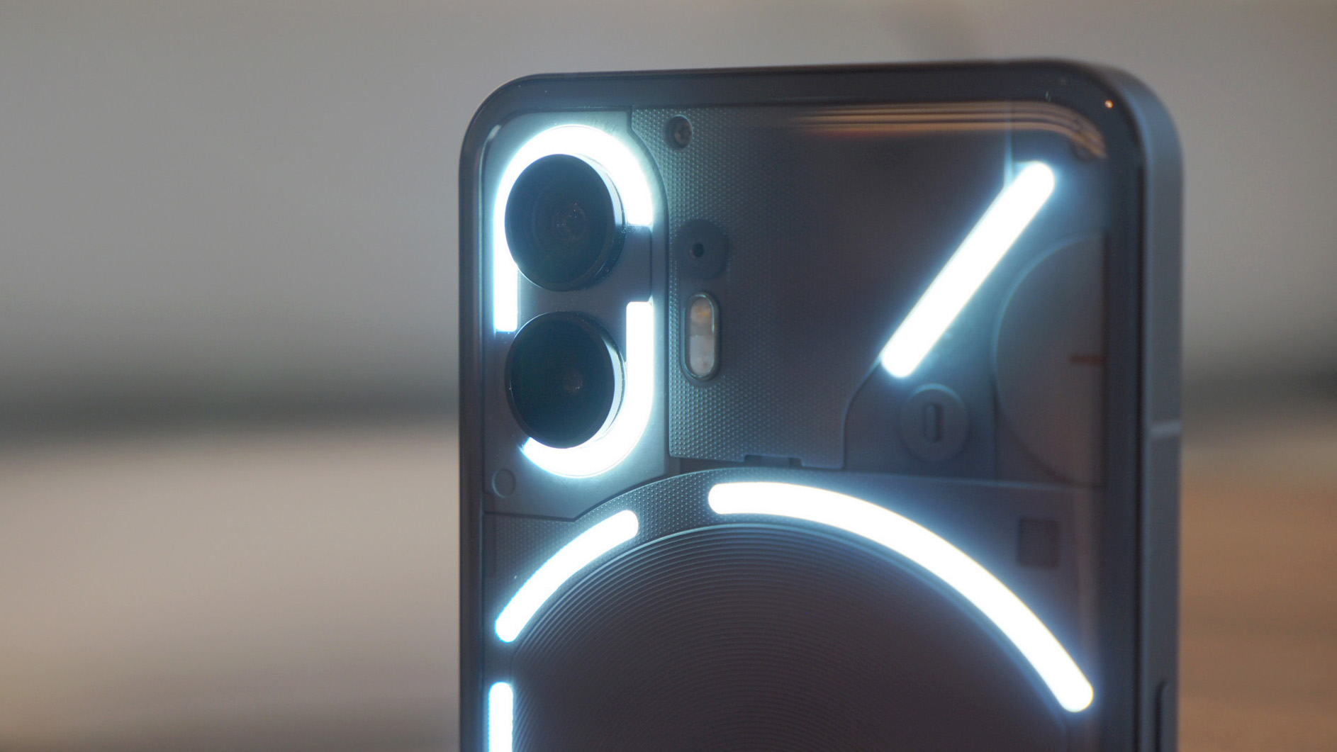
Thirdly, and this being Nothing's unique selling point, the Glyph lights on the rear (which illuminate for various reasons) are now broken up into a larger number, with the main one above the charging coil being dynamic in its illumination (it can 'fill up' and 'drain', for example).
Nothing Phone (2): Design & Display
I review a lot of the best phones as part of my job and have done for many years. So when something really stands out, just as the Nothing Phone (2) does, it's a real thrill. From the very moment I first held the handset it's the incredibly low weight – it's just 201g – that was most standout. That might not sound light, and in context it's only 40g less than the iPhone 14 Pro Max, but honestly there's a certain balance and lightness to this design that feels refreshing.
Despite feeling lightweight, however, the Phone (2) in no way feels like it lacks robustness. Usually by this point in a product review I'll see some scratches somewhere – the Google Pixel Fold, for example, already has marks on its camera 'bar' on the rear – but my Nothing handset looks good as new. I'm very fond of its grey finish too, which I think is far more appealing than the white option (there's no black as yet, but I reckon a special edition will arrive later down the line, echoing the company's release of Ear (2) in black, for example).
That rear glass panel is transparent by its material nature, which is another design major for Nothing Phone: you can see the wireless charging coil exposed, and while there are panels to hide away other aspects rather than being a full phone autopsy, it all feels deftly designed and arranged. Part of the reason for this, of course, is the inclusion of those Glyph lights – arranged in 11 LEDs across four sections – which are neatly integrated into the phone's form. I'll get to Glyphs in more detail later, but here I'll just say I'm pleased they're not overkill; they don't dominate the phone's function and you can be as outlandish or as subtle as you wish in their use.
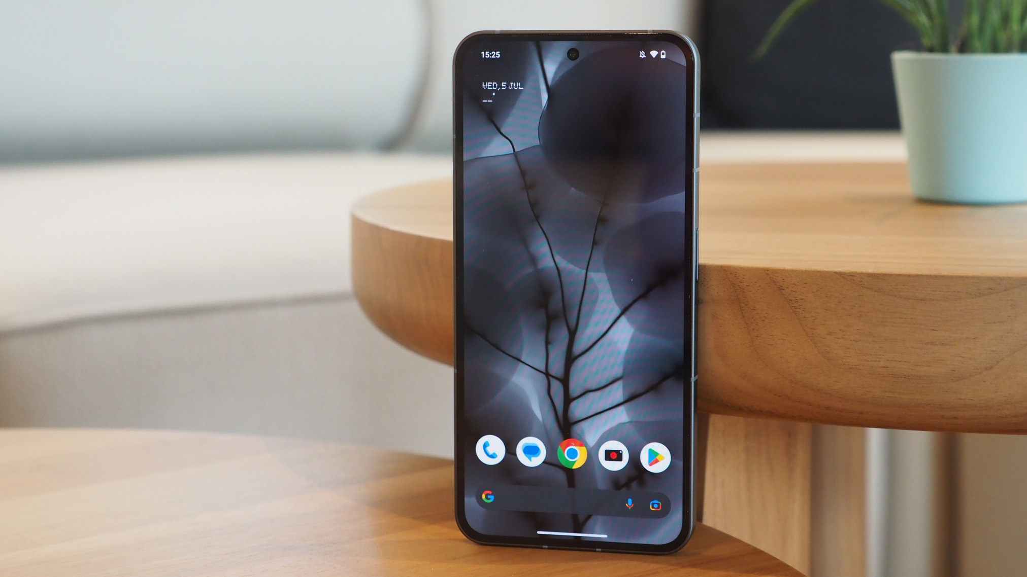
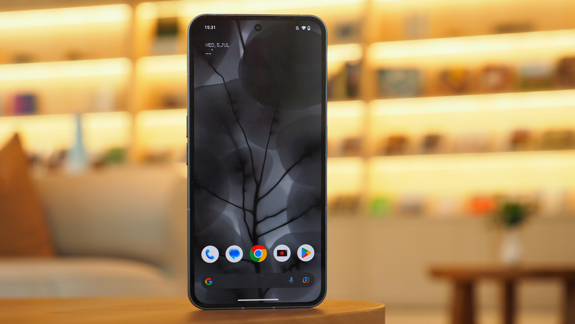
I've already touched upon the Phone (2)'s display, but it's worth really laying on the positives here – after all, it's a big improvement over the Phone (1)'s offering. While both phones are as sharp as one another – Phone (2)'s 1080 x 2412 resolution means roughly 400 pixels per inch (PPI) – the brightness is a big step up.
Low peak brightness was a criticism of the Phone (1), with its screen capping out at around 700 nits. The Nothing Phone (2), by contrast, climbs up to around 1,000 nits in typical use, though can pump images out at 1,600 nits when displaying HDR (high dynamic range) content. That's on par with many a flagship and unlike many phones I've tested it's not too 'twitchy' in its approach to auto-brightness – everything feels very fluid and always looks right to my eyes.
As this is an OLED panel it ensures great contrast, with blacks that are truly black, even when sat against bright whites. And given the brand's push of its new Nothing OS 2.0 operating system and fully black and white icon pack options and distinct visual appeal, everything marries up very nicely indeed. Add a 120Hz refresh rate for great fluidity and there's nothing more I could ask for from a display – it's refreshing that it's flat, too, which is actually more user-friendly and more greatly avert to accidental touch, despite still being very responsive.
Nothing Phone (2): Performance & Battery
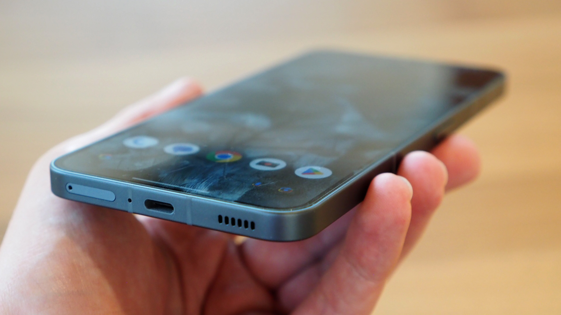
With the original Nothing Phone (1) I didn't have performance issues from a capability perspective, per se, but the Nothing Phone (2) does still uprate its internals to be more powerful. Sure, it's 'one step' behind the current Qualcomm top-tier chipset, but the Snapdragon 8+ Gen 1 on board here does a sterling job – and without getting too warm too. Multiple browser windows, current games such as Mighty Doom, and more besides, are no problem whatsoever.
The main concern I had when first setting up the Nothing Phone (2) was related to its predecessor's cursory battery life. Thankfully – and surprisingly – the Phone (2)'s larger-capacity battery delivers a significant longevity boost. Nothing's software updates have no doubt also helped be part of the concoction, but getting a full day of 16 hours use with many hours of screen time and still getting to bed with 20 per cent or more battery remaining is no issue whatsoever (seeing as the Phone (1) was close to 12 hours at its initial software release shows just how far things have come).
I suspect Nothing OS 2.0 is a key part of this overall performance, enabling the Phone (2) to not only look distinctive, but keep up with the best of them when it comes to daily tasks – and a few extras, of course, such as the Glyph lighting additions.
I've already written about the 3 Unique Nothing Phone (2) Features I Can't Live Without in a separate feature, which dives into how the software visualisations, use of dark mode, and a typically black-and-white palette in many areas creates a real distinct appearance. But there are other useful additions, including app clone (two of the same app, such as WhatsApp, for both personal and business numbers use), a new app locker (to lockdown app access), and distinctive Lock Screen widgets that all add to the appeal.
Nothing Phone (2): Glyph Lights
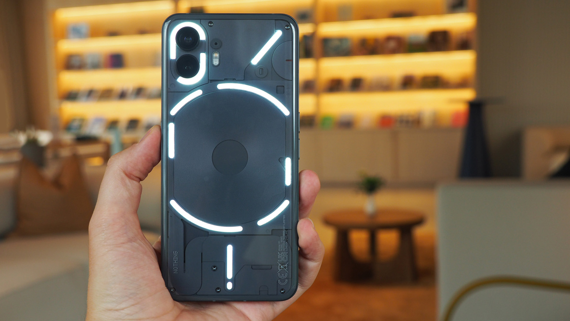
Now onto the even more fun stuff: Glyph lighting. As previously described: the critical difference between the original Phone (1) and Phone (2) is that the new device has a dynamic LED section in the Glyph to the upper part of the wireless charging coil. This means rather than just being off or on, it can dynamically adapt.
Why's that useful? It can do a number of cool things. Firstly, if you set a timer, the light bar will illuminate and then deplete (from right to left) for the duration of your countdown, removing the need to look at your phone's screen.
But, even more potentially practical than that, is a feature called Glyph Progress, which uses the same theory but can tie in with third-party apps – at this stage only Uber, but you can see the progress of your Uber coming to your destination without looking at the app or on-screen notifications. This is what Nothing is all about: being a different and fun, whilst adding practicality.
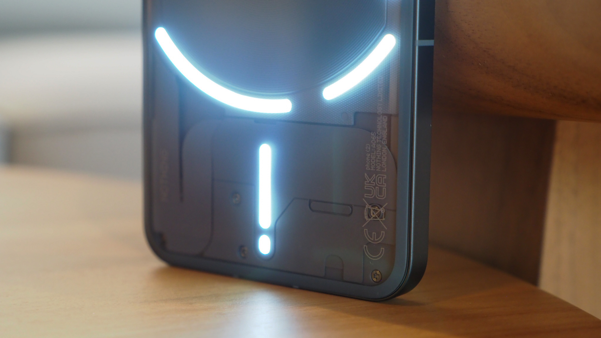
Glyph lights also illuminate and flash in sequences to give you specific alerts related to, say, app notifications, even certain people in your contacts calling – so you can create personalised customisations that only you'll know about. And this time around the inclusion of a dynamic auto-brightness feature means the lighting is far better balanced to surrounding ambient light, which not only looks better but surely aids in those battery savings too.
Making perhaps the most of the Glyphs, however, is an all-new Composer, which allows you to create mini live musical compositions using pre-loaded sound packs. Compose your own alarm. Compose your own unique ringtone. Or just compose by messing around – because it's weirdly fun. I'm not talking Ableton Live full-on sequencer levels of capable, as there's no time signature, no metronome, no ability to edit your creations in a multi-track format (yet, hopefully that'll come?).
Nothing x Swedish House Mafia@swedishousemfia have composed an exclusive Glyph Sound Pack for Phone (2), giving you a taste of what's coming up.With the new Glyph Composer, you can personalise and remix Swedish House Mafia's custom sounds. Tap the pads to trigger different… pic.twitter.com/ODbtj04AAmJune 26, 2023
Glyph Composer will expand in the future too: there are artist tie-ins due, such as the forthcoming Swedish House Mafia pack, which you can see in the embedded Tweet above to get a better understanding of how it works, sounds and, of course, illuminates those Glyph lights. Watch this space for more new packs coming in the near future, although Nothing isn't yet giving the game away about which artist link-ups it'll be securing...
Nothing Phone (2): Cameras
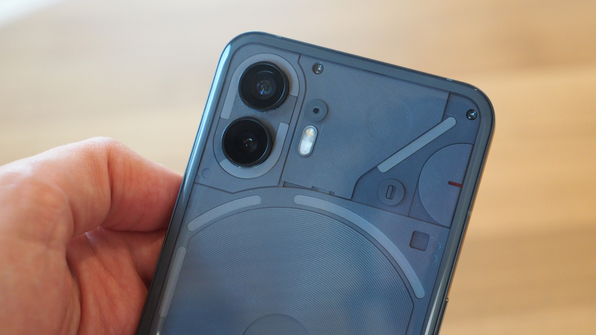
When it comes to cameras, Nothing hasn't totally reinvented the wheel in Phone (2) compared to Phone (1). That's to say there are still two 50-megapixel snappers on the rear, the main including optical image stabilisation (OIS), plus a selfie camera on the front (which is now higher-resolution, at 32MP).
Critically, however, there are a couple of key differences: Phone (2)'s main camera is now a Sony IMX890 sensor, which is a step up in capability in how it handles data, plus a new 18-bit image signal processor (ISP) meaning a bigger pipeline for handling its flow, meaning HDR (high dynamic range) now offers almost three times the levels of exposure for range for better-balanced results.


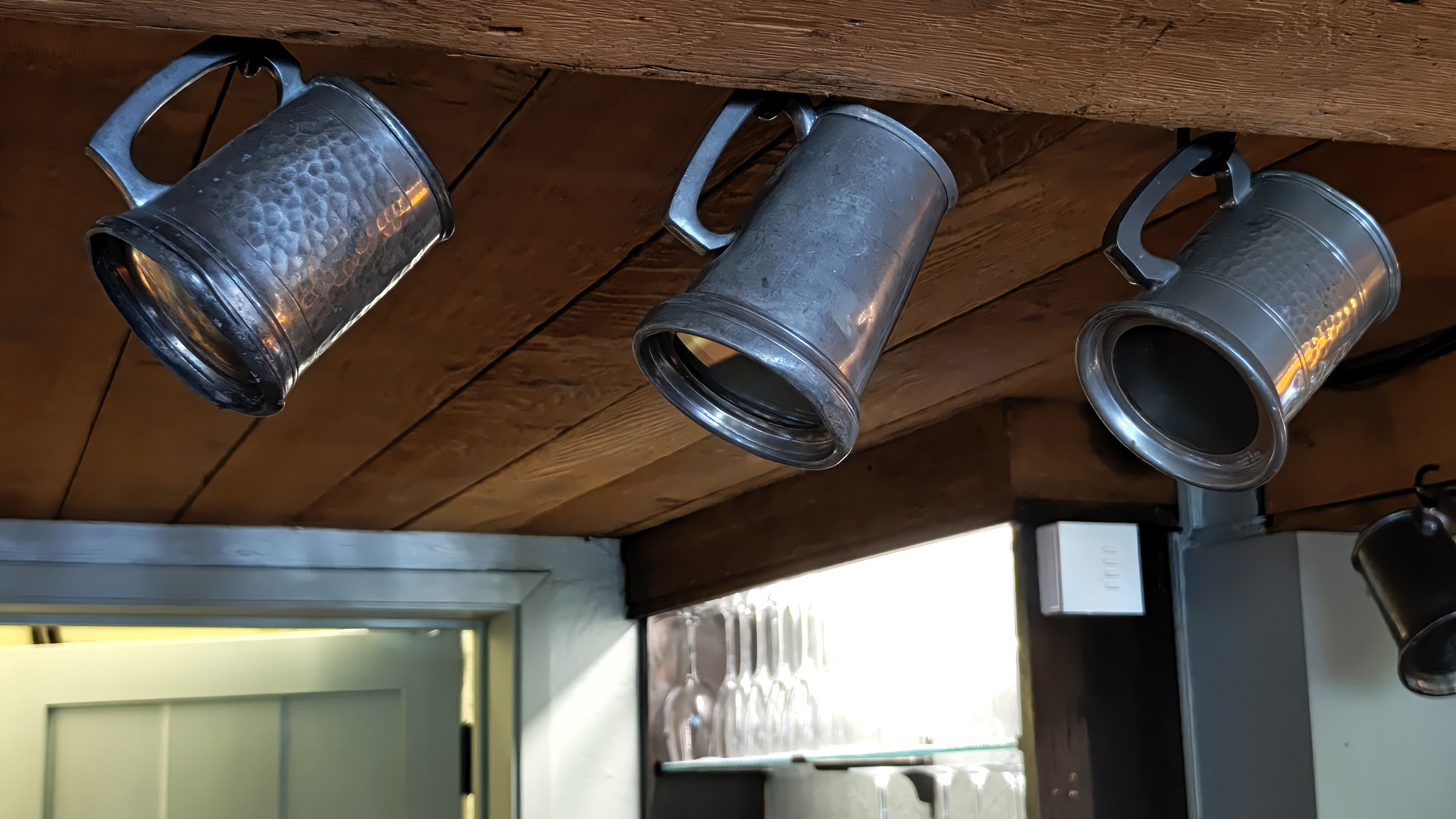


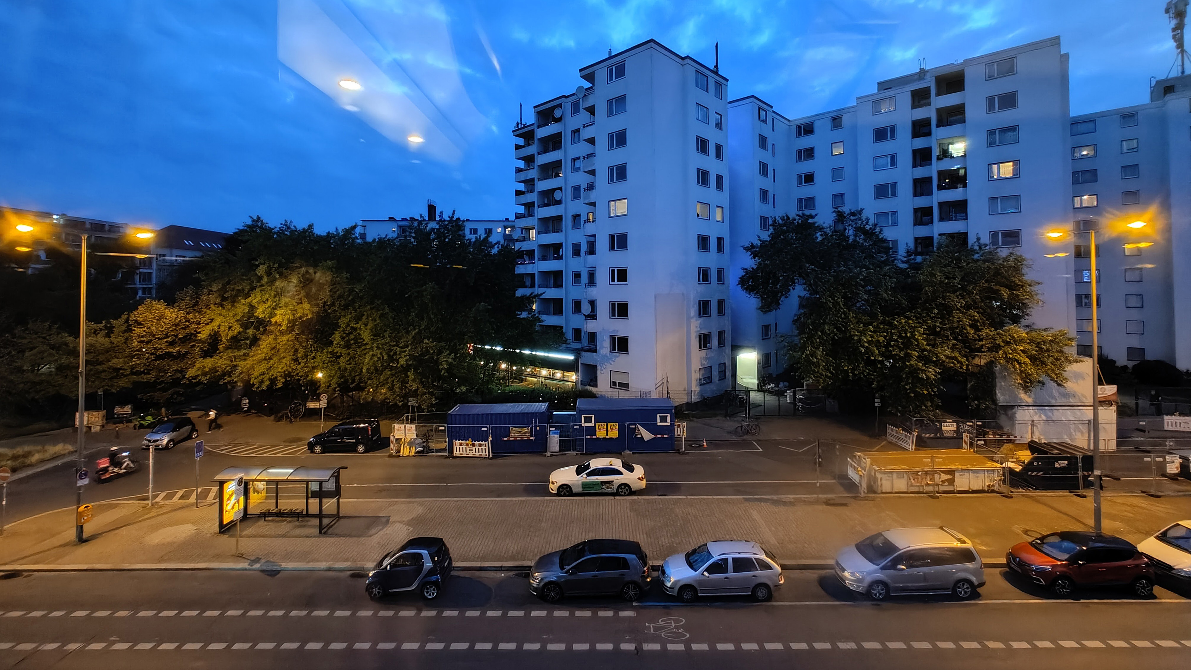
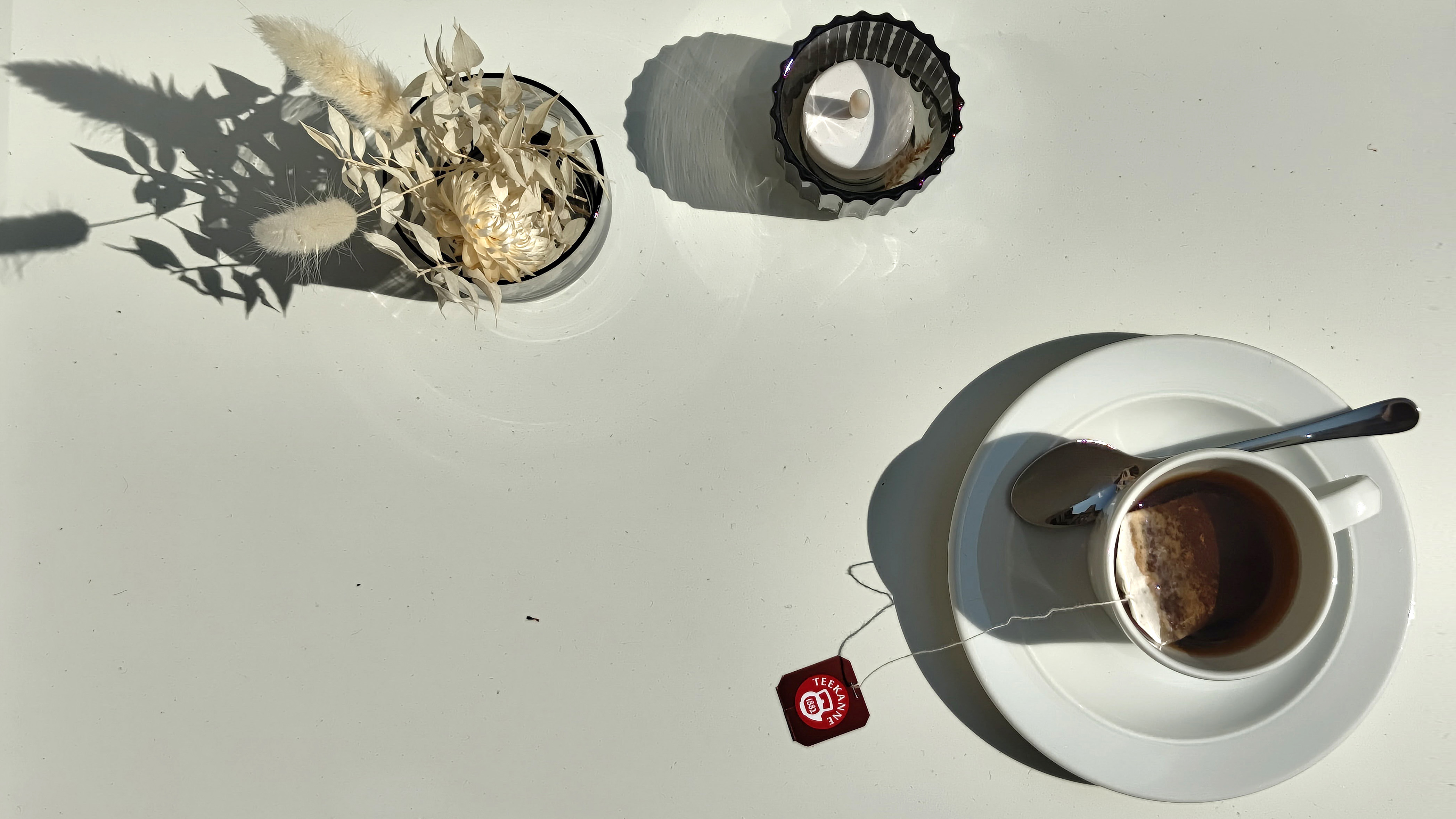
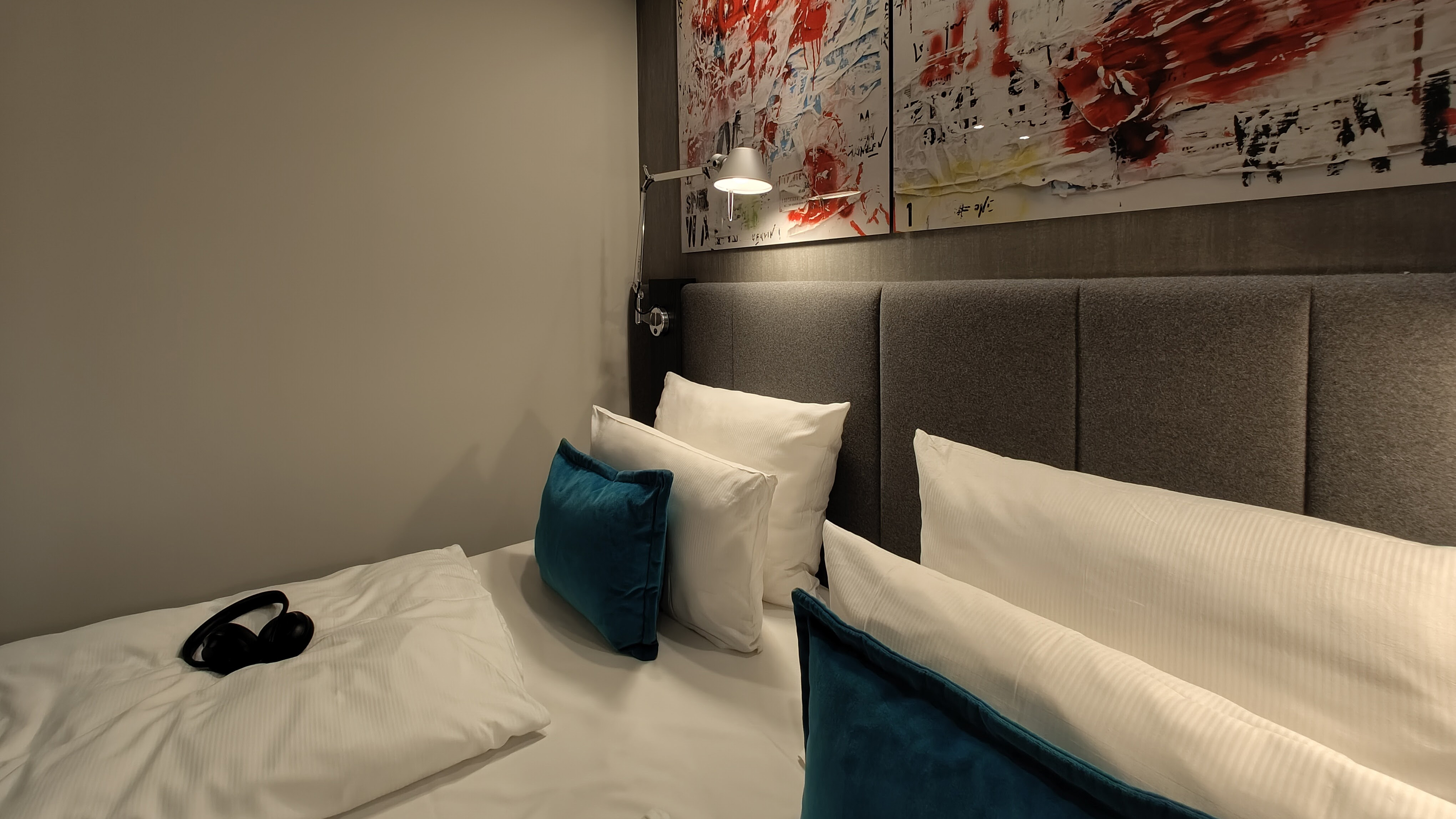
Does that all make a gigantic difference comparing Phone (1) to Phone (2)? It's small, really, but I think the greatest takeaway from the latest cameras is there's a level of consistency that looks always believable, and while there are no significant features such as zoom (the 2x digital does a decent job, with results much lower-resolution at 8MP) this is a very easy-to-use camera.
As you can see from the image gallery above, the colours don't oversaturate, the real-worldliness is a look that I appreciate, and while you're not going to get Google Pixel 7 levels of computational photography tricks from the Nothing Phone, that's not going to concern everyone.
I think it's a fine dual camera rear setup overall, and when considering the asking price of this device there's not a lot more you'd expect – and I'm super pleased that Nothing hasn't jumped on the Everything bandwagon and lobbed a bunch of useless low-res macro and depth sensors onto the Phone (2) for no reason.
Nothing Phone (2): Verdict
I arrived at using Phone (2) with a certain amount of trepidation, pondering if it could be the handset to truly one-up its predecessor. I needn't have had any doubt, though, as Nothing's handset sequel is akin to The Godfather or The Terminator: an unexpected classic that outshines the original across the board.
What's really taken me in is threefold: first, the Phone (2) is so comfortable to hold and use, with a distinctive design that's somehow simultaneously overstated yet subtle; two, the improvements to everyday essentials, such as battery life and screen quality; third, it adds a dollop of fun on top all of that, with features such as Glyph lights not just being a throwaway gimmick.
Sure, Phone (2) is pricier than its predecessor, but I think it's worth it – and in context to its competition Nothing's device easily stands out for the right reasons. It's not going to be for everyone, granted, but for me this is a rare moment of unexpected Android phone joy. Top marks.
Also consider
Yes, the Nothing Phone (2) costs more than the original, and if it's beyond your budget then the Nothing Phone (1) is available at a super-low price right now, so is certainly worth considering (despite less complex Glyphs and more limited battery) life – noting, of course, that it's unavailable in the USA, where it's Phone (2) or, er, nothing.
As other competitors go around this price point, the most obvious Android rival is the Google Pixel 7. It doesn't have the distinct style of Nothing's software or physical design, but then it's the way to go if you're looking for a pure Android OS experience from the maker of the operating system itself. The computational cameras are better here, too, it must be said.
Sign up to the T3 newsletter for smarter living straight to your inbox
Get all the latest news, reviews, deals and buying guides on gorgeous tech, home and active products from the T3 experts

Mike is T3's Tech Editor. He's been writing about consumer technology for 15 years and his beat covers phones – of which he's seen hundreds of handsets over the years – laptops, gaming, TV & audio, and more. There's little consumer tech he's not had a hand at trying, and with extensive commissioning and editing experience, he knows the industry inside out. As the former Reviews Editor at Pocket-lint for 10 years where he furthered his knowledge and expertise, whilst writing about literally thousands of products, he's also provided work for publications such as Wired, The Guardian, Metro, and more.
-
 The new Mercedes Vision V concept might be the coolest van I’ve ever seen
The interior of this Mercedes van looks more luxurious than a private jet
By Alistair Charlton Published
-
 One of Apple CarPlay's new Tesla-like features will soon be removed again
Just when you thought you could watch Netflix through CarPlay
By Rik Henderson Published
-
 Expected Samsung foldables could arrive later than expected this year
It could be a late launch for these foldables
By Sam Cross Published