
The Samsung Galaxy S22 range has just become a lot more interesting.
That's because we have now had multiple leaks that state that while the Galaxy S22 and Galaxy S22 Plus smartphones are going to be straight successors to last year's handsets, the S22 Ultra is not.
No instead the Samsung Galaxy S22 Ultra is actually going to be a redesigned device, so it is claimed with full S Pen digital stylus functionality. The S22 Ultra, so the rumored information states, is going to be the true successor to the Samsung Galaxy Note 20 Ultra, which never got a successor as Samsung put the Note range out to pasture before the Galaxy Note 21 saw the light of day.
So with this considered, when a well known insider then proceeds to release concept images showing what the Samsung Galaxy S22 Ultra's redesigned camera array could look like, and those camera arrays are ugly as sin, naturally the reason why such an aesthetic crime has been committed rears its head. As well as why Samsung just didn't keep the quite aesthetically pleasing camera array of last year.
I guess that Samsung uses as little area as possible in the camera area, which can save some weight and use this weight for SPen to keep the total weight of the phone unchanged at 228g. pic.twitter.com/ERd5UOGRXVSeptember 27, 2021
Luckily, though, Samsung's leakster-in-chief Ice universe has immediately rushed to the rescue in terms of an explanation. According to Ice, the reason why the Galaxy S22's camera could be so ugly as a consequence of Samsung doing two key things.
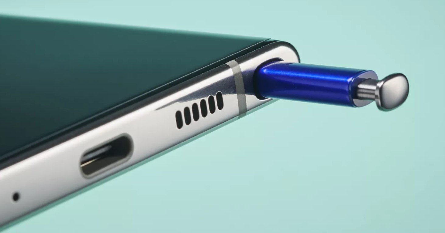
Firstly, the camera array might look odd as a result of Samsung porting full S Pen digital stylus into it, which the Samsung Galaxy S21 Ultra did not have. Unlike the S21 Ultra (which supported digital stylus use but did not come with one and could not store it) the S22 Ultra looks is claimed to be coming with an S Pen and an S Pen cavity in its body for storage.
And, simply put, that requires more space within the phone. This effects battery and component placement and, in the terms of the S22 Ultra, camera array positioning and design as the S Pen cavity is on the same side of the phone.
Sign up to the T3 newsletter for smarter living straight to your inbox
Get all the latest news, reviews, deals and buying guides on gorgeous tech, home and active products from the T3 experts
The second reason why Ice believes the camera array could look ugly and a bit old fashioned is that, according to his own leaked information, the S22 Ultra is remaining the same weight as the S21 Ultra, despite carrying an S Pen digital stylus inside it. That weight saving has to come from somewhere, which is why the larger, more uniform and aesthetically pleasing camera arrays we've seen on the S21 Ultra might have had to be sacrificed.
From my point of view I couldn't care less if the camera array on the S21 Ultra is a bit ugly as, one, I'm getting digital stylus functionality as a trade-off, which I love, and two the vast majority of people will immediately put their handset in a case, thereby hiding the array entirely.
Rob has been writing about computing, gaming, mobile, home entertainment technology, toys (specifically Lego and board games), smart home and more for over 15 years. As the editor of PC Gamer, and former Deputy Editor for T3.com, you can find Rob's work in magazines, bookazines and online, as well as on podcasts and videos, too. Outside of his work Rob is passionate about motorbikes, skiing/snowboarding and team sports, with football and cricket his two favourites.
-
 Google's Pixel 9a does one simple thing that could tempt me away from iPhones after a decade
Google's played a blinder here
By Max Freeman-Mills
-
 Google's new phone makes one huge, unexpected change
The Pixel 9a is flat – that's big!
By Max Freeman-Mills
-
 I saw an AI feature that I'd actually use – and it's not what you might think
AI to help you detect other AI is a neat idea
By Max Freeman-Mills
-
 Honor suddenly adds Samsung-rivalling upgrade that'll last for years
It's a big change, and a welcome one
By Max Freeman-Mills
-
 5 must-know iPhone 16e facts and how it compares to iPhone 16
Apple's newest iPhone is an interesting addition
By Max Freeman-Mills
-
 So where’s the promised 5G revolution?
Jon Bentley is disappointed that 5G hasn’t transformed the way we live – but he hasn’t given up hope just yet
By Jon Bentley
-
 The best new camera phone might not be from Samsung or Apple
Oppo's making a big push for its next phone
By Max Freeman-Mills
-
 I tried the iPhone 16 Pro on safari – now I want one for the huge camera upgrade
The iPhone 16 Pro's zoom boost is a game-changer
By Max Freeman-Mills
