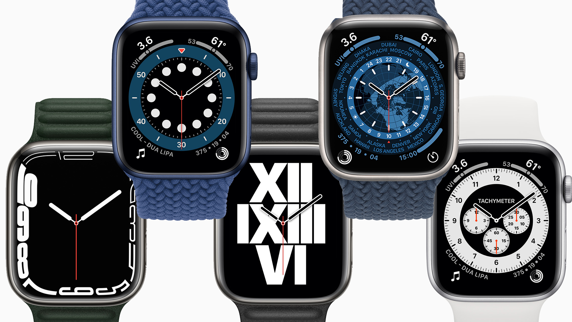

I've been testing and review Apple Watches since the very first one, and anyone who's read my reviews – including my Apple Watch Series 7 review – will have noticed a pattern: I'm never fully satisfied with the faces Apple offers.
Oh, the faces with a digital clock are just fine. There are options ranging from the information-dense to the simple and funky. You can easily find something cool or practical, depending on your preference, and either will look great.
It's the analogue (or, technically, faux analogue) watch faces that I've never been happy with – but analogue watch faces are what I prefer, so that's always left me in a pickle. Yet Apple has put so much effort into providing cool design options, you would think there should be something to satisfy me – but the problem isn't the parts you can change, but the part you can't: the hands.
In the early days, it didn't matter too much – the whole thing was new and interesting! But as time passed, I felt the potential of combining a watch dial with the infinite possibilities of a screen was being wasted. The faces were too same-y.
In watchOS 6, Apple introduced the fascinating new California watch face, which was more customisable than anything it had done before, and seemed to herald a new era – you could change the shape, the numerals, different aspect of the colours. But Apple never followed up with lots of similarly tweakable faces in the future.
In watchOS 7, Apple did introduce lots of interesting new watch faces inspired by favourite analogue watches – such as the Chronograph or GMT faces – but do you know what was the same across them all? And was the same on every California face even when you tinkered?
The hands. The same lozenge-shaped hands on them all. You can see it on the image at the top of this post. Sometimes they're darker, sometimes they're light. But the shape doesn't change.
Sign up to the T3 newsletter for smarter living straight to your inbox
Get all the latest news, reviews, deals and buying guides on gorgeous tech, home and active products from the T3 experts
This is a fundamental flaw if you're trying to design great watches, because the hands aren't just some boring practical aspect you can just slap on at the end. Designing a beautiful watch means means making every part match in tone and style, and the hands are vital for that – even if you still plan to keep things minimalist.
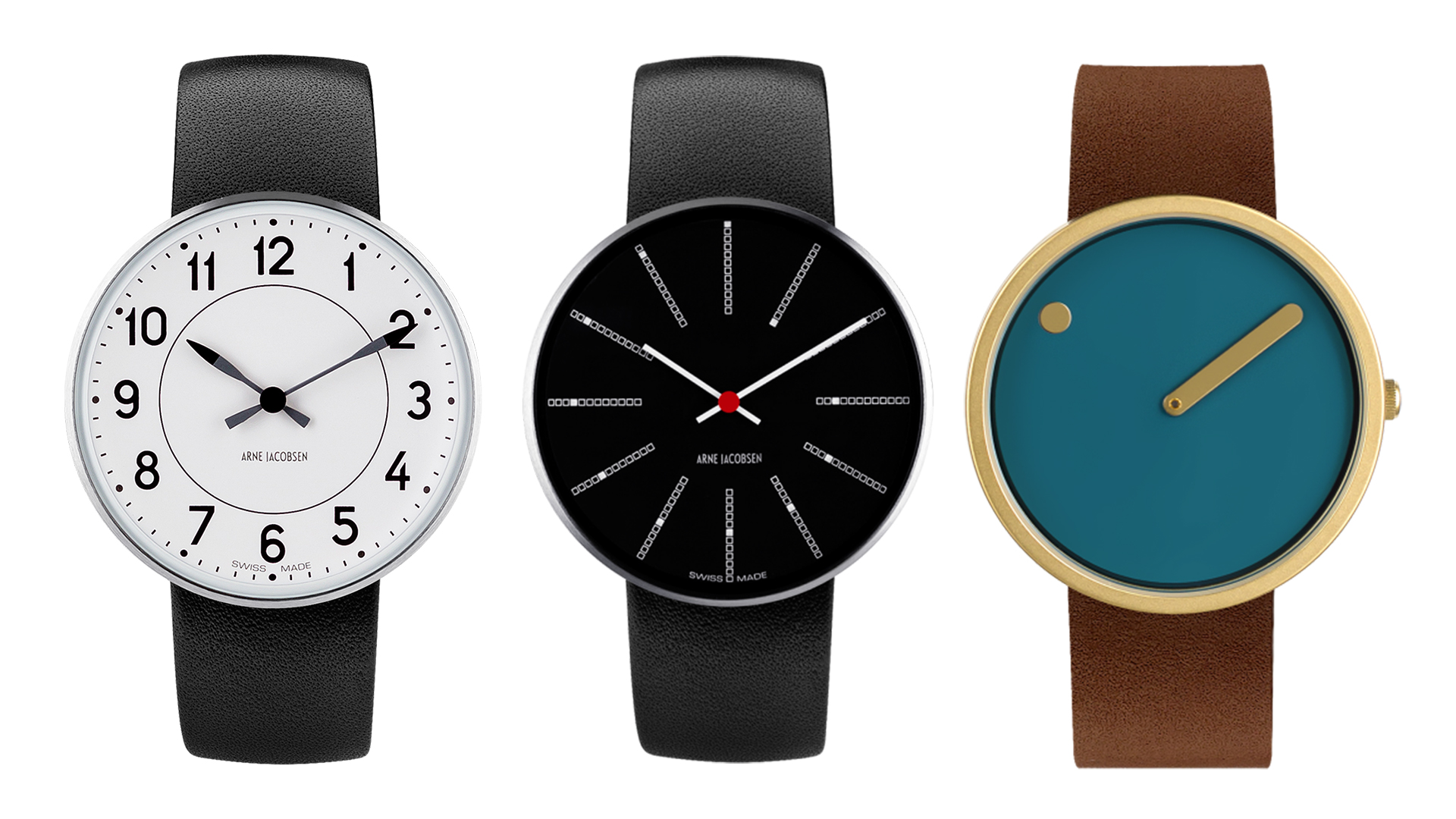
Here are three watches I love from Danish designers, to show how important hands are.

Left: Arne Jacobsen Station. Middle: Arne Jacobsen Bankers. Right: Picto.
Look at how the hand is vital to the overall tone of the first two watches, and is literally the entire face of the latter. The Arne Jacobsen Station features that undulating design – tapering to a point at the numbers, slimming, then spreading out again for a final flourish, like the tail of an arrow. There's even a little two-tone effect, drawing the eye more to the tip, and subtly mirroring the circle dividing line on the face itself.
On the Arne Jacobsen Bankers, the hands are obviously just simple rectangles – but note that they're the same width as the hour markers, and the same colour. As they tick through, it's so neat and satisfying.
And then the Picto watch just abandons the idea of an actual watch face completely. The clever touch here is how the hour 'hand' is at the edge, replacing the hour markers in that position on the face.
Now imagine swapping the hands between these watches. Every single one would be weaker for it. More disjointed, less cohesive.
Apple could recreate any of these faces easily in digital form, but would any of them look as good with the basic lozenge hands it uses? Of course not.
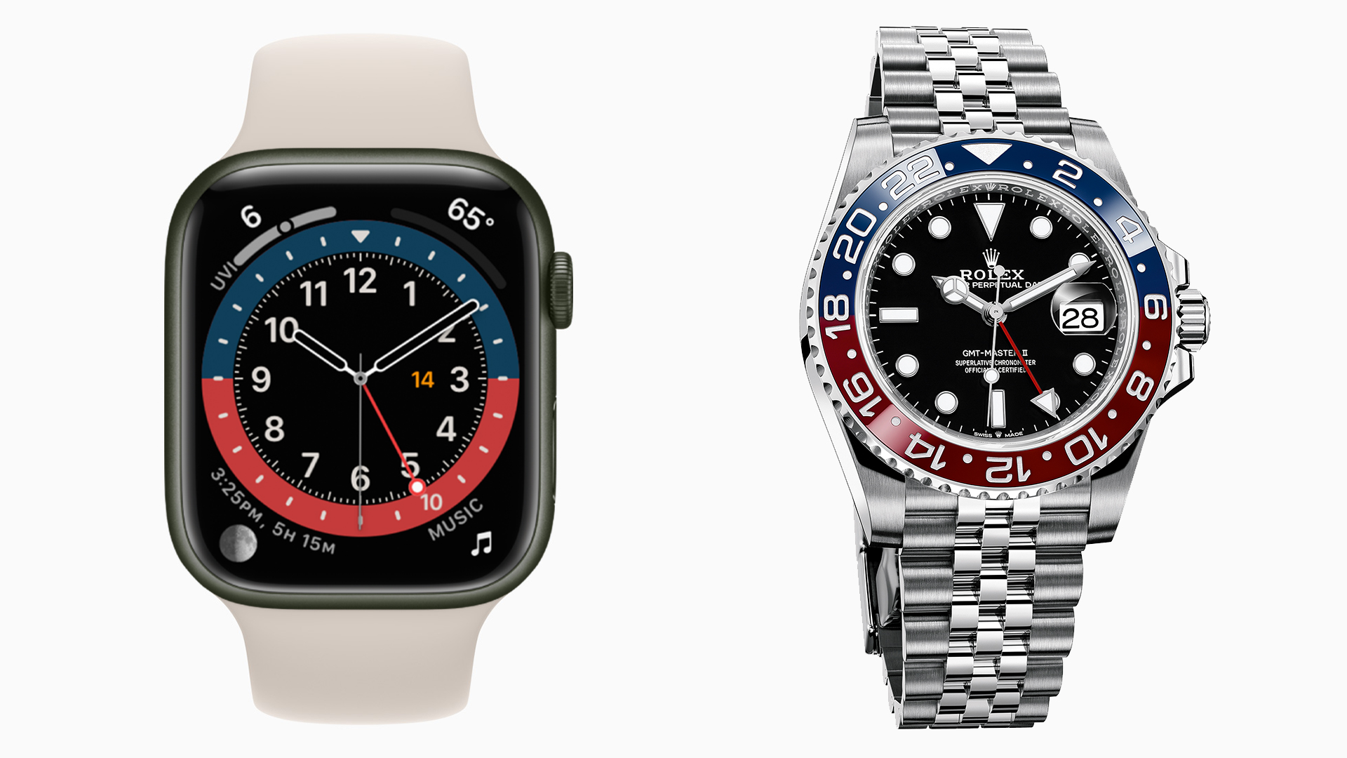
To really drive that home, here's a comparison of the Apple Watch's GMT face, along with the real Rolex GMT-Master II.

I probably don't need to tell you which is which here.
Now, as you might guess from my love of Danish minimalism, I find the Rolex's hands to be a little over-designed here, but they're clearly all part of the total design goals. The minute and hour hand ending in points reflects the arrow motif used on the 12 hour marker, on the bezel, and on the red hand that indicates the other time zone. The silver outside and white inside on the hands is similar to all the hour markers. The dot on the hour and second hands match the dot hour markers. It is a cohesive piece of design.
The Apple Watch's lozenge hands do match the little lozenges in the blue and red 'bezel', but I wouldn't exactly say that's bringing the whole aesthetic together. It is simply unexciting in comparison. It looks like a mix of existing face elements with a couple of GMT-related additions, not a face design for a GMT watch.
I expect Apple has perfectly justifiable reasons for using the same hand designs across all of its analogue faces except for one* – I'm sure it does all kinds of tests around legibility and general clarity.
But Apple lets us customise so many other aspects of our watch faces to make them garish and barely readable if we really want – if it just let me piece together my choice of hands with my choice of face, I could not only make something that better fits my aesthetic preferences, but actually feels more personal to me, and lets me feel more like my watch reflects my aesthetic preferences and style, as a good watch should.
* The only Apple Watch face to have custom hands? Mickey Mouse, of course.
Matt is T3's former AV and Smart Home Editor (UK), master of all things audiovisual, overseeing our TV, speakers and headphones coverage. He also covered smart home products and large appliances, as well as our toys and games articles. He's can explain both what Dolby Vision IQ is and why the Lego you're building doesn't fit together the way the instructions say, so is truly invaluable. Matt has worked for tech publications for over 10 years, in print and online, including running T3's print magazine and launching its most recent redesign. He's also contributed to a huge number of tech and gaming titles over the years. Say hello if you see him roaming the halls at CES, IFA or Toy Fair. Matt now works for our sister title TechRadar.

