The Apple Watch Series 7's new screen is a bigger deal than you think… literally
The new screen in the Series looks only a little bigger, but the impact it has is larger than you'd think


Get all the latest news, reviews, deals and buying guides on gorgeous tech, home and active products from the T3 experts
You are now subscribed
Your newsletter sign-up was successful
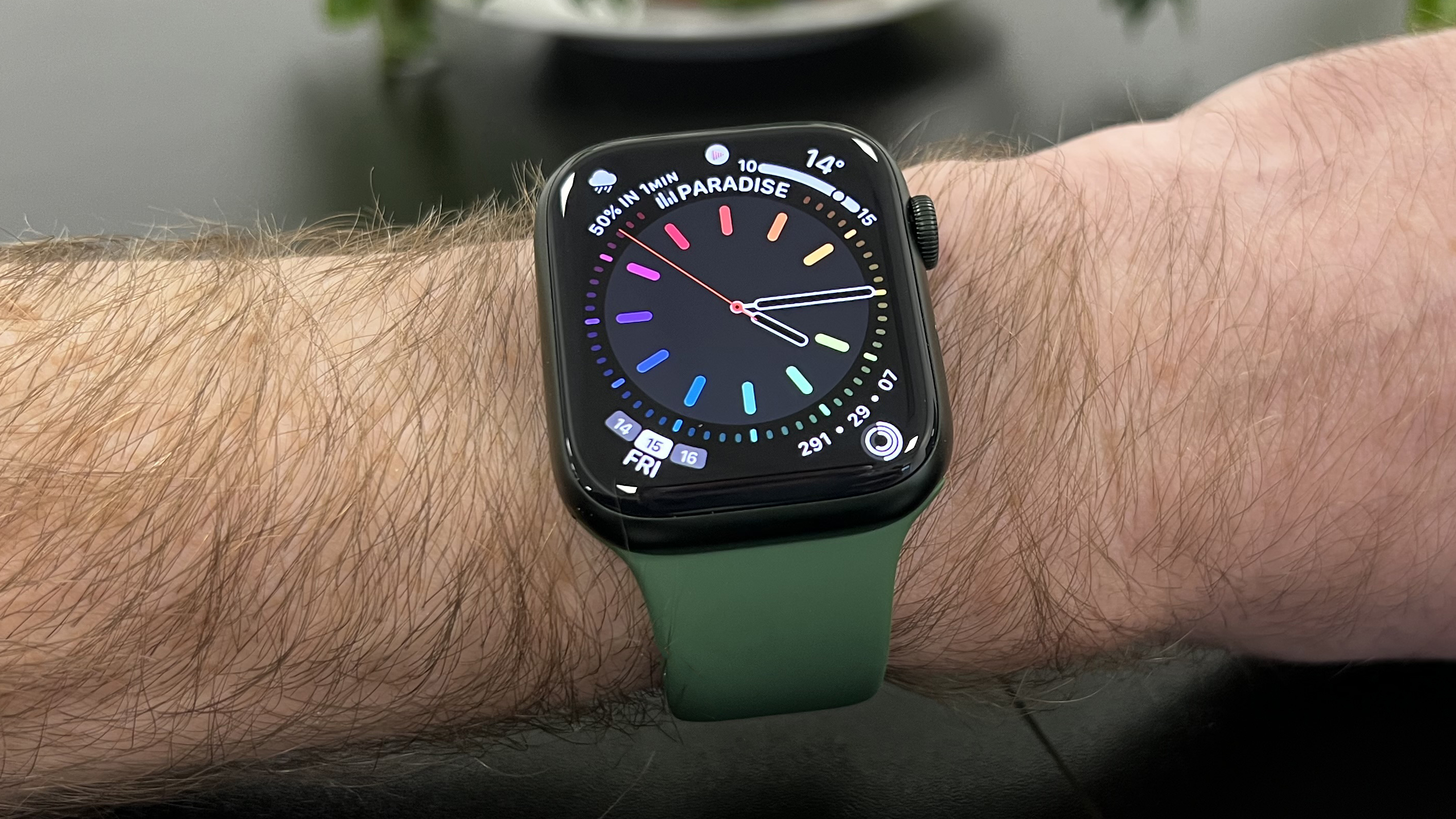
I've been testing the Apple Watch Series 7 for the last few days (full review coming soon), and though the updates this year haven't looked very dramatic, I gotta tell you… the new bigger screen makes an instant impact, and is a more significant upgrade than it sounds.
Apple describes the new screen as being 20% larger, which doesn't sound like a massive difference. And buttons and other interface elements have been boosted in size by 15% or so, which again sounds like a relatively small change.
But the effect is really noticeable compare to Apple Watch Series 6 from the moment you put the new Watch on your wrist, and has had two interesting effects that might go under the radar: I think fewer people should go for the larger size now; and I think the suitability of the Watch for older people just got a big boost.
Article continues belowI've been wearing the 44mm Series 6, and I now have the 45mm Series 7, and it feels more like a big slab of screen to be on your wrist than ever. Partly that's do with how it's basically all screen now (just 1.7mm of bezel), and partly that's because the case is physically larger.
And then when you actually interact with it, all the same buttons you've used before feel jumbo sized. Not in a bad way – they're easier to hit more accurately, which is only a bonus – but it immediately meant that to me, it feels like more than just a nice little screen size boost over the Series 6. It's a usability boost too, in a way that the Series 4 was over the Apple Watch Series 3.
This has also changed how I approach the Watch faces I choose to use. I've always shied away from using things that are too dense with information, but now the simple Watch faces actually feel like a waste of the (very) ample space on the 45mm model. I've gone for more information, and I'm happy with it – again, this is actually a pretty major usability change.
And this ties into what I was saying about it being better for older people. Text size on screens can be a real problem as you eyesight softens, and the ability to easily make text bigger on iPhones is probably one of its most-used but least-talked-about features for a huge number of people.
Get all the latest news, reviews, deals and buying guides on gorgeous tech, home and active products from the T3 experts
And you can actually do the same on the Apple Watch, so that tiny text on a tiny screen isn't such a non-starter for those with sight that's slipping a bit… but the screen is still tiny, so when you make the text bigger, you fit so much less of it on there. It's kind of a pain still. But the screen on the 45mm Series 7 fits so much more text on, even at the larger size, and still with those bumper-size buttons. I think it's a major improvement in making the Apple Watch something everyone can use at the same level.
But do you even need the 45mm version?
But the huge thing for me personally is that for the first time, I think the larger-sized model is needlessly big for me. I'm a slim man, so I've always wavered on the sizing: the big models have always been a tad larger than what I'd buy for myself in a non-smartwatch, but I've liked having the bigger screen size too much to seriously consider going smaller.
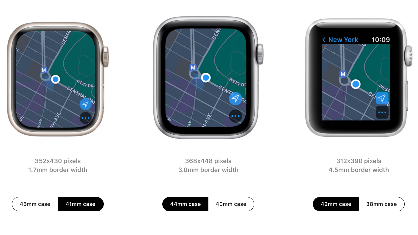
But have a look at this comparison image of current Apple Watch sizing from Apple:

Left to right: Series 7, Watch SE, Series 3
Notice how I'm comparing the smaller Apple Watch Series 7 to the larger of the other two models. And in particular, notice how the screen of the Series 7 and Series 6 are practically the same (just a few pixels smaller on the 7), yet the body of the Series 7 is smaller.
Already, the vast majority of women buy the smaller size of Apple Watch, but I think that with the Series 7, way more men should be looking at the smaller size too. It'll probably fit better, it'll be lighter, and there's effectively no downside in terms of screen size.
Despite the overall look of the Watch 7 not changing much (though, as always, it's actually a pretty drastic redesign internally), what it reminds me of is the iPhone 12 redesign (used again in the iPhone 13).
In that case, compared to the iPhone 11, Apple slimmed both the bezels and the case of the phone (as well as the weight) without changing the screen size, and suddenly it felt massively more usable, and easier to hold and manipulate with one hand, than the previous model.
The iPhone 12 also improved a whole bunch of other stuff in the screen (and elsewhere), so it was a clearly bigger update overall than the Apple Watch 7 is – but I think this screen change is more interesting than a lot of early impressions have let on, still.
And while you're here, random other first impressions: the fact that the Always-On screen is much brighter now really makes a big difference to its visibility. Even in the Series 6, it didn't take that strong of a reflection to wash it out so much that you couldn't really read it, but so far I've yet to see this new version ever be totally unreadable. And without a reflection, you'll be amazed how little difference in brightness there is between it and the normal brightness.
And the new fast-changing is nice. You can get a 50% charge in 30 minutes, which makes it much easier to wear overnight and then top up in the morning while you shower etc. This is how I've done it with the Series 6, and it works okay, but it needs to charge basically from when I get up to when I leave the house in order to hit 100%. The 7 doesn't need all that time, so on the days when you're in a rush, you'll have more time from it.

Matt is T3's former AV and Smart Home Editor (UK), master of all things audiovisual, overseeing our TV, speakers and headphones coverage. He also covered smart home products and large appliances, as well as our toys and games articles. He's can explain both what Dolby Vision IQ is and why the Lego you're building doesn't fit together the way the instructions say, so is truly invaluable. Matt has worked for tech publications for over 10 years, in print and online, including running T3's print magazine and launching its most recent redesign. He's also contributed to a huge number of tech and gaming titles over the years. Say hello if you see him roaming the halls at CES, IFA or Toy Fair. Matt now works for our sister title TechRadar.