Apple iPhone 11 Pro review: the best camera and screen on a phone
The iPhone 11 Pro's changes may not be flashy, but improvements in almost every area make this an absolutely phenomenal phone

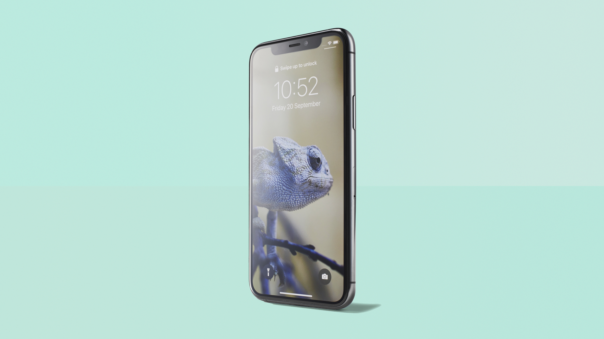
The iPhone 11 Pro's camera might be its stand-out feature, but every part of it has been refined from the inside out. It all combines into a big upgrade, and a truly brilliant phone.
-
+
The best phone camera so far
-
+
Incredible OLED screen
-
+
Supreme processor and graphics power
-
+
Much better battery life
-
+
Impressive audio
-
-
No 5G
-
-
No reverse wireless charging
-
-
Big notch remains
-
-
No USB-C port
Why you can trust T3

Welcome to T3's iPhone 11 Pro review, where we'll put Apple's new top-of-the-line phone through its paces to find out if it deserves its 'pro' moniker.
Apple made a big deal about the new triple camera system during the phone's announcement, and also highlighted an improved screen and better battery life… but it turns out that this year's upgrades are more comprehensive than you might think.
Of course, the camera is still the standout, and we'll go on a deep dive to show you why. But there's lot more to consider when it comes to the questions of updating from an older model.
- iPhone SE (2020) review
- iPhone 11 review
- iPhone XR review – updated for 2020
- Best iPhone 11 deals
- Apple Watch Series 5 review
Apple iPhone 11 Pro review: price and availability
The iPhone 11 Pro starts from £1,049, for the 5.8-inch model with 64GB of storage. There's also the iPhone 11 Pro Max, which has a 6.5-inch screen and longer battery life, but is otherwise identical when it comes to specs. That starts from £1,149 for 64GB.
You can upgrade to get more storage space. £150 more gets you 256GB. Another £200 on top of that gets you 512GB. It's a pretty hefty premium in both cases, and Apple still doesn't include a microSD card slot.
For most people, 64GB is a pretty reasonable size anyway, but if you like to keep a lot of movies downloaded (or take a lot of your own), or will download loads of games through Apple Arcade, the 256GB version is a solid upgrade in terms of size.
These are damn expensive phones, though the £1,000 mark is now not uncommon – the Samsung Galaxy Note10+ comes in at £999, and just like that model, these are Apple's highest-end offerings.
If it's more than you're willing to spend on a phone, it's totally understandable – the iPhone 11 (non-Pro version) starts from £729, with far fewer cut corners than you'd expect.
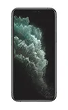
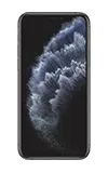
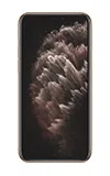
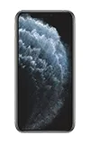
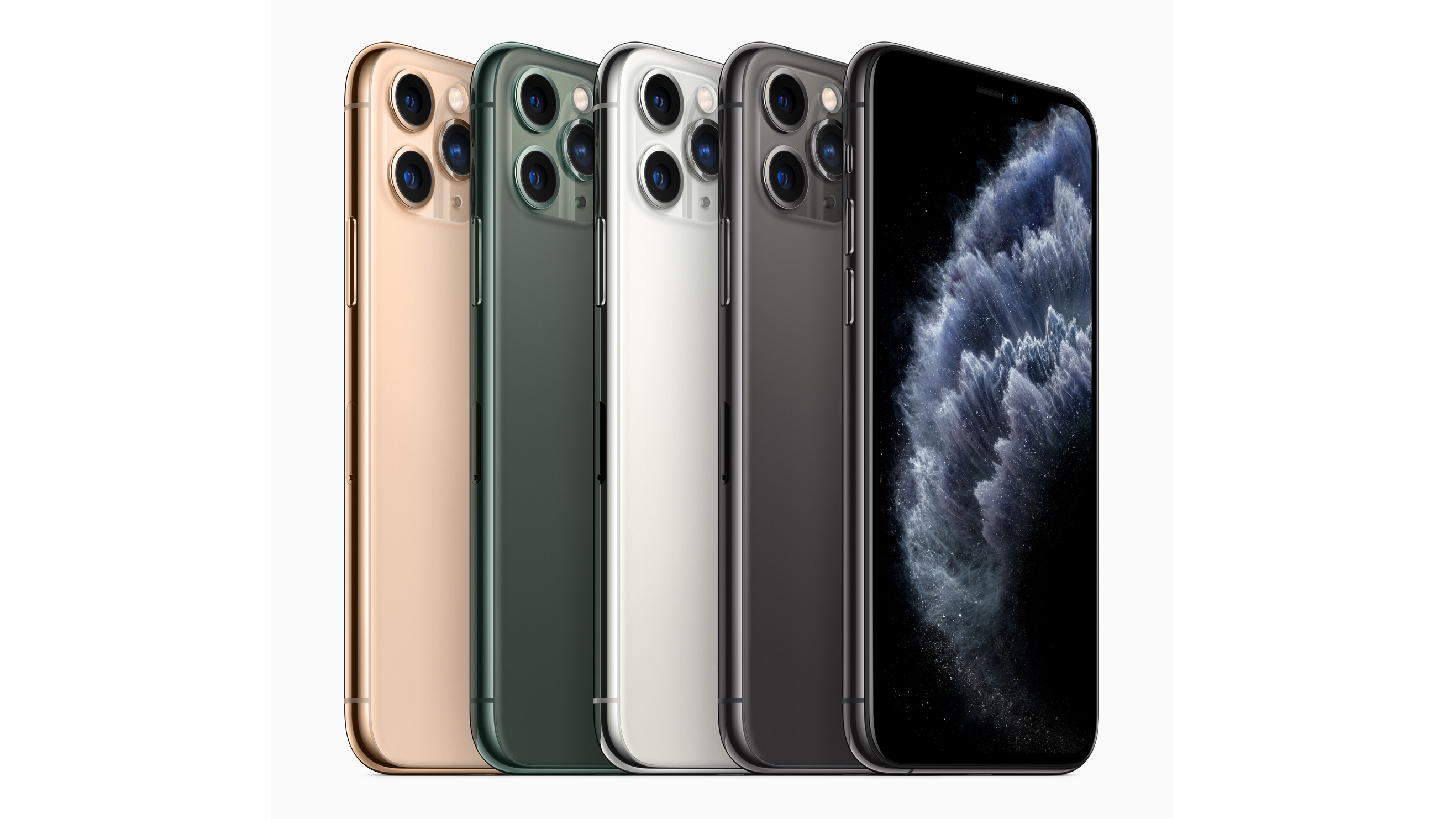
The iPhone 11 Pro is available in four colours: Space Grey (black on all sides), Silver (silver edges and a white back), Gold (warm gold edges with a back that's like a dark peach), and the new Midnight Green (with dark green edges, and kind of moody forest green back).
The latter is apparently wildly popular, which is no surprise for a new colour. It looks lovely – it's really dark, and in dim lighting could be mistaken for black, but it clearly has this rich green tint in all other lights.
Apple iPhone 11 Pro review: design, screen and speakers
The design of the 11 Pro is almost identical to the iPhone XS, including the use of stainless steel on the sides with glass across the back.
The glass has been upgraded again, and is the toughest glass ever on a smartphone, Apple says. The XS was really impressive in this regard, something that I tested empirically more times than I intended.
A falling phone is still far too unpredictable for us to be able to guarantee that the new model won't break after a fall, but your odds are better, and that's all you can ask for, really.
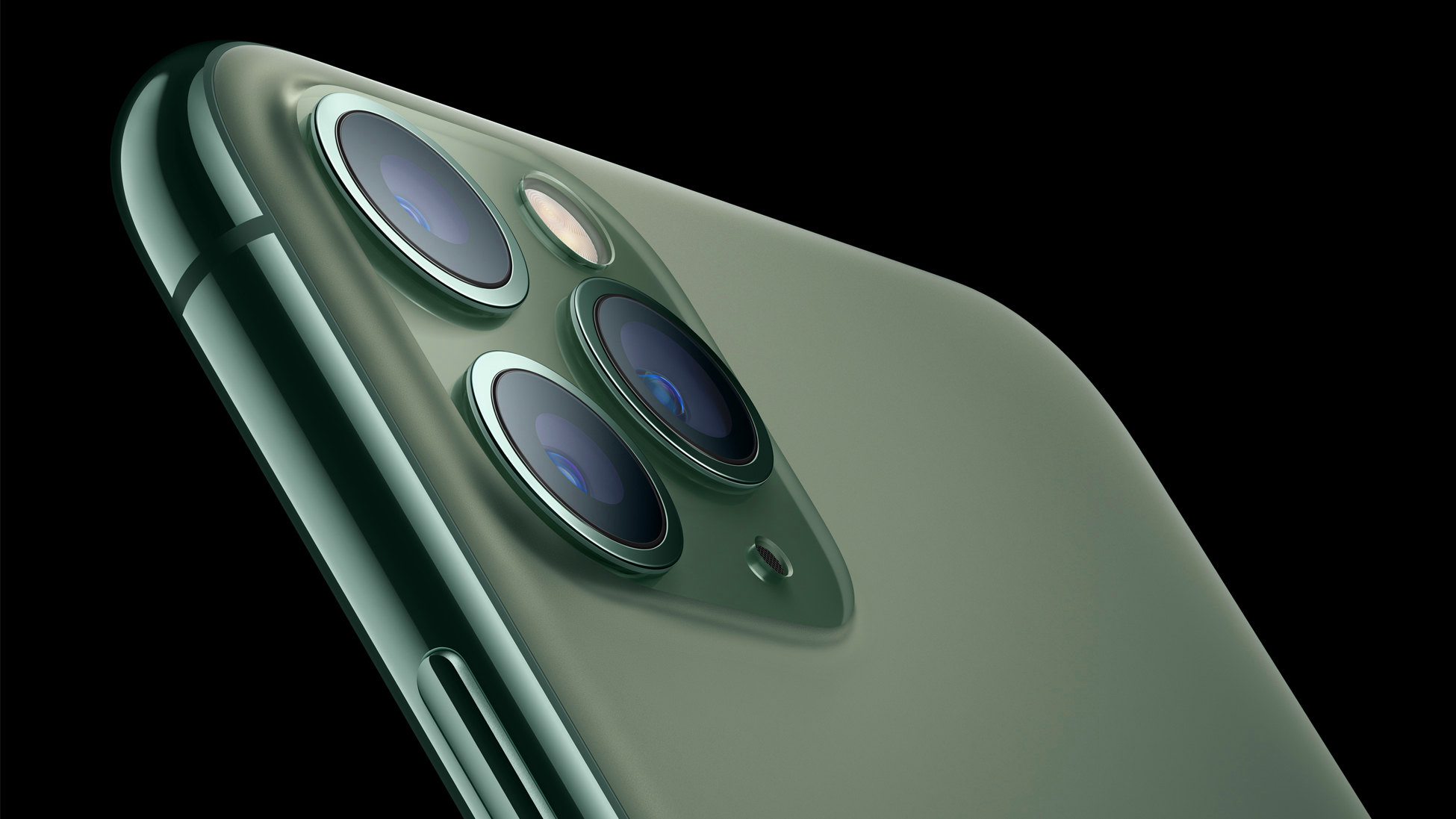
The only notable changes to the look are on the back: the camera, and the texture on the glass plate.
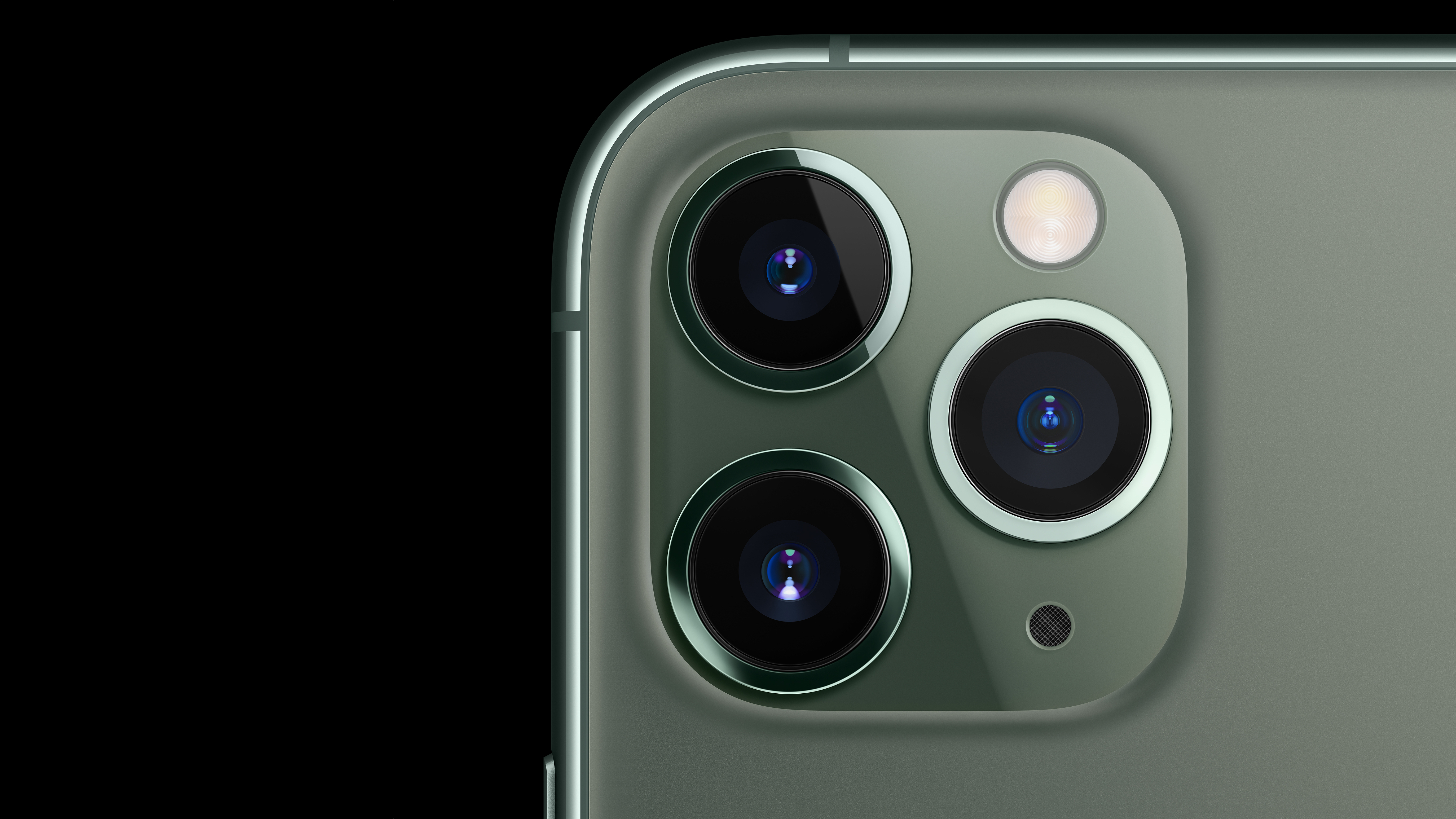
The big triple camera looks far better than it has any right to (though still is not quite a thing of unambiguous beauty). The trick is that it draws from classic design: much like the iPod evoked Braun radios, this is built like triple-lens film cameras such as the Crown8 E3.
The thick ring around each lens on the iPhone leans into this heritage – it makes the camera look practical and important, rather than like Apple has failed to hide it (as can be the case).
I'm not sure it's necessarily better-looking than the central camera arrays on the Samsung S10 or Huawei Mate 30, but I've become quite fond of its physicality.
The entire glass back of the phone now has an etched texture to it, which makes it more reliable to grip without a case. This is extremely welcome, because I learned exactly which surfaces in my home were flat and which weren't by watching the iPhone XS inevitably work its way towards edges and take a tumble.
On the front, there's still a hefty notch that can't help but make the design look a little behind rivals with punch-holes or pop-up cameras, which give you the full screen to view.
In practice, it's not a problem in any way – iOS has been designed around the notch, and Apple's secure (and now faster) Face ID needs chunkier sensors – but it does feel behind the curve, which isn't exactly what you want from a £1k+ phone. Especially when other high-end phones are coming with super-futuristic in-screen fingerprint sensors that work great, which we ultimately prefer to face recognition.
That brings us to the screen, which is our first unqualified rave review for the 11 Pro. Now peaking at 1,200 lumens when viewing HDR photos or video, it's basically like having an OLED telly in your hand.
HDR videos, and especially Dolby Vision, look absolutely incredible. There's no HDR10+ support, but given that this is barely used so far (Amazon Prime Video supports it), while Dolby Vision is on both Netflix and the iTunes Store, we don't mind this omission too much. HDR10+ videos will still fall back to regular HDR10, which is fully supported.
The wide P3 colour gamut makes photos look vibrant and realistic, and everything is pin-sharp. It's utterly, utterly gorgeous.
The iPhone 11 Pro and Pro Max have the same screen density (over 400ppi), but at different resolutions, so there's no difference in sharpness. For movie buffs, there's a strong argument to get the bigger model just to really, really enjoy the display.
Apple has included new 'spatial audio' speakers, with Dolby Atmos support. The effect is really impressive – there's clear separation of left and right, and you can hear nuance in the position of sounds from the front in movies, though you don't exactly get the full rear-speaker experience, unsurprisingly.
Of course, most people will probably use headphones for movies, but the new speaker setup has other advantages: it's super loud, and offers balance and quality that pretty much kills off the need for cheap Bluetooth speakers. It's even better and louder for calls – compared to the iPhone XS, the difference was noticeable from the very first ring tone we heard.
Apple iPhone 11 Pro review: cameras
Okay, this is the big section. The iPhone 11 Pro is Apple's first rear triple-camera system, in a year that's been full of them. The third lens is another first for the iPhone: an ultra-wide lens. These again are now de rigeur for phones, having arrived on just about every high-end handset in the last 12 months.
The ultra-wide lens brings a 120-degree field of view, which is ideal for landscapes, getting crazy perspective shots, shooting tall or wide objects, or 'zooming out' on a shot when you can't walk backwards any further.
That's in addition to the standard wide-angle lens and 2x telephoto lenses that the device inherits from the iPhone XS (this dual setup was also found on the iPhone X, iPhone 8 Plus and iPhone 7 Plus).
These remain largely unchanged, with two small but impactful updates. The first is that the telephoto lens now has a larger aperture, which lets in 40% more light – this makes it noticeably better in situations that don't involve bright sunlight, and makes for more detailed portrait shots, as we'll see.
The second is that the wide-angle sensor now has 100% focus pixels, which is tech talk for saying that it's much faster and more accurate at focusing, especially in very low light. This is vital for the new Night mode option, which is exclusive to the 11 series of iPhones.
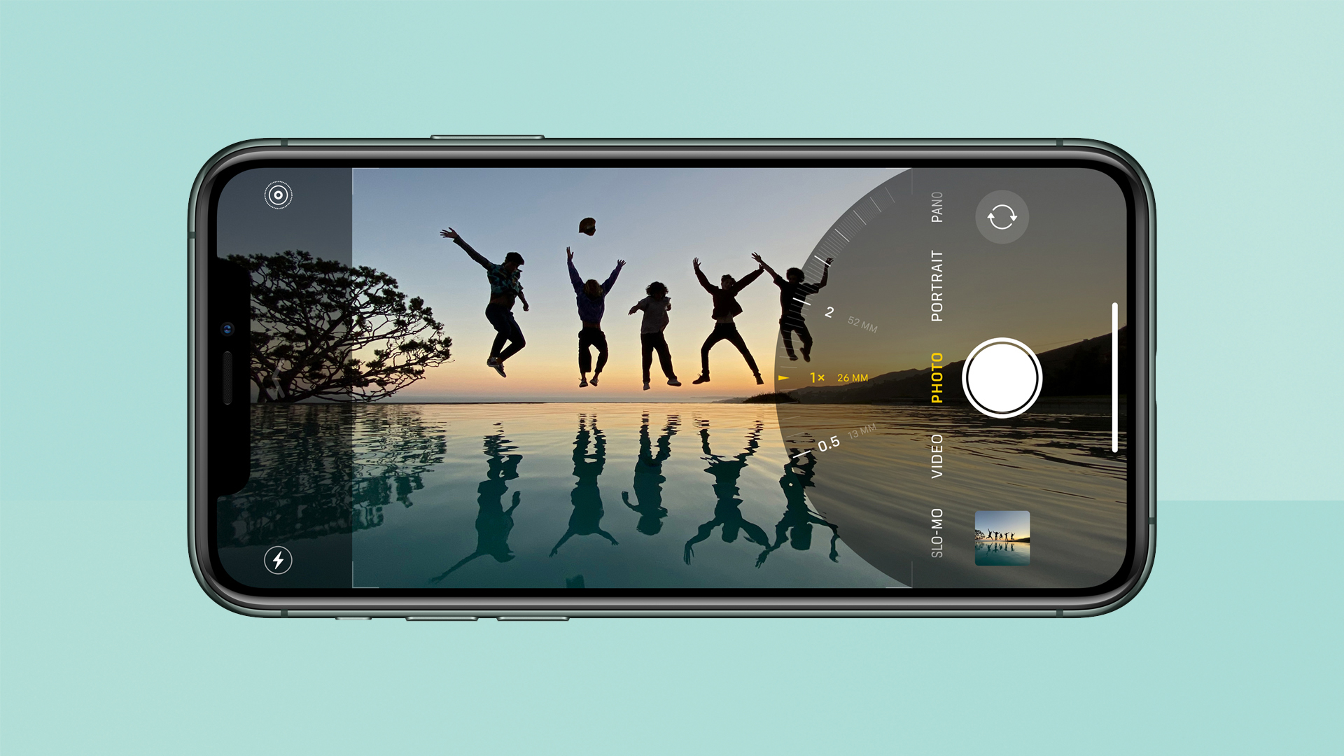
The camera interface has been rethought to make it easier to access different controls just under your thumb.
Like similar options on other devices (Google's Night Sight, Samsung's Bright Night, etc), this takes a slow shot in very dark conditions and pulls out colour and detail that would be totally lost normally.
To accommodate all this, there's a new design of the Camera app that's exclusive to iPhone 11 and iPhone 11 Pro. The flashiest difference is that the live view of what's being shot isn't just limited to the main viewfinder – if you're using the wide-angle lens, a faint view of what the ultra-wide is seeing is displayed under the buttons, making it a bit easier to decide whether you want to change your zoom level.
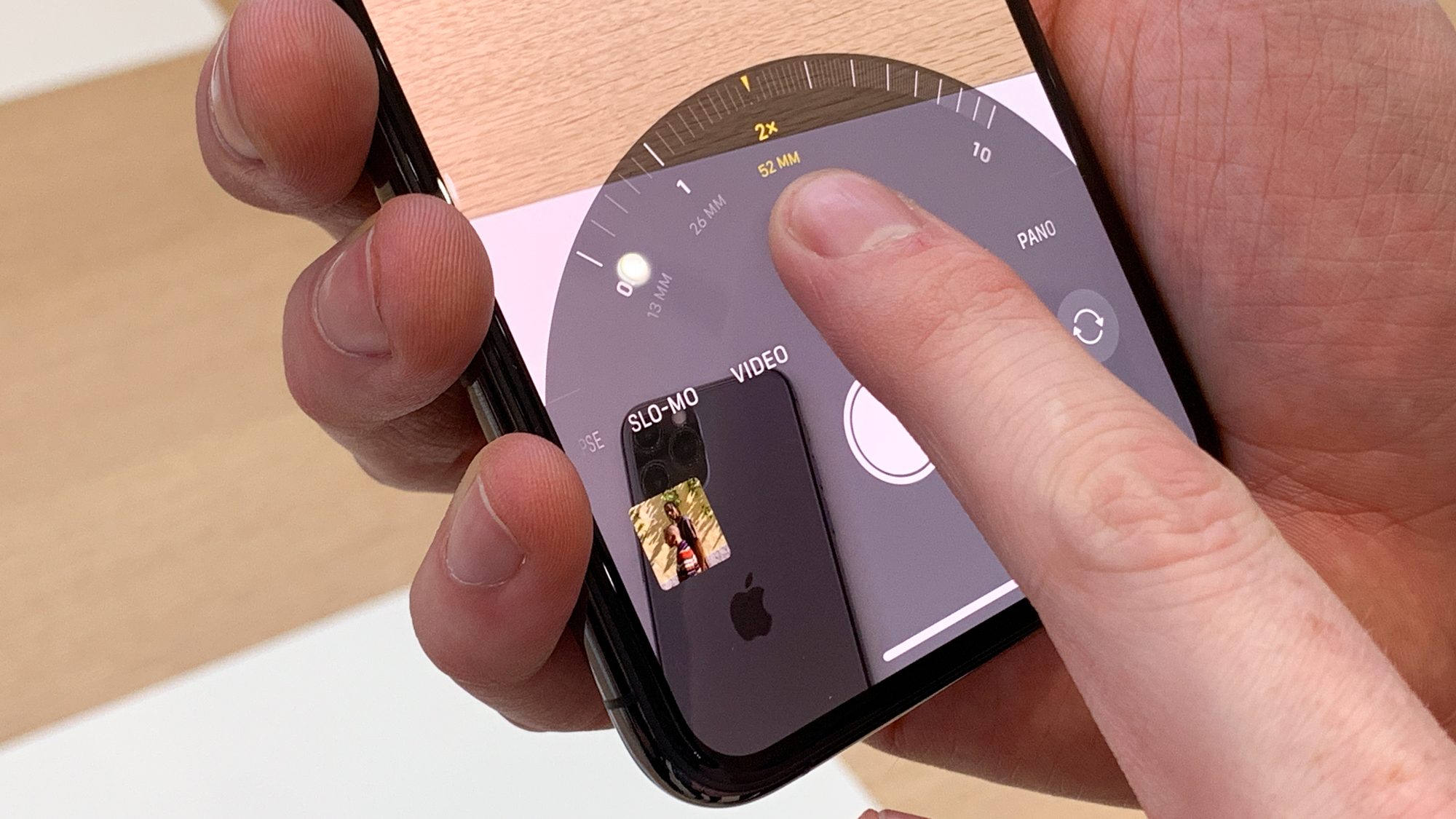
It's nice, though oddly doesn't always appear when you're in the 1x wide-angle lens. At first, we suspected a bug, but it seems to be connected to focus distance: if you're shooting an object at fairly close range, you get a black interface. Pull back a little and the view from the ultra-wide fades in. Apple didn't return a request for clarification about exactly how this works before publication.
Our favourite other difference is 'Quick Take' shooting, in which if you press and hold the shutter button, you'll capture video instead of pictures, which no change of modes needed. And if you slide your thumb left, you'll lock into recording video, and don't need to hold any more. If you want to shoot bursts (which is what used to happen when you held the shutter button), you slide right. It's a small change, but being able to rapidly switch between stills and video when your kid does something cute is so, so useful.
A bunch of handy controls have been made more accessible (just swipe over the different shooting modes to bring up a different set of buttons) and there's a new icon for Night mode in the corner. This shows whether Night mode is active (it fires up automatically when needed), and how long you'll need to hold still for Night mode to work.
The length of time will typically be one or three seconds if you're holding the iPhone in your hand: iOS calculates the time needed by looking at light levels and your hand shake. If you can go very still by leaning on something, it'll boost to five seconds. When you press the trigger, a little timer counts down to when the shot is complete.
You can actually manually override the timing if you're feeling confident, though – you can set it up to 30 seconds, in fact. You will need a tripod for this to be effective, but you can produce stunning starlight photography from this.
As we've hinted at above, the result of all this is astounding image quality, so let's look at some examples. First up, how the three lenses compare.

All shots from iPhone 11 Pro. Left to right: 2x telephoto; wide-angle; ultra-wide. See a larger version here.
Here, we've chosen a subject that's not far away. Note that the telephoto preserves a good amount of detail in the shadow on the door's right-hand side. Apple's Smart HDR has had an upgrade this year too, with great results that we'll see more of soon.
Without moving our feet at all, we go from the door filling the frame to taking up just a small portion in the centre. The ultra-wide lens is 0.5x magnification compared to the central wide-angle lens, and the telephoto is 2x the wide-angle, meaning you've got a full zoom range of 4x from end to end.
Here's what that means for taking in a whole building:

All shots from iPhone 11 Pro. Left to right: 2x telephoto; wide-angle; ultra-wide. See a larger version here.
A few things to note here. First, the colour and light level matching between the three cameras is astoundingly similar. Look at the lovely warm, nuanced sunny glow on the building's side, and how this translates from shot to shot. Getting this kind of light in the shots and keeping it consistent is one of the triumphs of the new camera system – we'll go more into that later.
Apple says it put a lot of effort into calibrating the lenses to match, so you that you can switch between the zoom levels without worrying about white balance or contrast changing drastically. This is not only great for lining up shots, but carries over to video too, where you can switch between lenses in the middle of recording without everything shifting in hue.
You'll notice there's a fair amount of lens distortion clear towards the edges of the frame. This shot was especially hard on the camera for that, because elements near the edges are quite a bit closer than the subject in the middle. It's something that's unavoidable from a lens like this – Apple does some automatic correction, but in harder situations, you'll still get the effect.
Now, let's move onto Night mode.
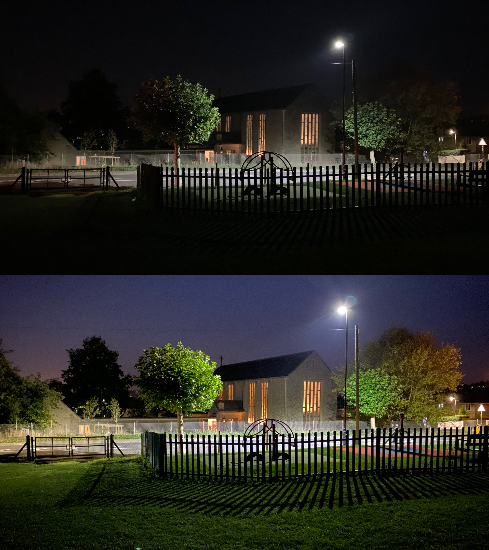
Top: iPhone XS Max. Bottom: iPhone 11 Pro Night mode. See a larger version here.
This is an interesting comparison because you could, quite fairly, decide that you like the top photo more, because it's much closer to what the eye sees. It has an moody aesthetic value all of its own, and doesn't disgrace the outgoing iPhone XS' camera by any means.
Of course, the iPhone 11 Pro could take a nearly identical shot to that one if you simply turn off Night mode deliberately. (Incidentally, Night mode only works on the wide-angle camera: if you try to use it in ultra-wide, it will turn on the flash instead. If you try to do it in telephoto, it just switches to the wide angle and uses digital zoom to mimic the telephoto, because the light capture is much better in that lens.)
However, Night mode has given us not only a cool hyper-real light aesthetic of its own, but also just blows us away with everything it's picked up. What looks like a sea of black to the iPhone XS includes a sharp dramatic shadow from the fence. The church roof is summoned from nowhere. Half a tree reappears over on the right!
And here's the killer part about Apple's Night mode: it pulls out so much detail too. It's superior to Google's fabled mode for this, and it's one reason we're often happy to see it triggering for just a second even in situations that don't seem that dark: sometimes when it fires up, it barely lightens things, but it does produce so much more detail.
In the bigger version of the shot above, you'll see brickwork and sharper fence diamonds all get pulled in by Night mode. But here's an even more stark example:

Top left: iPhone X. Top Right: iPhone XS Max. Bottom left: iPhone 11 Pro standard. Bottom right: iPhone 11 Pro Night mode. See a larger version here.
You see that each generation of iPhone taken in normal mode has a small but noticeable bump in contrast and detail over the last… and then we get to the last Night mode shot, which is on another level. Smeary pixels suddenly turn into rocks with texture and presence.
Let's do another multi-generational test, this time in Portrait mode, using the telephoto lens (the iPhone 11 Pro can now do Portrait mode in other lenses, which is a nice bit of flexibility to have).

Left to right: iPhone 11 Pro; iPhone XS Max; iPhone X. See a larger version here.
There's not much to choose between the 11 Pro and XS Max shots on an overview – the 11 Pro is pulling a slightly warmer tone that is probably somewhat more accurate to the day, but maybe that's just wishful thinking on my part about how sallow my skin is. The updated Smart HDR system in the 11 Pro has boosted the brightness in the shaded side of my face slightly, but both look good overall.
Note my shirt, though: the Portrait depth has done a much more realistic job on the new device, keeping realistic texture and detail on the front, and blurring slightly as you reach my shoulder. The XS' is muddy by comparison.
Now compare the 11 Pro to the iPhone X on the right – the colour is paler again, and the shirt is worse than the XS. Also, the lack of Smart HDR means that the shine of the sun on my forehead has lost any detail at all around there. The X shot once more isn't bad as an overview, though. But let's go closer.

Left: iPhone 11 Pro. Right: iPhone X. See a 100% version here.
Now we're comparing the 11 Pro to the X properly, which I think is the most appropriate and useful option: most people have an X or 8 Plus (which have exactly the same cameras, pretty much) or earlier, so if you're looking at an upgrade to the 11 Pro, this is the difference you'll really see.
There are drastic detail improvements across the whole face here. More textured hair, crisper edges to the glasses, some actual white in my eyes, and especially the right ear (in the shade). The iPhone X has pretty much abandoned it to noise and grain, but it's still solid in the new phone.
Look at the Portrait effect, too: my ears and hair drop gently out of focus in the 11 Pro shot; the X doesn't have the same realism to it.

Left: iPhone 11 Pro. Right: iPhone X. See a larger version here.
Sticking with our 11 Pro versus X theme, we're again shown how the X produces perfectly serviceable pictures, but the 11 Pro's are just so much nicer. The X's shot here doesn't have such a wide dynamic range, so where the 11 Pro's shot has bright warm sunset sun casting shadows on the hills to give them a 3D look, the X's shot is colder and less rich.
The 11 Pro's shot is also significantly sharper when you view it at a larger size – not that big of a deal overall, but useful if you plan to crop in at all.

Left: iPhone 11 Pro. Right: iPhone X. See a larger version here.
Now we test the telephoto lens on both. In this daylight shot, the quality is comparable from an overview. But we've chosen this shot because we want to see the lovely weathering on the old sign. And when you view bigger, or on a screen with any amount of detail, the X shot reveals the relative lack of lustre. The flaking sign looks like it's just part of the globe.
One the 11 Pro, you can see the peeling, and see that there's a subtle 3D element to its flaking. The ironwork and the walls behind also have much clearer detail.
So, in like-for-like shots in beautiful bright conditions, we're not talking about the 11 Pro giving you a giant transformation from the iPhone X, 8 Plus or earlier. You'll get a shot that's better in every way, but the X isn't bad!
However, in low-light conditions, the 11 Pro is a giant leap ahead when it comes to Night mode, and is generally a notable improvement over anything but the XS when it comes to regular low-light shots.
Between Night mode and the zoom and angle options afforded by the three lenses, this will feel like a whole new beast compared to an older iPhones.
There are also improvements to the front camera. It now has a wider view, which is used optionally – by default, you'll get the same viewing angle as before, suited to one or two people. But tap a button and you switch to a wider view for groups. Handy.
Apple says the 11 Pro has the highest-quality video ever for a phone, and we can well believe that. First, the detail and dynamic range of its shots are just astounding, especially in 4K.
But one thing that really helps with that is the new image stabilisation. Apple is underplaying this – it's only been mentioned lightly, but it provides fantastic smooth footage when handheld. It's not made to be like an action camera level of smoothing, but it's much more transformative than you might think from its lack of promotion.
It pretty much puts an end to nasty jerky home videos – you get stuff that looks you had pro equipment instead. We love it.
Apple iPhone 11 Pro review: camera vs Samsung Note10
It's not just about iPhone vs iPhone comparison is it? What if you're considering another equivalently priced, state-of-the-art phone too? Like the Samsung Galaxy Note10. Well, we took that out with the 11 Pro for a spin, too.

Left: iPhone 11 Pro. Right: Samsung Galaxy Note10. See a larger version here.
Here's how the ultra-wide-angle shots on both cameras stack up. The shot from the Samsung is brighter around the shop fronts, and the colours are more vibrant – see the leaves, the yellow building, the dirt in the foreground, the signs in the window of the shop on the left.
The iPhone is handling lens flare from the sun better (and proved seriously better than pretty much any phone we've tried for this, in fact, which is no small thing), but everything else looks a little less inviting and 'ready to share'.
This is, simply, how Samsung likes to do things. The Note10 captures dynamic range excellently, but goes heavy on the processing to make it look bright and Insta-worthy right off the bat (with, we think, some calibration to make shots really suit its screen). It aims to keep every bit of highlight detail, which is technically impressive, but leads to images that are a bit flat.
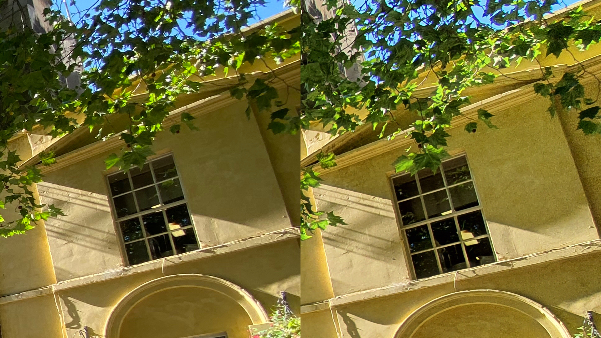
Left: iPhone 11 Pro. Right: Samsung Galaxy Note10. See a 100% version here.
This is from the top-right of the images above. What Samsung is doing is boosting the light and applying lots of sharpening, which are cramming the shadowed areas with noise, and dropping detail.
Essentially, Samsung is applying the kind of appealing filters that most people would add before sending to Facebook right to the images. Apple is giving you a much more realistic view of the light in the scene.
Personally, I prefer Apple's approach, because I can always still tweak the picture using the new and improved editing tools in iOS to look like Samsung's. But you can't dial back what Samsung is doing to get a more realistic shot.
But this is very much an aesthetic and effort thing – if you like what Samsung does with the shots and don't want to be processing it yourself, then this approach is is helpful. If you stay zoomed out on that original image above, you'd never really notice the noise.
The iPhone's ultra-wide lens also handles issues such as chromatic aberration better than the Samsung. It's small, but if you're going to name your phone 'Pro' it's the kind of thing you should be getting right, so it's good that Apple is.

Left: iPhone 11 Pro. Right: Samsung Galaxy Note10. See a larger version here.
Your eyes do not deceive you: the more vibrant image on the left is the Apple shot. What seems to have happened here is the Samsung's penchant for crushing the dynamic range has caused it to lose the warmth of the colours, as well as the nuance.
But that's not all – let's go closer:
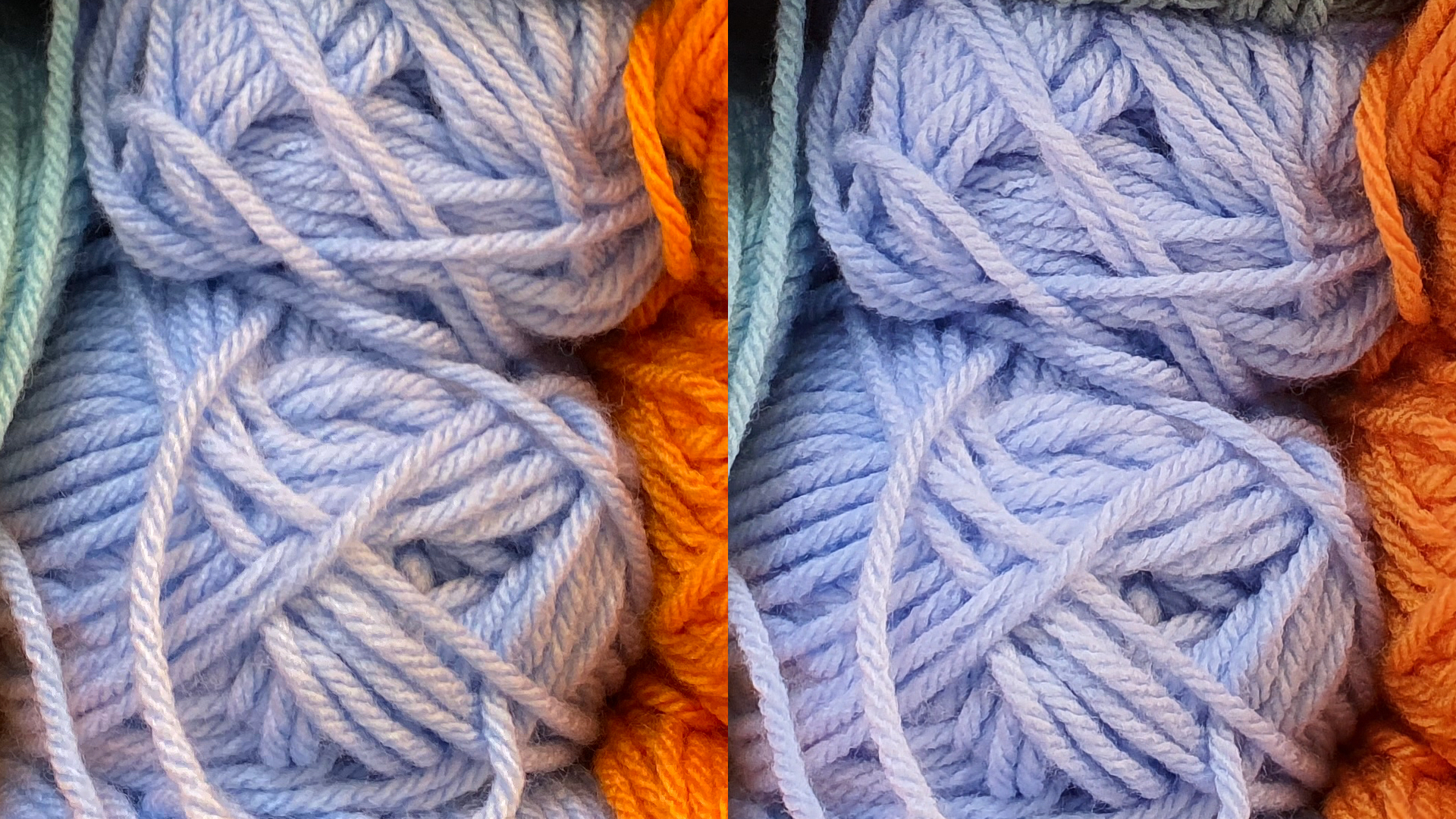
Left: Apple iPhone 11 Pro. Right: Samsung Galaxy Note10. View a 100% version here.
Here we see Samsung's gung-ho automatic sharpening has made fluffy wool look more like stiff twine. This isn't just a thing you have to zoom in to notice: go back up to the zoomed-out comparison and you can see Apple's shot has extra physicality in the wool itself as well as from its handling of the light.
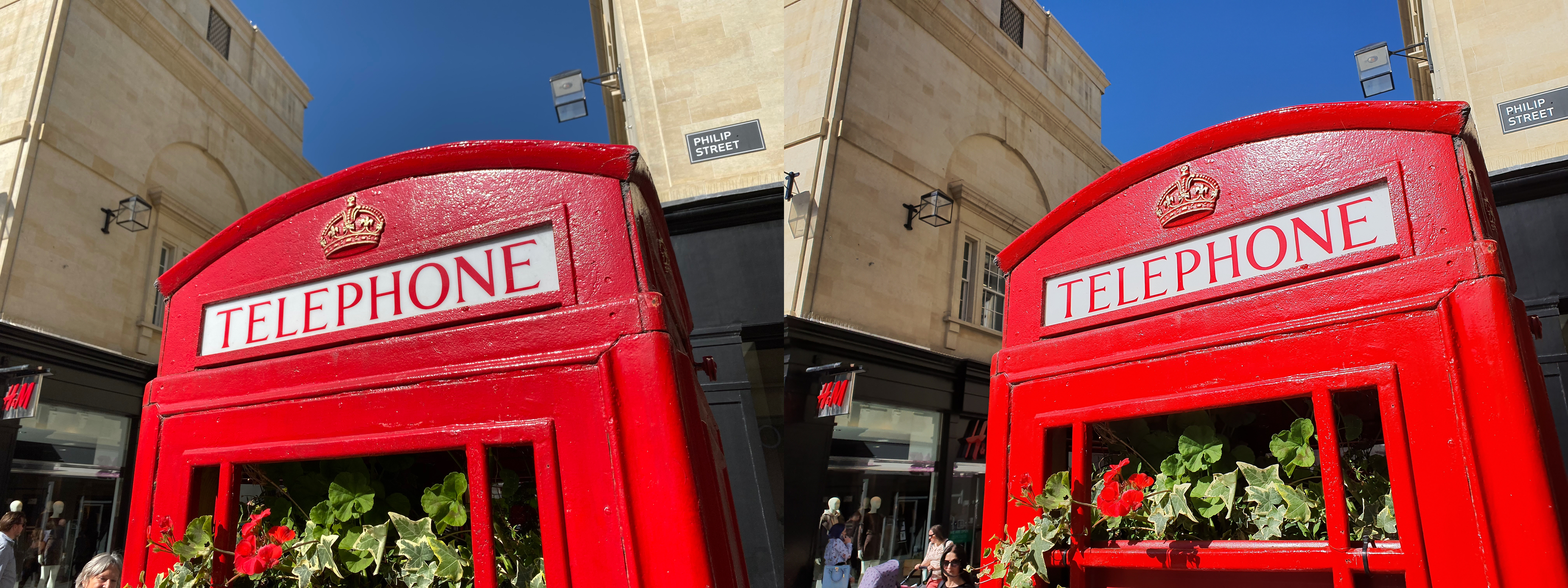
Left: Apple iPhone 11 Pro. Right: Samsung Galaxy Note10. See a bigger version here.
Here's a shot that gives the Samsung's vibrancy boost a big canvas, and is a good chance for you to see that aesthetic difference we were talking about: you can probably recognise that the bright red of the Samsung's shot is not exactly realistic, but – a bit like we said about Night mode – it has a hyper-real appeal of its own.
This shows the best and worst of Samsung's sharpening: it makes the texture on the phone box look even more touchable and prominent, but also makes the red text on the white sign look artificial, like it's been Photoshopped on. And compare the walls of the buildings on both shots – Samsung has sharpened away any texture.
Again, the Apple shot is lower-key, but more realistic. Samsung's shots look excellent at phone size, but Apple's shots will stand being made bigger or printed.
On top of this, the iPhone's Camera app also gives you a more realistic preview of the pic you'll actually capture compared to the Samsung, which is always important.
What the iPhone does well with its photos, it does subtly – but in combination, its handling of detail, dynamic range and colour given everything a warm realism that's superior not just to the Note10, but to everything else we've tried so far. Even if the difference isn't always massive.
That said, we do wish we could have the longer zoom range of the Huawei P30 Pro for even more flexibility. And we wouldn't blame anyone for wanting that flexibility over the pure image quality on show here. But we're still calling Apple the winner of the current camera Royal Rumble.
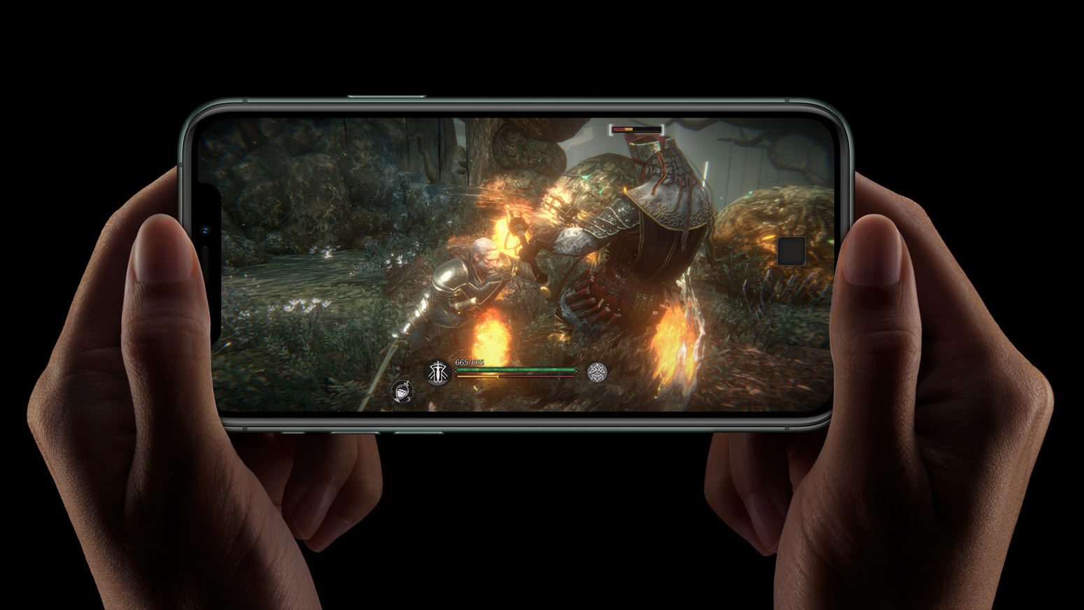
Apple iPhone 11 Pro review: performance and battery
Speaking of sports metaphors, Apple is the undisputed champ when it comes to phone processor performance. As the rest of the industry catches up with last year's A12 chip, here we have the A13, which adds more power.
The exact difference depends on what you're doing, and the phone will also feel faster because iOS 13 has a bunch of software optimisation to open and install apps faster.
In Geekbench 4, the difference is about 13% in single-core performance, and 22% in multi-core power. In Geekbench 5, it's about 20% in single-core, and 22% in single core.
Compared to the Samsung Note10, Apple's lead is clear: the 11 Pro leads the Note10 by 22% in single-core performance, and a brutal 50% in multi-core Geekbench 4 scores.
But then, it's not like the Samsung Note10 ever felt slow to us, nor have the last few iPhones. Apple dominance here is technical, not so much practical. That said, it's nice to know you have the headroom for things like recording multiple video streams from the cameras at once, or advanced editing. You may not do it, but if you ever wanted to, you could.
The other changes in the processor are bigger graphics power, a more powerful neural processor (which enables more advanced image processing, including Night mode and 'Deep Fusion', which is a new way of boosting image quality coming to these phones later in the year), and better power management.
That last one is the important bit, and also leads us to the thing that may tempt iPhone XS owners to upgrade after just a year: the battery life.
Apple has increased battery physical capacity significantly in the 11 Pro models, and has introduced much smarter power use of the A13 processor.
The result is a major boost of battery life – Apple says four more hours for this 5.8-inch iPhone 11 Pro model compared to its predecessor, and five hours for the iPhone 11 Pro Max.
I don't have the new Max to test at this time, but I've tested the regular 11 Pro to death, and the results are great.
Here's the bottom line: the smaller iPhone model now gets as much battery life as the iPhone XS Max did.
I'm an extremely heavy user, and it's normal for the iPhone XS Max to be pretty much spent for me at the end of a day. The 11 Pro reaches the same point, despite being so much smaller.
The Geekbench 4 battery benchmarks bear this out too: the iPhone 11 Pro scores basically the same as a new XS Max (it actually scores slightly better than my year-old one, but batteries do degrade over time).
This is a massive jump from any previous iPhone, including last year's model – it's easily one of the juiciest reasons for anyone to upgrade.
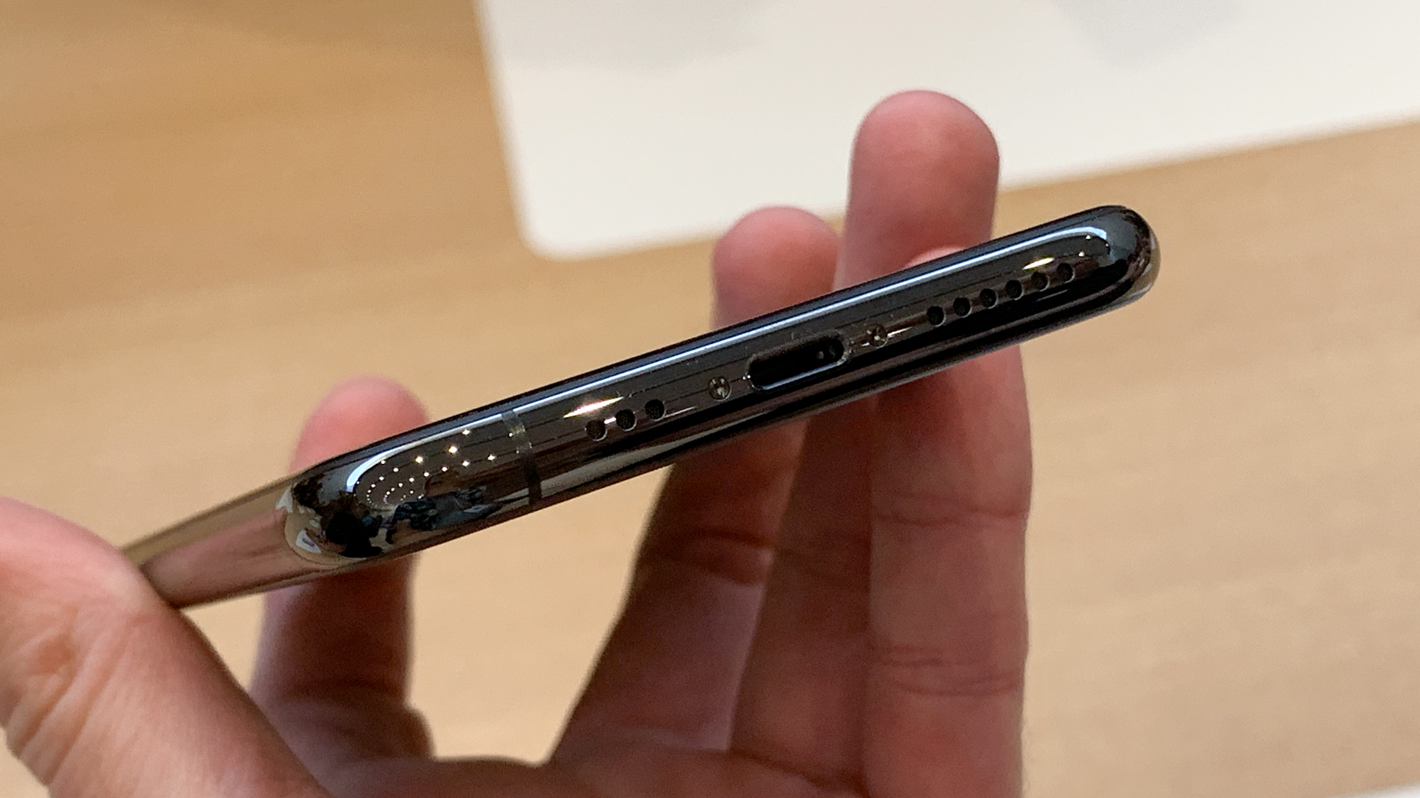
Apple doesn't have any official fast-charging listing, but if you use a higher-power plug, you can charge an iPhone damn quickly – and Apple now includes an 18W charger in the box for the Pro models, which has folding plug pins, usefully.
[An earlier version of this review mistakenly stated that the iPhone 11 Pro shipped with a 5W charger – my apologies for the mistake.]
There's wireless charging again, of course, but the rumoured bi-direction charging (so you could top up your AirPods from your phone) is absent. This is a shame – it's not an essential feature, but in a pinch, it's a great option to have.
We'll also talk about iOS 13 here. As an update, it's broadly good, but it's definitely a bit of a mixed bag. The first launch has been buggy, and while iOS 13.1 has just arrived at the time of writing, we haven't had enough time to be able to say how much it improves things.
There are lots of small changes in how it works, some better than others. The new Dark mode option is good to have, especially because it can be set to come on at certain times. Conversely, the new Share menu now needs more scrolling to find options that were closer to hand, and hides things that used to be more accessible. But it also makes other options more accessible and quicker to access, so it's swings and roundabouts.
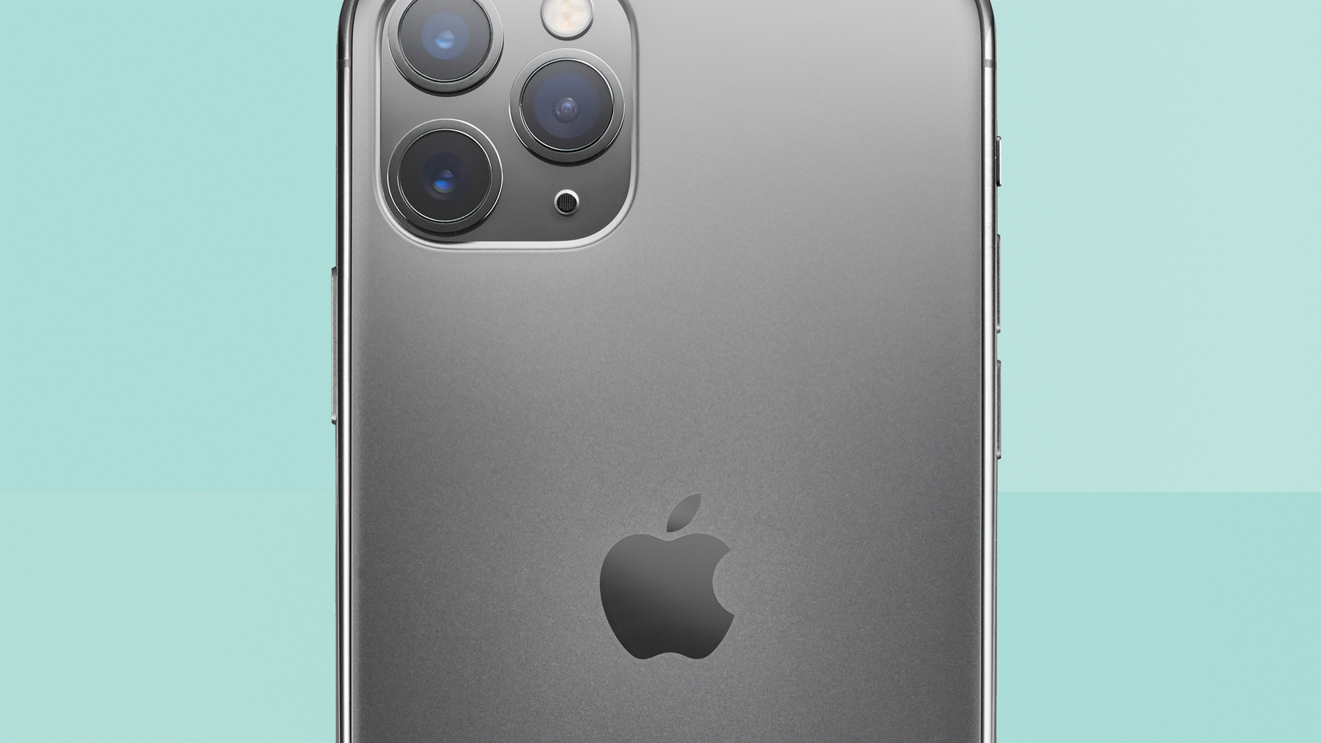
The frosted glass back is a new look for Apple, and it adds grip, so the phone is easier to hold safely without a case.
Some of the changes are not very well explained, either. The new Camera app has a little guide when you open it, but there's been confusion online from people about the fact that the 'Find my iPhone' and 'Find my Friends' apps have been merged into on new app called 'Find my'. Apple's principle here is fine, but you can't just take away an app and not tell people they can find the same functionality elsewhere.
There is a big change in here that's a mix of software and hardware, though: there's no 3D Touch any more. The writing was on the wall when it was left out of the iPhone XR last year, but no new iPhones have it at all.
There's still a version of it, called 'Haptic touch', which can best be described as 'tapping and holding on something'.
As an iPhone power user, I was pretty used to using 3D Touch's clever little shortcuts, and losing it is a bit frustrating. Some things are slower, such as using the torch or camera buttons on the lock screen – it takes a moment longer to trigger, them. Not much, but still a regression. And you used to be able to hard press anywhere on a keyboard to move the cursor, where as now you have to long-press on the space bar. It's just a little slower, a little more fiddly.
Some apps don't support the ability to peek at links before you open them using long press – again, not the biggest loss in the world, but I used it, and now I can't.
Apple has said that losing 3D Touch saved thickness in the screen, which has been put towards extra battery capacity. So in the context of that trade-off, we'll live with it, and after a week of use, our muscle memory is already getting overwritten. But, like other parts of iOS 13, the transition has been clunky.
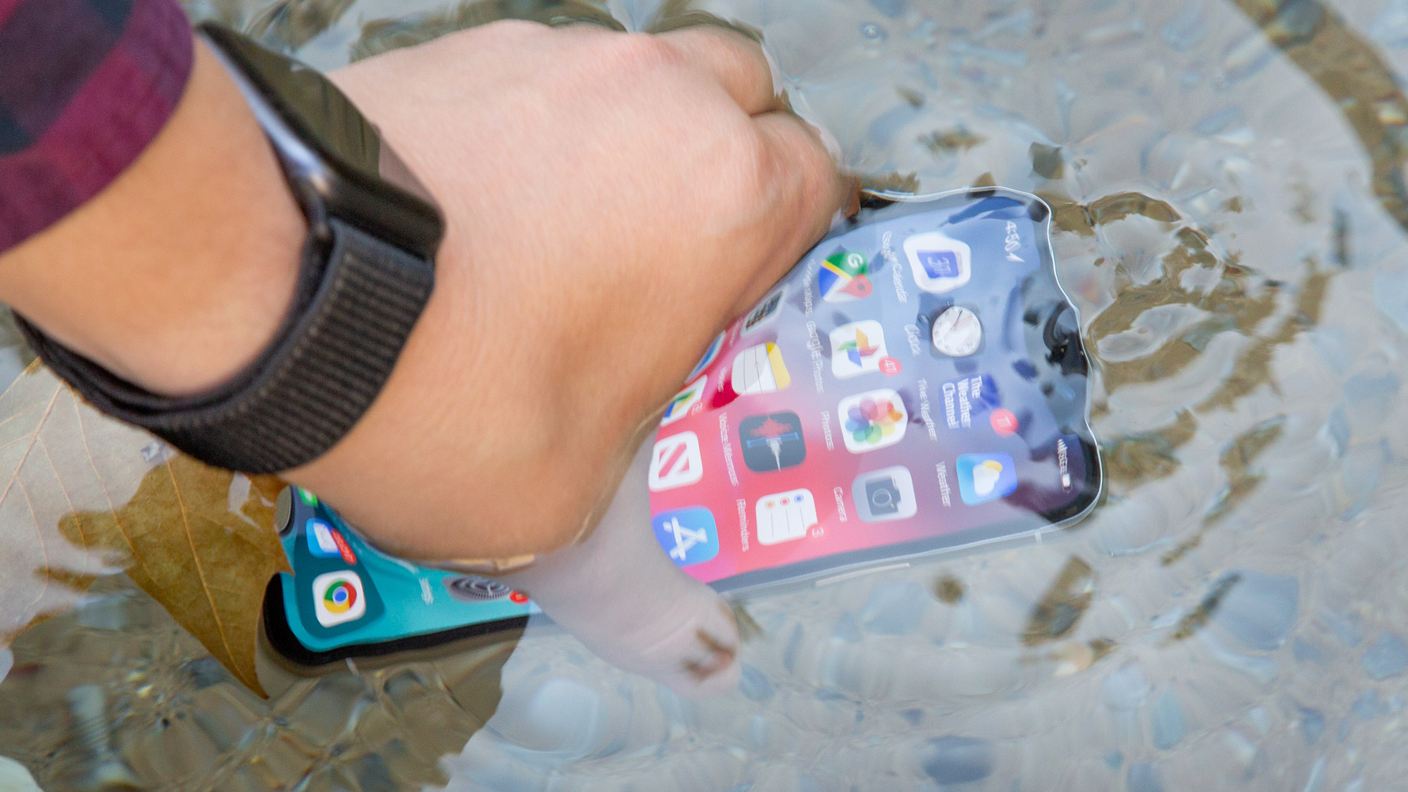
The iPhone 11 Pro is officially waterproof, enough to survive drops into the bath or sink.
Finally, Apple has improved wireless connectivity across the board here. An extra Bluetooth antenna gives longer range, which is great for headphones and Apple Watch – we've seen the connections for both last clearly longer distances.
There's also support for Wi-Fi 6, and Gigabit 4G. There's no 5G, but we never expected there to be – Apple waits for new tech like this to settle down a little before it includes it. It's obviously a shame if you live in a 5G area, but they're still relatively rare and patchy – Apple says it's focusing on the best 4G speeds possible right now, because it improves things for the most people.
Lastly, Apple has included support for Ultra-wideband, which is kind of like a next-gen Bluetooth – it can send information over short distances, but also includes accurate location-detection tech. Right now, it's only used for AirDropping files between devices (point your phone at another 11-series iPhone and it will be first on the list), but the potential is huge. An pair of AirPods with Ultra-wideband that you can locate down the back of a sofa using AR is absolutely on the cards, at some point. It's great future-proofing to have.
Apple iPhone 11 Pro review: should you upgrade?
If you have an iPhone numbered 8 or lower, I think this is the perfect time to upgrade generally. Both the iPhone 11 and iPhone 11 Pro get you better screens, brilliant cameras, great newer designs, much better battery life, as well as faster performance. Across the board, they're full of big improvements that you'll notice every day. But it doesn't matter too much whether you go for the £729 iPhone 11 or £1,049 iPhone 11 Pro – both are a big leap forward.
I know a lot of iPhone SE users really don't want a bigger phone, and have always hoped Apple would accommodate them, but those phones are getting long in the tooth, and Apple (like other manufacturers) doesn't seem interested in smaller phones. I think the iPhone 11 Pro is the best option for those people: it doesn't match the SE for cheapness, but it's the most compact of the new phones.
If you have an iPhone XS, it's probably not worth the upgrade – you've already got a screen that very nearly as good, and a camera system that's not far off. Those who travel a lot and love taking pics while on the move should consider that the ultra-wide lens will give them some excellent new creative options, and there's no denying that Night mode is a huge thing. But I think the battery life will probably be what wins you over if you do decide to upgrade – it's a powerful change. If you haven't been finding the battery on your XS limiting, then I think you should seriously consider waiting a year.
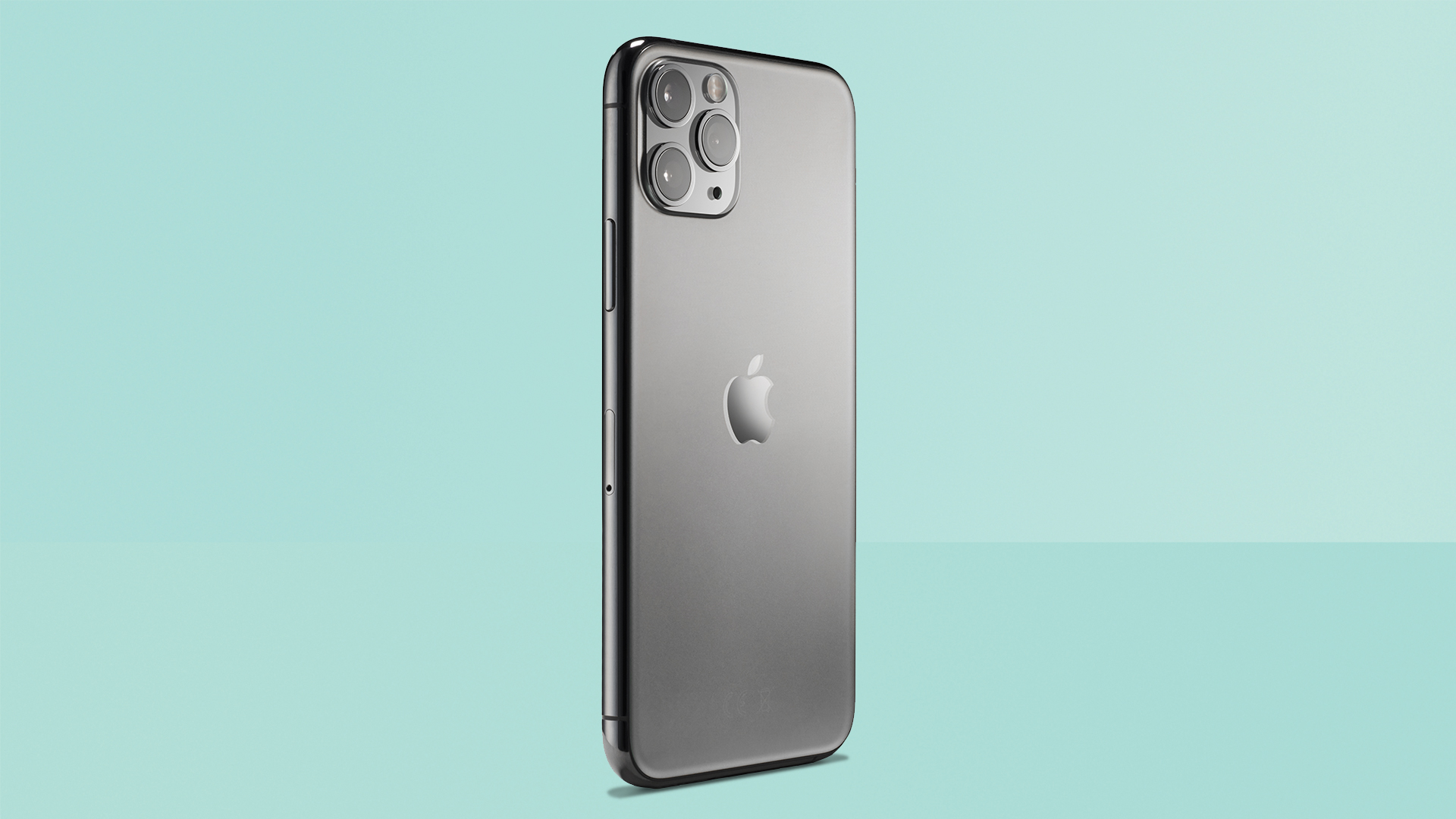
The design of the rear camera calls to mind triple-lens vintage film cameras – it shouldn't look good, but it does.
Apple iPhone 11 Pro review: verdict
It's the best iPhone ever, of course, but how could it be anything else? But it's also better than it looks, and better than Apple's own announcements seemed to let on.
I'm reminded of the Ship of Theseus, which asks: if you replace every beam and bolt of a ship with a new one, is it still the same ship?
The iPhone 11 Pro looks so similar to its predecessor, but almost every single part has been switched out for something new and better. The screen is brighter, the camera is far better, the speaker is improved, the wireless is faster, the battery is bigger, the processor is more powerful… the individual changes don't feel that big, but the sum makes for a really solid year-on-year upgrade. This is absolutely a new, shinier ship.
It does come at a very high price, though. We'd expect the iPhone 11 to be the more popular model by a long way, because it strikes a superb balance of features to price. But if you want the very best technology that you can get in an iPhone, you won't feel short-changed here.
Apple iPhone 11 Pro review: News & updates
August 2020 – Read our iOS 14 hands-on review to learn about the great new features coming to iPhone 11 Pro in the next big update.
Sign up to the T3 newsletter for smarter living straight to your inbox
Get all the latest news, reviews, deals and buying guides on gorgeous tech, home and active products from the T3 experts
Matt is T3's former AV and Smart Home Editor (UK), master of all things audiovisual, overseeing our TV, speakers and headphones coverage. He also covered smart home products and large appliances, as well as our toys and games articles. He's can explain both what Dolby Vision IQ is and why the Lego you're building doesn't fit together the way the instructions say, so is truly invaluable. Matt has worked for tech publications for over 10 years, in print and online, including running T3's print magazine and launching its most recent redesign. He's also contributed to a huge number of tech and gaming titles over the years. Say hello if you see him roaming the halls at CES, IFA or Toy Fair. Matt now works for our sister title TechRadar.
-
 Build unshakeable core strength with a kettlebell and these three exercises
Add this to the end of your workout to fire up your midsection muscles
By Bryony Firth-Bernard Published
-
 The next big tech battlefield is AR Glasses – and Apple is ready to fight
Tim Cook is said to "care about nothing else"
By Sam Cross Published
-
 Android Auto could add a feature that nobody asked for, but might appreciate anyway
This futuristic addition to Android Auto could change the experience forever
By Chris Hall Published
