Apple Watch Series 6 review
The Apple Watch Series 6 maintains Apple's dominance of the smartwatch field with new features and new looks

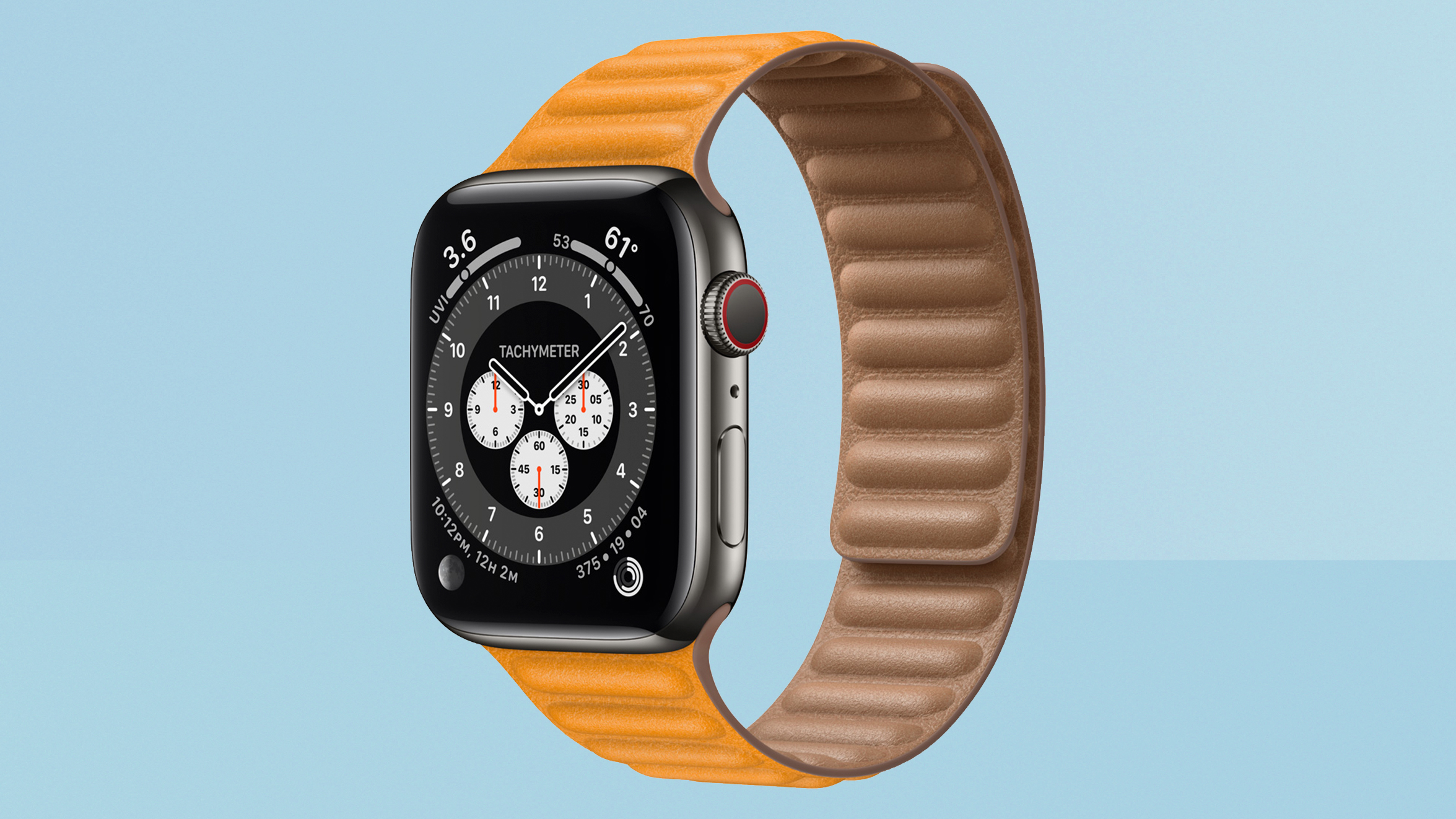
The Apple Watch Series 6 continues Apple's smartwatch dominance, with solid improvements across the board. Many of its features can be found in cheaper competitors, but not the overall experience.
-
+
Great range of health sensors
-
+
Brighter always-on screen is impressive
-
+
Excellent app support and software
-
+
Solid battery life for general use
-
+
Great new colour options
-
-
iPhone-only still
-
-
Not a big leap forward from Series 5
-
-
New sleep tracking is basic
-
-
Won't satisfy truly hardcore fitness fans
Why you can trust T3

The Apple Watch 6 is more a refinement on the Apple Watch Series 5 that came before it than anything groundbreaking. What it does do is give you a better overall package and experience which is what has kept it at the top of our list of the best smartwatches.
The Watch Series 6 adds a pulse oxygen sensor to its range of health systems, makes its always-on display 2.5 times brighter when in its dimmed mode, adjusts some other aspects (such as adding an always-running altimeter), steps up to the new S6 processor, and throws in all the new features of watchOS 7.
It means that it may not be a hugely tempting upgrade for those who bought the Apple Watch 5 last year, but most people won't buy a new Apple Watch every year, so I don't think that's what Apple is chasing with its smartwatch updates now.
- Apple Watch Series 7: release date, price and news
- Apple Watch SE review: Apple's new cheaper Watch option
- Best Apple Watch deals: the best prices on all models
For someone with an older Apple Watch, or who's coming to smartwatches for the first time, the Series 6 offers the most comprehensive and future-proofed option you can buy right now… but for quite a premium, and still for iPhone only.
I won't dwell on the fact that the Apple Watch works only for iPhone in this review, since it's not really a surprise. The Watch has advantages that other wearables don't by being so well integrated with Apple's systems.
But Apple's pitches for the Watch models often talk about how it can literally save someone's life, and how its combination of sensors and intuitive software mean that can happen in the background, subtly. Wouldn't it be nice if those life-saving advantages were available regardless of your phone choice?
Lastly, we think it important to draw the fact that the Apple Watch Series 6 has won T3's Best Smartwatch award at the T3 Awards 2021 to our readers' attentions. The judges were bowled over by the Series 6, and we advise anyone interested in the smartwatch to read up and see why before making a purchasing decision.
Get all the latest news, reviews, deals and buying guides on gorgeous tech, home and active products from the T3 experts
Apple Watch Series 6 review: price, release date and features
The Apple Watch Series 6 was released on September 18th 2020, and starts from £379/$399/AUS$599. In the UK, that's £20 less than the previous model started from, which is a little bonus.
That price is for the 40mm size, with an aluminium case and one of the more basic sports bands. Stepping up to the 44mm size with the same material and bands costs £409/$429/AUS$649.
You can also choose whether your Series 6 aluminium will have 4G connectivity or not. That costs £100/$100/AUS$150 over the base cost for your size/band combo.
Unlike the Apple Watch SE, the Series 6 gives you the option of going with a fancier case material than aluminium, though. A stainless steel 40mm watch starts from £649/$699/AUS$1,049 with a basic sports band, with the 44mm version costing £699/$749/AUS$1,119.
As a bonus, every stainless steel model comes with 4G built-in automatically, so there's no extra premium for that. Stainless steel models also have sapphire glass on the screen, instead of the toughened Ion-X glass of the aluminium version, meaning they're even more hardened against scratches or cracking.
There are also more expensive titanium models, and special Nike models with custom bands, and Hermes models with their own unique band options.
Choosing bands made of metal or leather will up the price a little more – the exact combination of size, case material, 4G or not, and band means your Apple Watch could cost anywhere in a pretty wide budget range.
• Browse all Apple Watch Series 6 options at Apple UK
• Browse all Apple Watch Series 6 options at Apple US
• Browse all Apple Watch Series 6 options at Apple Australia
The Apple Watch Series 6 is the most feature-ful model to date, unsurprisingly. You've got the always-on OLED display (now much brighter in its 'dimmed' mode, which I'll come to in in the next section), a new S6 processor that promises to be power-sipping, and therefore an 18-hour promised battery life (with the always-on display active).
Fitness and health features include motion sensing sensitive enough to detect falls (and ask you if you're okay) as well as to calculate how hard you're working out, a heart rate sensor with warnings for high and low heart rates, an ECG for accurate sensing of irregular heart rhythms, and a new pulse oxygen sensor for seeing how well-saturated with oxygen your blood is.
There's GPS on all models, a new altimeter that's always running (previously, it only updated live during workouts), an impressively accurate compass to detect your orientation when using maps, and 50m waterproofing.
Apple Watch Series 6 review: Screen & design
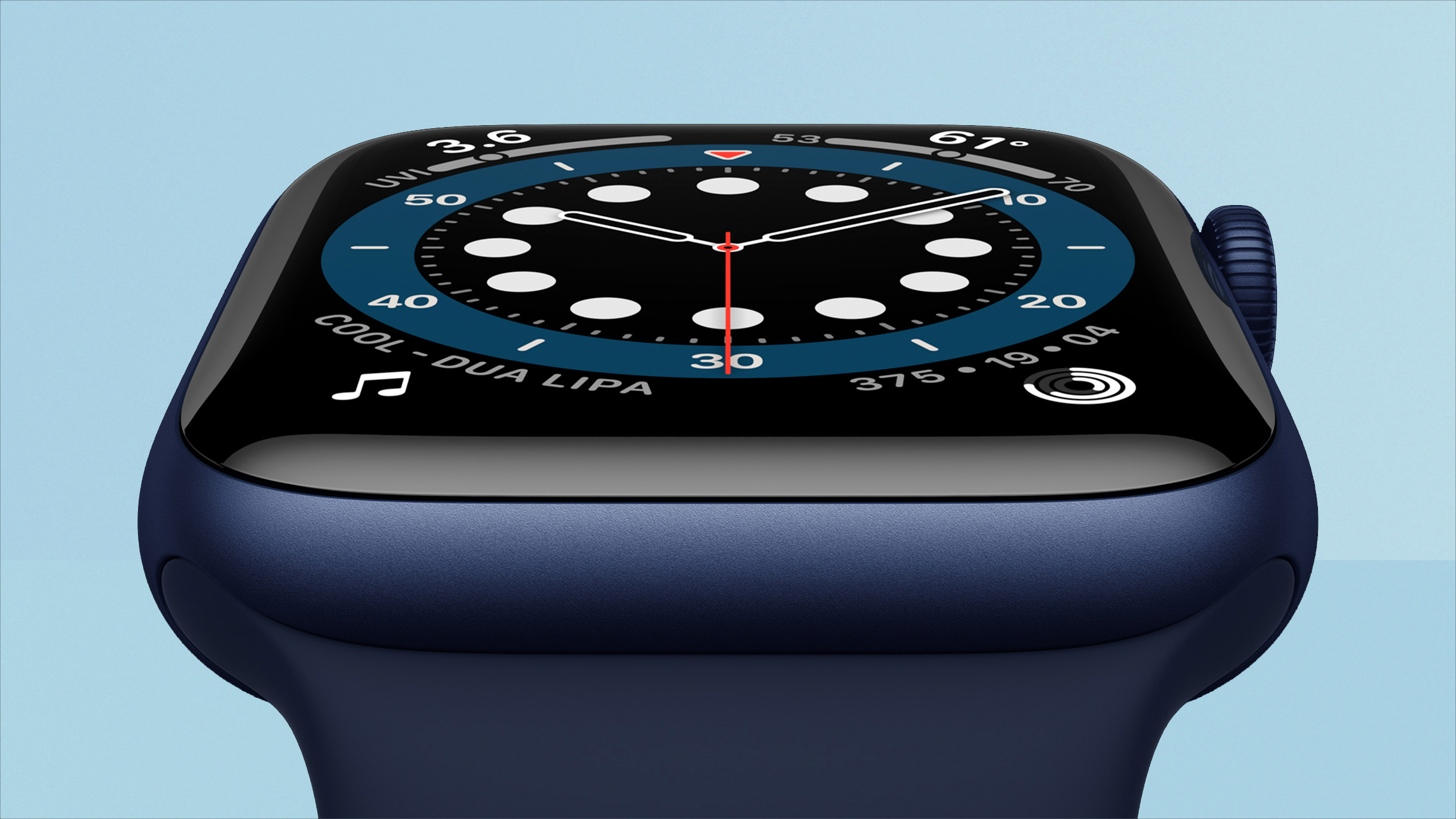
The only new feature in the Apple Watch Series 6 when it comes to the screen is that the always-on display is now 2.5 times brighter than the version in Series 5, which is a pretty damn significant increase.
The way that the the always-on display works is that, when you turn the Watch to face you, the OLED display pushes itself to full brightness, which is around 1,000 nits – the same as a pretty high-end TV. This makes it perfectly visible even in bright sunlight.
When you lower your wrist, the screen brightness dims, and what's on the screen may actually change. If it's your watch face, it will usually change to a version of it in darker or inverted colours (to save battery further); if it's an app, it'll show the time instead; if you're in a Workout, it'll show the same screen, but refreshing once per second instead of constantly.
Previously, the dimmed display was a little too dim to see clearly on a bright day – reflections too easily washed it out if you wanted to glance while in a position where you didn't want to shift your wrist, such as riding a bike.
On the Series 6, the dimmed display is impressively visible even in the sun. In indoor lighting, it appears remarkably close to the Watch's regular brightness.
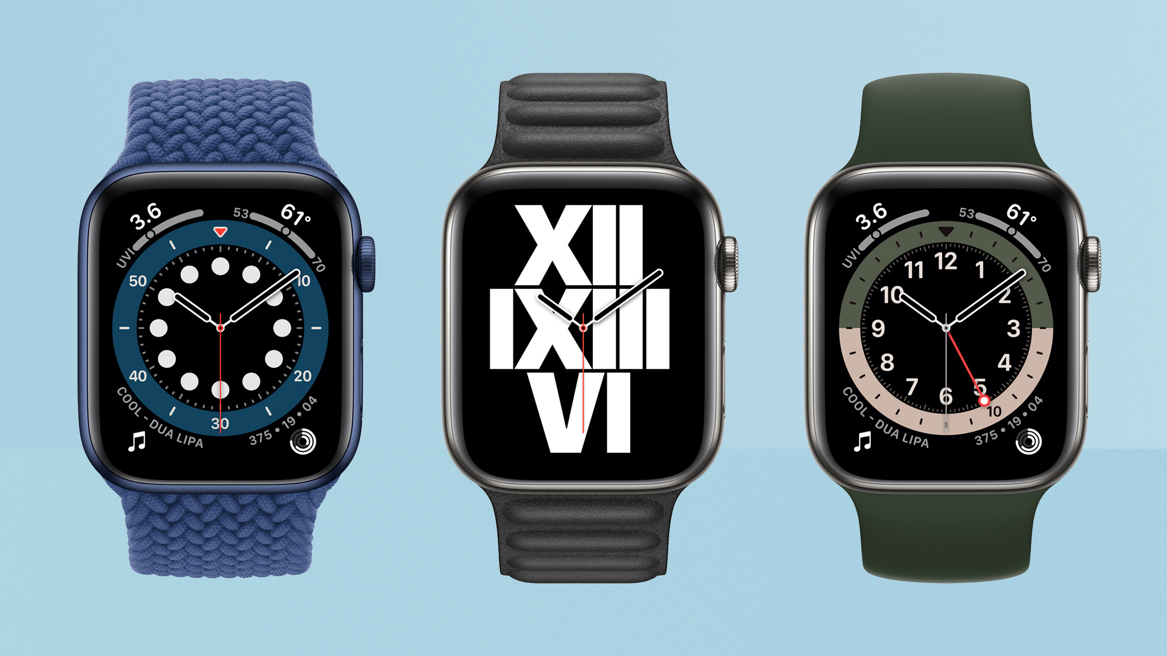
I was delighted about this, because one of the hopes I've had for the always-on display is that it would help some of your personal style to come to the forefront on the Watch, since instead of other people only seeing your case/band choices and a black screen, they would see your choice of face style too.
However, because the Watch switches to an alternative, more battery-friendly, version of your watch face when in the dimmed mode, you still don't get to communicate your full style.
Still, this very much feels like the more 'finished' version of the always-on screen, in a way – immediately superior to the the version in the Series 5. Well, it being full brightness without any kind of switching would be truly 'finished', but we're not there yet with current screen and battery tech.
Beyond that, the screen is the same as on the Series 4 and Series 5 Apple Watches, with a sharp and colourful 324x394-resolution display on the 40mm, and 368x448 screen on the 44mm version.
The design is basically identical to the last two Watch models too, save for one tiny change, but also quite a few new colour changes.
The tiny physical change is that the Series 6 is marginally thinner than the Series 5, though we didn't really notice a difference moving from one to the other.
You've still got the same rounded square shape, with the Digital Crown on the side, along with a single button. The Digital Crown originally felt like a little nod to the heritage of watches, but it's a bit of a secret weapon for the Apple Watch, acting as a scroll wheel to make moving through long lists or messages much less hassle than swiping on the small screen.
The side button is used to switch between recently used apps quickly (another great touch), or to trigger emergency calls – again, a feature I'm a big fan of. Well, in principle. I don't mean I go around calling ambulances from my Watch regularly.
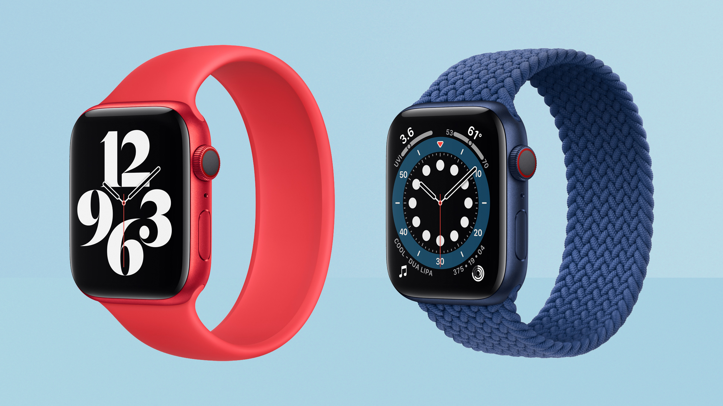
There are four new colours of Apple Watch this year, though two of them replace existing colours.
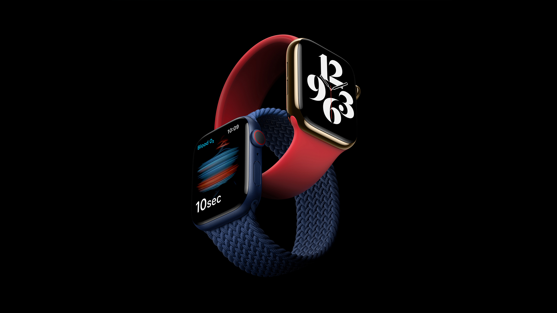
You can now get the aluminium case in blue or red, and both are pretty fetching, though I prefer the deepness of the blue personally.
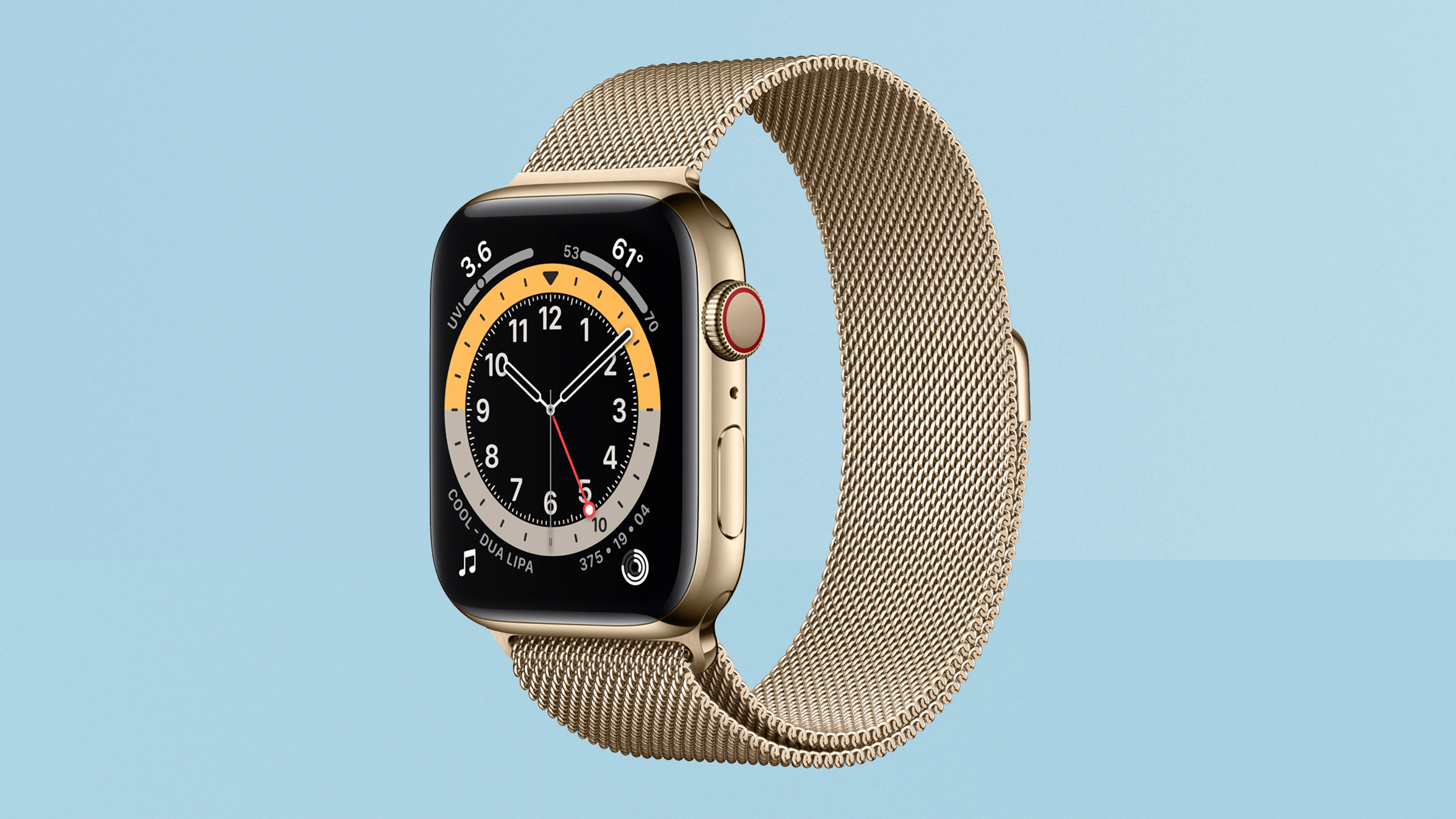
The stainless steel version comes in a new gold finish that replaces the old gold finish, and a new 'Graphite' finish that replaces the old 'Space Black' finish.
The gold is the model I have, and it's a much cooler gold – quite similar to brass – than the previous version, which was really warm and bold. I personally preferred the old gold just for its statement value, but I'm sure lots of people will prefer the slightly more subtle shade used now.
The 'Graphite' finish is quite a departure from the 'Space Black' it replaces – the old black was an incredibly shiny and deep black, while this new tone is more grey as the name implies, and looks more like the titanium finishes, actually. I think it will find a lot of fans who like something with a little less of the shininess of the silver or gold stainless steel.
Apple Watch Series 6 review: watchOS
The Apple Watch's software hasn't changed that dramatically since it first launched, which shows how well Apple hit the mark early on. The main way you'll interact with it is to… well, look at the time, really.
But otherwise, the main thing is that you get notifications on the Watch's screen, many of which you can respond to in useful ways with a quick tap. You shouldn't get all your notifications on your Watch if you want to keep your sanity, but it is so useful to get little reminders when your phone isn't to hand, or to be able to see a text and decide whether you should respond right away or not without getting your phone out of your bag.
Many apps will put buttons right on the notification that give you options to respond from your Watch.
Siri is also built into the Apple Watch Series 6, and you can raise your wrist and say "Hey Siri" followed by a request, or you can hold the Digital Crown to trigger it. You can do everything from dictate a text to send to someone, to just setting a timer for something you're cooking, with your Watch tapping you on the wrist when time is up.
There are lots of apps available on the Watch too, for giving it some extra powers if you need them – for example, outdoors mapping apps for a hike, or some apps for controlling smart devices, can be really useful. Again, I wouldn't recommended installing lots of trying to make your watch a miniature version of your phone – the small screen just isn't best for that.
Obviously, the Watch faces themselves are a huge part of the Apple Watch. In some cases, this is practical: you can add 'Complications' to many faces that act like little widgets. They can show you useful information such as the current likelihood of rain or what time your next calendar appointment is, or can act as shortcuts to open an app you like to use often.
The watch faces themselves are a minor on-going bone of contention for me. Every year, Apple releases a bunch of new options, and every year I look through them go "Yeah, they're all nice, but…"
Apple offers a really broad range these days, from watch faces that mimic classic chronograph elements, to simple dial-based watch faces, to digital clock faces, to practical faces more focused on widgets and information than time, to more out-there artistic and animated options. And each one is customisable, though some to a stronger degree than others.
And yet, I still haven't found one I truly love. Which is not to say that you won't – for many people, the simple face that shows one of your photos behind a basic watch dial (which has been there since the start) is their dream watch face – but I really wish Apple would open this up for developers to build their own weird and wonderful options.
I think part of my problem is that despite Apple offering many face options, they actually often share similar elements – almost all use the same hand design, for example, and similar lozenge-shaped hour markers. And I don't like either, so even when the rest of the style suits me, there are elements I'm not keen on that I'm stuck with – where are my modern-minimalist chunky squared off features? Or pointy hands over all slim markers? And that's ignoring all the possibilities for faces to be classic in looks but to have extra animations or dynamic elements.
There are faces a little like this – and I do want to particularly praise the new Artist face in watchOS 7 for being totally left-field in a great way – but they mostly still feel like they're playing it too safe.
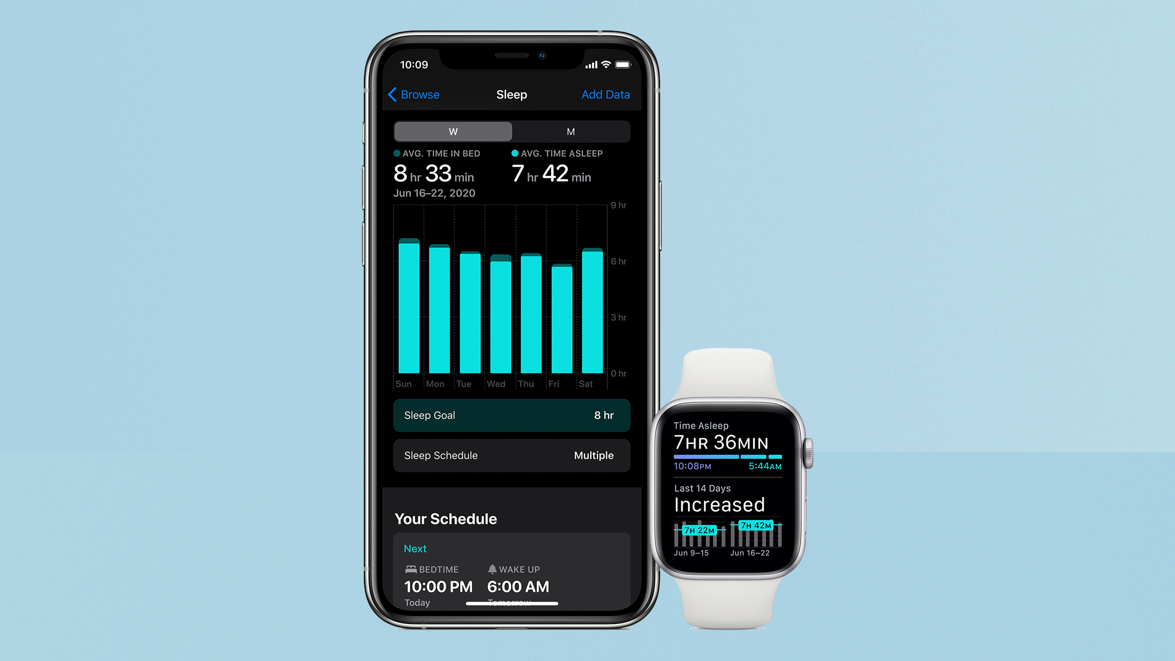
The marquee new feature of watchOS 7 is sleep tracking, along with Wind Down, which is a tool on Watch and iPhone that aims to help your sleep hygiene by discouraging screen use shortly before you'll go to bed.
The full way to use the sleep features and Wind Down is to tell it when you want to get up each day, and how much sleep you want to get. It can then automatically start triggering Wind Down when the time comes.
The Watch will enter a mode with an ultra-dark screen, so that having it on won't disturb you while you're asleep (apart from it being not the smallest and lightest wrist-based device).
While you sleep, the Watch will track your movement, and attempts to differentiate times you're asleep compared to times you're awake but still in bed (reasonably well, in our experience).
When it's time to wake up in the morning, you get some gentle taps on the wrist to rouse you, and optional light sounds. It's a much nicer way to wake up than a harsh external alarm, I have to say, and is quite effective.
However, the sleep tracking is rather basic. It only reports sleep vs not-sleep, and can't tell you whether you got lots of deep REM sleep, or whether you tossed and turned in light sleep a lot. The Watch will tell you what your heart rate was throughout the night, but doesn't really tie that into the sleep data at all – it just presents them together in your 'sleep highlights' in the Health app on iPhone.
The Series 6 has the pulse oxygen sensor, and this again does take some readings overnight, which could theoretically be beneficial for helping to spot sleep apnea. But the Health app didn't add this into my sleep highlights, so I had to dig elsewhere for the information. And even then, there are a couple of readings per night, which seems like too few to tell me much. On some nights, my oxygenation levels dipped below the ideal levels, but are these recording errors (possible, since there's no way for me to know how well the iPhone was pressed against my skin at that time) or something to be worried about? I'd need more readings, more consistently, and so far I'm not getting them.
On devices from the likes of Fitbit, sleep tracking is meant to be a part of looking at the overall picture – tying it with stress recording and other activity tracking and biometrics helps you to understand why you might feel more tired some days, and which habits can help you get more rejuvenating rest. On Apple Watch so far, you get notifications if your sleep time trends are changing, but there's no holistic approach beyond that.
It's fine if you want to dabble, but it won't change your life.
Apple Watch Series 6 review: Health & fitness
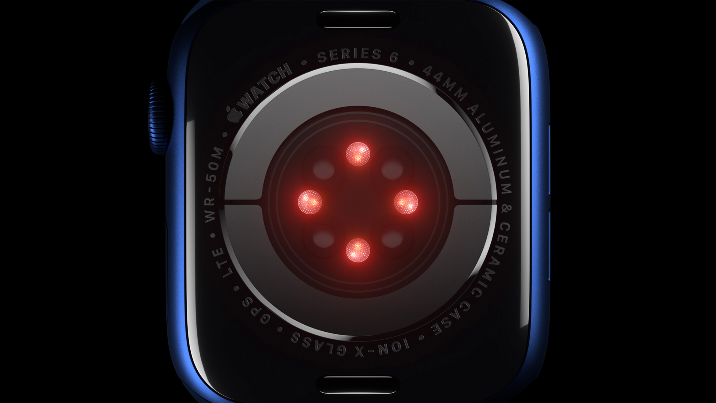
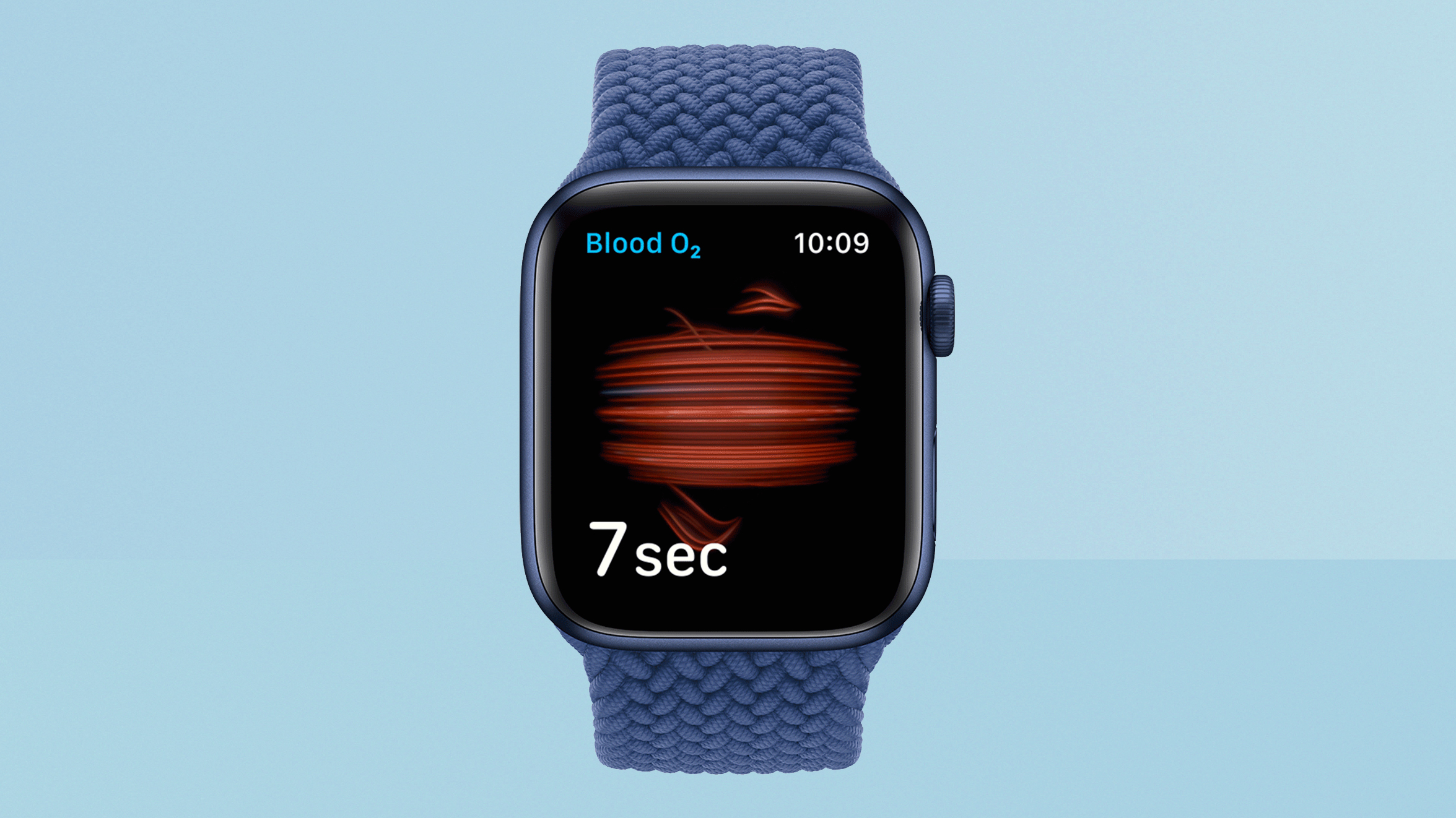
When it comes to new health and fitness features, only the pulse oxygen sensor is a major addition in the Series 6 hardware. Additional LED lights on back of the Watch can sense how well-fuelled with oxygen your blood is.
Much like the ECG (which is here again), taking a reading requires sitting still and stable for a few seconds, with a good Watch fit.
And also as with the ECG, most people will get a reading that's within the normal range, and then that will be that. It can be of interest to those especially into fitness training, because you can track how quickly your body regains its oxygen by taking a couple of different readings after working out.
For the non-hardcore, it's potentially useful (especially in Covid times, where respiratory issues are on the rise) as a way to check your health occasionally if you feel a little weak or light headed. Knowing whether your body is getting enough oxygen or not (combined with the ECG being able to tell you whether your heartbeat is regular or not) could help to identify problems much earlier than you otherwise might.
It takes readings of its own accord in the background, but it seems like you need to be wary of their accuracy if you're not sitting still, prepped for the reading. I fired up the app while writing this section, and it told me it had taken a reading of just 67% 16 minutes ago, which is alarmingly low. So I took the reading, and it came in at 99%, matching most of the other passive readings it had done that day.
Theoretically, one of the best uses of the pulse oxygen sensor would be to detect sleep apnea, where the body can't get enough oxygen while you sleep. We've already mentioned, though, that the low number of readings and inability to know how well positioned the Watch was at that exact moment mean that this feels too foggy for us currently. Still, if you find it taking regular low-oxygen readings during the night, talking to your doctor about sleep apnea may turn out to be a brilliant idea. We just wish this wasn't so hidden.
Apple also resolutely won't tell you much about what the readings mean, other than recommending you speak to doctor if, say, the ECG detects an irregular heartbeat.
We understand why – making software-based suggestions that could be seen as medical advice based on a consumer-level device could cause huge problems – but there are alternatives. Fitbit does a better job of giving you analysis what readings mean using the same sensors on the Fitbit Sense, and even the Cardiogram app, available for iPhone/Apple Watch has the simple trick of comparing your heart rate reading to other Cardiogram users. Cardiogram doesn't need to tell you you're unfit: it just says that your resting heart rate is in the bottom 10% of its users, and you get it.
It's fine throw sensors at us and present the results in a friendly view that give us a jumping point to understand our health, but it's not reaching the full potential of what the Watch could be.
The health support in the Watch isn't just limited to these, of course. The regular heart beat sensor runs throughout the day, and can warn you if your heart rate is especially high or low, and can spot a possible irregular heart beat, which you can more accurately check with the ECG.
Fall detection is one of the key features we love about the Apple Watch, because it really brings together the idea of the Watch as a little protector in the background. If you take a hard fall, it will ask you if you're okay – you can say that you're fine, or you can call the emergency services immediately from it.
If you have a 4G model, it will call directly (regardless of whether you actually have a plan on it), otherwise it will connect to your iPhone and call via that. If you don't respond to the question, it calls automatically after a certain amount of time, pinging your location to them, along with an automated distress signal, basically. It also tells your emergency contact what's happened.
You can also call the emergency services (and notify your contact) at any time on the Watch by pressing and holding the side button for a fixed period.
The Watch also protects your hearing, being able to warn you if the ambient volume in your location exceeds safe levels.
And watchOS 7 brings a new feature for monitoring good hand-washing technique, ensuring that you do the full 20 seconds, and recommending that you wash when you arrive home from elsewhere.
If you find all this to be too close to nannying, you can turn these monitoring features off individually.
When it comes to fitness, not much has changed compared to previous Apple Watches. There are more workout types than ever, with specific tracking for different exercise options, which is great to see. The Apple Watch is also tightly integrated with Apple's new Fitness+ classes, but we haven't been able to test that yet.
The heart beat sensor is accurate enough for most people, but won't replace a chest strap for the more hardcore. Similarly, the type of stats it records won't be deep enough for those looking to really hone their triathlon time, but will be enough for the rest of us.
As with other parts of the Watch, it keeps the stats light at first, but enables you to dig into certain areas if you want, including interesting info such as your average walking speed or step climbing speed or VO2MAX.
It means that the Apple Watch is a do-anything fitness watch, but not a highly specialised one, and I'm good with that. There's enough capability and headroom here to for most people, but hardcore runners will want a dedicated running watch.
Apple Watch Series 6 review: Performance & battery
The new S6 processor in the Series 6 is clearly very fast – everything in watchOS is extremely smooth and responsive. But that's also true of the Watch SE, so speed isn't really an advantage here – though having a more powerful processor is desirable from a future-proofing perspective.
But the internals being more efficient is a key aspect of freeing up battery consumption so that the always-on screen can be brighter without wrecking battery life.
Apple says 18 hours of use per charge, but that seems very pessimistic based on my use. In standard use, doing nothing out of the ordinary with the Watch, and including recording an hour-long outdoors walking workout in the middle of the day, I had around 50% battery left at bed time.
Sleep tracking takes another 10-15% out of the battery, in my experience. The Series 6 has fast charging, so I would place it on to charge while showering and getting ready in the morning, and it would be between 90% and full when I want it, so this routine has proved more than comfortable for battery life. You also get a notification on your iPhone when the Watch reaches 100% charge, usefully.
The Watch 6 offers slightly lower battery life than the Apple Watch SE, which was at around 57% with the same use.
However! I also tried turning the always-on screen off, for some longevity testing. In this mode, the Series 6 behaves like the Watch SE, only turning the screen on when you turn the Watch to face you, and turning it off when you lower your wrist.
This got me 65% battery remaining at the end of the day – a pretty significant improvement. So if you're away from a charger, making that tweak will get you definitely two, maybe even three days of use (if you don't use the sleep tracking).
Other activities will drain this faster, of course – tracking long workouts where the GPS is running the whole time (such as an outdoor run or cycle) will make a colossal difference. For all but the most extreme users, it should still be more than enough to get you through the day.
There are dedicated fitness and outdoors watches that make a point of lasting most of a week, and if you're running regular marathon training, the Watch is maybe not the perfect companion unless you don't mind charging it as soon as you're finished.
It would be nice if the Watch could last longer without charging, but I've found no issues with my routine – the battery more than lasts what I need it to, and charges at the speed I need it to, and my use is very much in line with the average user, I suspect.
One quick thing to note: the Apple Watch no longer comes with wall plug for charging – just the cable portion, with a USB charger on the end. We don't mind this change, but we do find it a little odd that Apple is still putting USB-A cables in with the Series 6.
The iPhone 11 Pro, iPhone 12 and even the new cheap 10.2-inch iPad all come with USB-C-connected chargers. It is a little odd that if I were to buy Apple's latest laptop, iPhone and iPads, I would be able to charge everything except my Apple Watch without buying an additional adapter. You can buy a separate USB-C Watch cable, but why do we need to?
Apple Watch Series 6 review: Verdict
The Apple Watch Series 6 keeps its predecessor's place as the best smartwatch still, but the gap is closing when it comes to health tech in particular, with some competing devices offering similar sensors for less.
The Series 6 feels like more of a premium price than its predecessors in that context, but the overall quality of its design, plus its screen quality and smooth operation, all leave it feeling worth the cost. It's simply the best and most comprehensive experience smartwatch experience when everything is taken into account – other devices challenge it in specific areas (and we've made some gripes in this review) but it's all about the whole.
The Series 6 doesn't represent much of an upgrade over the Series 5 in total, but I don't see that as a problem in itself. The sum of the improvements over recent years make it a big upgrade for people with earlier Apple Watches, and for people coming new to smartwatches, it and the Apple Watch SE offer two excellent experiences at two different prices.
One of the biggest leaps Apple could make for the future of the Watch is with the usefulness of its health data, but that doesn't even require new hardware, so hopefully the Series 6 may get this with watchOS 8 anyway.
Apple Watch Series 6 review: Also consider
The big competitor here is the Apple Watch SE, of course. For £269/$279/AUS$429, you get the same design but in aluminium only; same screen but without the always-on display; and same health and fitness features but without the ECG and pulse oxygen sensor. It's a really great device overall, and if you're looking at your first Apple Watch in particular and don't want to spend as much as the Series 6 costs, it's an extremely strong choice. Our full Apple Watch SE review explains all.
The Apple Watch Series 5 is also still around in stock at many places, and in the upcoming Amazon Prime Day deals and Black Friday deals may well go down to some extremely tempting prices. As we said, the Series 6 isn't a huge change from it – you'd be getting a dimmer always-on display and no pulse oxygen sensor – so if you can get a choice Series 5 model with a discount, we thoroughly recommend it. Our page of the best Apple Watch Series 5 deals will help you find the best prices.
The Fitbit Sense and Fitbit Versa 3 are strong competitors if general health and fitness are what you're interested in. The Sense in particular is designed around matching heart rate and pulse oxygen with strong sleep tracking features and stress levels, to help you understand how different parts of your life affect each other. It's cheaper than the Series 6 too, but isn't as nicely made, and doesn't work as slickly with your iPhone.
- Best Apple Watch
- Apple Watch Series 6 vs Apple Watch SE: which should you buy?
Matt is T3's former AV and Smart Home Editor (UK), master of all things audiovisual, overseeing our TV, speakers and headphones coverage. He also covered smart home products and large appliances, as well as our toys and games articles. He's can explain both what Dolby Vision IQ is and why the Lego you're building doesn't fit together the way the instructions say, so is truly invaluable. Matt has worked for tech publications for over 10 years, in print and online, including running T3's print magazine and launching its most recent redesign. He's also contributed to a huge number of tech and gaming titles over the years. Say hello if you see him roaming the halls at CES, IFA or Toy Fair. Matt now works for our sister title TechRadar.
