Galaxy S8+ review: 2017’s best phone but even that screen can’t make up for a few flaws
It comes at a price, but it's hard to ignore just how superb the 6.2-inch WQHD+ display really is
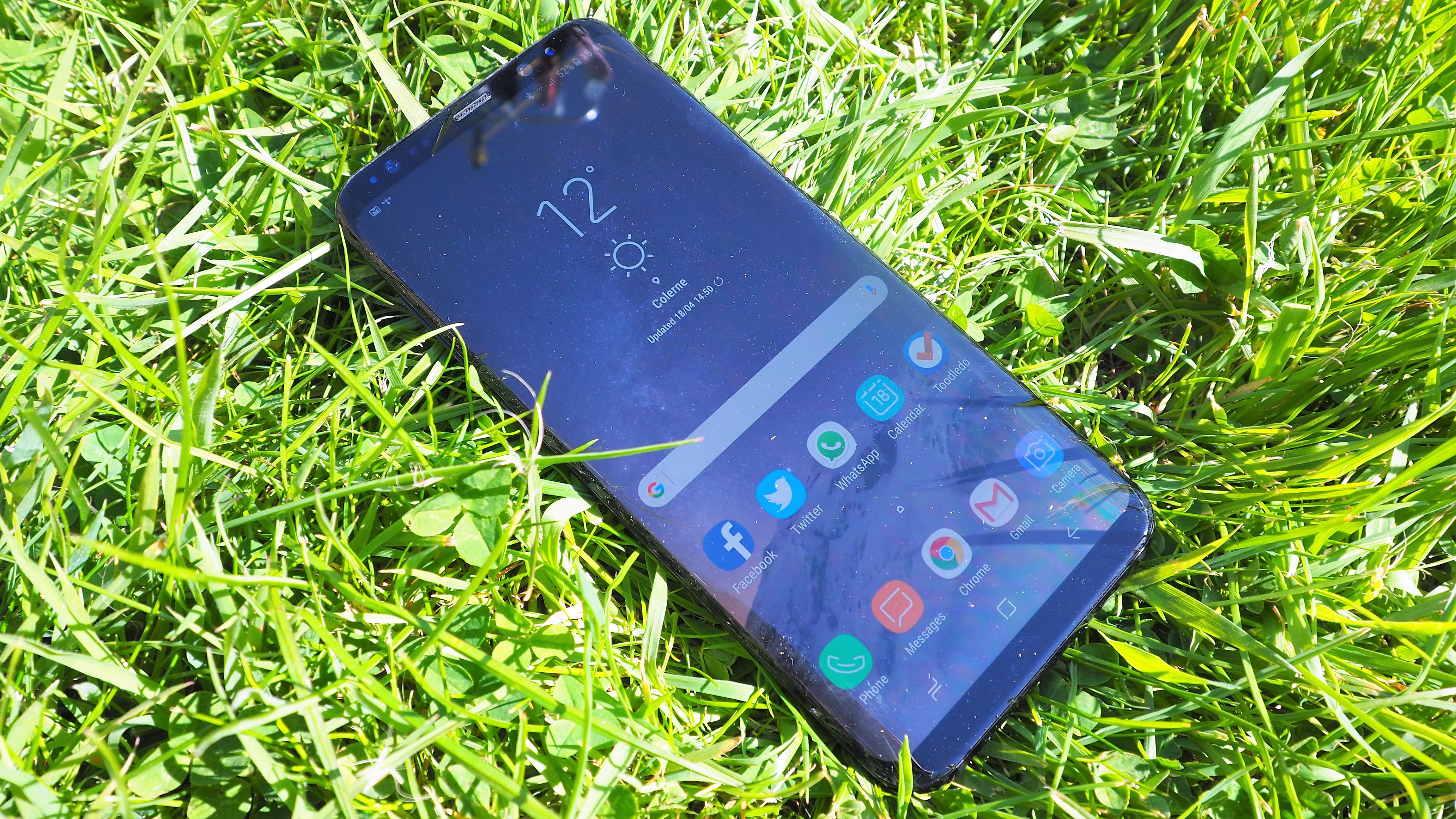
The S8+ takes smartphone screens to another level, but the fingerprint reader spoils the party.
-
+
Brilliant 6.2-inch display
-
+
Blazing fast performance
-
+
Bluetooth 5/dual audio
-
-
Rear fingerprint reader placement
-
-
Bixby needs to differentiate
-
-
Face recognition hit and miss
Why you can trust T3

So here we are: the Samsung Galaxy S8 and S8+ have been revealed and will be in stores next week. When is the S8 edge not the S8 edge? When it’s the Galaxy S8+ of course!
The Samsung Galaxy S8 and S8+ will launch next week (28 April) in the UK and Europe. In the UK, the Galaxy S8 will retail at £689 and the Galaxy S8+ will retail at £779. Check out all the Galaxy S8 and Galaxy S8+ prices, deals and tariffs
We’re initially reviewing the Galaxy S8+ here, although we’ll bring you a review of the standard Galaxy S8 just as soon as we can. Spoiler though: the result will be quite similar - here's our Galaxy S8 and S8+ specs comparison.
That’s because the pair are pretty much the same apart from the larger 6.2-inch screen size as opposed to the still-fairly-whopping 5.8-inch display on the standard S8. The S8+ also a slightly bigger battery (3,500mAh versus 3,000mAh) and costs £90 more SIM-free.
And don't forget to check out our Galaxy S8 review
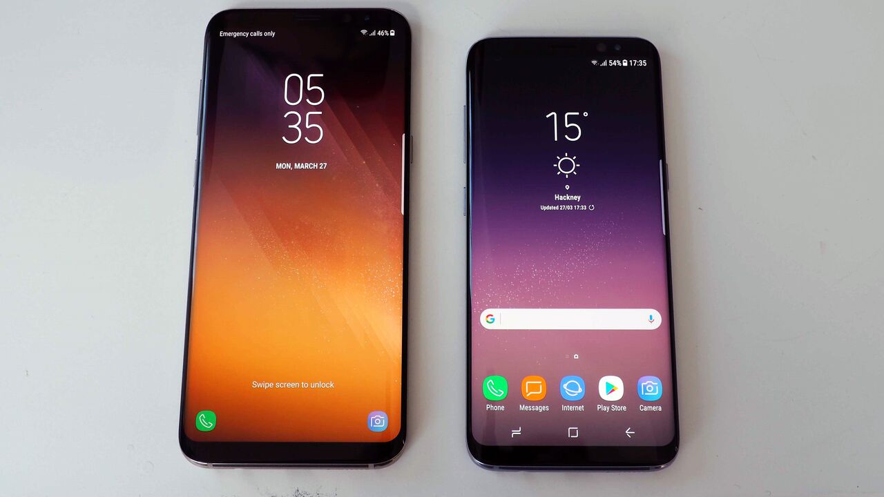
- Our Samsung Galaxy S8 vs Samsung Galaxy S8 Plus specs comparison
So with the S8 series, Samsung has basically taken the Galaxy S7 edge, beefed up the display considerably, changed some of the other specs, moved the fingerprint reader to the back, shoved the home button under the screen thanks to a new pressure sensor, added an extra button to the side of the phone for its Bixby personal assistant and released the phone in two sizes.
More on all that shortly, but essentially what you need to know is that buying an S8 or S8+ won’t be a bad decision; these are superb devices that are worthy successors to the super S7 Edge.
You feel like you could pretty much do anything with this phone in your hand. However, despite all the enthusiasm we have for this handset, there are some flaws, which we’ll talk about shortly.
There are many who would love to have vanilla Android on the S8+ and formerly the S7 edge. More so now than ever, we feel this call is misplaced. Samsung's TouchWiz overlay is better than ever and these days has a slickness that feels like you're always in control.
It can be as complex or as simple as you want to get. The swipe up from the home screens to get to the app drawer is a particular highlight.
Galaxy S8+ screen and design
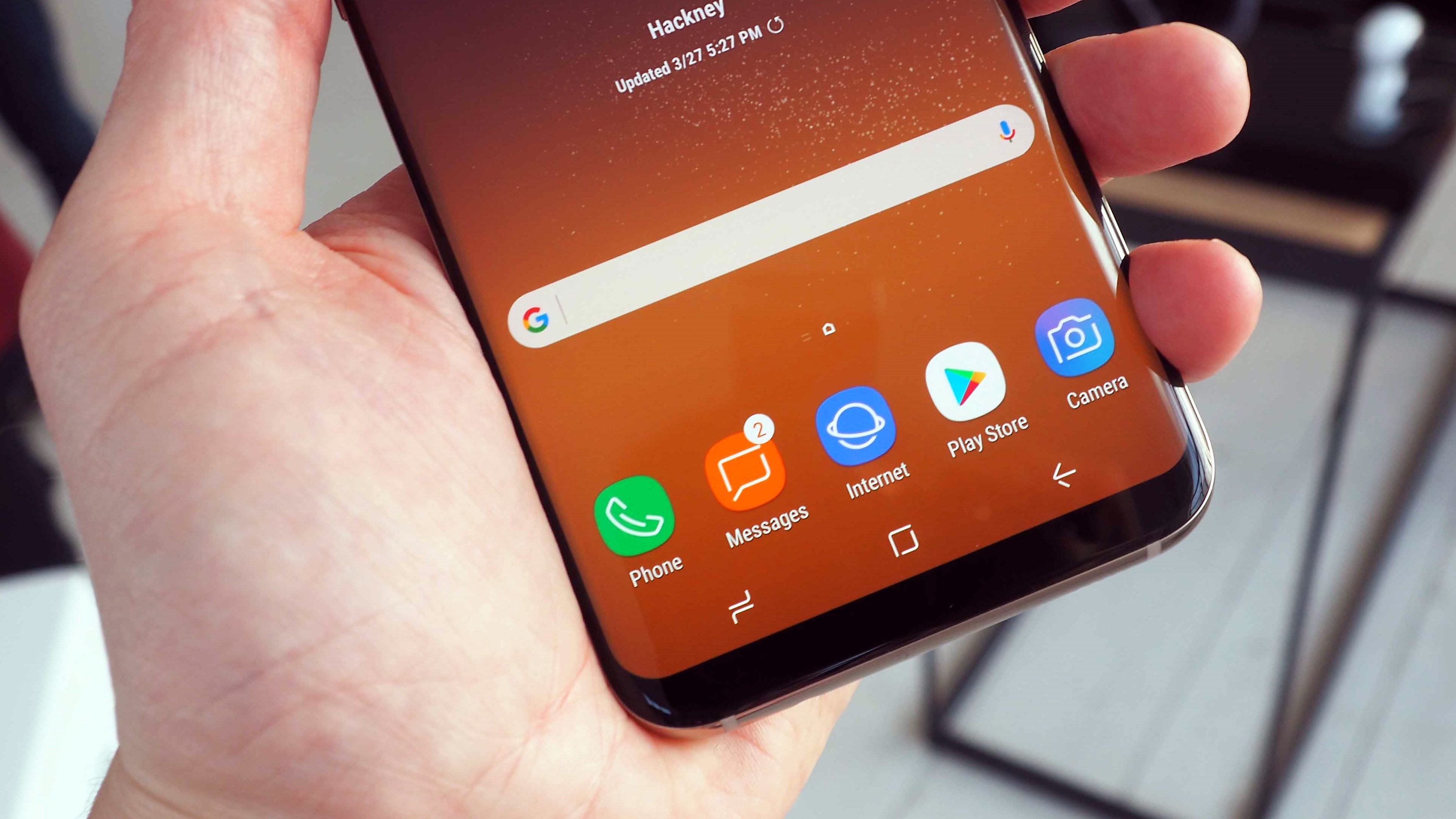
The S8+ takes smartphone screens to another level with its so-called infinity display, again taking on the rounded edges and edge apps of the Galaxy S7 edge. The 2,960 x 1,440 WQHD+ 529ppi display is significantly bigger than the 5.1-inch S7, 5.5-inch S7 Edge and iPhone 7 Plus.
The aspect ratio has changed from 16.9 to 18.5:9, which is very similar although slightly different from the LG G6 (5.7-inch display 1440 x 2880 pixels). Like the LG G6, the handset is Mobile HDR Premium certified.
It’s also 0.4-inches bigger than its sister, the Galaxy S8 and even outsizes the display on last year’s Galaxy Note 7 (yes, we know, we don’t need to say it) by 0.1-inches as well as Huawei’s recent whopper phone, the 5.9-inch Mate 9. By default, the S8+ is set to FHD+ resolution, but you can easily switch it to WQHD+ in settings.
The problem is that video content isn’t optimised for it, so most of the time you get black bars at the sides of the video content, although YouTuve will try and adapt to the screen. This is OK but you can lose some content at the bottom of videos if you stretch them. Most of the time, YouTube content is nicely optimised.
Where the screen excels is in terms of apps, where scrolling through tweets, Facebook posts or webpages is a pleasure. You can snap windows to the top and bottom of the screen as with older Samsung handsets.
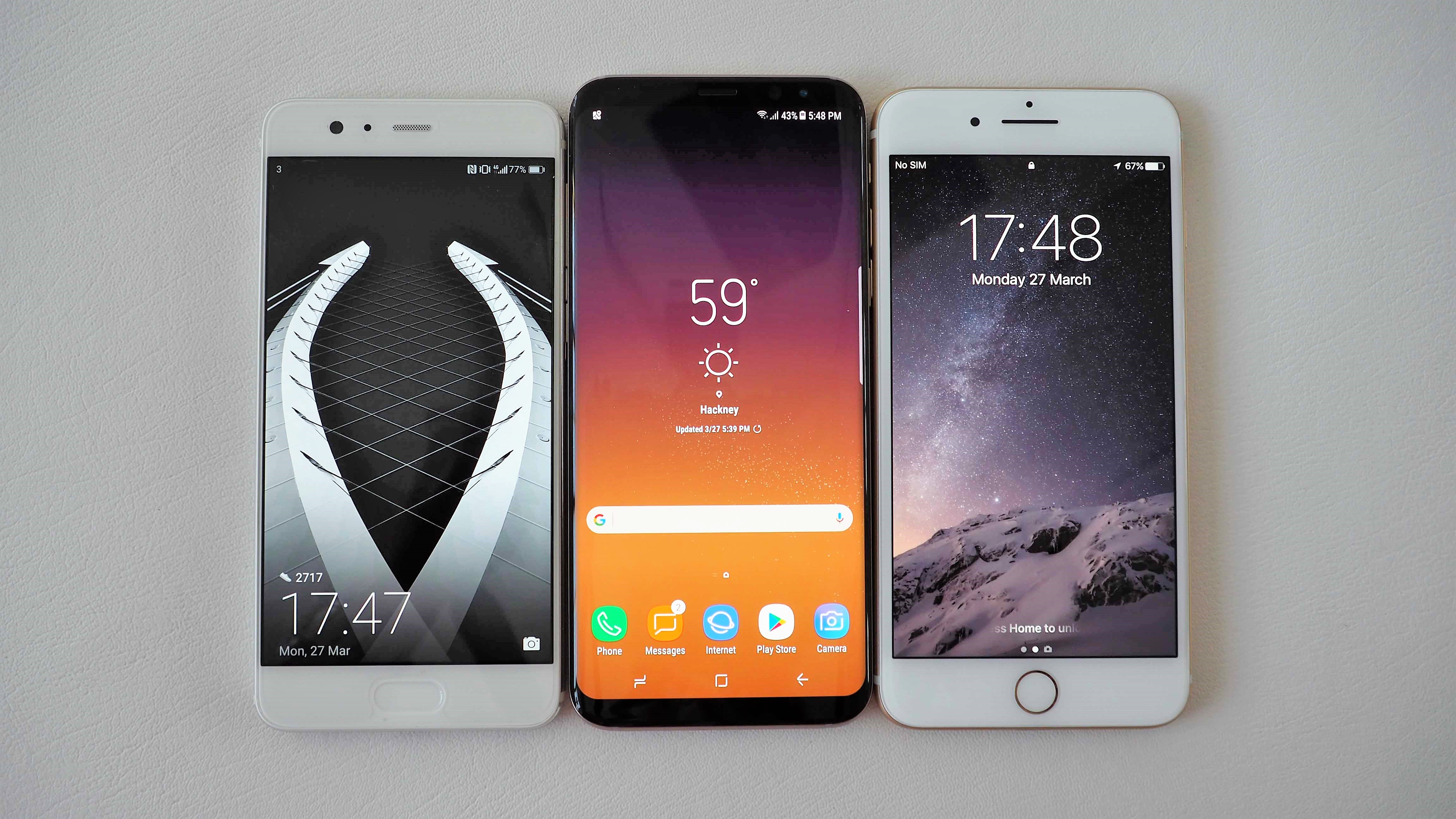
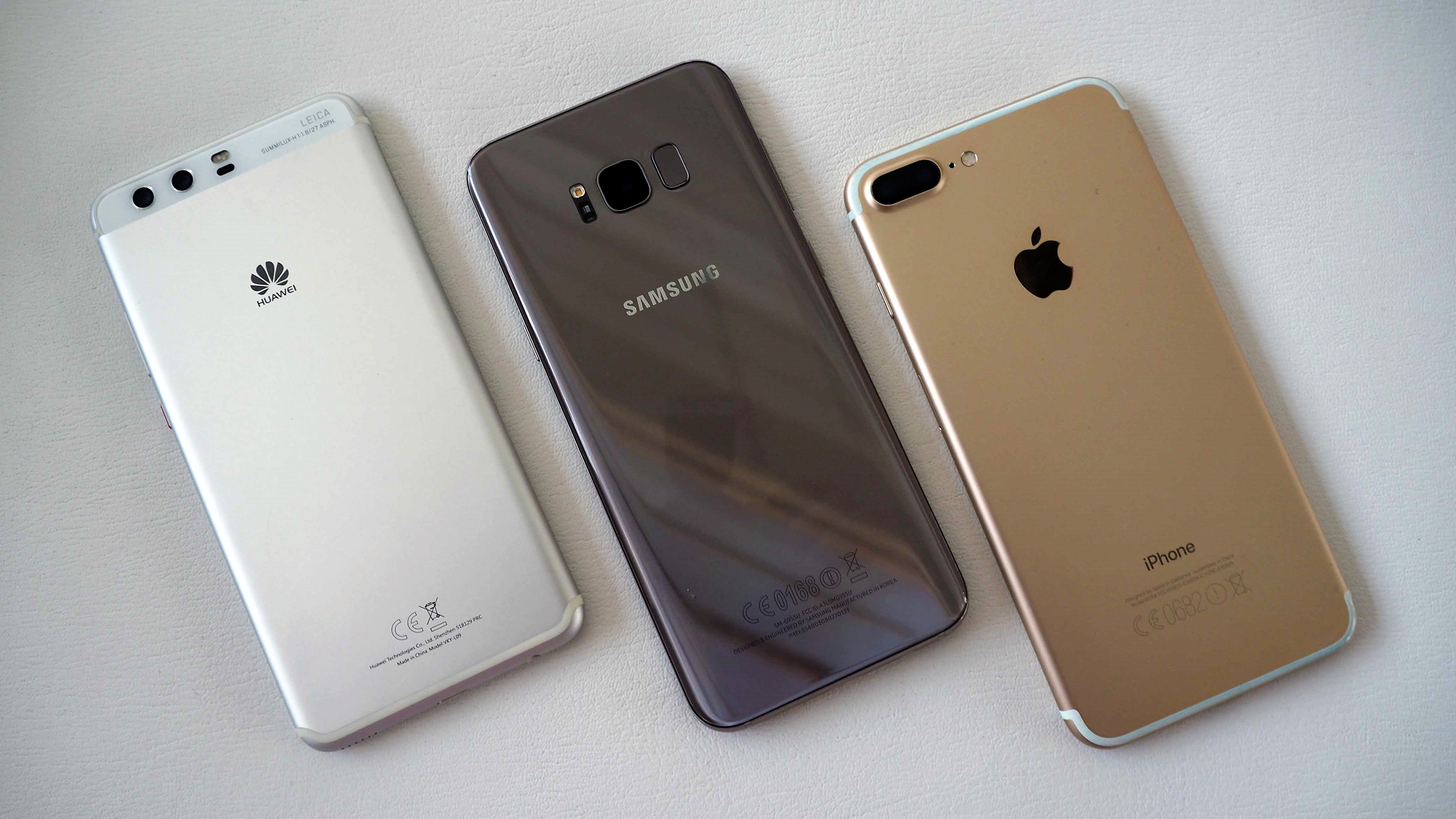
Because of the balance between body and display, there is no way this phone feels like it has a 6.2-inch display. In fact, it’s only a little taller than the iPhone 7 Plus and Huawei P10 Plus that we took to our session with the S8+ yet has a significantly bigger display than both. It feels and looks fantastic and there's no doubt it's an impressive device to look at, even if the rear isn't exactly distinctive.
Check out T3 Smackdown: Samsung Galaxy S8+ vs iPhone 7 Plus, Google Pixel XL, and more
Galaxy S8+ biometrics
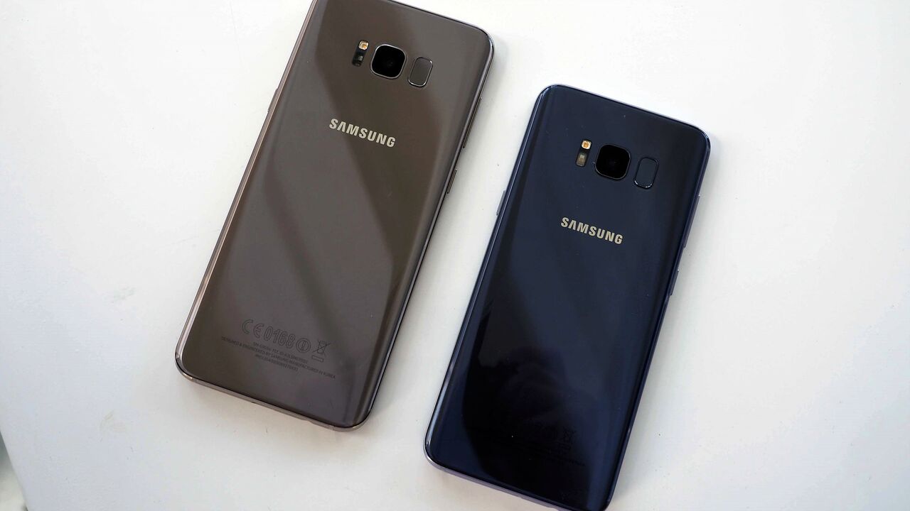
So we mentioned before that there are some issues with the S8+. The most serious of these concerns the fingerprint reader. As the home button has now disappeared into the display, the fingerprint reader has been moved to the back.
Now, this implementation is no good if the phone is lying flat on its back on a desk. But we think rear fingerprint readers are generally fine and we really like Huawei’s implementation on the Nexus 6P, P9 and Mate 9 where the reader is set away from the camera.
In other words, it’s easy to find it with your finger. Unfortunately this isn’t the case with the S8 and S8+.
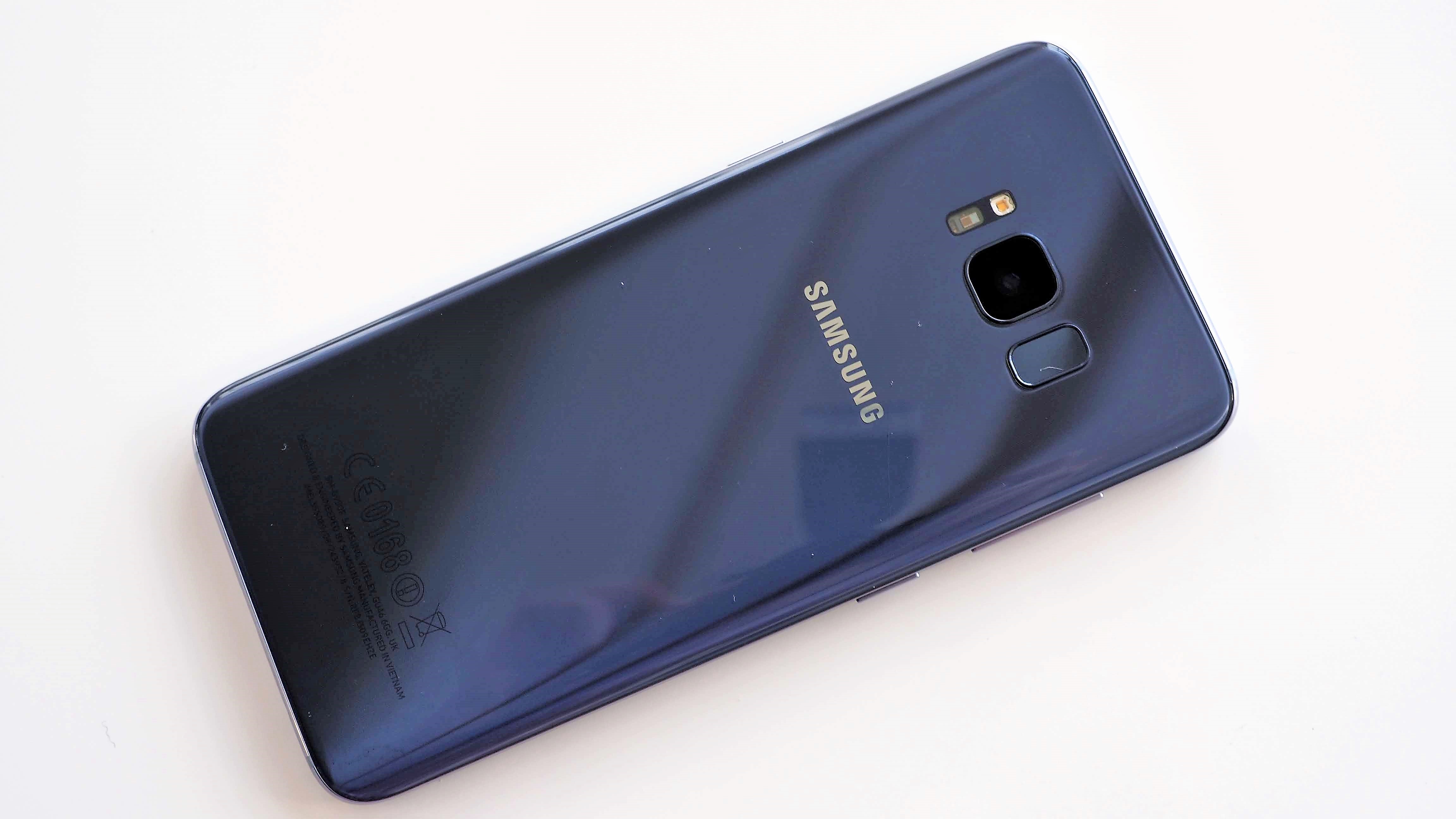
It’s too high up the phone for one thing so you’re almost stretching your finger to the reader (this might be less of an issue with the standard S8). Worse still, you often smudge your finger across the camera lens (Samsung knows this could be an issue because it tells you to be careful about that in the fingerprint setup).
The reader isn’t anywhere near pronounced enough on the rear of the phone and the experience with it is very poor.
Even though the camera is stepped out of the case and the fingerprint reader is stepped in, you just can’t find it accurately enough EVERY TIME and there are often read errors because you don’t cover the sensor correctly. We thought we’d get used to it, but we haven’t yet.
Some reports have surfaced stating that Samsung really wanted to have the fingerprint reader as part of the screen on the front and it was only placed on the rear when this became impossible to do within the launch timeframe. This seems plausible, but even so it’s strange the implementation isn’t better.
Perhaps it didn’t want to put the reader lower on the back because that’s what Huawei tends to do (although it’s interesting that Huawei has dumped this implementation for the P10 and P10 Plus).
The other biometrics aren’t much better. The improved iris recognition isn’t bad, but we fail to see why you’d use it – since you need to flick across to the PIN input screen to use it, it’s almost as quick to input your PIN and you won’t look a plonker doing it.
CLARIFICATION: Samsung has been in touch with us to point out that you don't necessarily need to flick across to the PIN input screen to use Iris recognition, something we didn't realise when we wrote this review. It doesn't change our key point, however, that it can be almost as quick to put in your PIN rather than hold the phone steady and stare at the phone. Samsung says "Iris recognition can be set to automatically and instantly unlock the handset when the power button is pressed without the flick action by the following steps: Settings>Lock screen and security>Iris Scanner> and then activate Iris unlock when screen turns on".
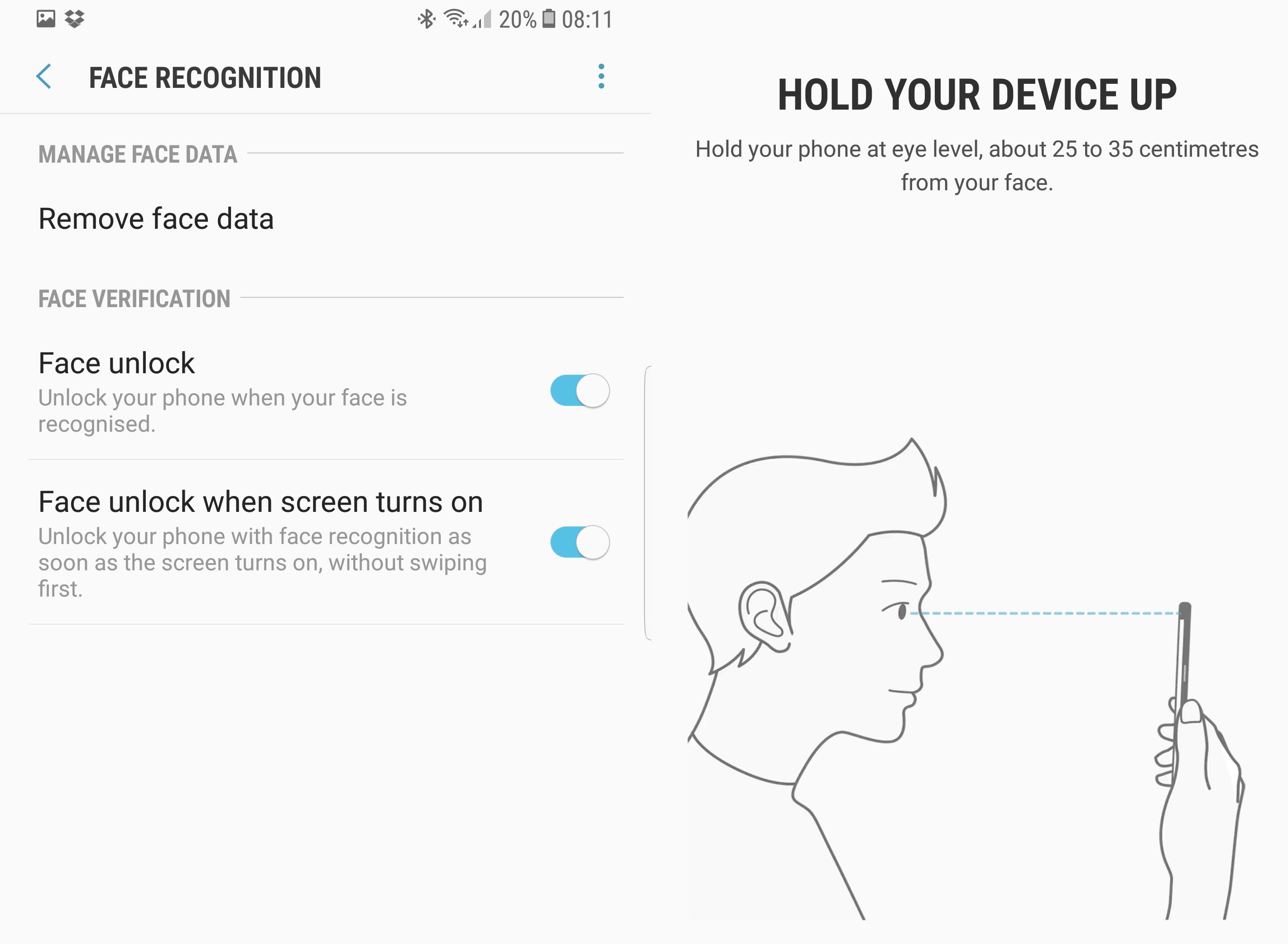
Face recognition is less secure because there is the potential that it can be duped with a photo, but it is also very hit-and-miss. If you’re in a room with decent light, we found it worked quite well and in anything less was next-to-useless. Can you really be arsed to assess the ambient conditions before you unlock your phone?
We also found it unlocked a few times when all we wanted to do is to check our notifications. One of those things, but still...
Galaxy S8+ performance
As you’d expect, the S8+ comes another octa-core processor, this time in the shape of a 2.3Ghz variant that will be the Qualcomm Snapdragon 835 with Adreno graphics (US) or a Samsung Exynos 8895 elsewhere (that’s what this handset is packing, along with ARM-designed Mali G71 graphics).
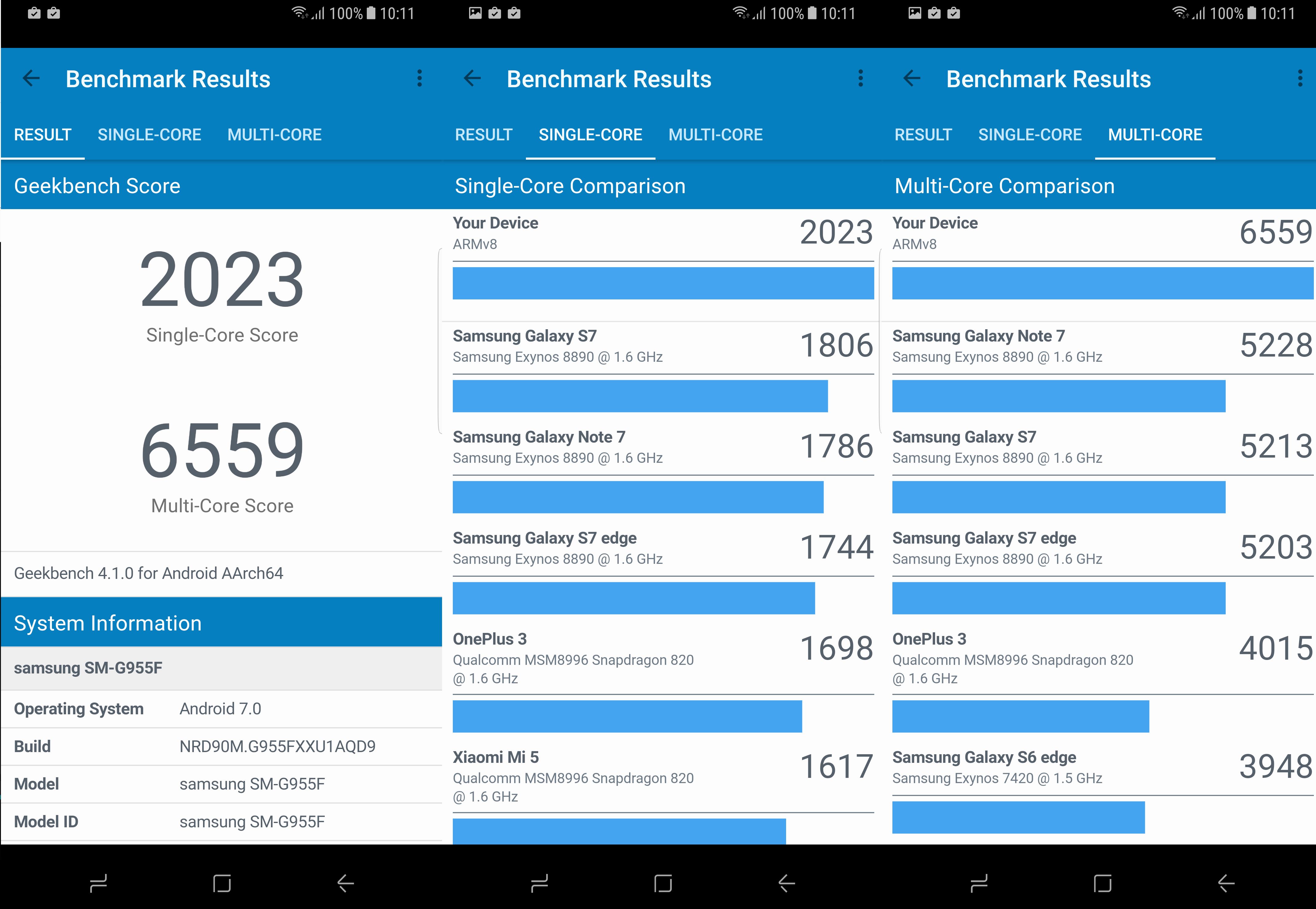
In Geekbench, the handset comfortably outperformed the Galaxy S7, Note 7 and S7 edge as well as the OnePlus 3 for both single-core and multi-core performance.
The storage is 64GB, though unlike the S7 there’s no 32GB version. The S7’s microSD slot stays, so you can expand the storage significantly. 4GB of RAM is also on board, just like last year’s models. We’ve heard there may be a 128GB version at some point, though this hasn’t been confirmed to us by Samsung.
Galaxy S8+ Bixby
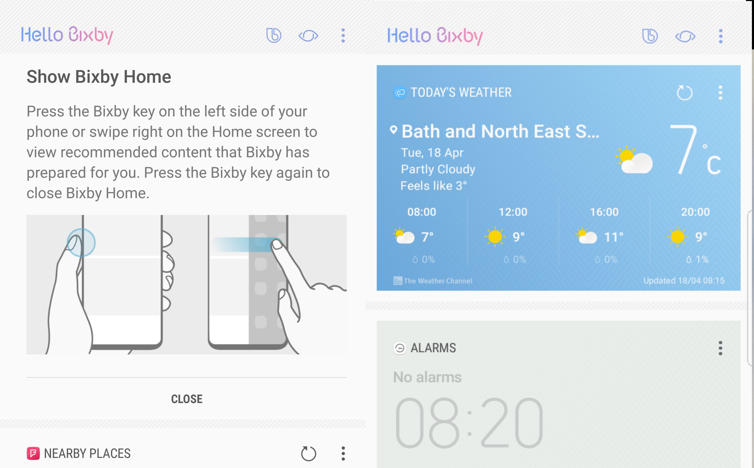
An extra button on the left of the phone (you can also swipe across to the left) activates Samsung’s Bixby personal assistant, which uses technology acquired from startup Viv last year. Interestingly. Viv was actually from the makers of Siri (which Apple bought rather than created).
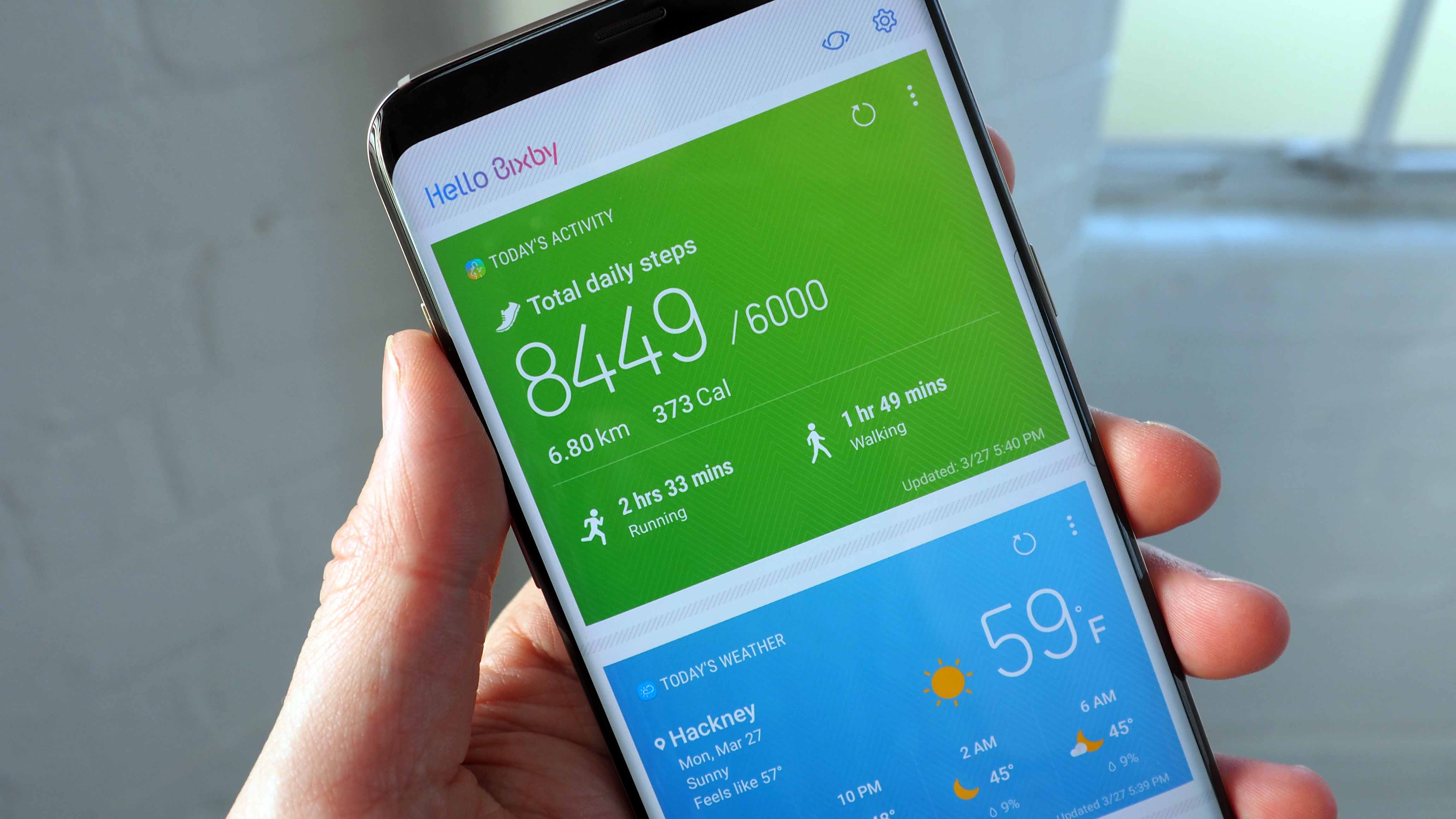
That was only in the Autumn, so it could well be one of the reasons we didn’t see the S8 surface a month ago at Mobile World Congress alongside the rather excellent 5.7-inch LG G6. You can access a Bixby screen to the left of the home screen on the S8, which is so, so similar to Google Now. It even has ‘cards’ you can customise. You can set time or location-based reminders, too.
However, the ‘voice assistant’ part of Bixby – aka the voice commands, won’t be available until later in the Spring. So the device you buy won’t have it. Bixby Voice will be available in Korean and U.S English initially, and will expand to more languages later this year including UK English.
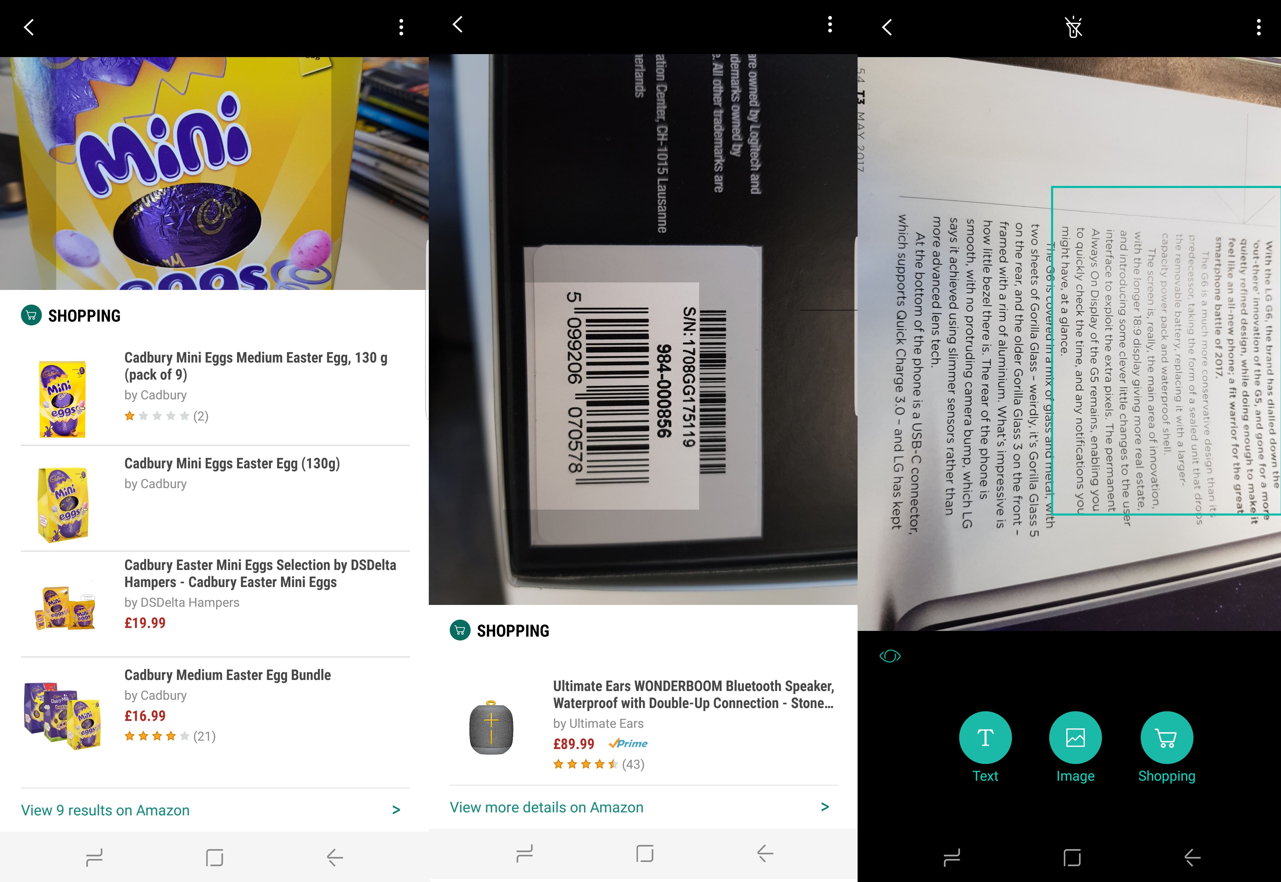
Bixby Vision is rather like Google Googles, enabling you to search to do a shopping search for things you take pictures of, or find images of the item online. This works…kind of. Matches are REALLY hit and miss, but we did have some success and it scans barcodes just fine.
So why the button? Samsung was keen that Bixby wasn’t like other personal assistants where you have to call the assistant to order – it wanted to avoid a key phrase like ‘OK Google’ or ‘Hey, Siri’. The problem is that those keyphrases are useful for handsfree operation of the phone and as people get used to instructing their devices from afar, surely a keyphrase is necessary?
It’s understandable why Samsung wants to get into having an assistant, but let’s not beat around the bush – surely most people would prefer to use Google Assistant. That’s not actually going to be difficult - Google Assistant is there on the S8 and S8+ - just press and hold the Home button. Yep, the battle of the assistants will take place on the same device. Samsung says it has included the Google Assistant to give consumers choice.
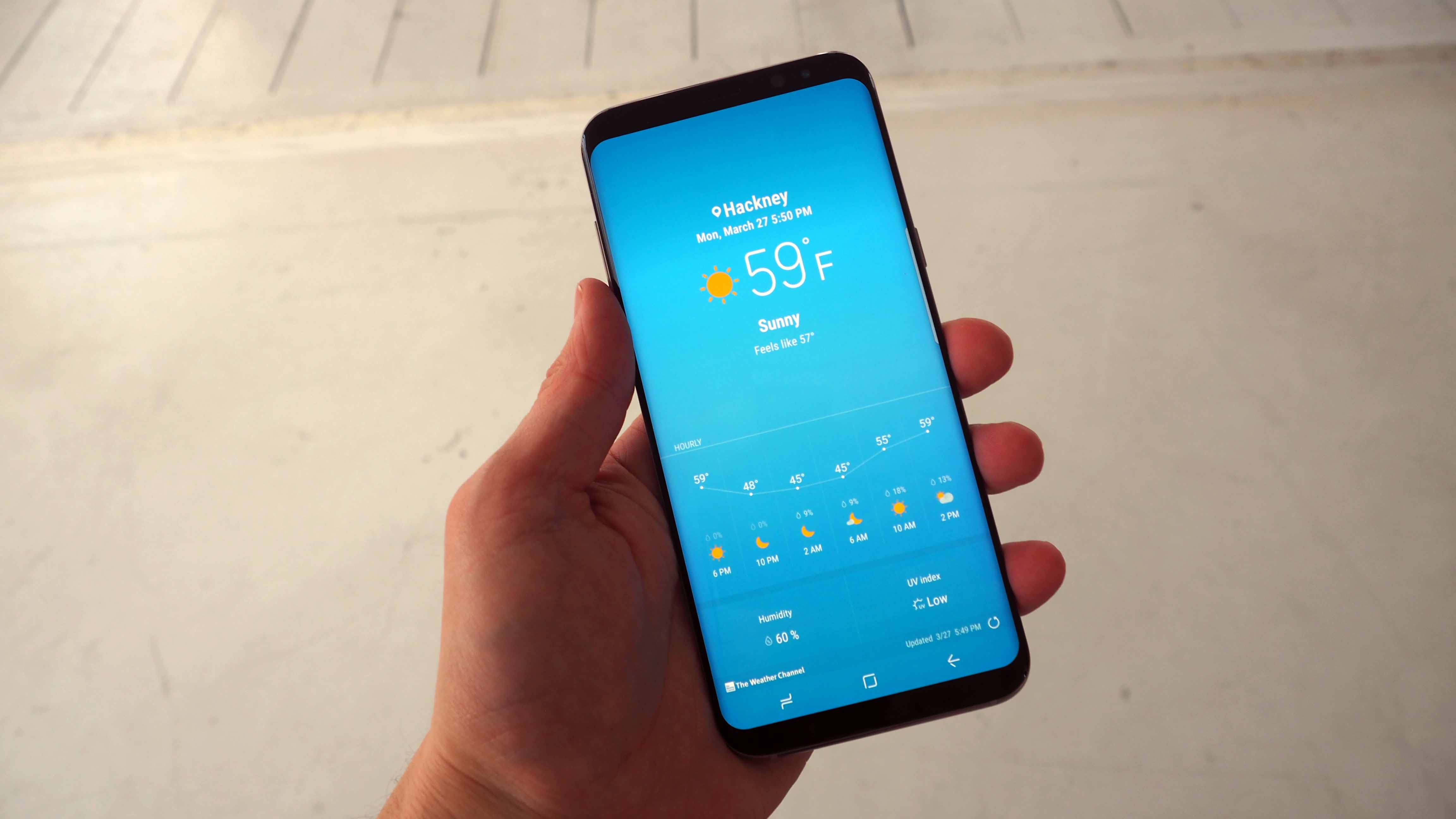
YouTube is already alive with a myriad of how to videos that show you to how to re-map the Bixby button to Google Assistant or another app or command.
Galaxy S8+ camera
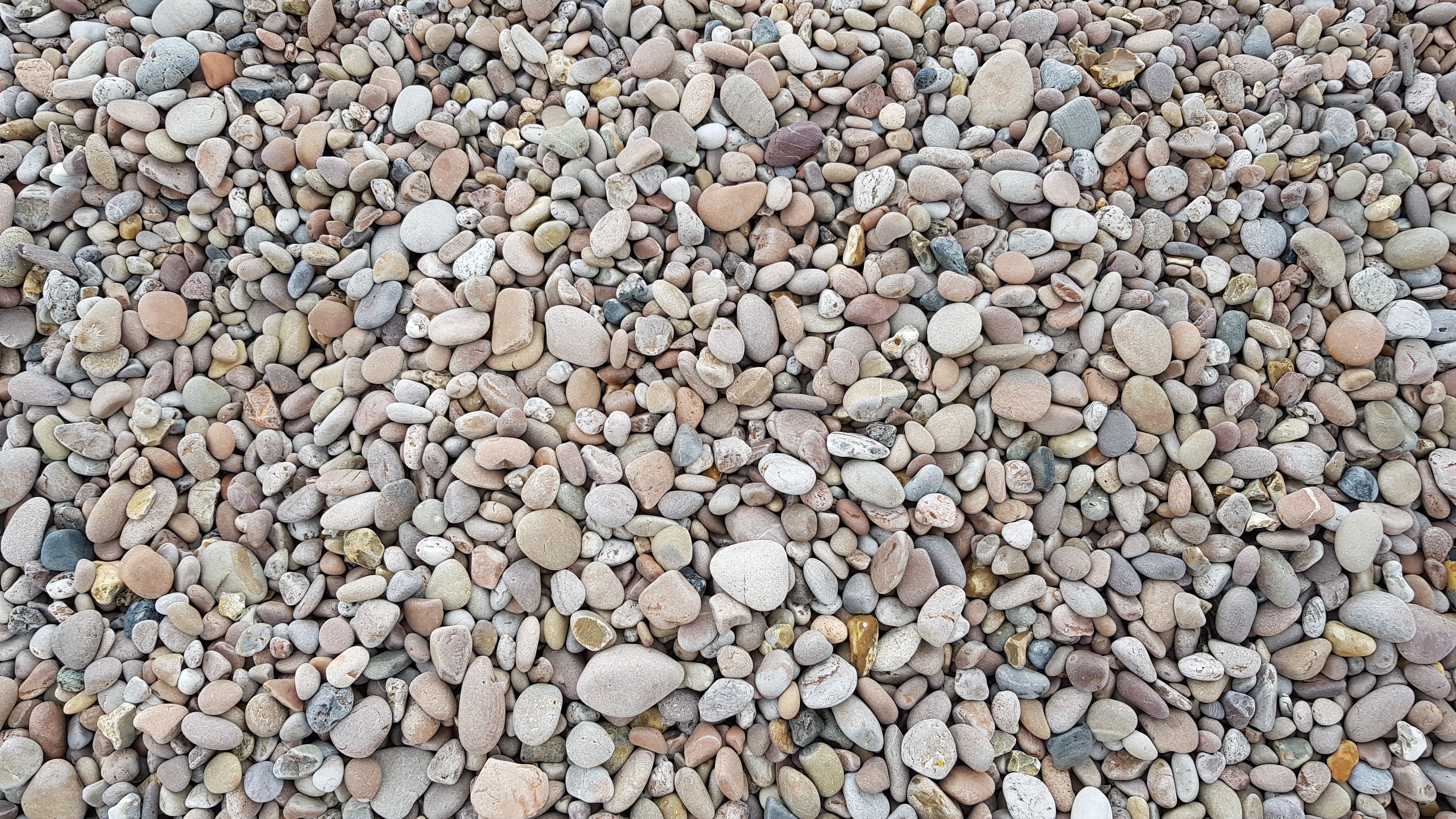
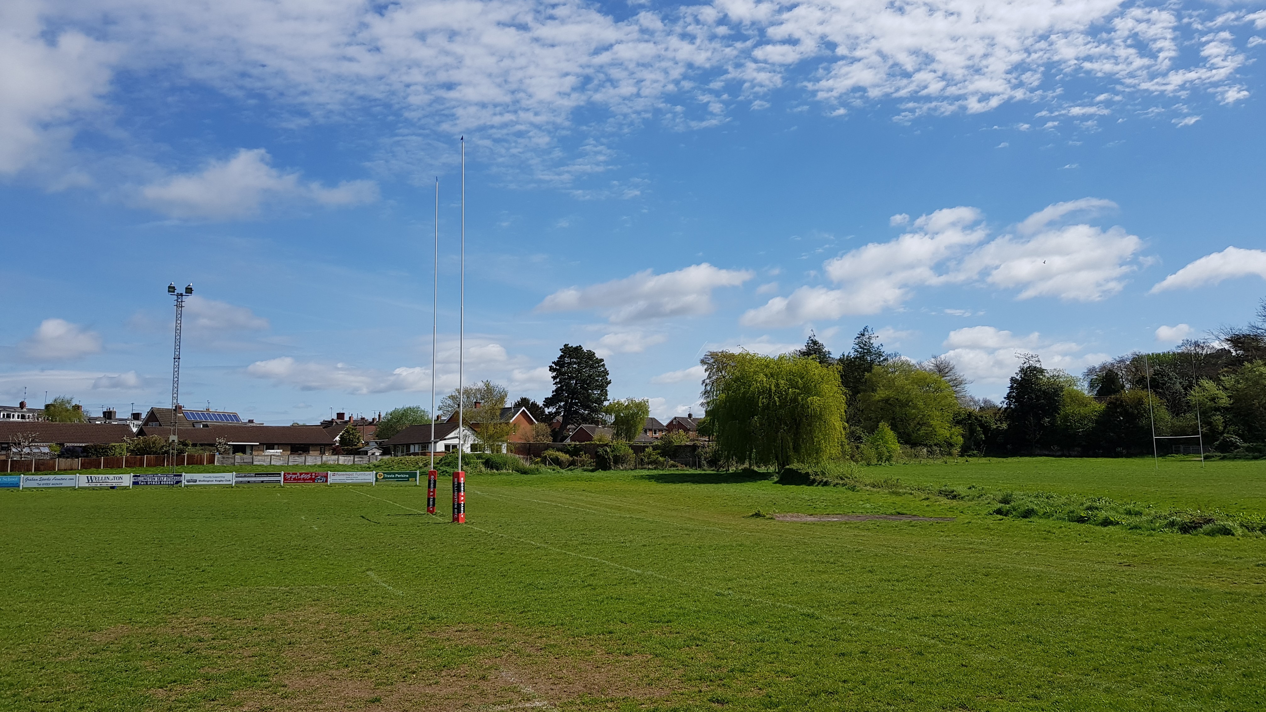
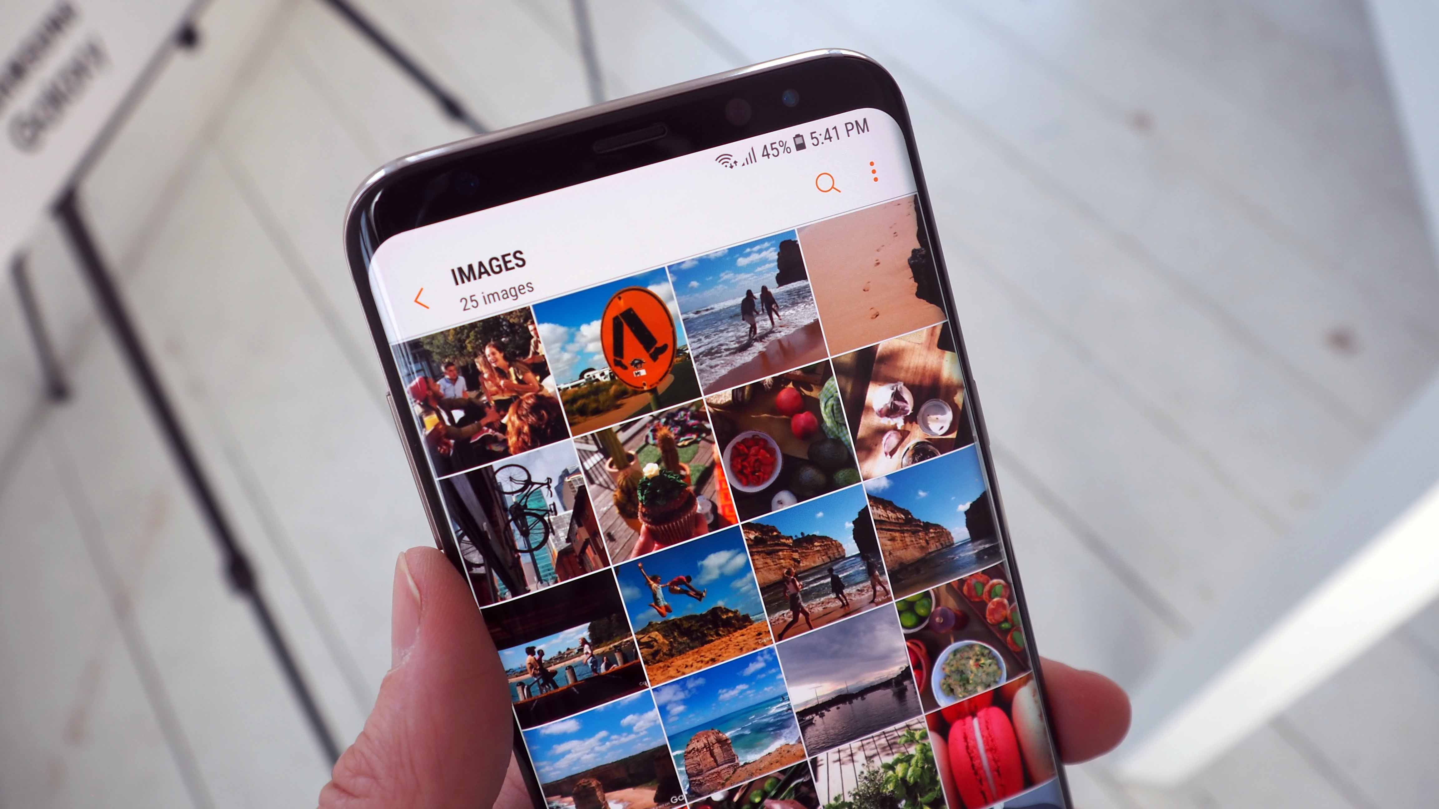
The primary camera is a 12MP f/1.7 dual-pixel snapper with the same core specs as last year’s S7. That’s not necessarily a bad thing since it the S7 and S7 edge cameras were among our favourite smartphone cameras of 2016. As you can see from our sample images below, we got some great images from the camera with very strong colours. These images have not been colour corrected in any way, although they have been cropped for use on T3.com.
Camera startup time and image quality remains superb with the S8, although we still don’t think it’s the easiest to use to access some of the settings. The secondary camera has been upgraded from 5 to 8MP with Smart Autofocus. Samsung has tried to make the camera easy-to-use with one hand, but the jury was out for us as we kept using two.
Galaxy S8+ camera sample images






Galaxy S8+ audio and headphones
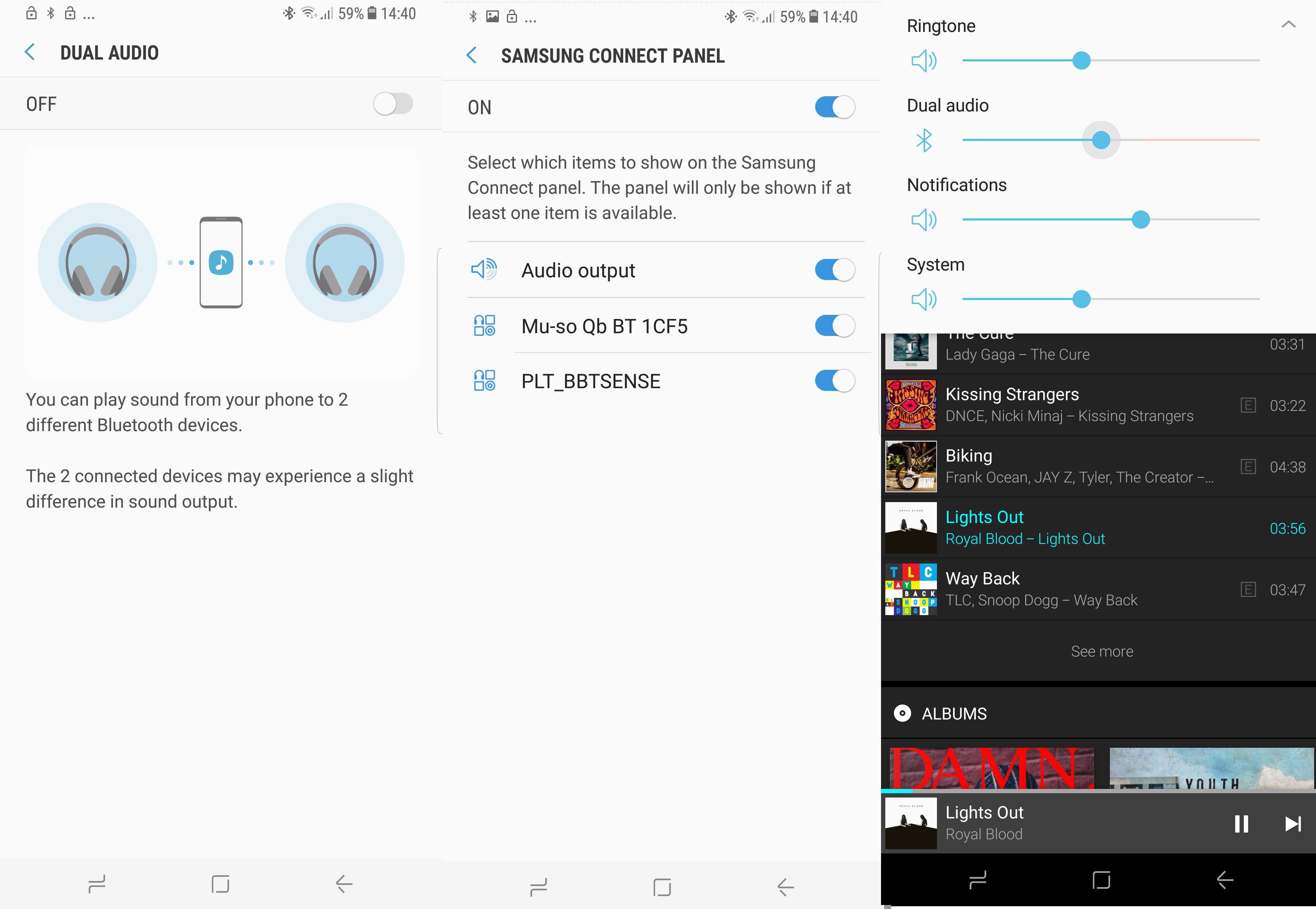
The handset is Bluetooth 5, so it is able to stream to two speakers or two sets of headphones simultaneously with independent volume control. This worked brilliantly streaming to a Naim speaker as well as to a pair of Plantronics headphones and while you’re warned that the synchronisation might be different, this wasn’t a problem for us.
Talking of headphones, the headphone jack remains, while charging (including fast charging) and wired data transfer is via USB-C.
What's in the Galaxy S8+ box?
There are some nice extras in the box. First you get AKG/Harman-tuned headphones since Samsung bought the audio company last year. You get some extra ear tips, too. The headphones are surprisingly comfortable and resist tangles to a point. But the sound is pretty flat and lacking in bass. You’ll be reaching for a beefier pair of headphones in no time at all.
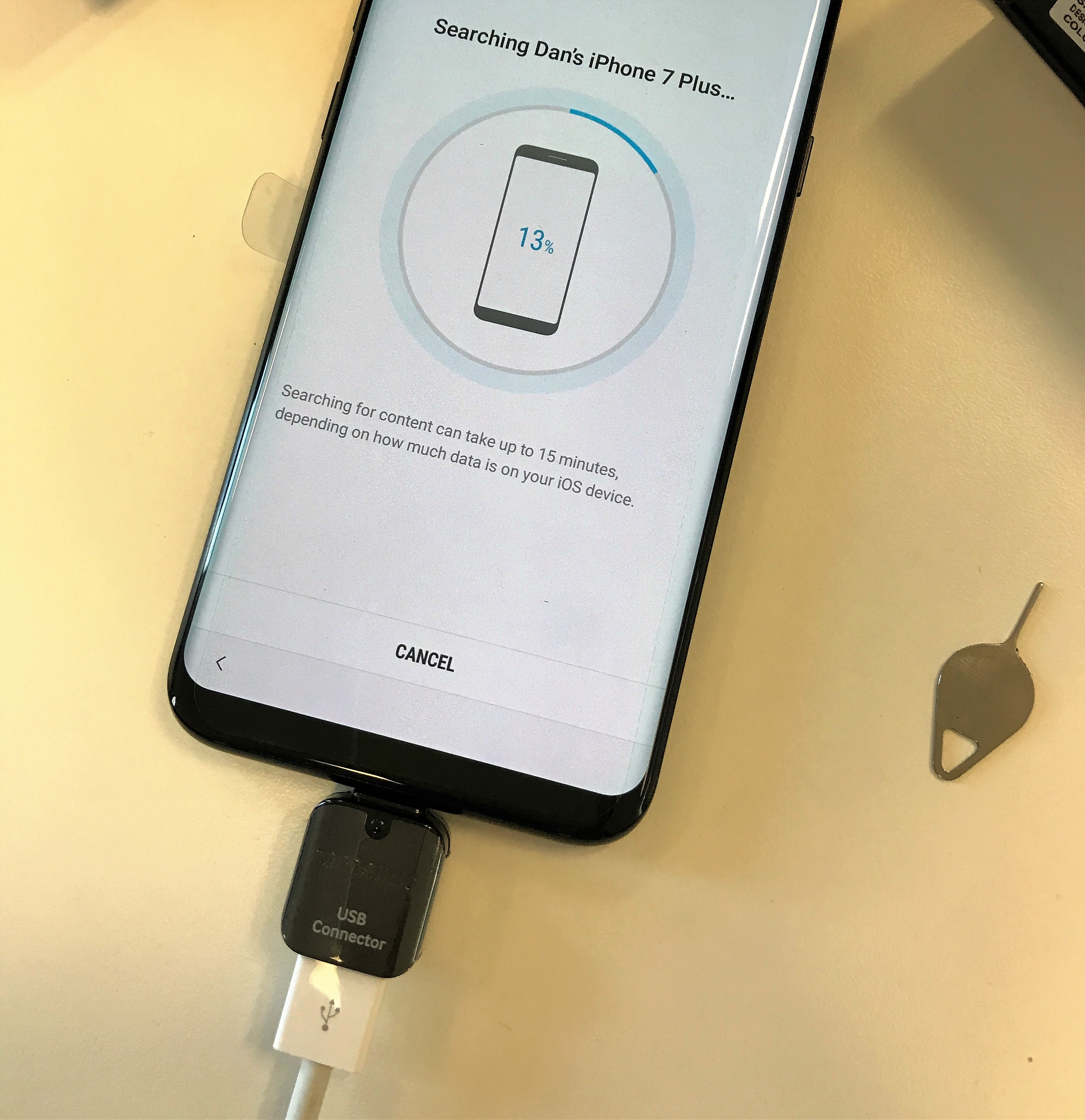
There’s also the increasingly-standard USB-C cable and charger plus two adapters – one to take a standard USB cable from another device for data transfer (see below in action) and then a microUSB adapter so you can convert any older charger to USB-C.
Galaxy S8+ battery life
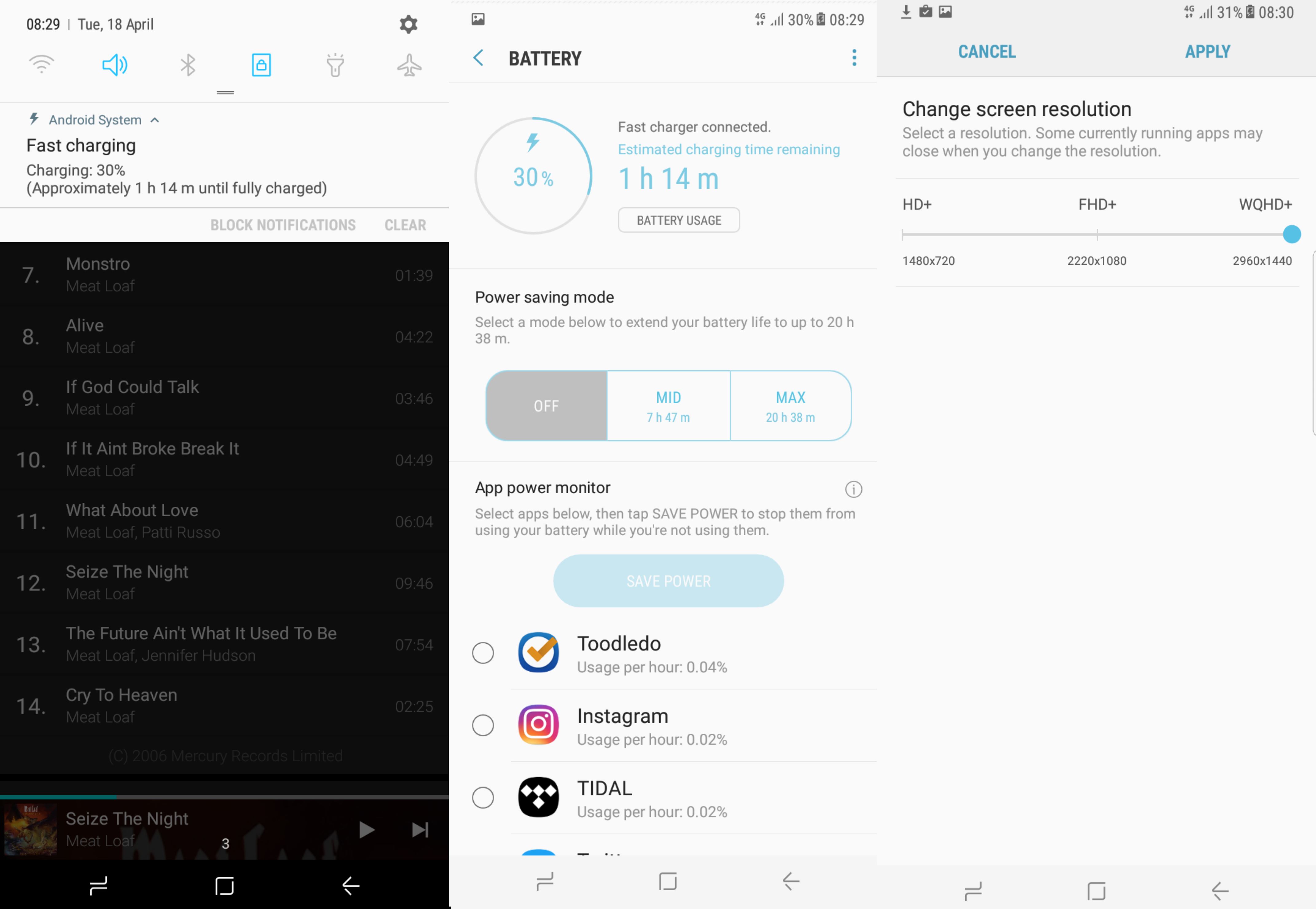
Onto battery life. As we said before, the battery is 3,500mAh so slightly smaller than the 3,600mAh battery in the S7 edge last year. Thanks to fast charging, you can get it to around 50 percent in around 30 minutes and charge the whole thing in well under two hours.
We didn’t get stellar battery life from the S8+ - it lasted the working day (plus commute) at full screen resolution and that was about it. However, you can (unsurprisingly) drastically increase battery life by dialling down the resolution and brightness as you’d expect (and then there’s the Always On display, which will give you a few extra percent). In short, we couldn’t eek as much out of it as the iPhone 7 Plus, but you can get it through the entire day by turning all the bells and whistles off.
Galaxy S8+ price comparison
One thing the S8+ isn’t is a cheap option. In the UK, the Galaxy S8 will retail at £689 and the Galaxy S8+ will retail at £779. That’s a significant price step-up from the £599 and £719 price points of the iPhone and iPhone 7 Plus. Now that’s not comparing apples with Apples, because the standard S8 is still bigger than the 7 Plus. And the S8 models come with 64GB of storage, double that of the standard iPhones.
In terms of other big-screeners, the Huawei P10 Plus represents much better value versus the base iPhone 7 Plus at £40 less SIM-free and with a huge amount more memory - 128GB versus 32GB of the base iPhone and the 64GB S8+.
Galaxy S8+ colours
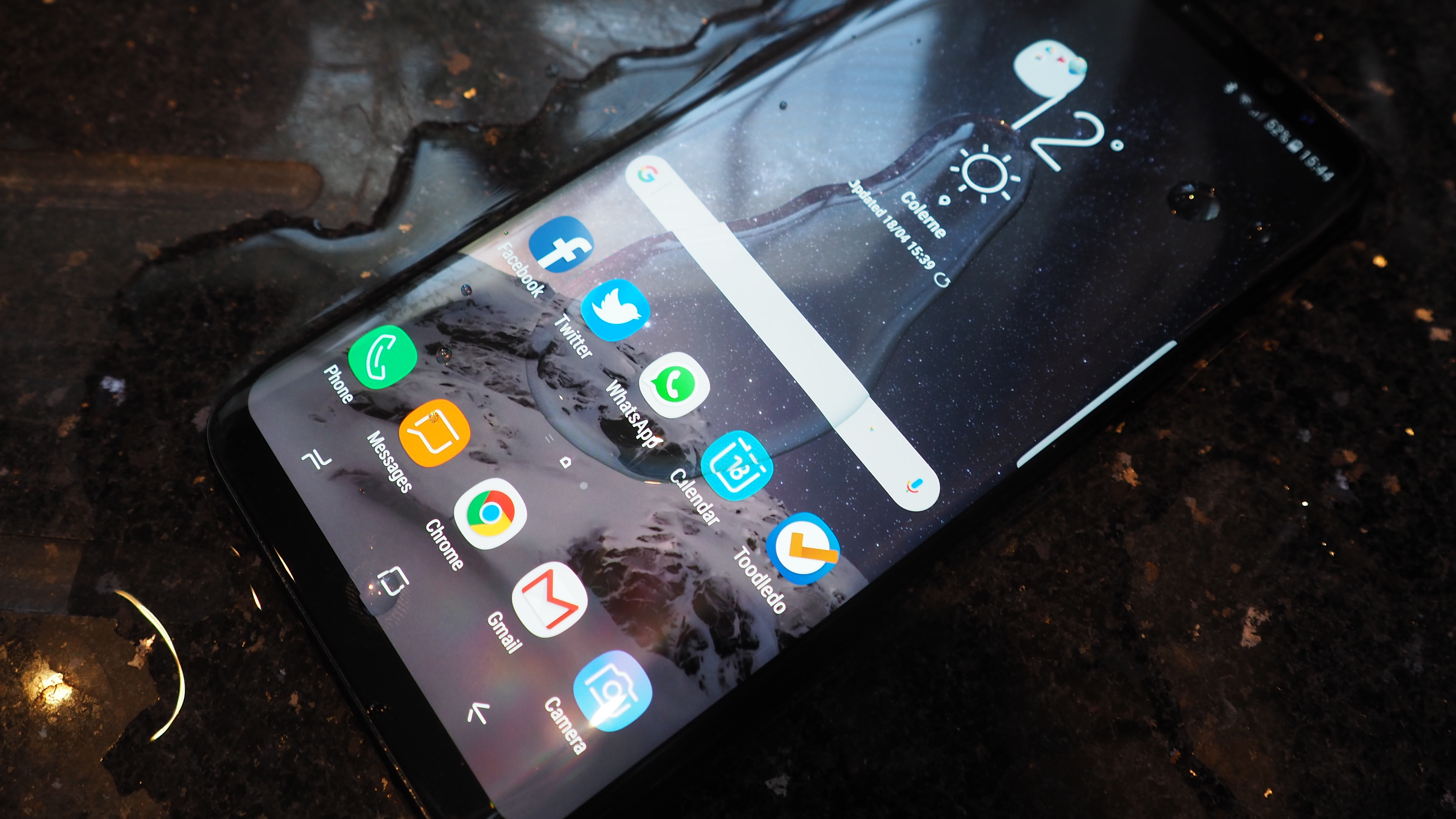
There will be three S8+ colours to choose from at launch, black, grey and silver, although the silver won’t be here for UK launch apparently. A blue model of the S7 appeared, so expect a special edition at some point. And, although it seems regular now (though not for the Google Pixel or Huawei P10 series), this Galaxy is also waterproof and dustproof.
T3 verdict
So what do we think of the Galaxy S8+? We think it’s probably the best phone of 2017 so far, shading the LG G6 and Huawei P10 Plus and Mate 9. But it’s not a unreserved recommendation; there are flaws here and not even the incredible display can mask them. It’s also not a wallet-friendly choice, but then neither is it intended to be.
But it’s when you see it up against some of the other recent handsets that it hits home how different it is from the current crop of rivals. If Apple comes out with iPhone 7S in September rather than iPhone 8 or iPhone X, it will look ancient. Bezel-less is how the future will be, although sort that fingerprint reader out Samsung!
Now why not check out our Hands on Galaxy S8 review
Sign up to the T3 newsletter for smarter living straight to your inbox
Get all the latest news, reviews, deals and buying guides on gorgeous tech, home and active products from the T3 experts
Dan is a previous Editor for T3.com and covered the latest in computing, home entertainment and mobile tech. He's also the former Deputy Editor of TechRadar and former Editor of Lifehacker UK. Dan has written for numerous computing and lifestyle magazines and has also written a book, too. You'll see him pop up in numerous places, having been quoted in or on The Sun, BBC World Service, BBC News Online, ITN News, BBC Radio 5Live, BBC Radio 4 and Sky News Radio.
-
 Leaked AirPods prototype looks like Nothing... literally
And we are here for them
By Britta O'Boyle Published
-
 OnePlus Watch 3 lands in the UK with a flurry of freebies and a huge discount
The new titanium-clad smartwatch brings 120-hour battery life, ECG health checks, and some serious launch offers
By Matt Kollat Published
-
 Future YouTube feature could put an end to your doomscrolling
And that's something we would love to see
By Britta O'Boyle Published