Mac OS X Yosemite preview
Mac OSX Yosemite is out in a matter of weeks - should you upgrade?
Why you can trust T3


The latest version of OSX will be out this autumn - and it's free. But should you be holding your breath for it? Read on for our extensive OSX Yosemite preview
Apple users are familiar now with the annual update cycle: the software for the iPhone, iPad and iPod touch are updated each autumn. And since last year OSX has had an autumn update, too. The two separate systems now overlap so much that it makes sense to update them both at the same time.
Perhaps we can expect new features to launch on both phone and laptop almost simultaneously. One of the stand-outs announced at the World Wide Developers' Conference in June was a system where you could start writing an email on your iPhone but then, when you realised it was going to be something of a magnum opus, carry on with it seamlessly on your Mac - whether it's an iMac, MacBook Air or MacBook Pro. This kind of synergy is brilliant, and requires the two systems to be in synchronised step.
Mac OS X Yosemite: Updates
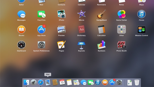
One of the most immediately striking changes in Yosemite is the OS design. It's all gone through the rigorous updating that the iPhone 5s went through last year with the move to iOS 7. And Yosemite has taken a lot of the design language from the handheld.
Now, there's greater translucency to drop-down panels to show the colours behind more clearly. This looks great but can result in some parts of a window being opaque and others partly see-through, which can be confusing. The font used for file title bars and pretty much everywhere else has switched to Helvetica.
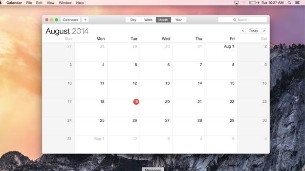
And there's been a marked move to the simpler, layered quality of iOS. So the calendar program icon has ceased to be the faithful reproduction of a tear-off date block, complete with curling-edge pages. This is a good thing.
The application dock at the bottom of the screen no longer resembles a translucent 3D glass shelf on which the apps perch. Now it's a 2D grey oblong and translucency is reserved for the rubbish bin icon which is no longer the mesh bin effect of previous versions - Microsoft had one of these gleaming models years ago, but this one looks great.
And the iTunes icon is now red, to match the one found on the iPhone. It all looks pretty appealing, though it's at its best on a Retina display where the extra detail makes it all the more detailed and precise.
Some will miss the drop shadows that surrounded windows in previous designs or the thin outlines around the dock, say. Overall, though, the simplified icons and details work tremendously - though the folders that formerly looked so straightforward, reliable and dare we say it, real, now seem a bit over simplified. Still, these things can change - it's a beta, remember.
Safari is among the many programs to be redesigned, with more space and less clutter. The simplification is certainly elegant though at times it makes the page furniture feel less defined, less 'there' than it previously did - though that might be part of the intention.
Mac OS X Yosemite: Features
Spotlight is a genius feature that Windows and Google came to ape later on. In fact, you can use your computer perfectly well and never reach for it, but once you have, it's as necessary as oxygen. If you haven't made much use of it, it's basically the magnifying glass icon at the top right of the screen which when clicked launches a text box so you can search for files.
It's a comprehensive tool and if you can't see everything clearly you previously had to choose 'Show All in Finder' to open up a bigger window.
Now tapping on the magnifying glass launches a bigger text box that's front and centre. As you type a wider set of results are returned, including outside sources such as Wikipedia, as well as documents, images and more on your hard drive. As ever, it's fast and well organised.
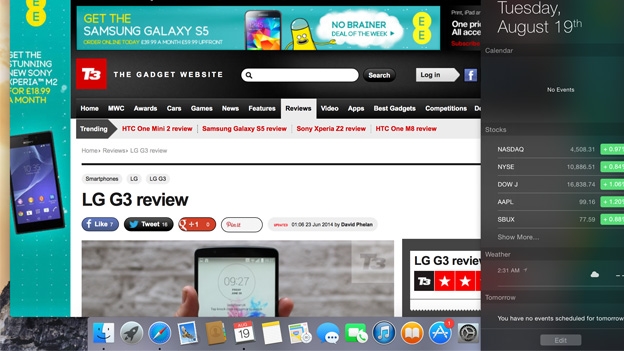
The Notification Centre, introduced previously and showing your latest emails appointments and more when you swipe in from the right edge of the touchpad, is now updated to closely resemble the one found on the iPhone. It's usefully familiar. It also contains the widgets you previously had to go to a whole separate screen to find.
Mac OS X Yosemite: Mail
Mail, already an excellent and capable performer is improved with a splendid extra called Mail Drop. If you have a big file to send to someone by email, you probably reach for WeTransfer to avoid email inbox rules (yours or your recipient's).
Now, with Mail Drop you can transfer them within Mail. You drag them into the message as before but the system recognises the size, uploads the files to iCloud and sends a link to the person awaiting it. It's effortless and works well.
In a further unification between iOS and OSX, Messages now incorporates sound files and images, threads you can name and conversations you can hop out of easily. It exactly matches what we've seen so far of iOS 8.
Mac OS X Yosemite: iCloud Drive
And there's more: iCloud Drive is a cloud-based repository for your files which you can access from any of your machines, such as iPhone and iPad as well as iMac. This is the great advantage Apple has in making software for all its machines, and only its machines - it can ensure seamless and problem-free connections between everything.
Only Apple can do this (BlackBerry has the same software-and-hardware exclusivity but no longer has the same wide range of hardware, and never made computers, of course).
The system which allows you to start an email on your iPhone but continue it on your Mac is also part of the same seamlessness. And it leads to another innovation: answer phone calls on your Mac.
This is ideal if, for example, your iPhone is sitting on your window sill where the mobile phone signal reaches, and you're sitting at your desk at the back of the flat. You can make calls from the Mac, which will be routed through the phone, as well.
Samsung had a similar feature before now, but Apple has implemented it with great simplicity. For example, if you see the phone number for a restaurant on the place's website, you highlight it and choose the option to dial it from your phone. Done.
There are more features, many of them, introduced in this new OS release. Like the Instant Hotspot that makes it easy to connect your MacBook Air to the internet via your iPhone without even taking the phone out of your pocket or bag.
Mac OS X Yosemite: Performance
There's no point in having new features if your laptop becomes so slow it's unusable. But that's not the case here. There was no noticeable slowdown with Yosemite. In fact the only downside is that on a non-Retina screen the new fonts seemed less defined than with Mavericks. But Apple has ensured that performance is as good as ever.
Mac OS X Yosemite: Verdict
As you'd hope, the new version of Mac OS is a big improvement - if the beta is anything to go by. The slicker icons, the simplified design and the overall layered approach all look as snazzily different as iOS7 did on the iPhone a year ago. Some items, such as the folder icons, could do with some more sprucing up, but this is a big step forward.
The new features are wide-ranging and largely very effective. Where Apple has used ideas other companies have had as well, it's made them sublimely easy to use. And the advantage of controlling the whole eco-system is you can make it seamless and fluid.
Just as iOS7 felt like a new start for the iPhone's OS, so Yosemite feels like a fresh beginning for OSX. It's fast, logical and full of useful new features.
Mac OS X Yosemite release date: Autumn 2014
Mac OS X Yosemite price: Free
Sign up to the T3 newsletter for smarter living straight to your inbox
Get all the latest news, reviews, deals and buying guides on gorgeous tech, home and active products from the T3 experts
-
 One of the best villains in gaming is coming to Xbox Game Pass for free
All Game Pass subscribers are getting one of the best single-player shooters of the decade
By Rik Henderson Published
-
 Xiaomi’s next indoor smart security camera could be its most affordable yet
It's less than $40...
By Lizzie Wilmot Published
-
 Samsung hits pause on Android 15 rollout, but your phone might be lucky
Your delayed Samsung One UI 7 software update could be delayed some more
By Chris Hall Published