Nokia 6700 Slide review
Full review: Is this colourful slider the new style kid on the block?
Why you can trust T3

Nokia's attempt at a stylish slider is let down by a creaking OS
The rise of the smartphone has been well documented, and while Nokia used to lead the charge it's fallen woefully behind of late. The 6700 Slide is another handset that combines sleek lines with its S60 OS, but is it worth the £190 price tag?
We're so used to touchscreens these days that it's almost a shock to prod the screen and find nothing happens, but it's important to remember this is a phone for those that don't want an Apple iPhone or HTC Desire – it's a caller and texting machine, with a little extra functionality thrown in for good measure.
------------------------------
More on Nokia
--------------------------------
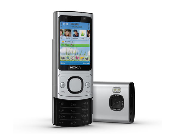
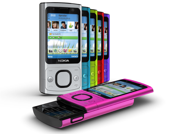
The build quality looks excellent; it almost looks iPod Nano-esque, but a lot thicker. The curved lines are clad in an aluminium chassis, or at least that's how it looks, as on closer inspection it's actually silver plastic that looks like it could get damaged a little easily in the pocket.
However the slide mechanism is pleasant enough and the phone sits nicely in the hand, although the keyboard could be a little big bigger for faster finger flicks when texting and the like.
As we mentioned before, the 6700 Slide uses the S60 OS and suffers a little for it, as there's still an element of the phone trying to do too much all the time. Don't get us wrong, it's much better than the pitiful attempts of the likes of the Nokia N96 a couple of years ago, but it still lags on occasion.
The menu system is as familiar, it's a simple case of a few favourite icons on the home screen with the icon-based menu taking you to the desired sub-menus with a few clicks. It works far better one a keyboard-based device than a touchscreen, that's for sure.
The screen, despite only being QVGA and 2.2-inches, is surprisingly bright and easy to read – video looks a little squished on it, but the contrast ratio and clarity is tip top. It struggles in bright sunlight, as most screens do these days, but it's eminently usable most of the time.
Another point to these touchscreen-less phones is the resulting improvement in battery life – you can easily last a day on this handset with only two bars of battery life – you can almost eke out three on a full charge, especially with the intelligent power management when the juice is close to running out.
Nokia 6700 Slide: Calling and texting
Calling is similarly good – you get a good, comprehensive signal most of the time and the voice clarity is good, if not amazing – it's not going to beat those phones with noise cancellation or active voice boosting.
Texting is OK too – nothing special, and Nokia's predictive text (which used to be excellent) is very quickly starting to age when compared to the eery word correction of today's smartphones. We like keyboards for messaging, but this one isn't too intuitive.
In fairness, the 6700 Slide does have a full range of email types supported: Exchange, Gmail, YahooMail – in fact nearly all are accessible on the phone.
Also the 5MP camera is clear and fairly quick to take a few snaps – there aren't a lot of options to tinker with, but for straight shooting there's not a lot more that you'd want.
Nokia 6700 Slide: Internet and media
But that's about all the decent elements of this Nokia phone – it does pretty poorly after that. While the internet browser is OK, it's been the same for years and it's still woefully slow and of course there's nothing helpful like Flash video in sight.
Also media – why this phone has a 2.5mm headphone jack we don't know – it's 2010 Nokia, and we're not sure anyone has ever used that dinky slot.
As such you're forced to use the bundled adaptor, so no matter how good the music and video player is, it's never going to be a brilliant media experience unless you fork out for some better cans. The music player is basic at best, and sounds only adequate – it's a nice addition to the phone, which is clearly not meant to be a media-centric handset, but we would still like a few more options to play with.
Similarly video: good performance for such a low-res screen, but the amount of file types supported is low, and the screen far too small for movies – think iPod nano and you'll be on the right lines.
Nokia 6700 Slide: Verdict
Overall, this is a phone that might appeal to those that just want a simple phone, but we can't see why you'd have it over the classier and more stylish Nokia 6700 Classic.
Sure, you can access Nokia Ovi Store – but that's one of the worst applications portals out there, and this isn't the phone to use if you're desperate to get app-tastic, as it takes just a little too long to chug along.
Nokia is still the undisputed king of non-touch phones, but you could easily look at something from the Sony Ericsson slider range and find a little more slickness to proceedings, and for a lower price than one that's nearly £200.
Availability: Out now, £189.99 on PAYG. Find out more from Nokia
--------------------------------------------------------------
SPECIFICATIONS
Processor: ARM 11 600 MHz processor
Screen: 240 x 320 pixels, 2.2 inches
Storage: 45MB – 2GB microSD included
Connections: Bluetooth 2.0 with A2DP, HSDPA (10.2Mbps)
Camera: 5MP with single LED flash
Dimensions: 95 x 46 x 16 mm
Battery: Four hours talk/300 standby
Weight: 110 g
-----------------------------------------------------------------------
Sign up to the T3 newsletter for smarter living straight to your inbox
Get all the latest news, reviews, deals and buying guides on gorgeous tech, home and active products from the T3 experts
-
 YETI just made bowls cool – literally. And also figuratively.
New YETI design, same bear-proof energy
By Matt Kollat Published
-
 Nothing's next phone could be a budget powerhouse, thanks to this confirmed hardware detail
Official details reveal more about the next phone coming from Nothing
By Chris Hall Published
-
 Adidas Adizero Boston 13 is softer, faster, and finally feels like a proper trainer
The brand quietly fixed everything runners didn’t love about the Boston 12
By Matt Kollat Published