Nothing Phone 1 review: all or nothing?
The most hyped Android phone of a generation is here, but is it really revolutionary?
The Nothing Phone 1 may have succeeded in delivering the hype ahead of launch, but having used this Android phone extensively I find its fun-factor Glyph notification lights can't outshine the fundamental lack of battery life per charge. It's still a good value-for-money device, and one that doesn't scrimp in many key areas where it matters, but it's not grand enough to truly reimagine what a phone is or does.
-
+
Really interesting design concept
-
+
Decent cameras without gimmicks
-
+
Well priced proposition
-
+
Glyph lighting is fun
-
-
Battery life struggles to get through a day
-
-
Do you really need Glyph lighting anyway?
-
-
The default sounds/ringtones are grating
-
-
Pretty chunky build
Why you can trust T3
Nothing isn't a conventional brand. It launched the Phone 1, on review here, during Amazon Prime Day 2022. A sort of finger-up at the establishment move; a "hey, we don't do things like others". I could tell that was very much the case when attending the company's London launch event, where founder Carl Pei presented via pre-recorded video (before entering the venue) in one of the most informal yet engaging presentations I've seen for some time.
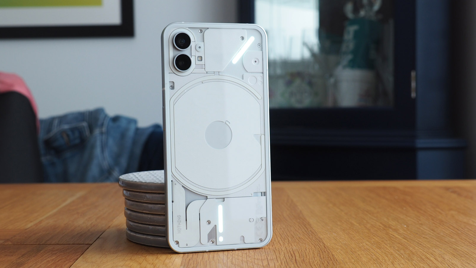
To look at the Nothing Phone 1 is equally engaging, though I wouldn't call it informal: its transparent rear design, which houses a series of notification lights (which the company calls Glyph), has a kind of techno-industrial vibe about its aesthetic. It's this design language and those lights that are the fun-factor and stand-apart aspect about the Nothing Phone 1.
Well, that and the price point. The Phone 1 isn't a flagship, it's a first go; an intentional lure to those who might be looking for not only a different phone to stand out from the crowd, but also one of the best cheap phones going. I feel it's a good starting point, too, although has the Phone 1 convinced me that it's going to change the Android market entirely? Not quite. Here's why...
Nothing Phone (1) review: Price and availability
As I touched upon above, the Nothing Phone 1 isn't a pricey bit of kit: it costs £399 in the UK, which is also Nothing's home (a rare UK-based tech company), or €470 in Europe. There's also a pricier variant which doubles the storage to 256GB instead of 128GB.
But that's your lot. Nothing is going after the giant nations, so there's no availability in the USA. In that respect it's a fairly small launch that's very much targeted at the European continent, further adding to its unusual scope.
Nothing Phone (1) review: Design and display
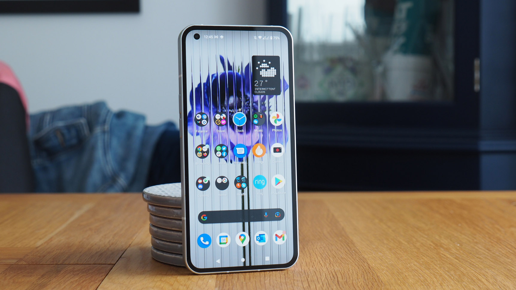
And so on to the visuals of this handset: the Nothing Phone 1 is truly, undeniably a striking-looking device. I sometimes forget it's got that rear which, from afar, looks more like a wannabe case than the reality of a translucent rear. It explains why people have often glanced over, though.
There's the white option, which I've got on review here, or a black finish which I actually think looks neater (I saw it at the launch event, but haven't possessed one myself). No other fancy colours to be found: Nothing's design language has a very binary, industrial aesthetic about it, right down to the dot-constructed Nothing logo on the rear of the phone.
As I pointed out in my Nothing Phone (1): Here Are (3) Things I Like & (2) I Don't feature: "you only need take one glance at Phone 1's design to have a bit of a wow moment. It's unusual, that's for sure, embodying the partially transparent design language that the Nothing Ear 1 earphones first presented, just in a phone format.
"That doesn't mean the Phone 1 is entirely see-through, though, as that would just look downright messy. I think Nothing has done a good job with positioning components into a sensible arrangement, so you can see the wireless charging coil on the rear" alongside surrounding elements.
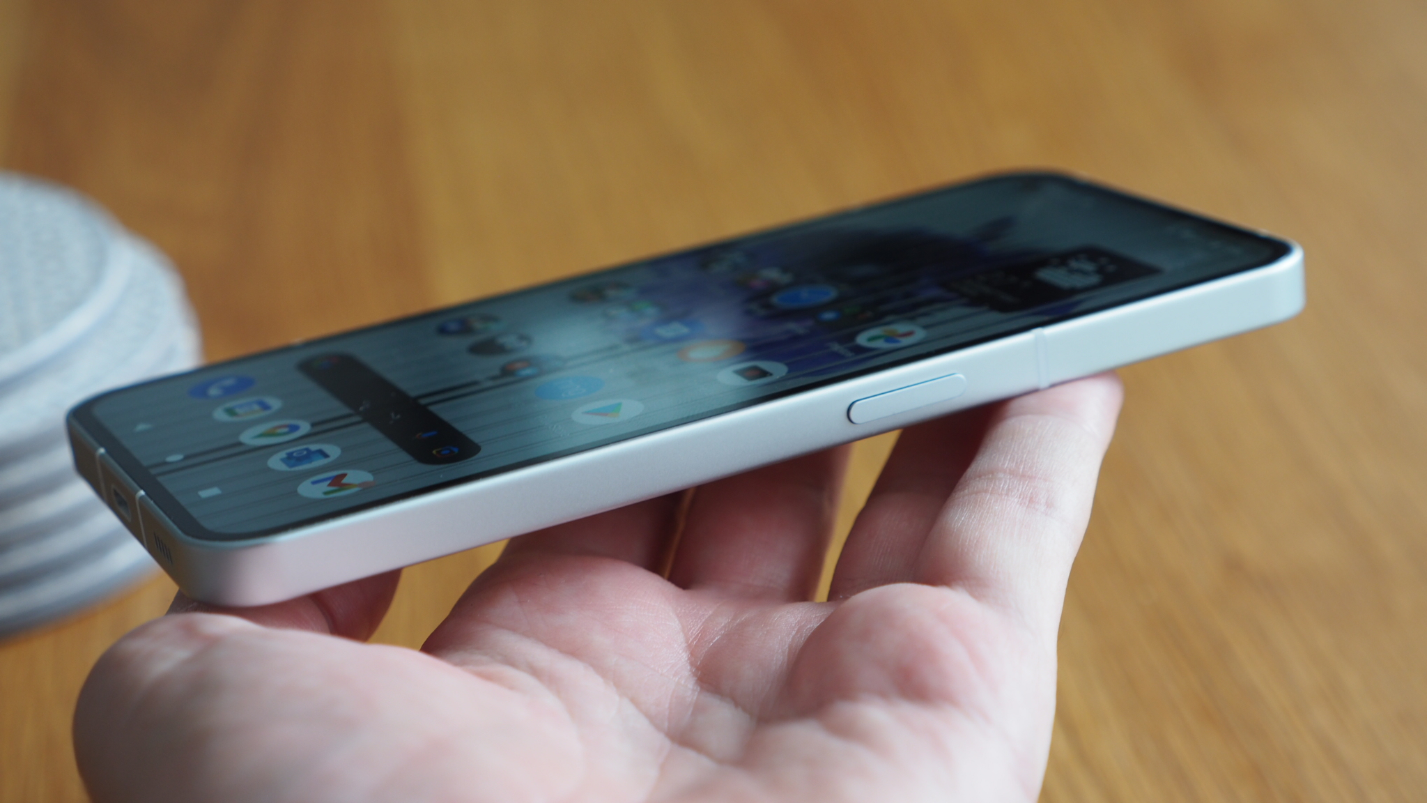
It is a chunky handset, though, more so than its 8.3mm thickness would suggest. If you've handled lots of phones over the years then you'll know what I mean: that's not a thickness really any different to much else on the market right now, it's just that the very square edges and totally flat screen make your hand believe it's more brick-like than it really is. That's not especially great in terms of in-use feel, but at least the screen is flat so images look great on there, with no contrast fall-off.
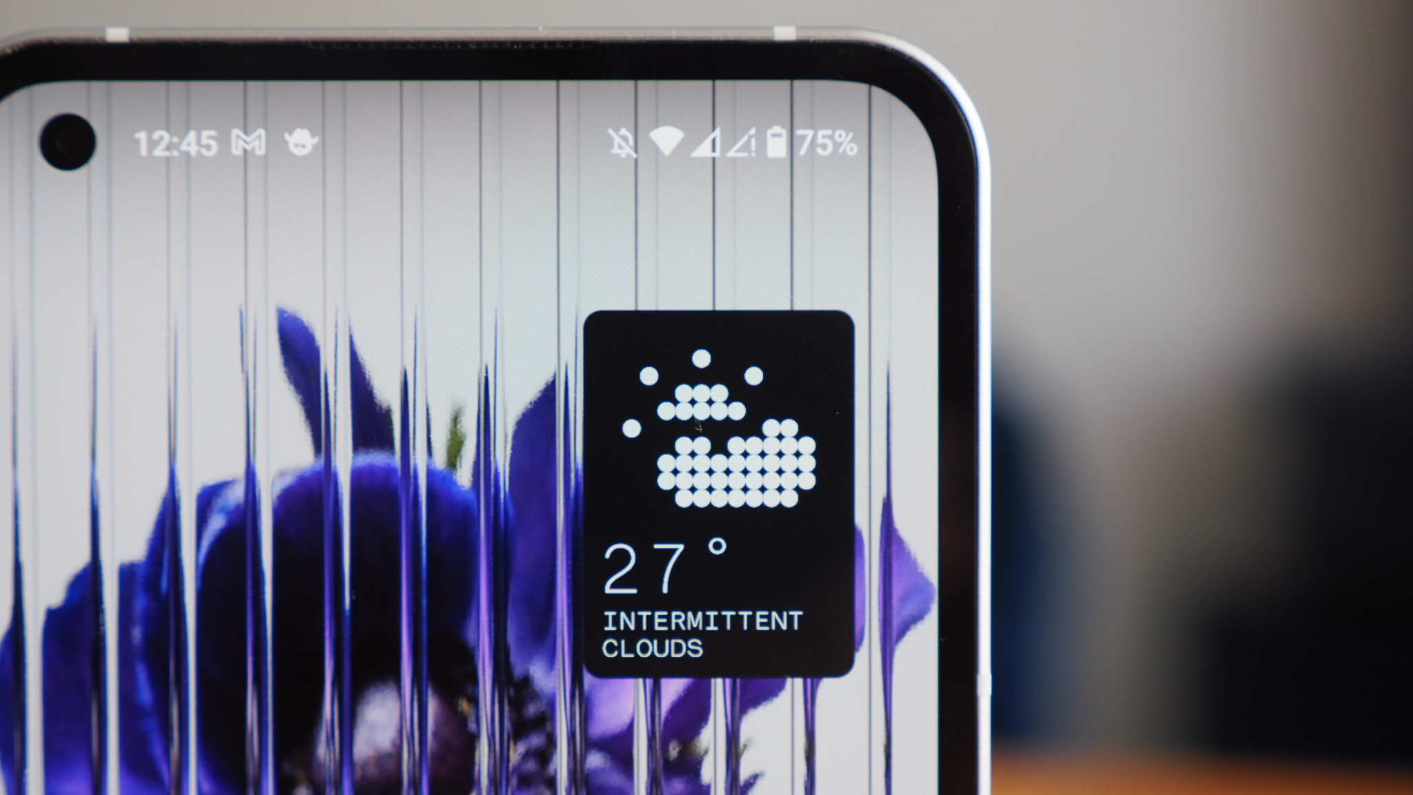
The screen is one of the most interesting parts about this phone, as it turns out, and as I learnt at the Nothing Phone 1 launch event. What do I mean exactly? Well, the Phone 1 uses a flexible display, solely so the designers could wrap the base around the bottom and hide the ribbon strips that connect the panel, meaning the bezel around the device is entirely equal all the way around. The 'chin' isn't bigger than the 'forehead' bezel as a result, which is real commitment to craft.
The screen itself is a 6.55-inch OLED panel, so slightly smaller than the current norm in most flagships, but it's a sensible size to reach across during use. It's a decent-looking panel, like I say, largely thanks to it being so flat. While it's not exactly anything special, it does tick all the mod cons, such as 120Hz refresh and 500 nits brightness with HDR10+ support, making it very capable at this price point for sure.
Nothing Phone (1) review: Glyph lights explained
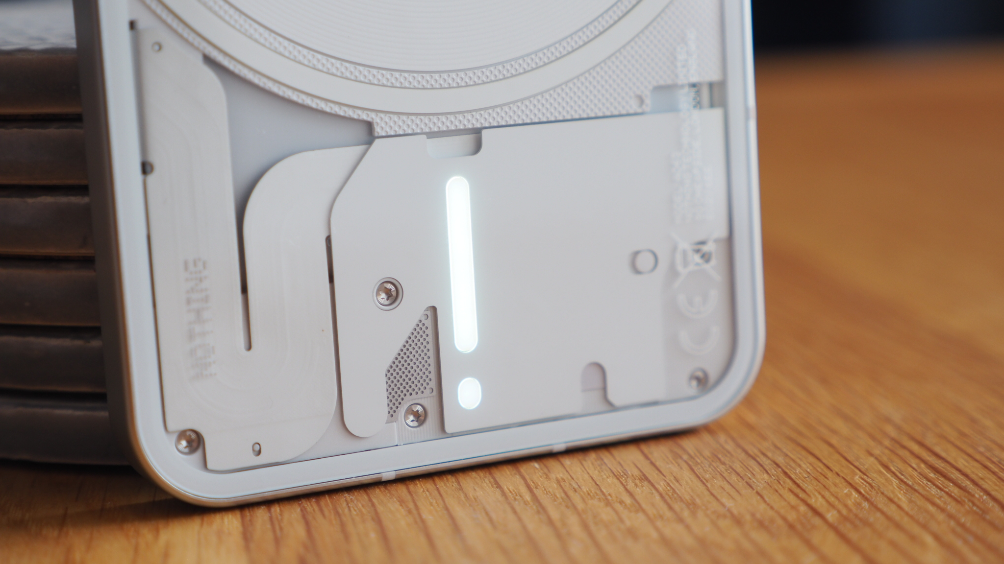
But the real reason that anyone is going to look at the Nothing Phone 1 is down to those rear lights, or Glyph lights as they're called within software. It's a big part of the reason for the transparent design, so you can see all four lights beneath the phone's 'skin'.
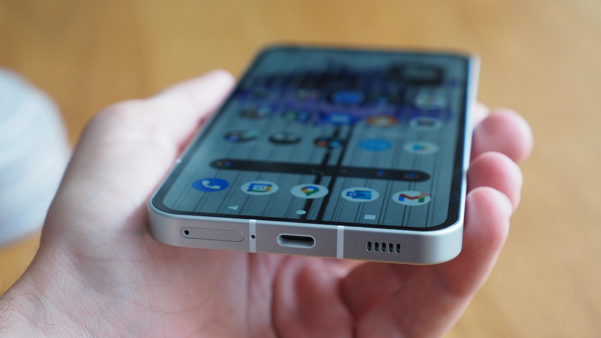
There's a four-light arrangement in total: one around the cameras unit; one surrounding the wireless charging core; one above the USB-C charging port; and another to the upper right corner at a 45-degree angle (as if 'pointing' around to the front-facing camera).
Now, you can't explicitly control these lights at your whim. You can illuminate the whole lot like a mega-torch from within the camera app. Or you can turn on their various functions, which involve patterns related to notifications, the ability to assign specific contacts (up to 10) to individual patterns, and, er, even the ability for Glyph to 'dance' during music playback.
Ultimately the whole Glyph lighting is Nothing's 'fun factor' moment. And it is fun. But it's just not that useful. At least not to me. Except, perhaps, for the light strip that fills up during charging to show the battery percentage in visual form.
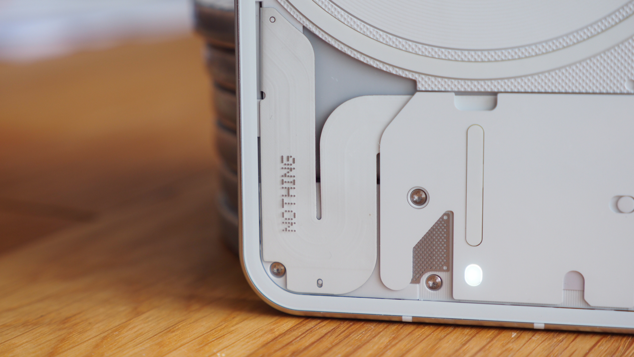
Part of the reasoning for having it is that you can put your Nothing Phone 1 screen side down and then you won't be distracted by unwanted calls, because you'll have assigned the one or two specific contacts with their own individual Glyph callsign. I get the principle of that idea, but we're talking about a mass of lights on the rear here, there's nothing subtle about that – for you or others around you.
I've also had issues with the lights pinging on in the night for various reasons, while at any point you set the phone down from use it'll give you a confirmatory Glyph 'ping' of lights – which for the last week makes me immediately pick the phone back up assuming there's a message.
The end result? I've largely switched Glyph off. And so I've dialled out the Nothing Phone 1's key unique sales point, in effect. As such, those ignored, I can only really treat it like any other phone in the market of this type and at this price point.
Nothing Phone (1) review: Performance and battery
Which is the point when the Nothing Phone 1 hits its first major hurdle: battery life. Inside there's a 4,500mAh cell, which is an acceptable capacity for a phone of this size and with a mid-level Qualcomm Snapdragon 778 platform in tow.
Except, despite that, the battery life of the Nothing Phone 1 has been a real struggle – I've needed top-ups at the plug before a day is through. Nothing claims a full 18 hours per charge. I've been pressed to get too far beyond 12 hours, delivering around 5 hours of screen time.
I don't even think this below par battery life is anything much to do with the Glyph lights. Sure, they'll use up something, but it's actually Nothing Launcher, the Android skin that the company uses, which tells me that it's sapping battery the most overall. Which is a surprise overall.
This is the biggest hurdle that the Nothing Phone 1 faces. Some updates and I'm sure it could be improved. I hope it is, because it's the one thing that would stop me from wanting to go on using this phone as my daily driver.
Otherwise from a performance point of view things are pretty good: we're at a point where even Snapdragon processors a couple of steps down the ranks are perfectly capable, and I've had no issues with multiple apps, gaming and such like. Nothing's look is individual, sure, but it doesn't stray far from Android at all, so there's nothing hidden away, no notification issues like with many Chinese brand competitors, and such like.
Nothing Phone (1) review: Cameras
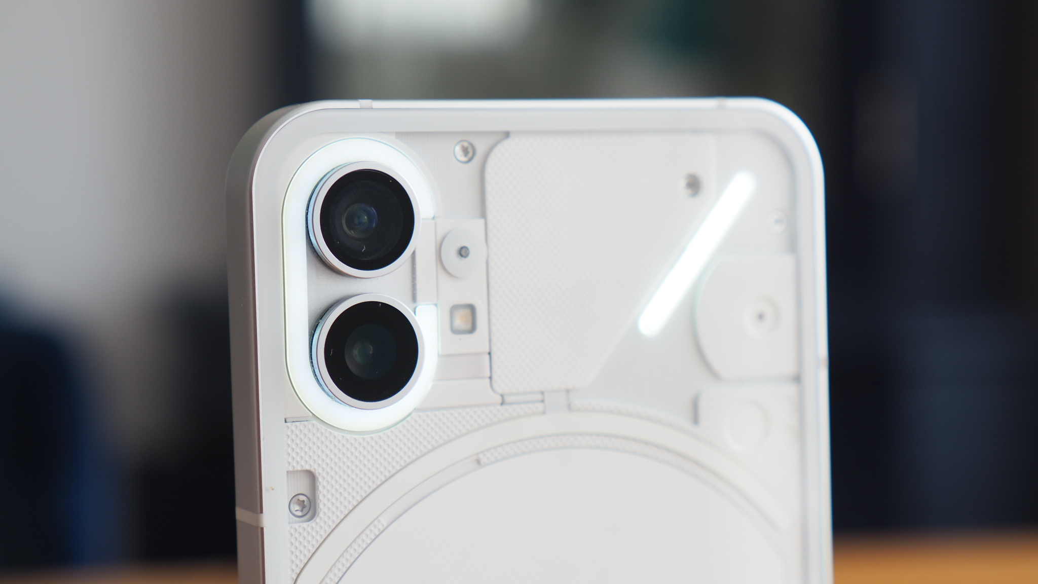
When I first saw the Nothing Phone 1 I brazenly assumed the cameras were going to be an afterthought. But, actually, Nothing's been really wise here: the Phone 1's dual rear system comprises two 50-megapixel sensors, one wide, the other ultra-wide. So there's no compromise between one and the next.
Better still, the Phone 1 doesn't dabble in crappy camera gimmicks like so many others. There's no macro or depth nonsense here that's just not needed. And that I am totally behind.
That's allowed the company to focus on the good aspects of what it's working with, including adding optical image stabilisation (OIS) to proceedings, which is really handy for that added stability. I've been able to more-or-less feel the stabilisation in action when using the Camera app as my viewfinder.


I've not shot extensive rounds of pictures with the Nothing Phone 1, but ample shots (some of which are above) to see how it's able to process what it gathers. It does a fair job, too, largely down to the success of the main Sony sensor being used under the skin.
Go low-light, however, and Nothing's lack of image processing lets way to more image noise and grain that you may find from some more established competitors.
And before I forget: you can use the Glyph lights as a fill light, which is great for close-up shots or when recording video. No other device on the market can offer such a feature, that's for sure, so there are practical use-cases for the lighting USP.
Nothing Phone (1) review: Verdict

The Nothing Phone 1 may have succeeded in delivering the hype ahead of launch like no other, but having used this Android phone extensively I find its fun-factor Glyph notification lights can't outshine the fundamental lack of battery life per charge.
It's still a good value for money phone, however, and one that doesn't scrimp in many key areas where it matters – such as cameras and screen quality – and that'll certainly help its cause. Not that the Phone 1 truly reinvents what a phone is or does, but it does show there's space for other ways of thinking in this busy Android market.
But the big question is whether the Phone 1's Glyph lights will truly resonate with its prospective audience. Otherwise it's probably a case of lights out.
Also consider
This is where the Nothing Phone 1 shows its value: it's set squarely against the likes of the OnePlus Nord 2, which given its age you can now pick up for a little less cash now (see the widget below for latest pricing).
That's almost ironic, seeing as Carl Pei, Nothing's founder, also co-founded OnePlus many years ago. The Nord 2 might be a better pick for battery life, even if its design doesn't excite quite so much.
Sign up to the T3 newsletter for smarter living straight to your inbox
Get all the latest news, reviews, deals and buying guides on gorgeous tech, home and active products from the T3 experts

Mike is T3's Tech Editor. He's been writing about consumer technology for 15 years and his beat covers phones – of which he's seen hundreds of handsets over the years – laptops, gaming, TV & audio, and more. There's little consumer tech he's not had a hand at trying, and with extensive commissioning and editing experience, he knows the industry inside out. As the former Reviews Editor at Pocket-lint for 10 years where he furthered his knowledge and expertise, whilst writing about literally thousands of products, he's also provided work for publications such as Wired, The Guardian, Metro, and more.
-
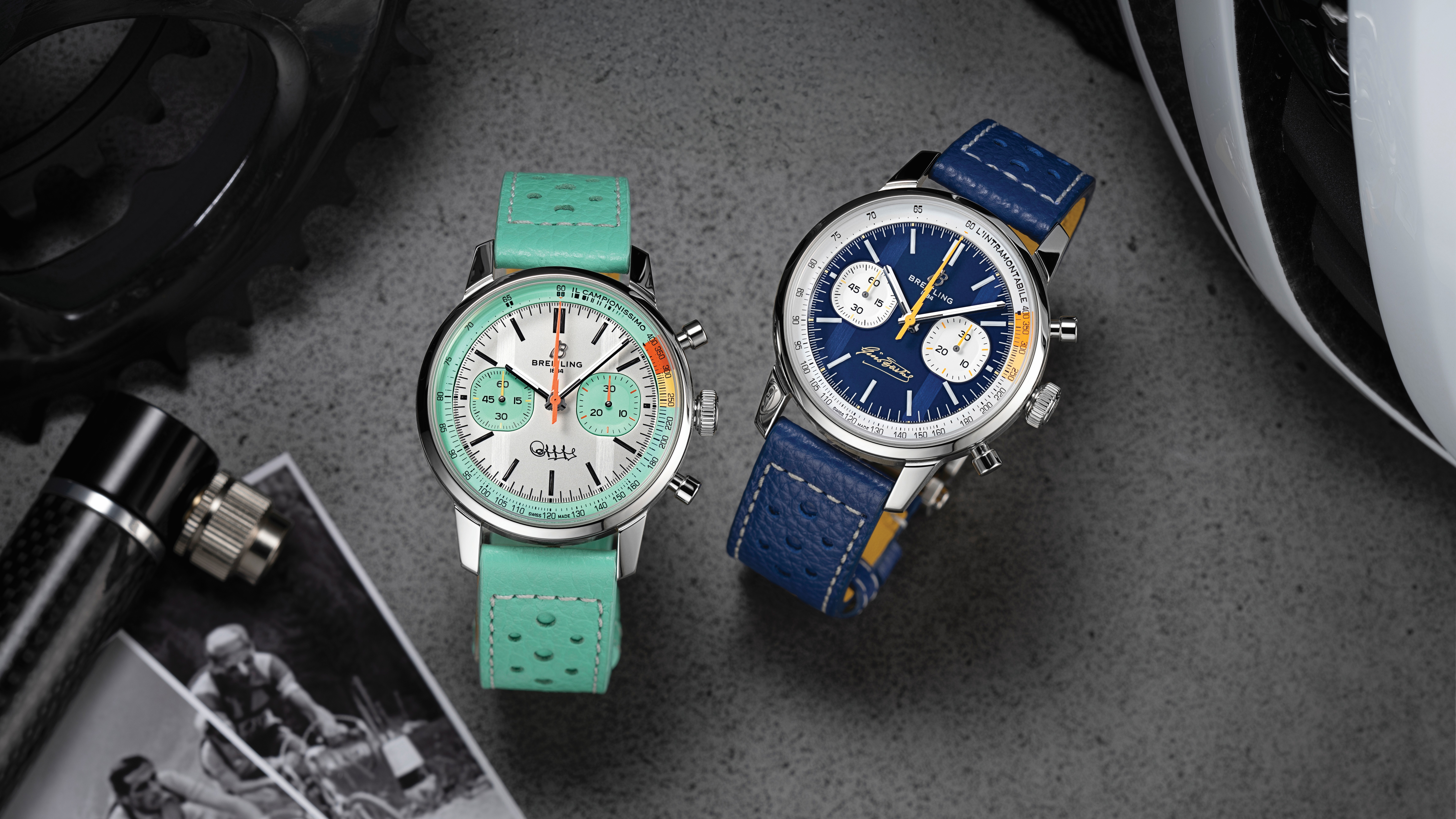 Breitling adds two new Top Time chronographs celebrates the legacy of cycling legends
These are gorgeous watches
By Sam Cross Published
-
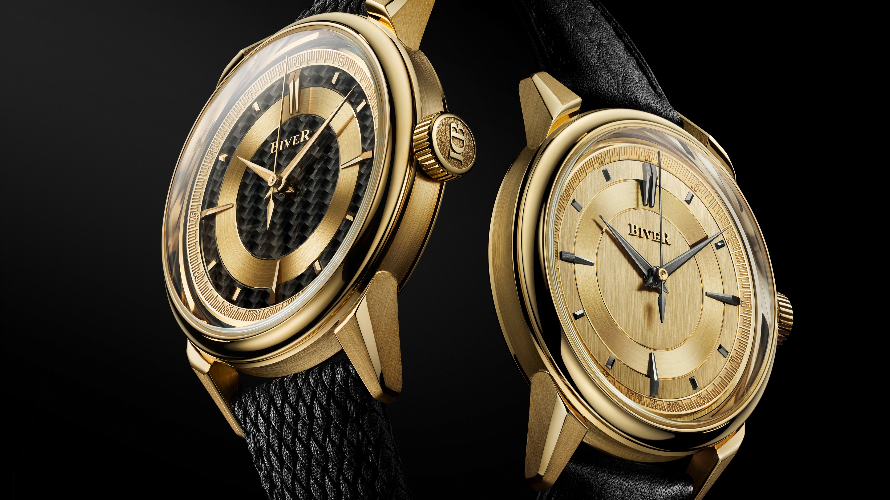 Biver adds another two Automatique models to its collection
These are classy additions
By Sam Cross Published
-
 Audeze’s new planar headphones promise studio-quality sound without a sky-high price
The new LCD-S20 closed-back headphones are Audeze's most affordable premium planar headphones yet
By Carrie Marshall Published