Onyx Boox Tab Ultra C review: colour me E Ink
The Boox Tab Ultra C's screen straddles eye-friendly E Ink and full-colour better than anything else out now
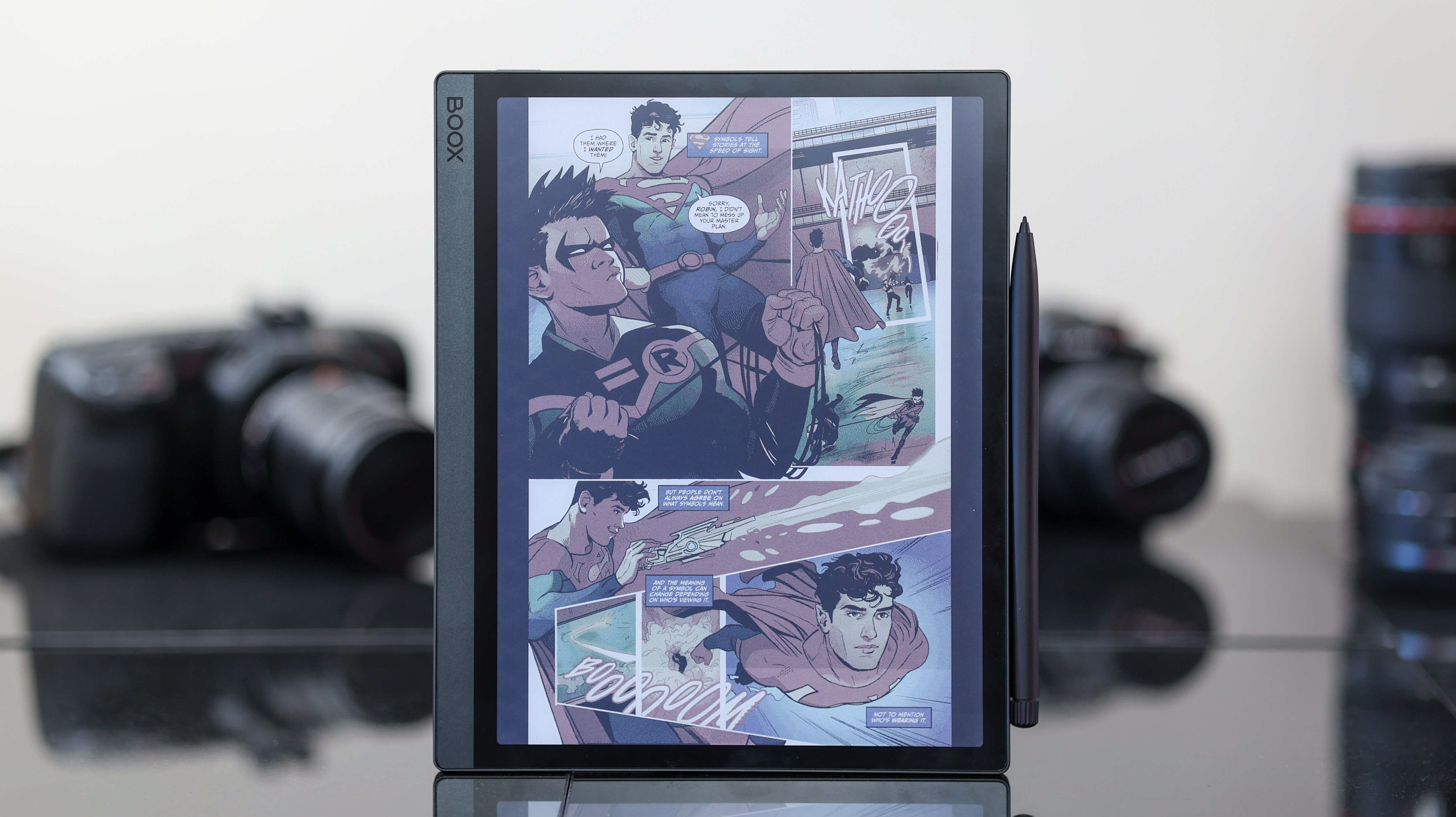
If you love reading but want a little extra from your E Ink tablet, the Tab Ultra C could be for you. It runs Android apps, making it more versatile than the Amazon Kindle Scribe or Remarkable 2, and its colour ePaper screen means it's less hamstrung than monochrome Android E Ink slates. So while the colour fidelity never gets zingier than a diffuse shade of washed out, the Boox Tab Ultra C is still a unique and powerful (yet niche and pricey) tool for a particular type of user.
-
+
Unique and versatile colour display
-
+
Pen included with the tablet
-
+
Best-in-class app support
-
+
Solid build quality
-
-
Pricier than better-specced iPads and Android tabs
-
-
Pen latency with third-party notetaking apps
-
-
Weak camera with clunky scanner app
-
-
Runs an old version of Android
Why you can trust T3

Holy mackerel Batman! Is that a colour E Ink-style tablet? Why would anyone possibly want one of those!? I hear you Robin; that's exactly what I thought when I heard about the Boox Tab Ultra C. But after a few weeks with this unsaturated slate, it's proven to be a pretty rad tonic to the doom-scrolling and Netflix binge-inducing multimedia wizardry of today's other do-it-all tablets.
If you haven't used an E Ink tablet before, the category has gained momentum in the last few years. Amazon's Kindle Scribe and Lenovo's Smart Paper have hit the scene, and fan favourites like the Remarkable 2 and Boox Note Air line have been around for a while as well.
Why do E Ink tablets even exist? Because they don't need a backlight, so are probably less likely to cause eye strain than traditional LCD and OLED tabs. Their paper-like quality and typically excellent battery life also make them mighty notetaking tools. If you've ever used an Amazon Kindle – they're basically big Kindles with pens.
When E Ink tablets have tried to get smart and run Android apps in the past, though, they've hit a monochrome wall. Some apps don't work when they're black and white – from Wordle to Marvel Unlimited or other comic book apps – and that brings us to the full-colour Boox Tab Ultra C, which adds a whole other layer of appeal to its offering.
Onyx Boox Tab Ultra C: Price & availability
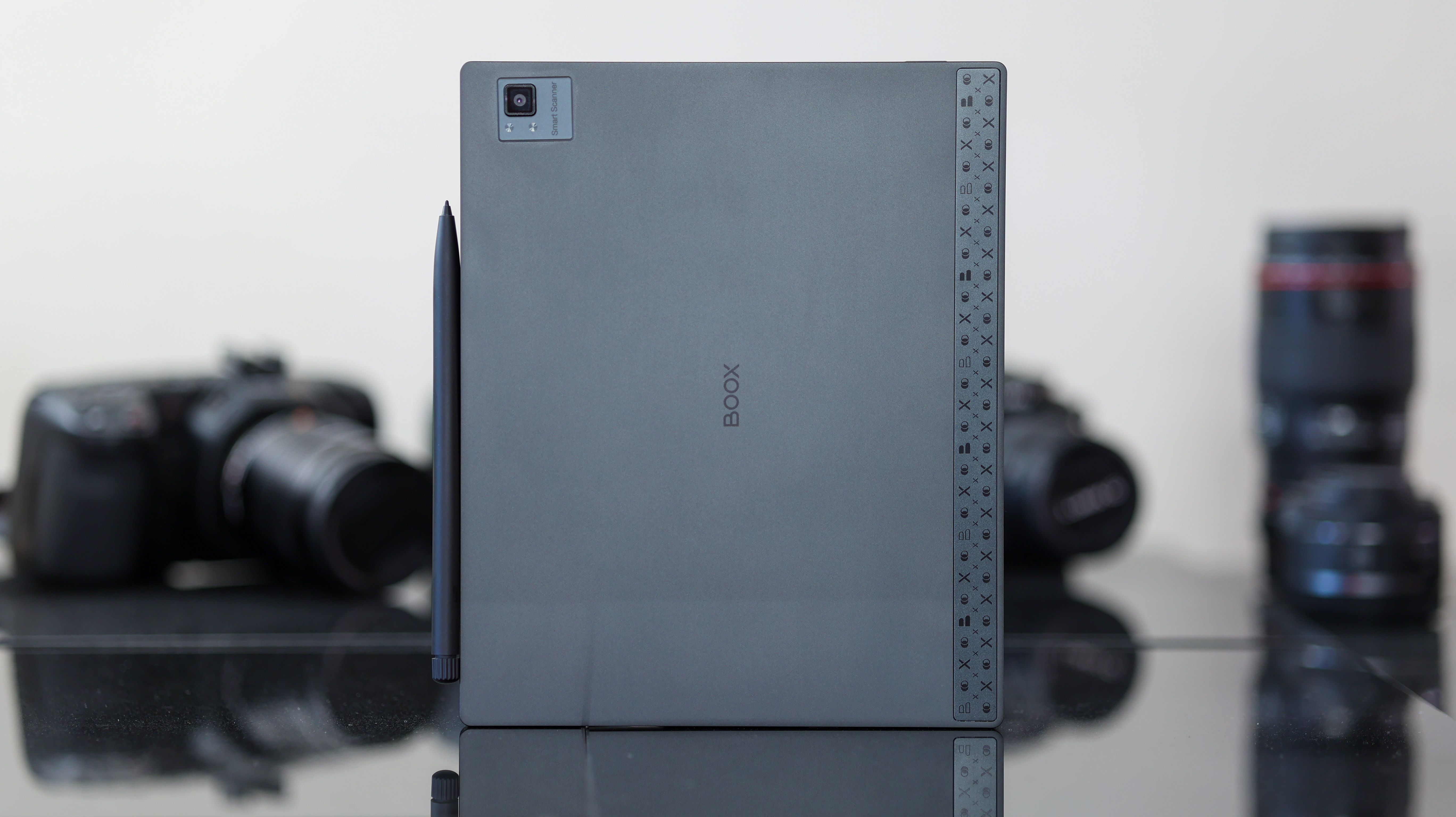
The Onyx Boox Tab Ultra C is available now for £599/$599, and you can pick it up on the official Boox website or other retailers, including Amazon.
The Boox Tab Ultra C can be picked up in one capacity option (128GB) and ships with a pen in the box, though there are a few accessories sold separately that help eke a little more utility from it.
The Magnetic Keyboard Cover, which works for both the Tab Ultra and Tab Ultra C costs £120/$110, while the BOOX Magnetic Cover costs around £60/$50.
Onyx Boox Tab Ultra C review: Design & display
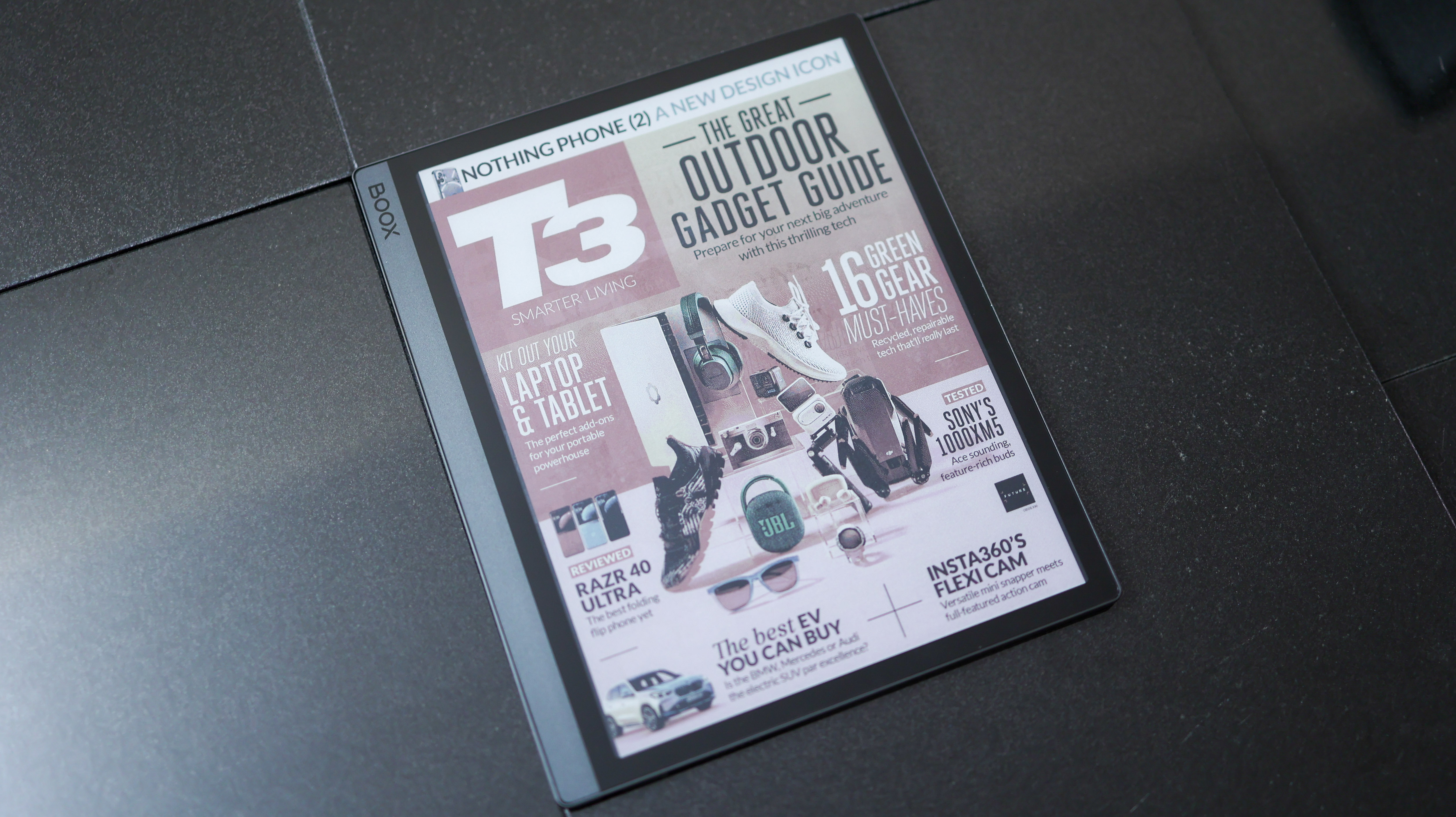
The Boox Tab Ultra C feels like a solid slice of tablet. At 6.7mm thin, it isn't as slim as E Ink slabs like the Boox Note Air line or the ReMarkable 2, but it's still likely thinner than your smartphone.
With squared-off corners and edges, a glass front and metal frame, and weighing 480g – a little heavier than an 11-inch Apple iPad Pro – the Tab Ultra C has presence. It's comfortable to hold one-handed for short bouts, but long reading sessions will probably need that second hand to step in.
There's a microSD card slot and a USB-C port at the bottom of the tab, directly below the margin to the left of the screen. On the left side of the Tab Ultra C are POGO pins to connect it to the keyboard folio. At the top is a power button which is also a fingerprint scanner, and on the right side is where the pen magnetically latches onto the tablet. It locks in place securely, unlike some past Boox pen tablets.
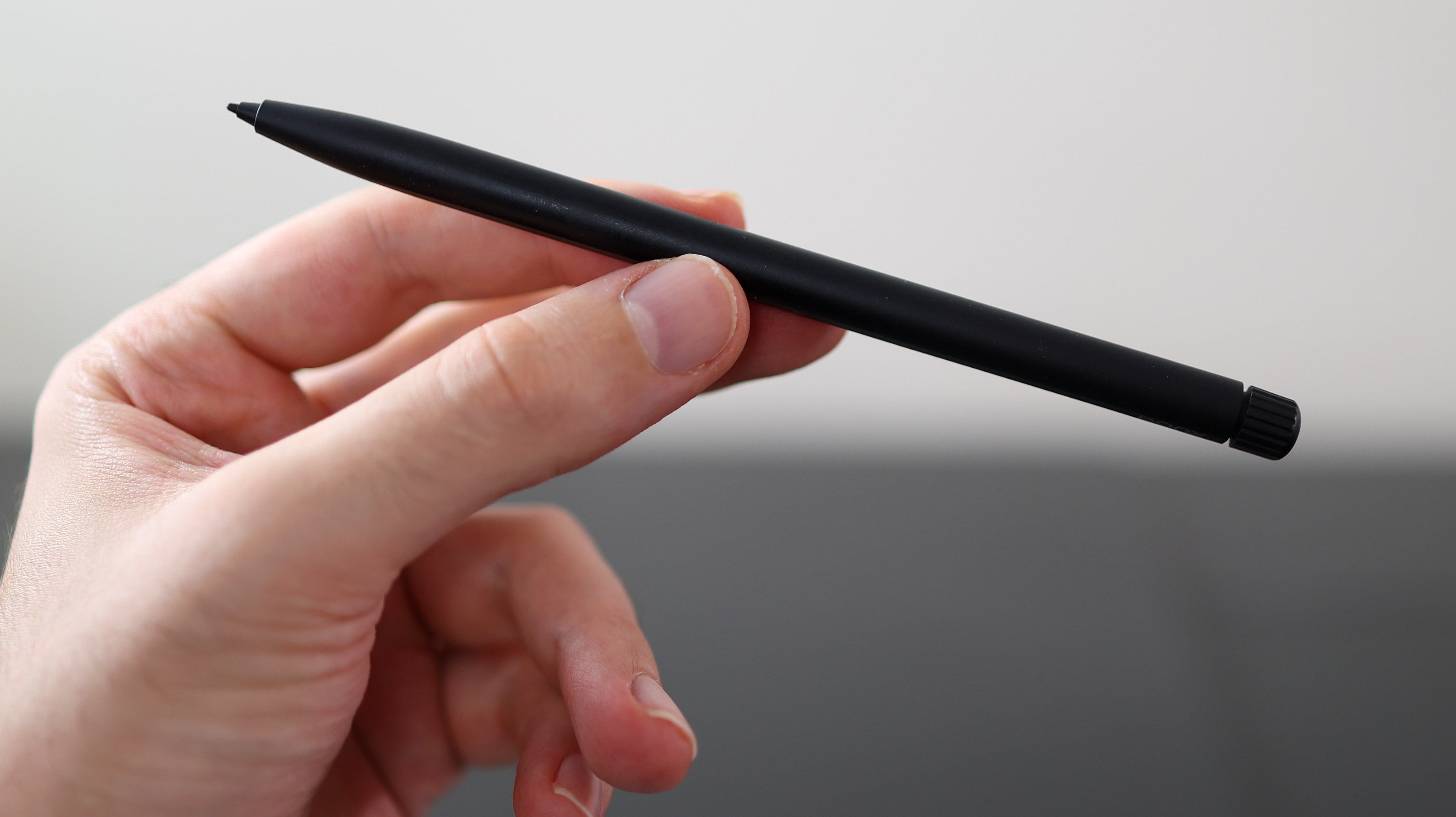
While the Note Air line we reviewed shipped with a relatively hollow-feeling pen, the Ultra line comes with the Boox Pen 2 Pro, which has an eraser on the top side and feels very comfortable to write with.
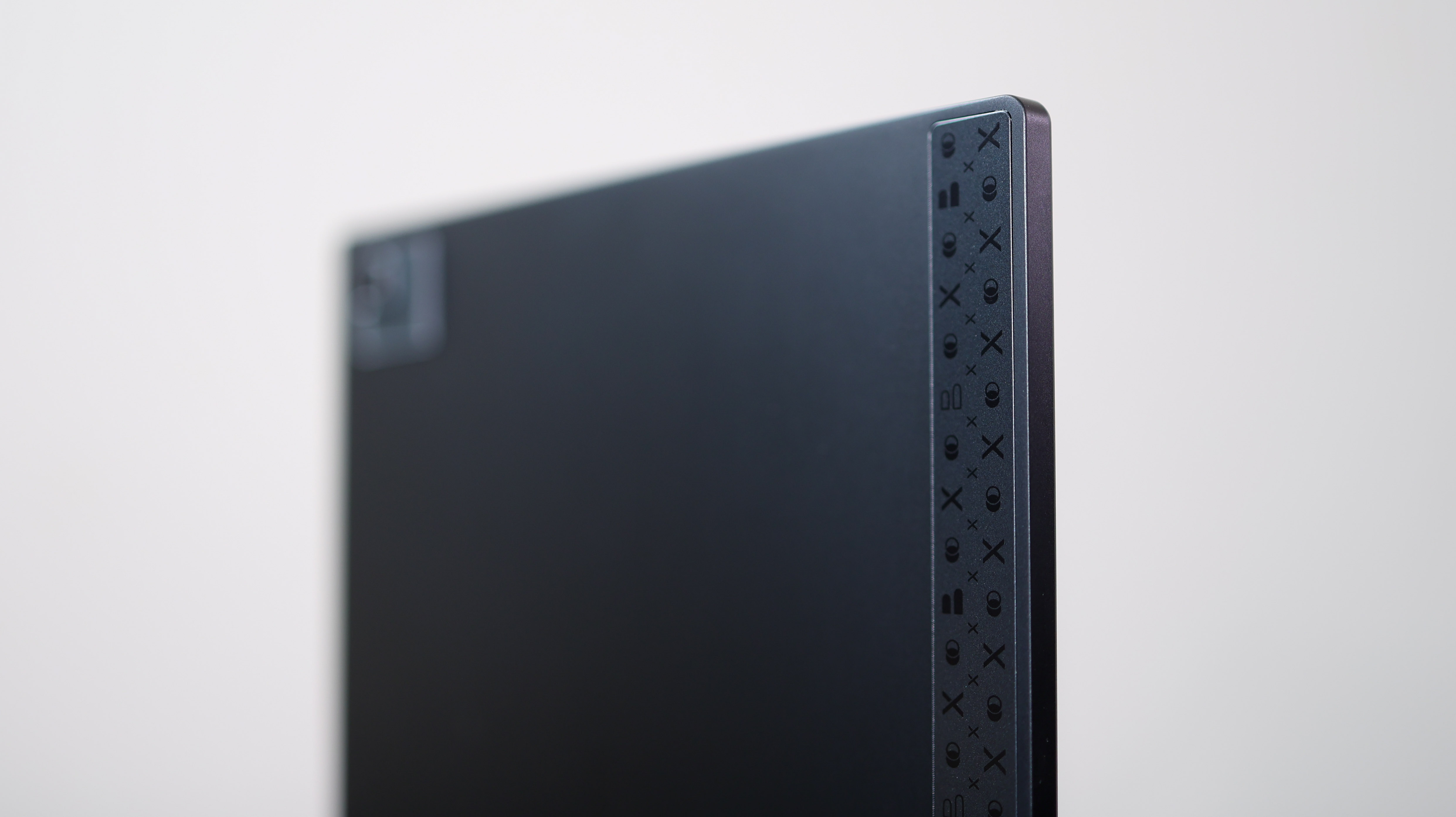
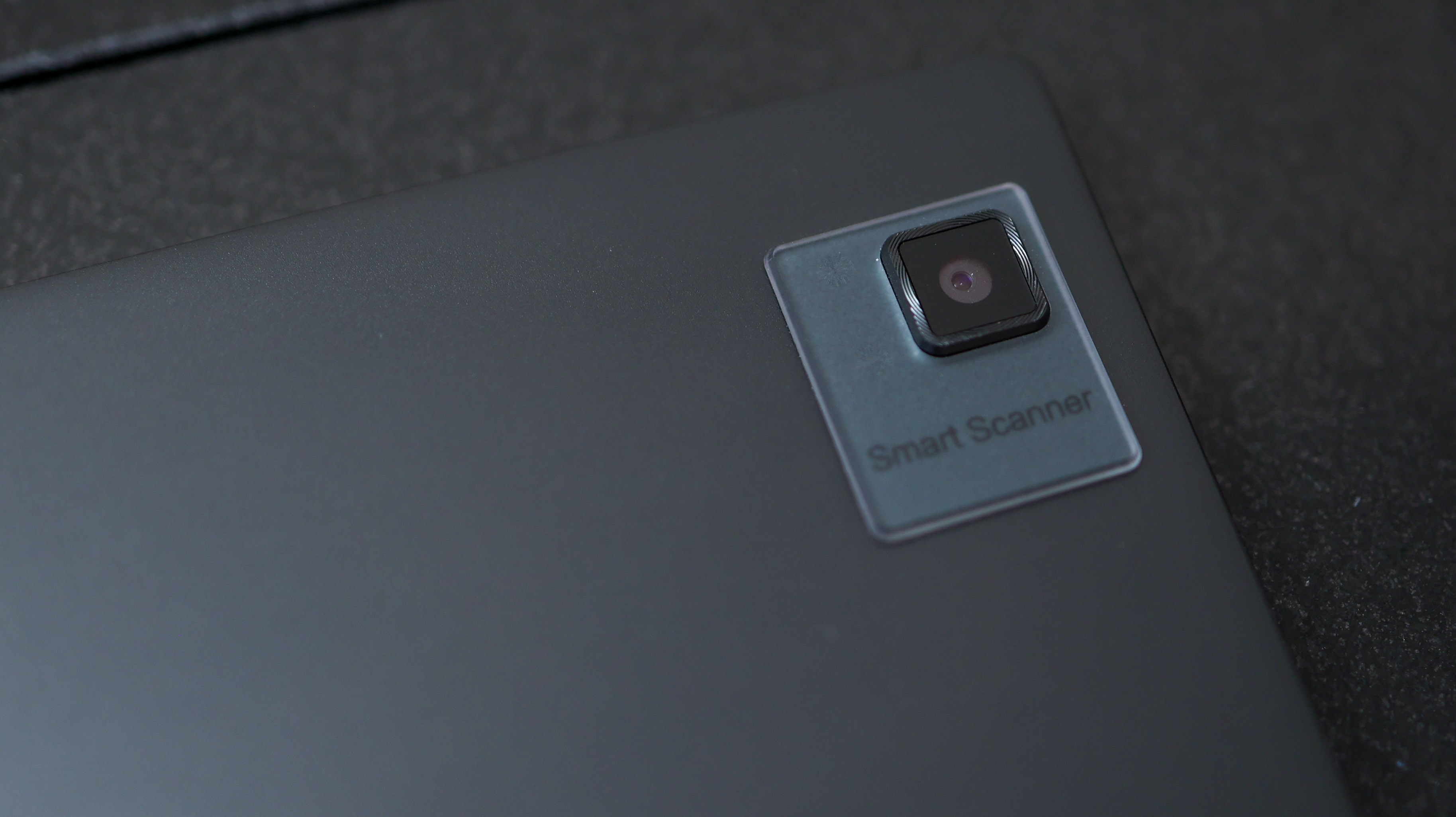
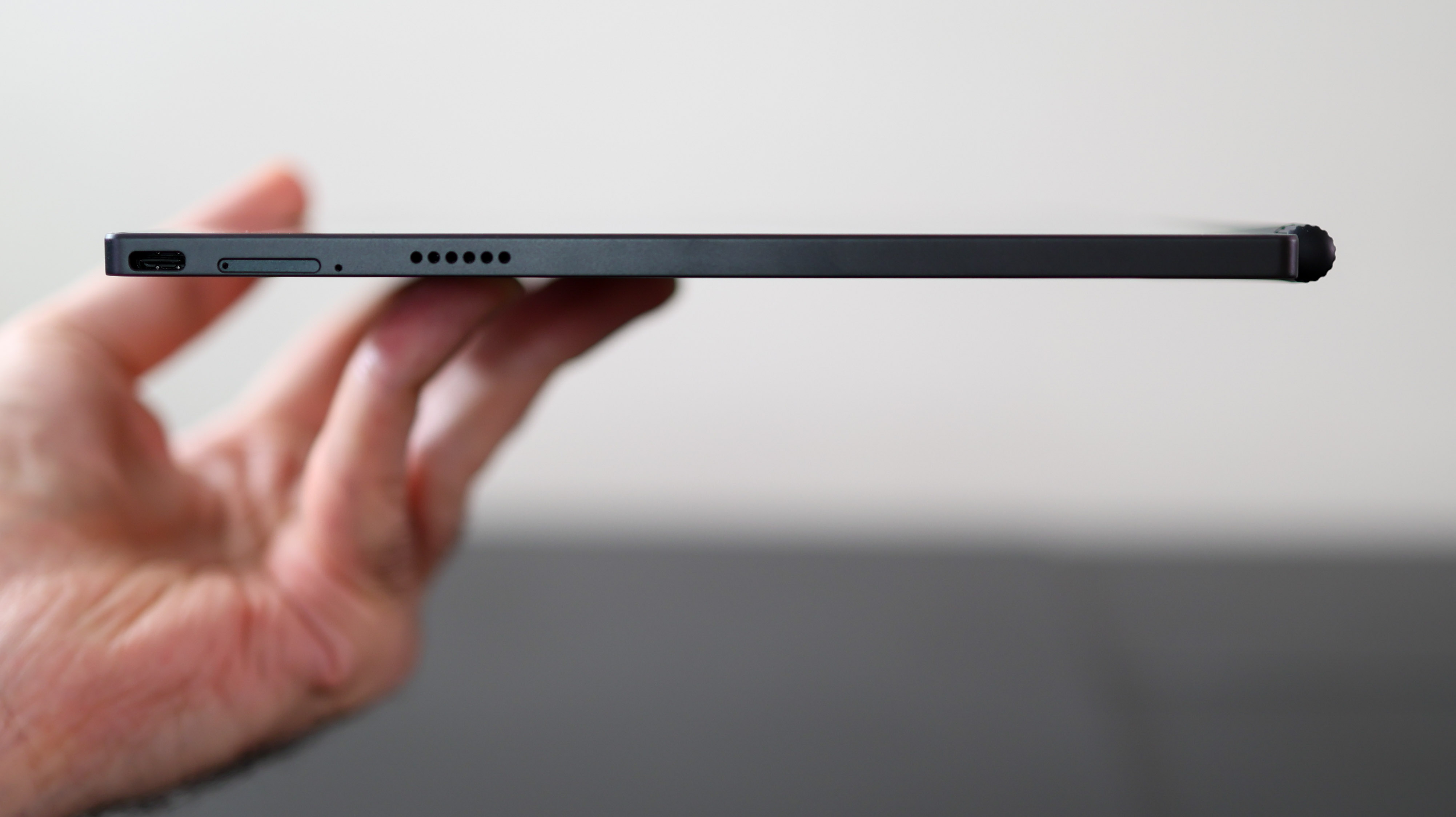
There are a few random choices dotted around the back of the Tab Ultra C. The first is a camera, which we wouldn't expect to see on an E Ink or ePaper tablet, but with the words "Smart Scanner" alongside it, document scanning is clearly one of the Tab Ultra C's touted features.
The second quirk is a plastic strip from the top to the bottom along the edge. This is probably to improve wireless connectivity, but the heavy patterning is an off-centre move that interrupts the Tab Ultra's otherwise clean aesthetic.
The Tab Ultra C's biggest draw isn't its design, though, it's that 10.3-inch Kaleido 3 Carta 1200 colour screen. With 4,096 colours, it's a far cry from the 10-bit 1-billion-colour displays on top-tier tabs like the Galaxy Tab S9 Ultra. Still, it marks an exciting step forward for the tech behind the humble E-Reader.
Unlike the ReMarkable 2, the Boox Tab Ultra C has a backlight, can shine warm or cool, and can be dialled down to zero or up to 100 per cent while still displaying on-screen content, with very even light coverage.
Calling the screen full-colour isn't over-selling it per se, but its colours are muted, particularly with the backlight off. While black-on-white content is very easy to read – not dissimilar to a traditional monochrome E Ink alternative – colour content looks lower in contrast.
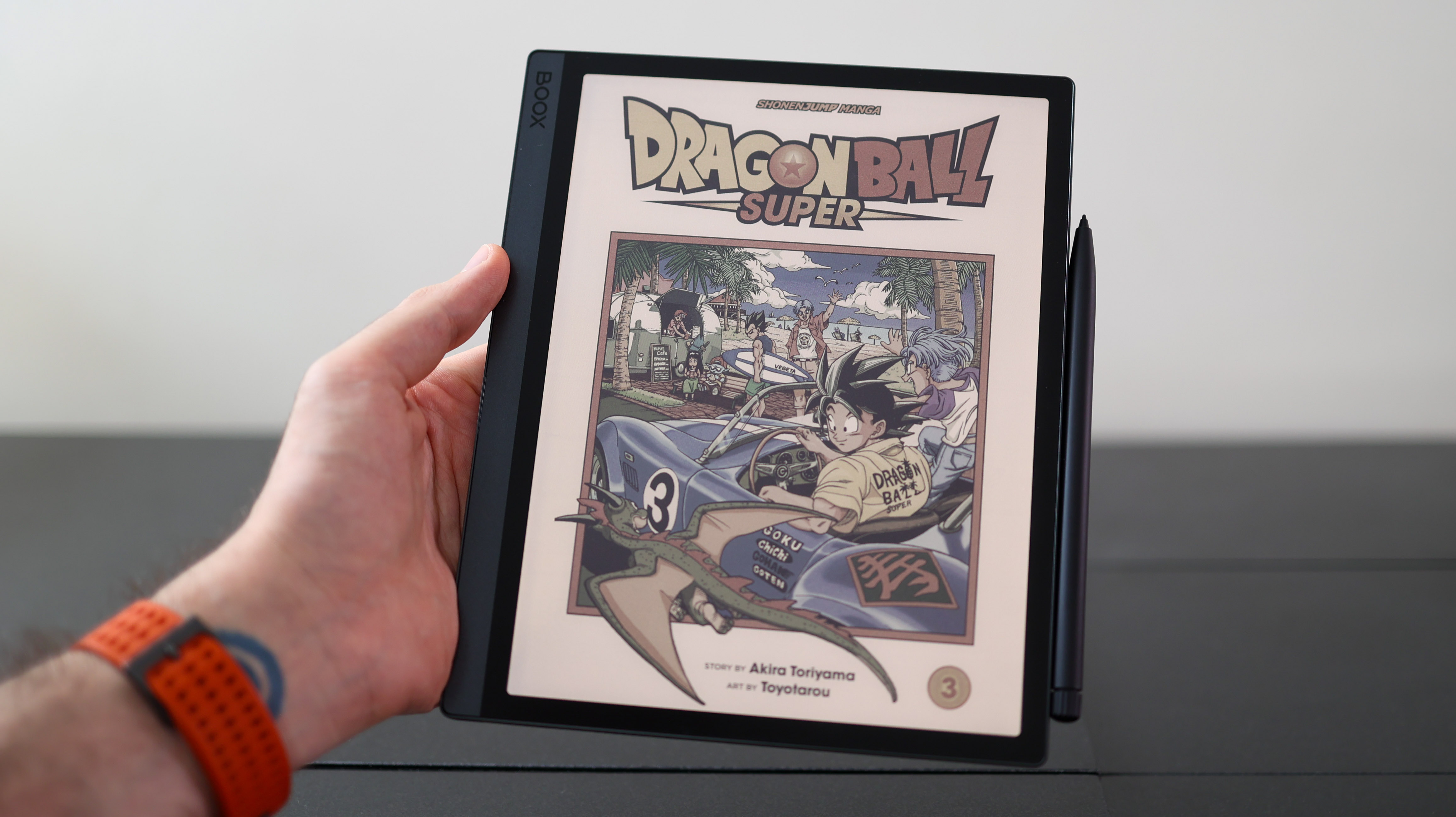
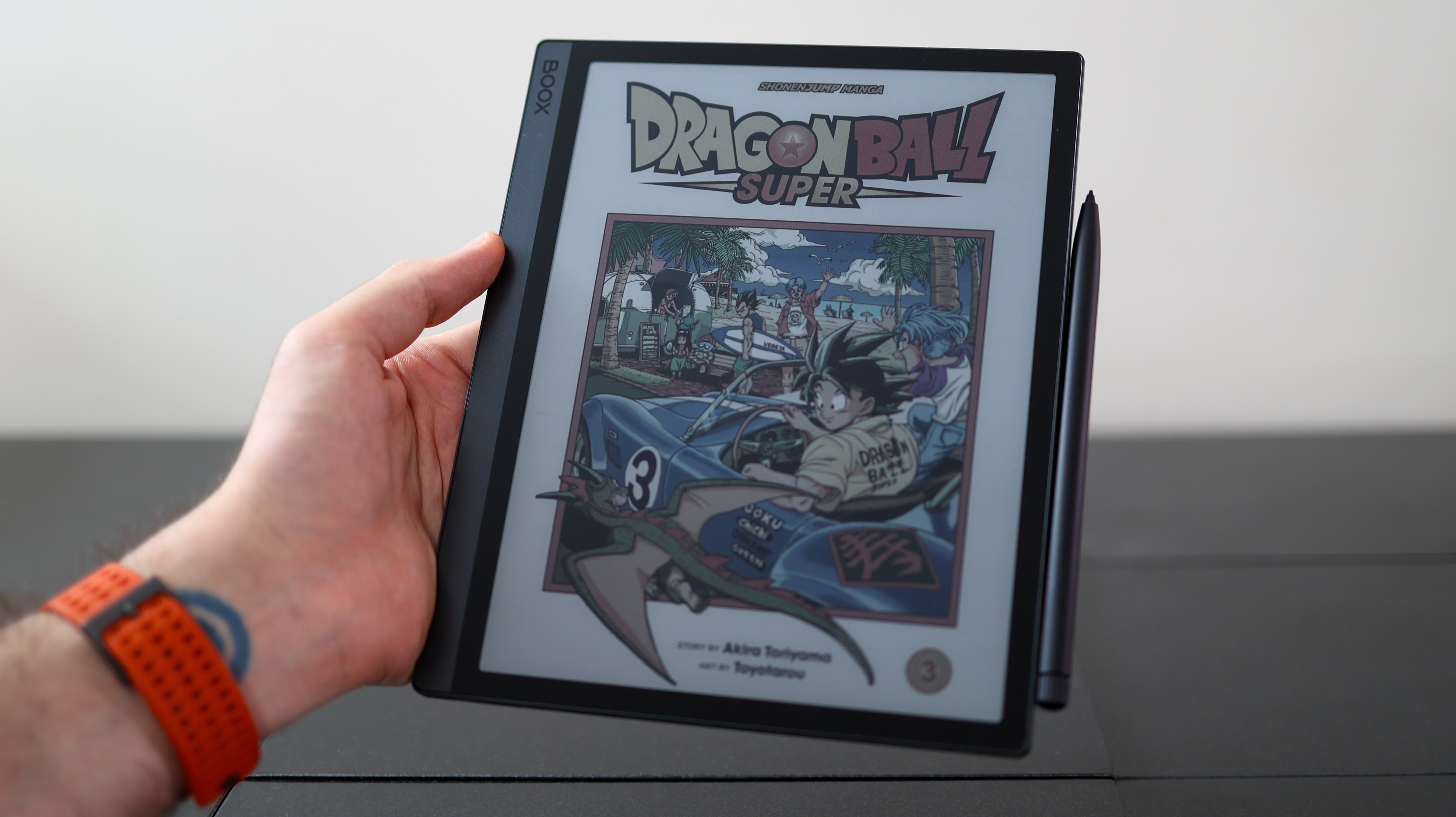
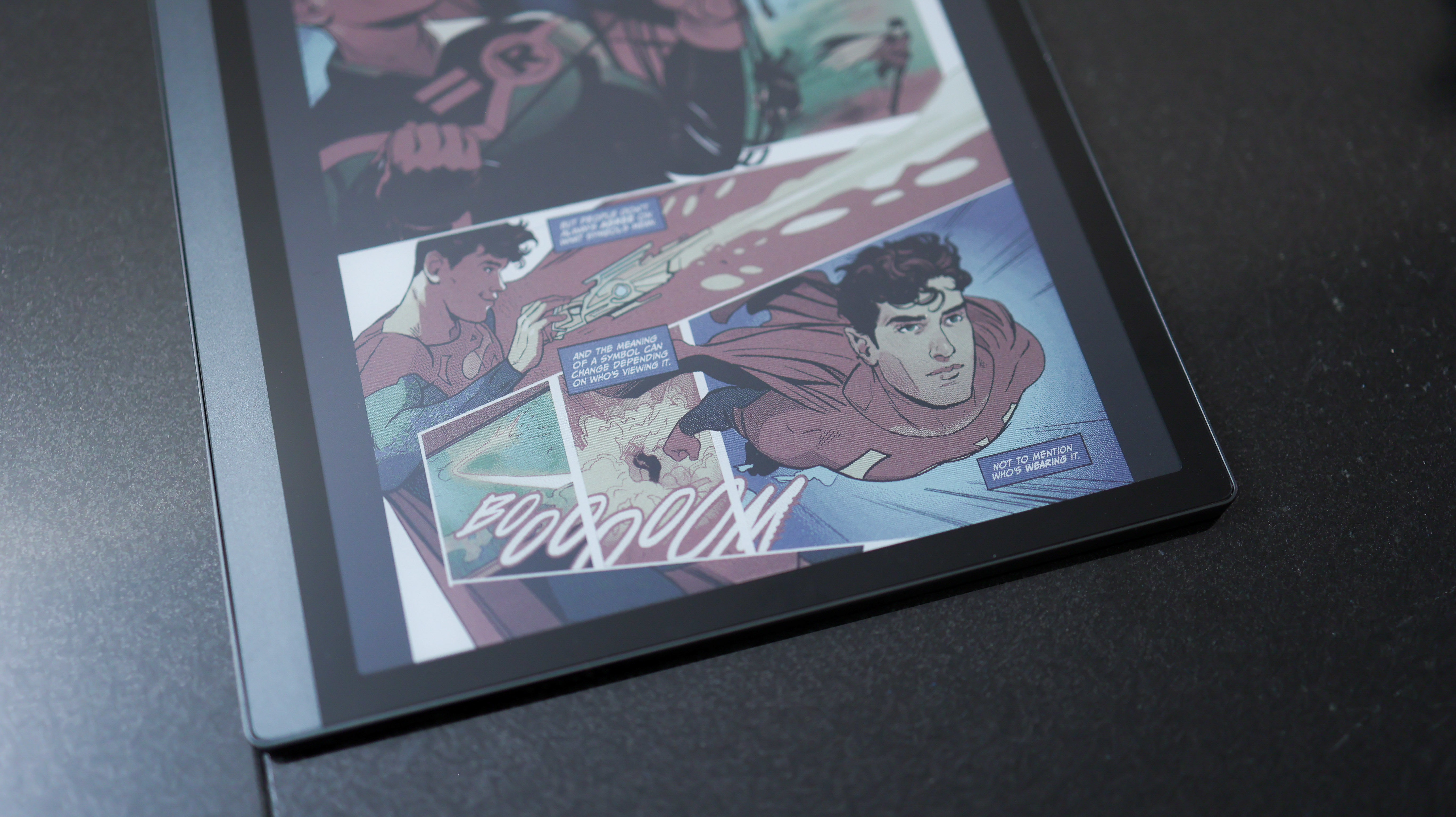
E Ink doesn't transition from one frame to another smoothly, it stutters a bit, so the Tab Ultra C isn't a good option for moving content such as movies or games. For reading and notetaking, though, it's impressive.
Onyx also gives you plenty of screen refresh modes to choose from, so you can customise each app to display just the way you want it to and force a full-screen refresh at any point.
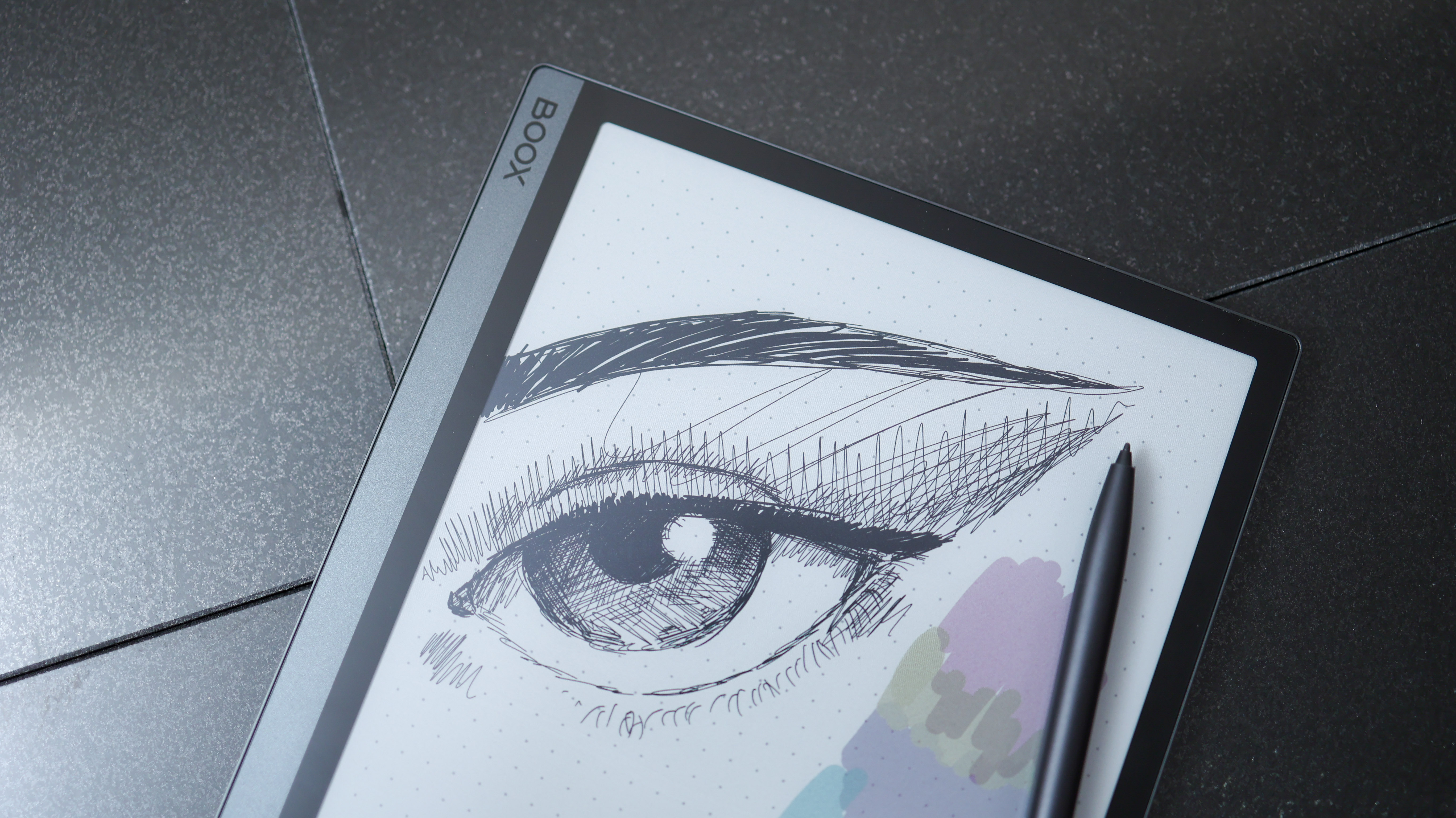
On top of smart software, the Tab Ultra C's display hardware feels very good. Thanks to the screen's finish, it's almost frictionless to the finger for a smooth swipe – near-ReMarkable 2 levels – and yet when you use the pen with it, there's an almost paper-like tactility. This pen-screen experience bests the stark, glassy Apple Pencil-like slickness that takes some getting used to on most tablets.
The pen supports 4,096 levels of pressure sensitivity and tilt support, and the touchscreen can tell the difference between a pen and a finger, so you can control which does what in key apps like Notes.
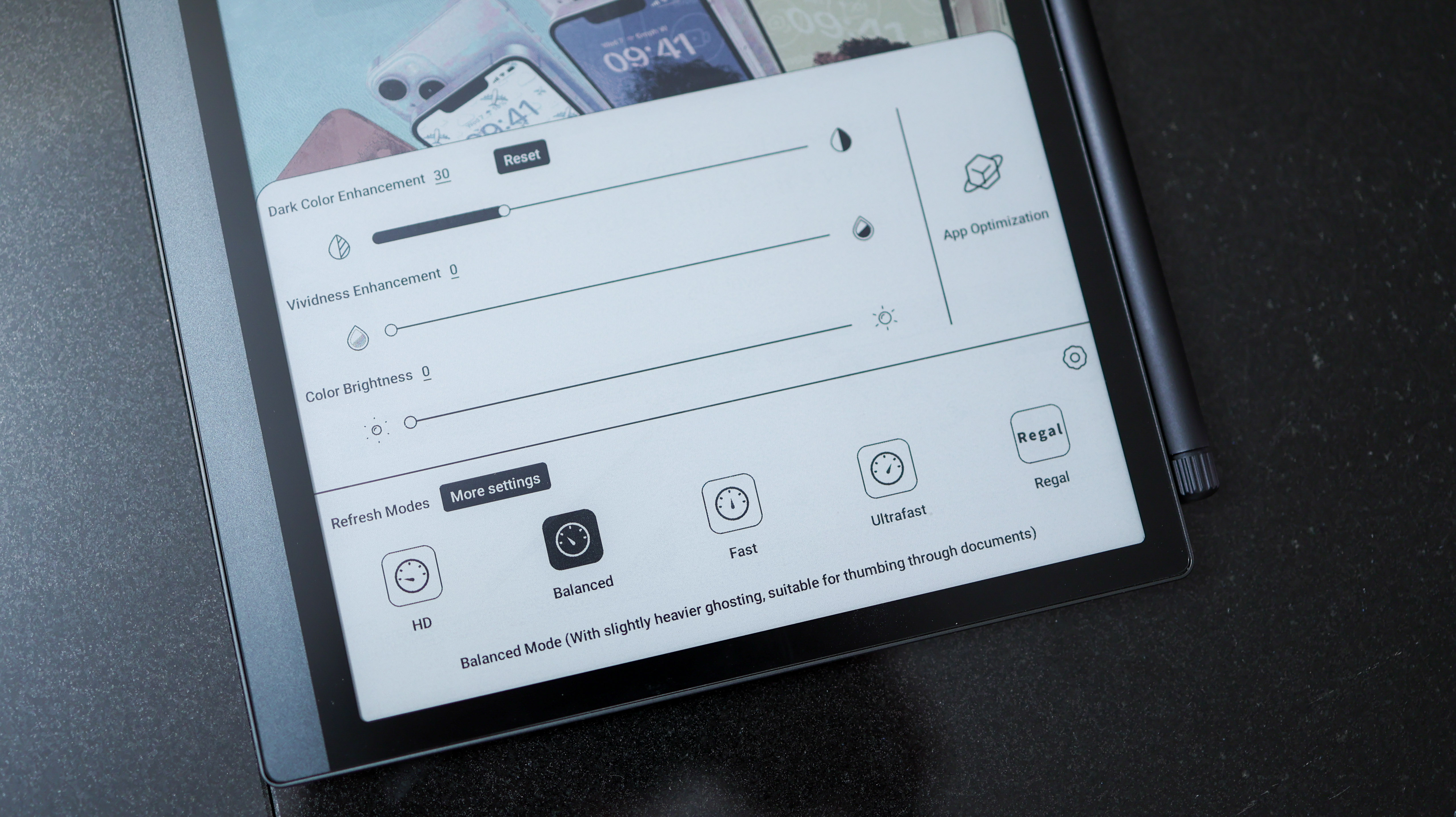
On to resolution, and the Tab Ultra C actually has two. The black and white resolution is a crisp 300 pixels-per-inch, at 2480 x 1860. The colour resolution halves those numbers, so it's 150ppi, at 1240 x 930. For context, the iPad Pro's screen is 265ppi, the Samsung Galaxy Tab S8 Ultra's is 240ppi, and the Kobo Elipsa 2E's is 227ppi.
Practically speaking, we didn't notice these dual resolutions. The experience looks crisp both when reading black-on-white text, and in colour – more so than a 150ppi LCD or OLED equivalent display.
The Tab Ultra C comfortably passed the bed test, replacing my Kindle at night without giving me eye fatigue before I konked out – not quite a lab test, but a testament to the screen's eye-friendly nature.
The screen's minimum brightness gets very low, particularly good compared to LCD screens, which don't get as dim as E Ink, ePaper, and OLED. So if you're currently using a tab with an LCD screen before sleeping and struggle to get a restful slumber, you might want to consider switching out.
Onyx Boox Tab Ultra C review: performance & battery
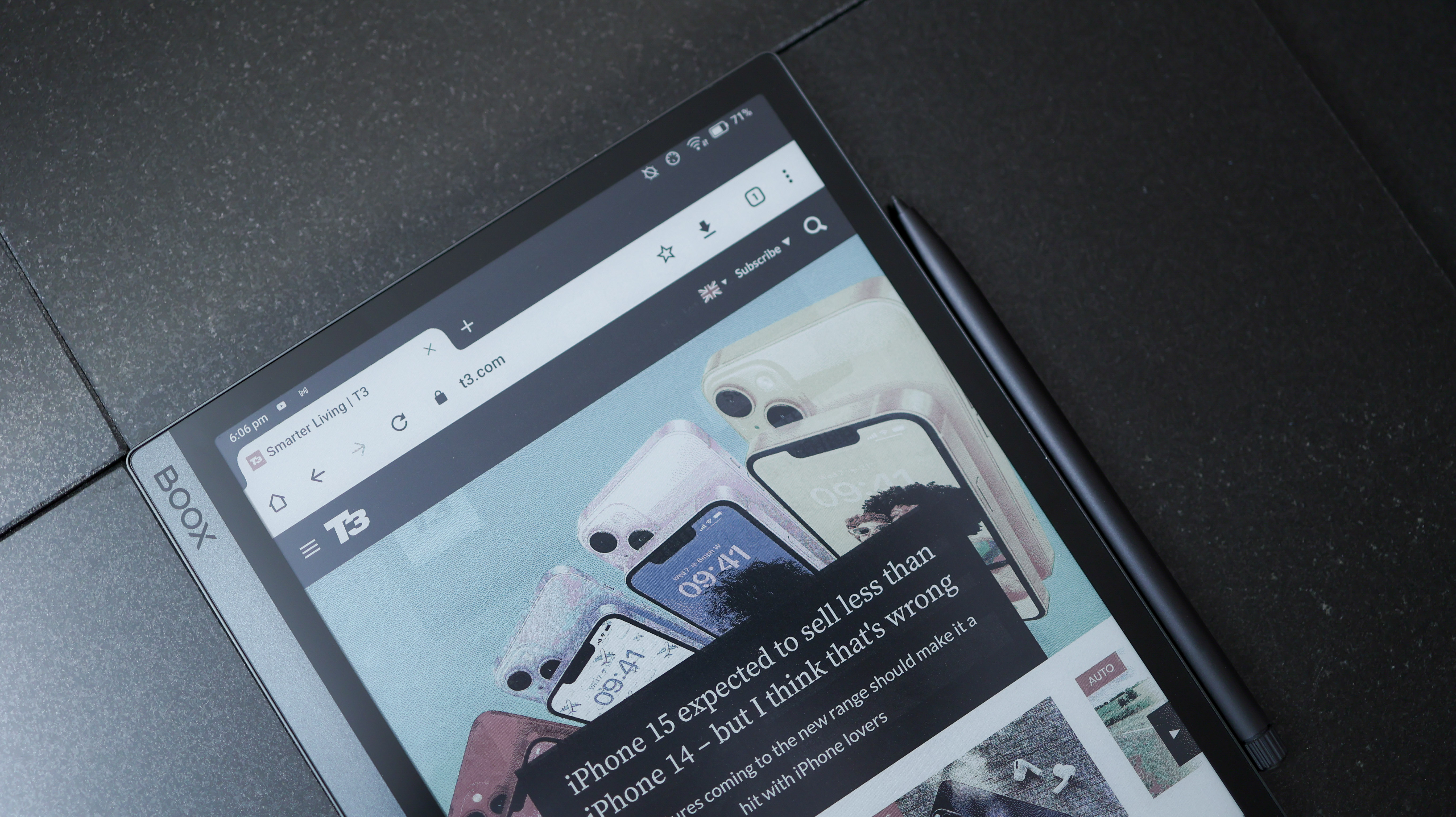
E Ink tablets have pared-back specs when compared to traditional ones – that's just the way it is, whether it's a ReMarkable 2 or an Onyx Boox slate. And with a modest Qualcomm Snapdragon 662 and 4GB RAM inside the Tab Ultra C, processing power is entry-level.
For about £50/$50 more than you'd pay for the Tab Ultra C, you can pick up a mighty gaming tablet with a brilliant screen and stacks of power like the Samsung Galaxy Tab S8, or a standard iPad Air.
When testing the Note Air 2 Plus the internals didn't concern me – after all, there was only so much we could do on it – they do hold the Tab Ultra C back a bit. There's occasional lag when working across some of the apps that the new, colour screen supports. So while nothing ever crashed or broke the experience, given the price and the Tab Ultra C's potential to run a wider gamut of apps than monochrome alternatives, I would have loved a little extra oomph.
It's also worth noting that if you plan on using the Tab Ultra C with third-party pen apps like Concepts or Squid, input is very laggy. This renders them unusable, which is a real shame, even if the pre-loaded Notes app is excellent and very responsive.
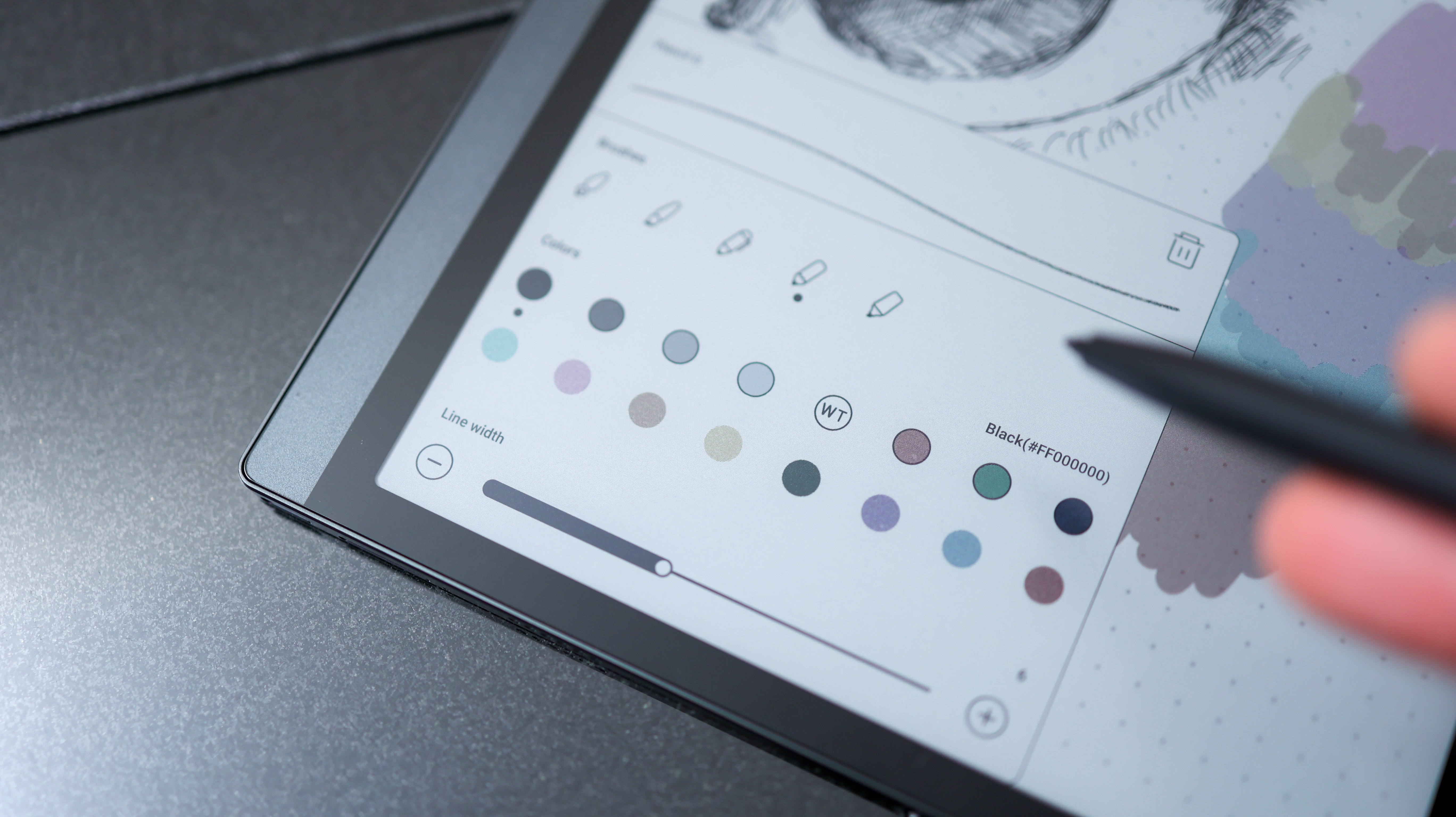
At the heart of the tablet is Android 11, with full access to the Google Play Store. If you've used a Boox reader before, the Tab Ultra C has a very different interface that's much more like a standard Android phone or tablet. There's an apps menu which supports widgets, and a pull-down notification bar and control centre from the top.
Running such an old version of Android is a bit of a red flag that puts future-proofing into question though. Practically speaking, this shouldn't affect app support, but with the tablet able to run more work and personal apps than Boox's other offerings, security updates that are part of newer versions of Android are something I'd want to get.
There's plenty of storage with 128GB of internal space and an SD card slot to increase that. The tablet does have speakers, so you can playback music on it or connect a Bluetooth audio device for wireless playback.
Battery life on the Tab Ultra C is excellent, with its 6300mAh capacity being almost double what we see on most E Ink devices. Keep the backlight off, and the tablet will keep going for a week or two with a few hours of reading and note-taking on most days. Turn on the backlight, and this time goes down, but you can still expect a solid few days of regular use from the Tab Ultra C.
Finally, the camera is definitely the most unnecessary part of the Tab Ultra C. Yes, it's handy for third-party apps that need a quick QR code scanned, but it's a poor substitute for a smartphone when you need to snap a photo of a document and convert it to PDF.
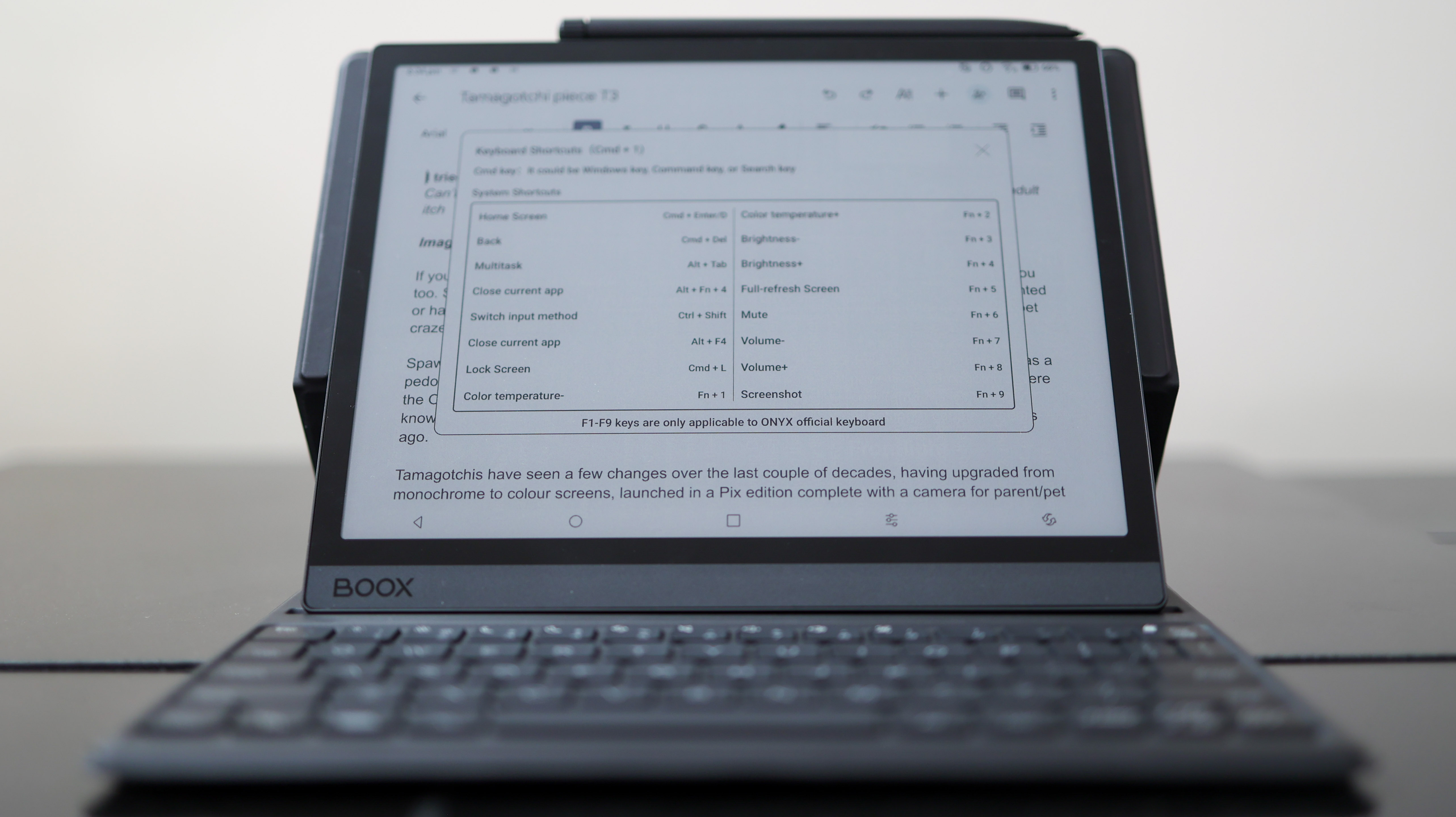
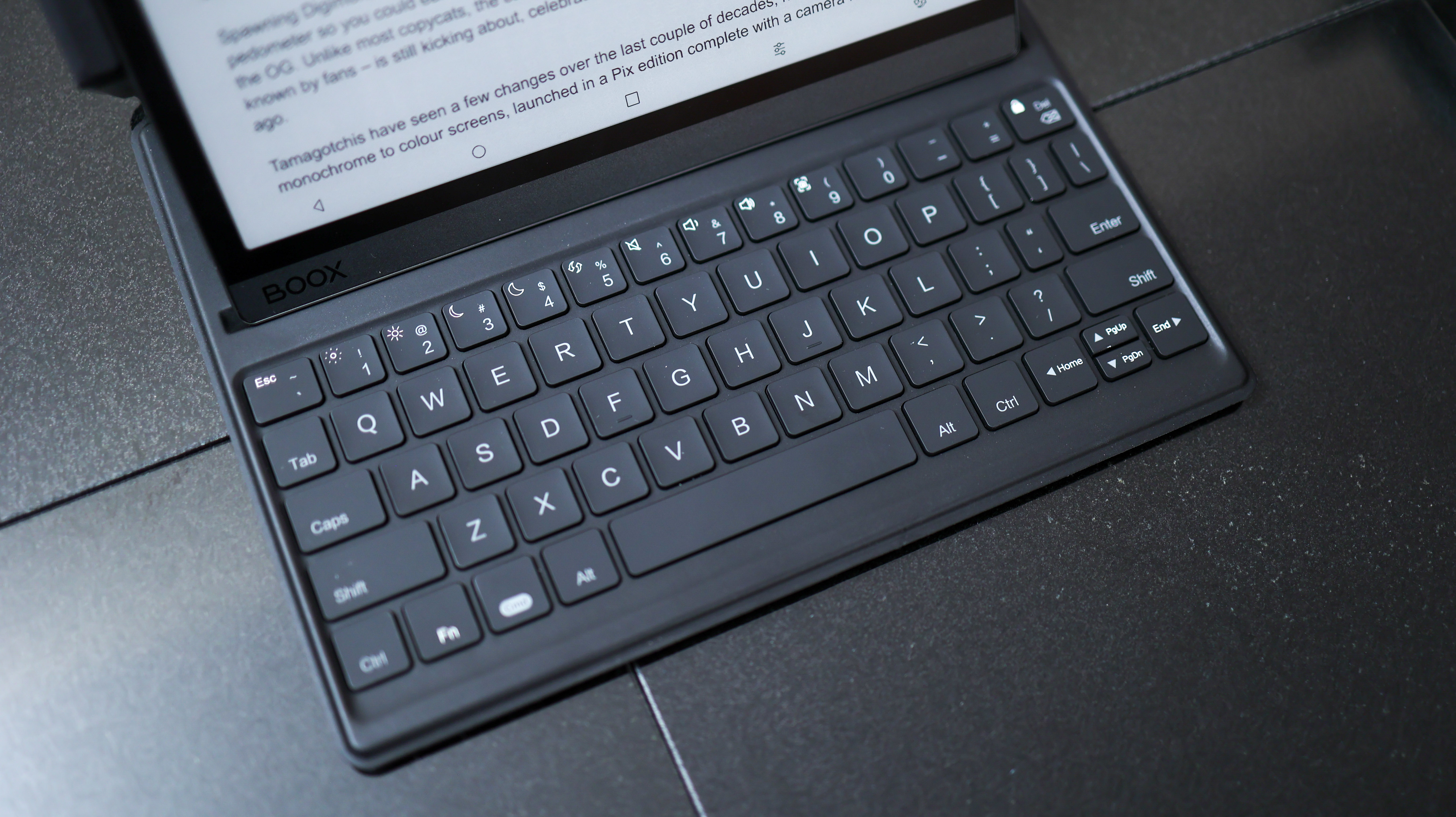
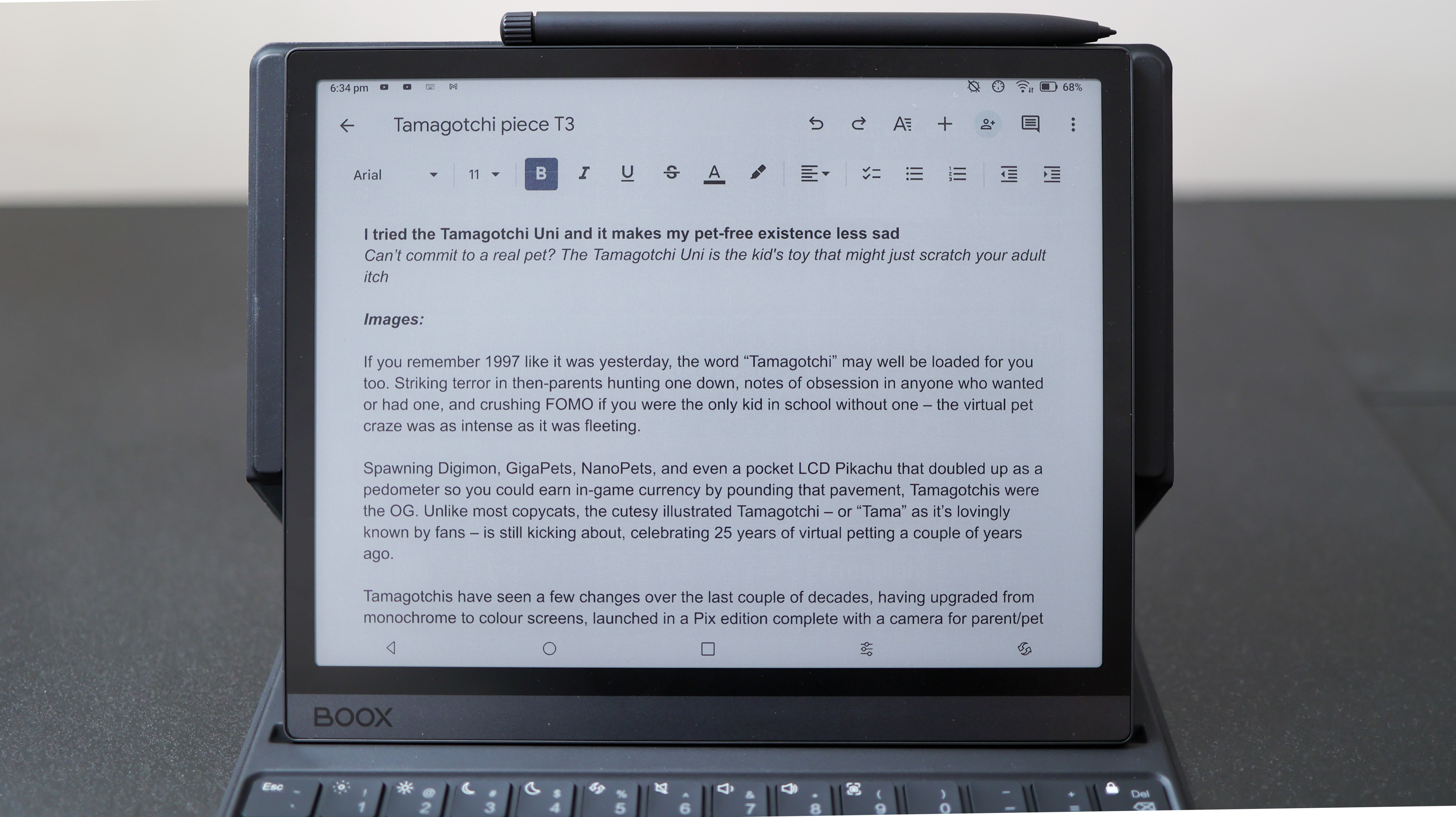
I also tested out the Boox keyboard folio for the Tab Ultra C, sold separately. While I almost loved it – the keys have great travel, and typing is comfortable on it – it's a clunky thing, adding a bit too much extra size to the relatively compact tablet.
Once you can get past its size – a relatively small ask for days of typing on a single charge – inflexible software also hurts the experience. When typing a word, the UI overlays alternative suggestions on-screen, covering up part of your document. Unable to turn these overlays off in the settings, I was left a little frustrated.
Able to run apps like Microsoft Word and Google Docs, the Tab Ultra C can, nevertheless, be a powerful productivity tool for easy-on-the-eye, backlight-free document edits on the go. And the Tab's battery life also makes it a superb, long-lasting typing tool.
Onyx Boox Tab Ultra C review: Verdict
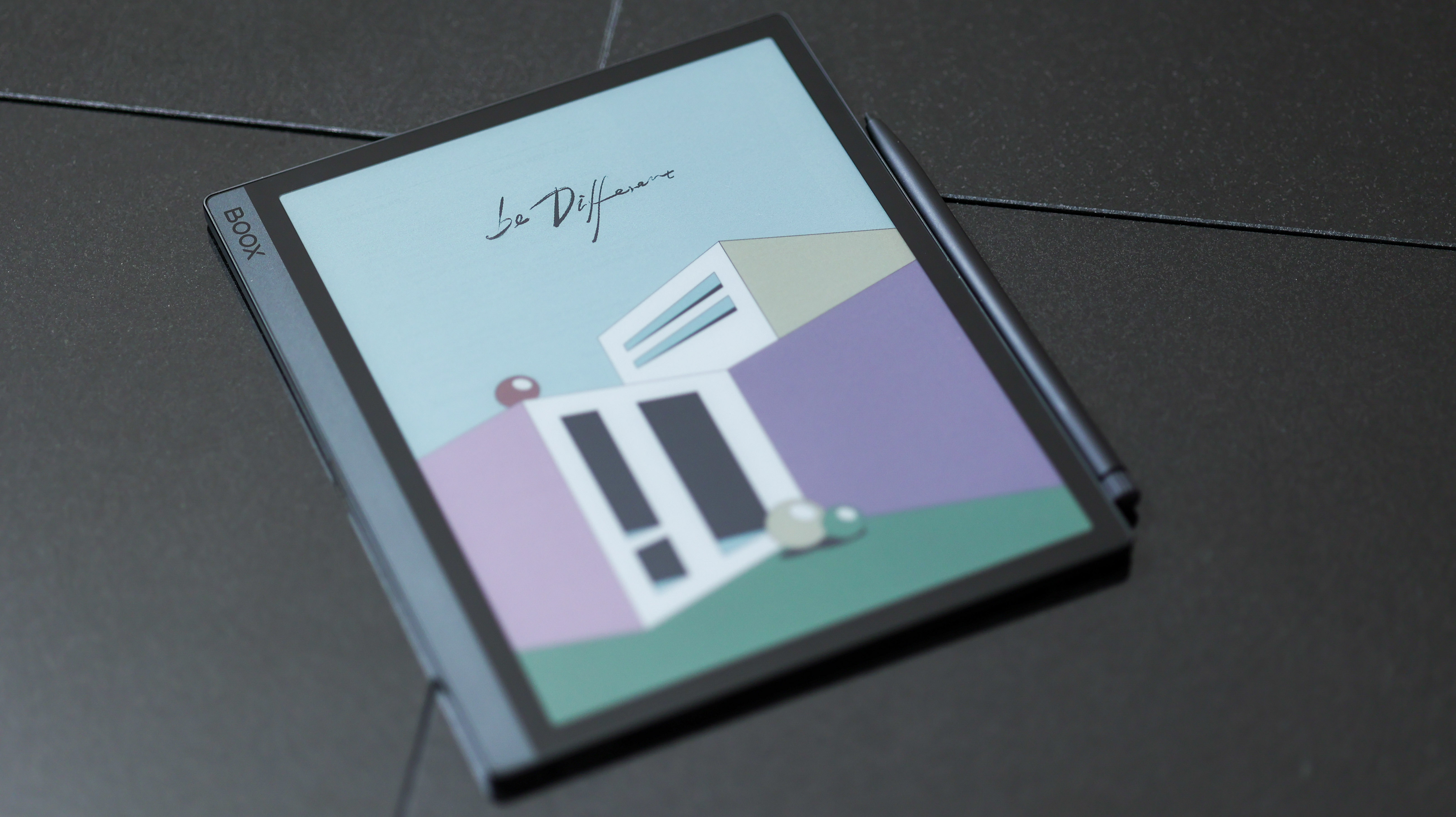
The Boox Tab Ultra C is niche, there's no doubt about that, given its dual black-and-white and colour ePaper display. But if you love reading and want a little extra from your E Ink tablet, this could be the product for you.
It runs Android apps, making it more versatile than the Amazon Kindle Scribe or Remarkable 2, and its colour ePaper screen means it's less hamstrung than monochrome Android E Ink slates.
So while the colour fidelity never gets zingier than a diffuse shade of washed out, the Boox Tab Ultra C is still a unique and powerful (and pricey) tool for a particular type of user. So if you're specifically after a low-fi alternative to today's baggable cinema-grade tablets, and supremely good battery life to boot, it could be your kind of niche.
Also consider
Looking at the monochrome E Ink alternatives and the ReMarkable 2 is its most established competition. It's a simpler tablet that can't compete when it comes to app support but is still rich with features and ultimately feels a bit more refined from a software point of view. Most impressive is the degree to which the ReMarkable 2 has been upgraded since launch: it now supports live screen mirroring to a macOS or Windows device, cloud storage support, and a host of other features.
The Boox Note Air 2 Plus is another alternative that costs a bit less but offers a similarly flexible version of Android, only with a monochrome E Ink screen. Alternatively, the Kindle Scribe has been significantly updated since we first tested it, now loaded with many more paper templates and pen commands. Or the Kobo Elipsa 2E is another capable contender from the underdog Kindle alternative.
Sign up to the T3 newsletter for smarter living straight to your inbox
Get all the latest news, reviews, deals and buying guides on gorgeous tech, home and active products from the T3 experts

Basil has been writing about tech for over 12 years, with bylines in TechRadar, Metro, Wired, and Digital Camera World – to name but a few titles. He expertly covers everything from mobile phones to smart devices, cameras, audio-visual hardware, and kitchen tech. In addition to his extensive journalism experience, Basil is also skilled in video production, content strategy, and vegan baking, and runs Tech[edit], a technology-focused YouTube channel.
-
 YETI just made bowls cool – literally. And also figuratively.
New YETI design, same bear-proof energy
By Matt Kollat Published
-
 Nothing's next phone could be a budget powerhouse, thanks to this confirmed hardware detail
Official details reveal more about the next phone coming from Nothing
By Chris Hall Published
-
 Adidas Adizero Boston 13 is softer, faster, and finally feels like a proper trainer
The brand quietly fixed everything runners didn’t love about the Boston 12
By Matt Kollat Published