Pebble Steel review
Is the Pebble Steel the best smartwatch to buy?
-
+
iPhone & Android support
-
+
Professional design
-
+
Always-on display
-
-
Limited functions
-
-
No killer feature
-
-
No touchscreen
Why you can trust T3

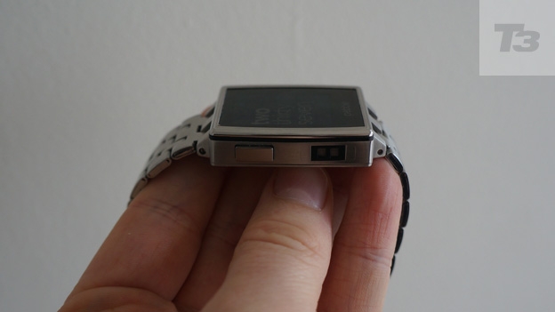
It may boast classy looks, but should the latest Pebble be your smartwatch of choice? Find out in our Pebble Steel review
It's been over a year since the Pebble Steel was announced at CES 2014 in Las Vegas, and in the time it took to get to market a host of Android Wear smartwatches have come to the fore. Can the Steel still muscle in on the wearable action?
Where as the plastic clad Pebble smartwatch was aimed at the early adopters, the Pebble Steel is a much more professional offering with premium design and a discrete aesthetic allowing it to blend into your outfit, rather than stand out like a sore thumb.
At £180 the Pebble Steel is around the same price as the Android Wear crowd - the LG G Watch R and Moto 360 are now hovering around the £200 mark while the G Watch and Gear Live are both cheaper than the Steel.
One thing's for sure - the Pebble Steel has its work cut out if it's going to make its e-ink display and limited functionality standout in the increasingly populated wearable world.
Pebble Steel: Design
We had nothing against the design of the original Pebble, though the slightly blocky, plastic body hardly screamed out class and high-end style.
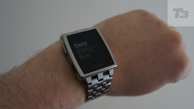
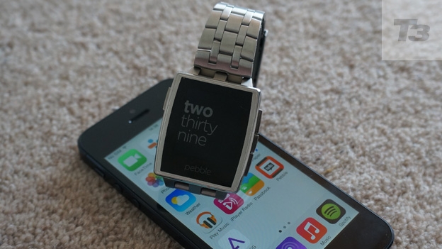
That's all changed this time around with the Pebble Steel, a mix of stainless steel and Gorilla Glass that feels premium, looks great and actually resembles a watch in a way others have failed to do so far.
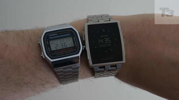
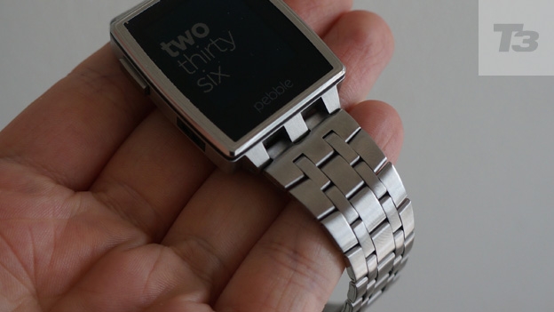
Every part of the watch has been updated and clad in steel, from the strap to the direction buttons on the sides. These buttons are now much clickier than before, with a more satisfying push and the strap looks like something from a retro Casio.
You get a leather strap in the box, but if you fancy something classier you can pick up a steel band for $20 (around £15), which looks and feels better than the leather option.
Unlike the first Pebble though, you can't simply pop on any generic watch band to make it feel personal as the Steel uses a proprietary connection technique. Pebble has said though that it will make the band connection available to everyone, so third-party options will hopefully exist at some point.
Everything feels and looks good, apart from the edging to the Gorilla Glass display (another improvement over last year's model), which is a bit sharp. Run your finger down and it feels like it's not quite finished, as if it needs brushing one more time. It's a small quibble, but it's something you wouldn't find on a product by Apple or Motorola.
You'll be able to pick up the Pebble Steel in two colours, a brushed stainless steel version, which we tried and a lovely-looking matte black one. If we had a choice, we'd probably go for the black, as it just that looks that bit sleeker.
Pebble Steel: Screen
While the body has seen a dramatic change, the display remains exactly the same as before. Just to refresh your memory that's a 1.26-inch, 144x168-pixel monochrome screen that looks good whether you're sunning yourself on a beach or bustling through the rain.
Unlike the LCD and AMOLED displays used on some watches, e-ink uses much less power and allows the watch face to show at all times, just like a mechanical watch.
There's also a backlight, which can either be activated by a quick flick of the wrist, or by a dedicated button press. We tended to use the former as, after a bit of getting used to, it became natural to shake the device to light it up.
For the most part the fairly low resolution of the display won't bother you. Text is readable, clock faces look smooth and it's more than enough for a device you'll only be glancing down at.
The Gorilla Glass coating should keep scratches at bay and after using the device for the best part of three weeks it still looks as good as when we first took it out of the box. No dings or dents to speak of.
Pebble Steel: Apps
Alongside the launch of the Steel, Pebble unveiled version 2.0 of its operating system and a brand-new, app store-lead mobile application. The updated app, which sees a better, cleaner design and the ability to quickly move apps between the watch and your 'Pebble locker', is currently available on iPhone and Android. If you're operating system of choice is Windows Phone 8 or BB10, then you're out of luck.
As you can only store eight apps or watch faces on the device at a single time, you'll find yourself using the Pebble locker area of the app fairly frequently. Moving apps backwards and forwards is simple and quick, though we'd like to be able to store a more apps on the watch at a single time.
Talking of apps, there's a fair amount of them available on the Pebble app store, though the usefulness of them is still quite limited.
For instance, the Yelp app is handy for quickly finding somewhere close by to grab a sarnie, but due to fiddly navigation it is probably easier to just pull out your phone. ESPN has a decent app for checking sports scores, though as you'd expect it is a little US focussed and there's a few for controlling the snapper on your smartphone.
Most of the time we chose a glanceable watch face, like YWeather, Futura Weather or Studio Clock and this lets you easily see the weather, battery status and, of course, the time.
When you receive an email, it'll pop up on the display and you can read the first few lines, though you can't act on it, so no quick replying.
Thanks to a recent update if you receive an SMS, or message via another client, you can now reply with an emoticon or one of five preset templates. You can answer and hang-up a phone call and interact with the music playing on your phone - change tracks, play/pause and the like. We really like the music remote, skipping tracks from your watch just makes sense.
Pebble Steel: Battery and power
While we've all become accustomed to charging our phones on a daily basis, the same can't be said for our watches. If you're going to make the jump to a smartwatch though, this is something you'll have to get used to.
Thankfully the Pebble Steel doesn't need to be charged every night; most of time you won't need to plug it in for about four nights. However the battery life, which Pebble quotes should last five to seven days, does seem to be a bit unreliable.
Charging is done by a proprietary cable, similar to the one used for the original Pebble, but different enough to make them not cross-compatible. The magnetic plug clips on to the side and sits there firmly.
We did find it took a while to fully charge back up, so you'll need to make sure you have time.
Pebble Steel: Verdict
We like the Pebble Steel and it's a decent smartwatch, but that doesn't mean we can recommend you plonk down £199 for this timepiece. Why? Well, it just doesn't have that killer feature.
Apart from showing your notifications, or giving you access to fairly basic apps, it doesn't actually do that much. We're not saying it should have a camera, or the ability to play movies or anything like that, it just needs a real headline feature that makes you go, 'I need one of them'.
There's another reason too, and that's Android Wear - the Google-based Android OS spin-off for wearables. There's a range of watches now running Google's wearable OS with more features and similar (and in some cases lower) price tags.
If you're looking for a fuss free smartwatch and aren't too bothered about features above and beyond notifications and the Steel will be good enough, but remember you can get more for your money elsewhere.
Pebble Steel release date: Out now
Pebble Steel price: £199
Sign up to the T3 newsletter for smarter living straight to your inbox
Get all the latest news, reviews, deals and buying guides on gorgeous tech, home and active products from the T3 experts
-
 Vertere’s award-winning audiophile turntable gets an everything upgrade
The Vertere DG X is a sonically gifted high-spec turntable that looks incredible too
By Carrie Marshall Published
-
 New Tiffany & Co Bird on a Flying Tourbillon watch is like nothing you've seen before
It's a stunning, summery watch
By Sam Cross Published
-
 I love the Murderbot books, and Apple TV+'s first trailer has me excited
Murderbot is a series I can't wait for
By Max Freeman-Mills Published