Google Maps gets another neat design update and we like it
The makeover continues


Get all the latest news, reviews, deals and buying guides on gorgeous tech, home and active products from the T3 experts
You are now subscribed
Your newsletter sign-up was successful
Quick Summary
Google has redesigned some of its iconic pins, with a rounder and shorter look implemented for categories.
The redesign was picked up by 9to5Google, which showed a before and after of the new icons.
Ever played a round in a pub quiz where you need to guess the name of the company based on pictures of their logos? If you haven't, you are missing out friends. It is much more satisfying than guessing the artist and title of a song based on the first few seconds of a beat. Some logos are just iconic, from the Nike tick and the Starbucks queen, to Google's 'G' and Apple's, well, Apple.
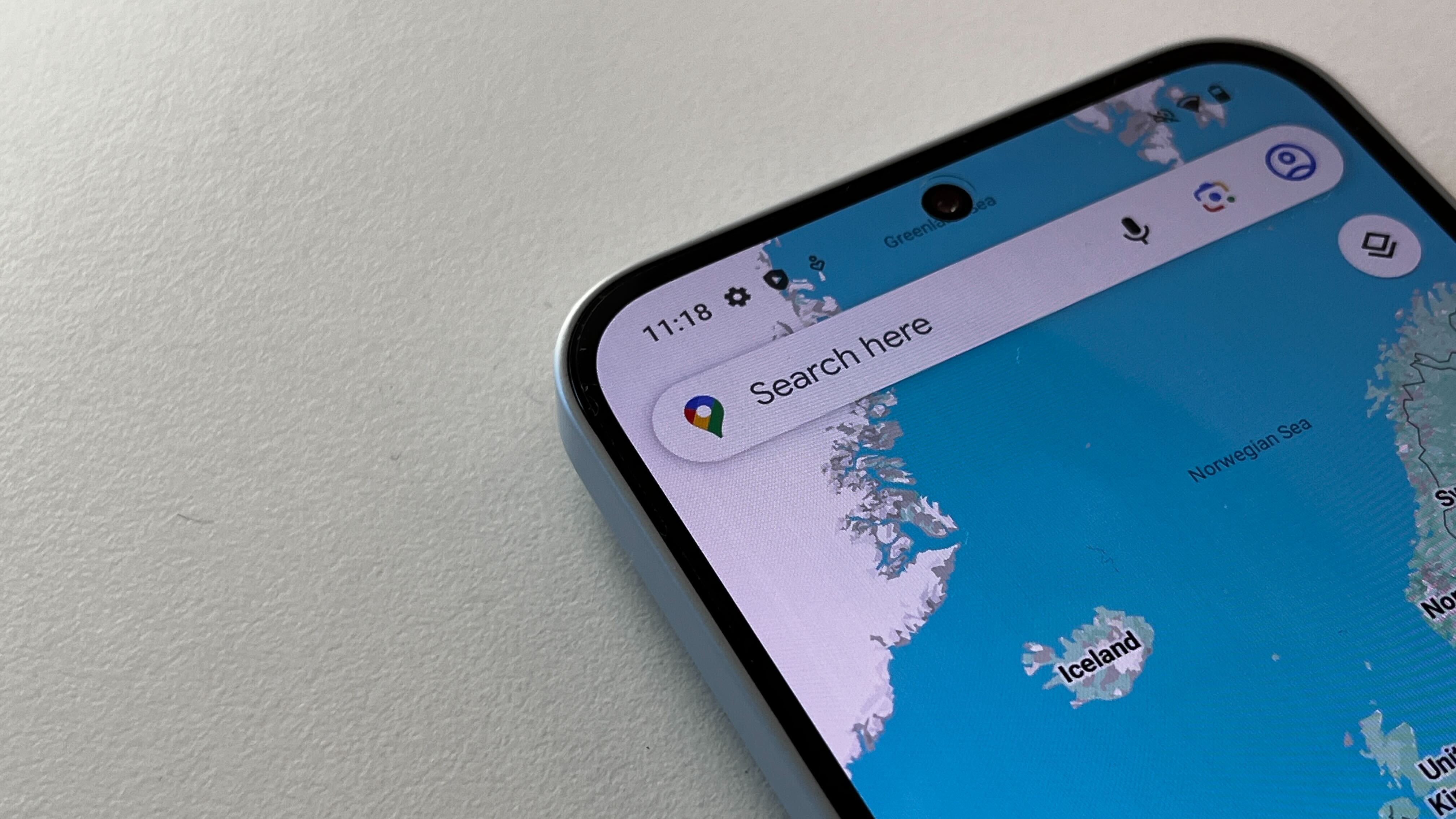
It's always a bit of a risk then when companies mess around with well-loved and well-identified symbols, though. Don't worry, Google isn't changing the 'G', nor the main pin icon for Google Maps, but it has redesigned the iconic pins within Google Maps on its app for phones and the web. It's Okay team, it's not a bad redesign, not in our eyes anyway.
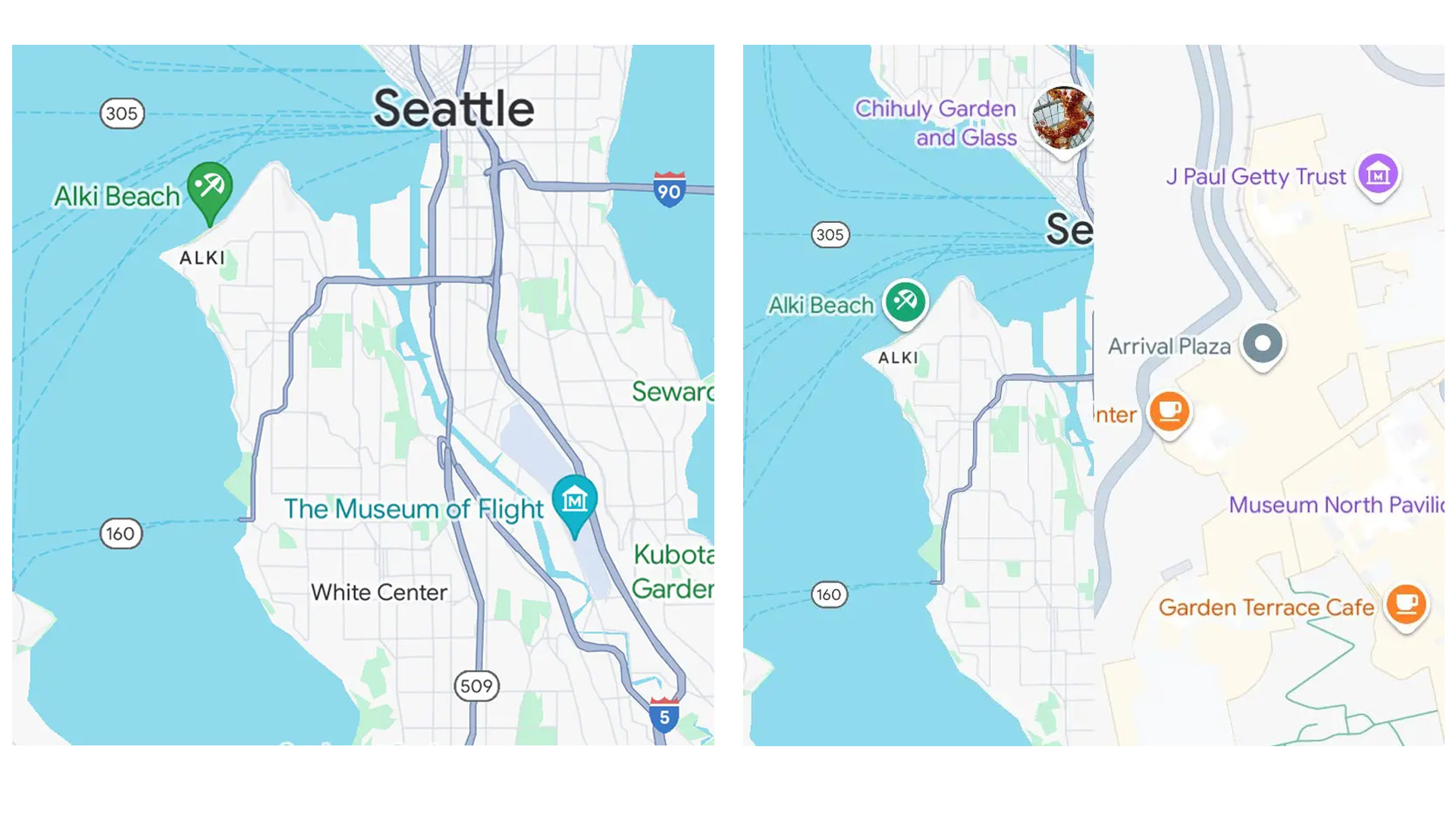
New colours and shapes have arrived for categories within the Google Maps app and browser, with the sharper point of the pin replaced with a shorter and more rounded alternative. It's a softer approach, and one that matches the icon design for stars, flags and hearts as 9to5Google points out.
Article continues below 
Categories now appear in a coloured circle with an icon and specific colour and that circle is then placed on a white background within the new pins.
The report from 9to5Google, which spotted the icon change, not only offers a nice before and after pic that we've included above so you can see the differences, but also highlights that while most icons have remained the same colour, some have changed.
The museum icon for example, was a teal colour in the previous version of Google Maps, switching to purple in the redesign and that applies to the name of the museum that sits alongside the icon too. The zoo icon meanwhile, remains the same colour but a slightly lighter shade.
The new Google Map pins should be available to see on Android, iOS and on your browser so you can have a look for yourself and see what you think. We like them, do you?
Get all the latest news, reviews, deals and buying guides on gorgeous tech, home and active products from the T3 experts

Britta is a freelance technology journalist who has been writing about tech for over a decade. She's covered all consumer tech from phones, tablets and wearables to smart home and beauty tech, with everything in between. She has a fashion journalism degree from London College of Fashion and previously did a long stint as deputy editor of Pocket-lint, but you’ll now find her byline on several titles including GQ, the Express, the Mirror, TechRadar, Stuff and iMore. You'll never find her without her Apple Watch on, aiming to complete her rings so she can justify the extra bar of chocolate and she loves a good iPhone trick.