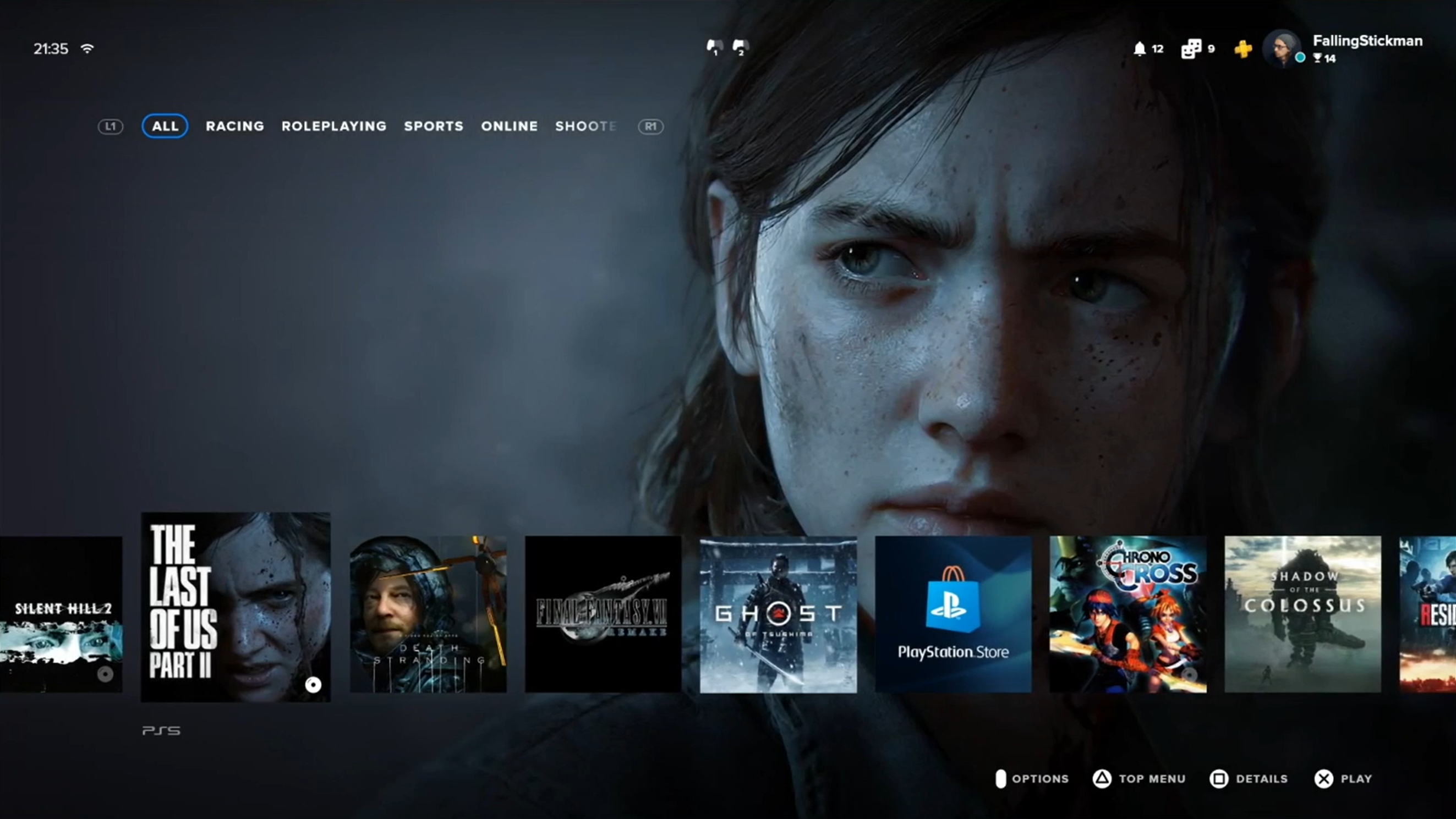

In light of the news that the Sony PS5 is, actually, going to come in two variants to compete directly against a double console assault from Microsoft, one being the 12 teraflops-packing Xbox Series X, it feels more crucial than ever that the Japanese gaming hardware maker brings as many weapons to the next-gen war as possible.
There's been plenty of talk in the gaming community that this next console generation could very well be the last traditional rumble we see, with two gaming giants pitting systems loaded with advanced hardware against each other, each trying to outdo each other with jaw-dropping new games and experiences. So both Sony and Microsoft, the latter who is just coming off a drubbing this gen sales-wise, need to get their offerings to gamers right.
- NEW: PS5 and PlayStation 5 Pro to go head-to-head against TWO new Xbox consoles
- Disney Plus: Full launch lineup for Disney+ UK revealed!
- Make waiting for PS5 easier: BOOST your PS4 console with this simple trick
And, one way that can be achieved is with a next-gen user interface on each maker's respective consoles. In terms of the PS5's UI, this came to light recently when gamers started discussing a concept video on Reddit, with one linking in a video to a fresh concept design that shows just how the PlayStation 5 user interface could look and operate.
The video in question was posted on Reddit and it is the work of talented Polish designer Paweł Durczok — it shows a depiction of what the the PlayStation 5 home screen could look like, and how its menu systems could be navigated.
[Video] This is the best PS5 UI concept I've seen so far! (more in comments) from r/PS5
The PS5 video shows a similar but streamlined take on the PlayStation XrossMediaBar, but one that is heavily image lead. It also shows a UI that is, visually, streets ahead of that previous PS5 UI leak. The video shows a user flicking through the PS5 games in their library via game icons, before selecting The Last of Us: Part II.
From there, the home screen drops into a sub-menu, which shows off a variety of game-specific options and statistics. There is a played for time, total storage the game is taking up on the console's SSD, number of add-ons (DLC) it has, as well as how many of the user's friends also own the game.
The user interface for the game also shows how far through it the user is in terms of a completion percentage, as well as offering up access to its trophies, store, community, associated media and management options.
Sign up to the T3 newsletter for smarter living straight to your inbox
Get all the latest news, reviews, deals and buying guides on gorgeous tech, home and active products from the T3 experts
Neatly, the video also shows the option of directly starting the game from a chosen save file within the PS5 user interface, rather than having to load the game and then load the save from within an in-game menu. That time save makes perfect sense to us here at T3.
The initial video was then followed by a second PS5 UI video post on the same Reddit thread, which shows the same setup but with a little bit more navigation between titles.
Here at T3 there are definitely aspects of this design that appeal. We like how it looks streamline and clean, with big bold images and a reversed, bottom-mounted game scroller, while also tucking away serious accessibility and options within a few button presses. What we're not sure of, though, is that Sony is going make such big changes for PS5, as it has a track record of only making small adjustments.
Regardless, though, we think this is the best concept yet that we've seen of what the PlayStation 5 UI could look like. The big question is, though, is this a design that the vast majority of gamers would be happy with?
Rob has been writing about computing, gaming, mobile, home entertainment technology, toys (specifically Lego and board games), smart home and more for over 15 years. As the editor of PC Gamer, and former Deputy Editor for T3.com, you can find Rob's work in magazines, bookazines and online, as well as on podcasts and videos, too. Outside of his work Rob is passionate about motorbikes, skiing/snowboarding and team sports, with football and cricket his two favourites.
-
 This smart home gadget can tell you when to water, feed and move your houseplants
Stress-free plant care? Yes please
By Lizzie Wilmot
-
 Strava just bought Runna and we got the inside story from both CEOs
No, Runna isn’t going anywhere – and no, your subscription won’t get more expensive (for now)
By Matt Kollat