Apple Watch SE review: the ideal smartwatch for most iPhone users
The Apple Watch SE is a premium smartwatch for less, and brings some great fitness and health features for iPhone users
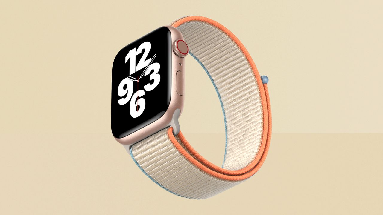
The Apple Watch SE is as slick as the higher-priced Watch Series 6, and delivers all the essential features and then some. But when it comes to more advanced health sensors, it's not as well equipped as competitors.
-
+
Fast and smooth to use
-
+
Comfortable, wearable design
-
+
Clear and bright screen
-
+
Great background health features
-
+
Excellent fitness tracking overall
-
-
No always-on screen
-
-
Sleep tracking is basic
-
-
No blood oxygen or ECG sensors
Why you can trust T3

To summarise this Apple Watch SE review, the Apple Watch SE nails its brief of bringing the convenience and fitness features of the Apple Watch to more people, and they've done so at the perfect time when being able to keep a low-key eye on your health is more important than ever.
This is the first time Apple has introduced an Apple Watch model specifically to be lower-priced – normally, older models stay around and get price cuts. But in this case, Apple has cherry-picked features from previous Watch models to create a mid-range Watch option at a price halfway between the ultra-low price of the Watch Series 3 and the more premium Apple Watch Series 6.
The idea is to create something with the latest and greatest design and all the most commonly used headline features, with just a few more 'premium' options reserved for the Apple Watch Series 6. However, that includes some major health features, and we'll talk about that omission later. Should the Apple Watch SE be included in our best Apple Watch and best smartwatch guides? Read on to find out.
We reviewed the second iteration of Apple's affordable wearable, and you can find out how the two compare here: Apple Watch SE 2 review.
Apple Watch SE review: price, release date & features
The Apple Watch SE was released on September 18th 2020.
It costs £269/$279/AUS$429 for the 40mm model (with a cheaper band option – more expensive bands are available that push up the price). For the larger 44mm model, it costs £299/$309/AUS$479.
You can also step up to a model with 4G connectivity built in, meaning you can leave the phone at home and still get useful info beamed to your Watch. These models start from from £319/$329/AUS$499 – but you'll also need an data add-on supporting it from your phone service provider, and not all actually offer this, so check beforehand!
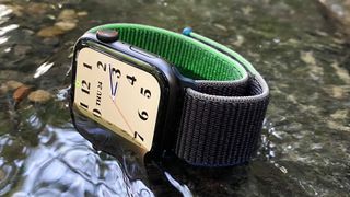
The Apple Watch SE is equipped with all the key features of current-gen Apple Watches, including an OLED screen, customisable faces and 'complications', activity tracking, heart-rate tracking, fall detection, notifications you can action on the wrist, calling and messaging, Bluetooth headphones connectivity and music/podcast playback, an always-on altimeter, the Taptic Engine for 'tapping' your wrist, 50m waterproofing, swappable bands, sleep tracking and a battery life designed to last a full day.
Apple Watch SE review: screen & design
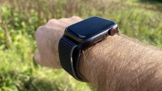
The Watch SE has the same new-style design that all Watches since the Series 4 have included, with a nearly edge-to-edge screen with rounded corners that's very much of a piece with current iPhone design.
The screen is about 30% larger than the display on equivalent Watch Series 3 models, despite the body of the watch not really being noticeably larger. The 40mm model has a 324x394-resolution display, while the 44mm model has a 368x448-resolution screen.
The screen is OLED, rated for the same 1000 nits of brightness as the Apple Watch Series 6 – in fact, in most cases, the screen seems to be the same as the more premium model. That means it's lovely and clear, and easily visible in sunlight.
When really getting nerdy about the screen, we didn't notice that the dark areas on the Apple Watch SE seemed to be more inky black than the Watch Series 6, but at the same time, bright colours didn't seem to pop quite as hard, as if the whole colour profile was shifted down in the dynamic range just slightly. But this is us getting extremely picky about it – the difference made no odds to visibility overall, and you're not exactly watching movies on this thing.
However, while they're most the same, the Apple Watch SE lacks the always-on display that the Apple Watch Series 5 and Series 6 have featured. With other smartwatches, such as the Fitbit Versa 3, including the option of an always-on display at a lower price than the Watch SE, we can understand if some find this a frustrating omission, but we don't mind, ultimately.
The always-on screen is really nice to have in the Series 5 and 6, and particularly in the 6, where its visibility is much improved at times when it's not facing you. But it's definitely nice to have, not essential to have.
I admit that I don't like going back to a smartwatch without it having used it for a year, but the Watch SE isn't going to be bought by people who've already got an Apple Watch Series 5 or 6. For most people who buy the SE, it will be their first smartwatch, or an upgrade from an Apple Watch Series 3 bought at the time, perhaps.
So for those people, its omission isn't something they'll miss, and it's just fine not to have it. The Watch SE lights up the screen so quickly when you turn your wrist that it's rare that you would be in a situation where you want to see the screen but can't.
There are some occasions like this, and exercising or bike riding is when we noticed it the most – times when you might want to see your workout stats, but don't want to turn your wrist. But for this to be a dealbreaker, I think you'd have to be quite hardcore about fitness.
The Apple Watch SE comes with an aluminium case only (there's no stainless steel or titanium case option), in Gold, Silver or Space Grey finishes.
The glass is toughened Ion-X glass, and though not as indestructible as the sapphire used on more expensive models, we've found it tough enough for the job of surviving scrapes and bashes.
The back, where it touches your wrist, is sapphire and ceramic, meaning it's as comfortable and hypoallergenic as you can get, really.
Other than the always-on display, there's really nothing to tell the Watch SE apart from the aluminium Series 6 visually, or in feel. As Apple does with its phones, it really feels like you're getting the premium treatment.
Apple Watch SE review: health & fitness
The Apple Watch has always walked a fine line when it comes to being a fitness watch. Apple has put health and fitness right at the heart of it, but it's never tried to pitch it as a full rival to the likes of Garmin's higher-end Forerunners when it comes to being elite-level running watches.
It's aimed at a more basic level, starting with just giving you some activity tracking to help you hit core baselines, but also with the ability to easily activate tracking of a particular kind of workout, ranging from yoga and dance, to walking, to running, to swimming, to cycling, to HIIT and more.
The Watch SE knows what kind of motion to look for in each of these exercise types, analysing your movements and tracking your heart rate while you exercise, and putting some limited key information on-screen.
In these, it keeps things as simple as possible – great for people who don't know much about their workout data, but would like to start tracking accurately.
But when you dig into the Fitness and the Health apps on iPhone, you quickly find that there's much more information available if you want to get into it, from VO2 Max to average walking and climbing speeds, to resting heart rate, and more.
This is the trick of all Apple Watches, including the SE – to make fitness tracking available with no complexity to those just dipping a toe in, but to also give you the headroom to get more serious, if you want.
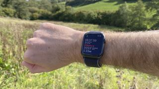
And the app freedom of the Watch, as well as some recent sensor improvements, make it much more impressive as an outdoor/adventure watch these days: the always-on altimeter can track your height live, and even includes an indicator of your angle of ascent (or descent), which is a fun touch. A solid and accurate compass and GPS, plus the ability to load maps to the Watch with a compatible app, make it a great hiking watch too.
Dedicated running watches still offer way more useful hardcore stats potential, and dedicated hiking watches give you longer battery life and again more stats, but we're really impressed at just how much the Apple Watch SE can turn its hand to (so to speak).
For years, the Apple Watch has impressed at the basics, such as heart rate tracking and calorie burning tracking that's largely in line with these stats as measured in other devices.
Wrist-based tracking will never be as accurate as a chest-strap heart-rate monitor, but that's okay – it's easily good enough, and Apple's more recent sensors have fewer clearly erroneous fluctuations than early models.
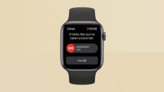
The fall detection feature here is the thing we really hoped Apple would include, and it's here. If you take a hard fall, the Watch SE's sensors can detect this, and a message will pop up asking if you're okay. You can tell it that you are, or you can choose an option for it to call the emergency services. If you don't respond at all, it will call the emergency services automatically after a set amount of time.
It's odd to want a feature that ideally will never come up in practice, but this is a key selling point of this Watch for us – particularly for anyone who's physically vulnerable. It could be a literal life-saver, and in as far as we've been able to test it (it's not easy to trigger from a fake fall, since the motion isn't quite the same), it works well.
This isn't the only instance in which you can easily call the emergency services from your Watch SE. If you press and hold the side button for a moment, and then keep holding it for five seconds, the Watch SE will go straight into a call to the emergency services. If you have a 4G-connected Watch, the call is made directly over the network (even if you haven't actually paid for a plan); if you have a regular Watch, it will make the call via its connection to your iPhone.
The call takes place over the speaker and mic built into the Watch SE, so no hands are required for the call. If you're unable to speak, that's still okay – your location (from the GPS) is sent to the emergency services, and whenever you trigger the emergency call, the information is also sent to a personal contact you designate.
Now let's talk about the two missing health features of the Apple Watch SE, though: the ECG, and the blood oxygen sensor. The Apple Watch Series 6 has both of these, with the ECG able to take a highly accurate heartbeat reading, including any signs of atrial fibrillation – an irregular heartbeat that's a common symptom of heart conditions.
The blood oxygen sensor is brand new to the Series 6, and is able to detect how well saturated your blood is with oxygen – below a certain level can be a sign of health problems.
Each of these requires an additional set of sensors that the Apple Watch SE doesn't have, with these two (along with the non-always-on screen) being the major features left out compared to the Series 6.
Now, we don't consider this a dealbreaker for the Watch SE, especially because it can actually can still potentially detect an irregular heartbeat using the main heart sensor – it's just that it will be more of a 'suspected' irregularity than one that's all-but-confirmed by the real ECG, requiring you to go to a doctor to confirm (which you should do even with the ECG reading, to be clear).
However, given how Apple starts every Watch-related keynote section with talk of how this product is regularly saving lives, to release a more-affordable Apple Watch that more people can get on their wrists and to not include as many health options as possible on it feels… wrong.
And that feeling goes double when the Fitbit Versa 3 is significantly cheaper than the Watch SE and includes a blood oxygen sensor. And the Fitbit Sense is around the same price as the SE and includes both blood oxygen and ECG.
Apple has included an ECG feature on watches since the Apple Watch Series 4 – two years ago – so it seems like exactly the kind of thing that should go into a low-price model. It's not something that people use every day, but neither is fall detection – the important thing is that it's there when it's needed.
I know that features need to be cut to get a product to a lower price, but in this case, the omissions feel counter to Apple's messaging about how excited the company is to get life-saving features into people's hands. One set of health sensors in the more expensive model, and a less capable set for the rest of us? It doesn't sit right, and it's disappointing.
As I say, though, it isn't a dealbreaker for buying the Apple Watch SE that Apple did make, rather than the one I wish it had made. It's a really good set of fitness and health features overall, and crucially they're features that are easy for anyone to use, rather than being something too intimidating to get into.
Or you can ignore them completely, but the health features in particular will still sit in the background and do their job. They add some peace of mind, and that's the important thing.
Apple Watch SE review: watchOS
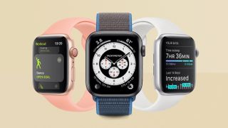
The Apple Watch's software, watchOS, continues to be a big part of its success. It means there's a huge range of apps that you can use on the device, as well as notifications and alerts that appear on it powered by your iPhone, which you can respond to with a tap without finding your phone.
Most people won't actually bother with that many apps on the Watch – the more important part is how easy it is to read messages, answer calls, acknowledge reminders and anything else that pops up on the Watch SE having been pinged there from your phone.
You don't need to have every notification that comes into your phone mirrored on your Watch (indeed, both Apple and I would recommend that you don't do this), but it means you're much less likely to miss the important things if they appear on your Watch.
It's also really easy to underestimate quite how convenient it is to be able to quickly scan a message's content on your wrist while your hands are full and decide whether you need to respond, rather than feeling your phone go off and having to put everything down to take a look. Is it life-changing? No. Would you ever go back once you've tried it? Hell no.
WatchOS is friendly, and designed well for the small screen of a Watch – everything is clear and easy to tap no matter which screen size you get. We also like that Apple has kept the Digital Crown control on the side of the Watch ever since the very first version, which is a little wheel you can use to scroll, instead of swiping on the screen – it's much nicer to use. It's the kind of thing other companies haven't all emulated, and that you might worry Apple would drop when it wants to streamline the design, but I'd really miss it. It's a great part of making the Watch user-friendly.
Siri, Apple's virtual assistant, is on-board here. You can raise the Watch and say "Hey Siri" to activate it, and then ask something of it. That can be useful knowledge such as unit conversions, or you can ask for the Watch to do something without you needing to tap on its small screen – Siri is great for sending a text to someone, or for setting a timer.
Your watch face is at the centre of the watchOS experience, which is smart – it makes it feel less like a computer with an optional timepiece, and more a timepiece with a hidden computer behind it.
However, let's talk about the watch faces. Apple continues to grow the selection of different styles you can choose, with watchOS 7 adding a bunch more, including a few inspired be classic physical watches that we quite like, including a Chronograph Pro face and a Rolex-inspired GMT face.
There are also some more modern designs, and some that are quite out there and artistic.
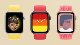
Everyone will be able to find some kind of watch face they like, whether that's something full of little features, or something as simple as the watch face that puts photos from your library behind a basic clock.
But I personally haven't been able to find a watch face that I love, still. There are plenty that I like and that include lots of spaces for smart complication widgets that I find useful, so I'm not actively disappointed in what's on offer.
But as someone who loves Scandi minimalist watches, I've never found anything that really satisfies. And some of the faces that mimic classic watch design feel like they're falling into the trap of being a bit too busy at the size of even the bigger screen.
I just think this is one area where Apple continues to struggle to hit it out of the park, and though Apple keeps making strides towards taking advantage of the fact that a digital watch face can do anything, it has yet to blow me away even now.
Many Watch faces can be supplemented with 'complications', which are basically tiny snippets of information pulled through from apps or online services. You can customise which of these appear on your watch face, which means you really make it your own – mine has my Activity goals, the current outdoor temperature, the current chance of rain (because it's England), and the battery level (because I'm keeping an eye on it for this review – I will probably swap this out for a shortcut to playing podcasts later).
You can save multiple different watch face options, with their own individual complication setups, and can then move between them with just a swipe, which great – from busy business mode to friendly home mode with a single move.
WatchOS does a load of useful stuff in the background, some of which relates to the health features we mentioned earlier. It takes your heart rate periodically even when you're not working out, and if it's alarmingly low or high, it will warn you. It also monitors the current volume level of the location you're in – if the loudness becomes a danger to your hearing, it pops up a message warning you.
The Watch SE can also detect hand washing – new feature added especially for current times. When you start washing your hands, it kicks off a 20-second timer, tapping you on the wrist when time is up, making it easy to ensure you're nailing the hygiene. This works well in our experience – it can take a few seconds to kick in, but it takes those seconds off the timer, smartly.
You can disable pretty much all of these monitoring functions, if you find the idea of them overbearing.
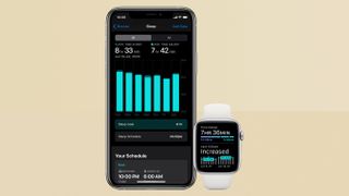
One new feature of watchOS 7 is the Sleep app, and sleep monitoring, which is well overdue on Apple Watch, to be blunt. But it's here now, and it's… okay.
Given how much information the Apple Watch can obtain, it's surprising how un-smart the sleep tracking is. It attempts (largely successfully, in our experience) to differentiate between when you're just lying in bed awake, and when you're asleep.
In the morning, you can see a simple, easy-to-understand chart showing when you slept and when you woke up during the night, and how much sleep you got (and how that compares to normal for you).
I was surprised not to see more depth here. Other trackers will aim to track the quality of your sleep, including how much time you spend in deep REM sleep, which can make a big difference to how good you feel in the morning.
The Watch SE can take your heart rate readings, and can detect noise levels, and both of these seem like they could be useful information for analysing why you might have had a bad night's sleep, rather than just seeing some broken lines on a graph.
The Health app on iPhone does contain some additional data that you can try to put together here, but there's no guarantee the Watch will have taken many heart rate readings overnight, so it may not be any help at all.
Across the Watch SE and iPhone, Apple has introduced a new Wind Down mode that will encourage you not to use your screens just before bedtime. And if you're wearing the Watch overnight, it can wake you up with a gentle tapping on your wrist and some soft tones. It's quite a pleasant way to wake up, all told.
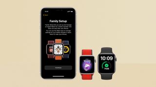
One potentially useful new feature Apple has included this year is the ability to activate and use an Apple Watch for people without an iPhone, provided the Watch is a 4G model. So, someone who does have an iPhone can get the Watch SE up and running, and then it can be used by a child or other relative for whom it would be useful.
If a Watch is being used by a child, there are actually different activity tracking metrics used (calories are no longer used as a measure, for example), and the motion detection is adjusted for smaller bodies.
You can also set geofenced alerts, so you know when someone arrives at a location, or leaves it at a time you're not expecting them to.
We have mixed feelings about this – if you want to be able to track your kid this way and the child agrees, then fine. But it's quite an extreme option – though you don't have to set all of these tools to be active all the time, of course.
We can see the features being of great use for some older and/or vulnerable relatives. With fall detection already on board, and now this optional ability to – for example – get a notification when a relative with dementia has left their house at a time you weren't expecting, this whole setup could be really valuable for keeping an eye on an older relative without actually having to keep an eye on them.
Apple Watch SE review: performance and battery life
The Watch SE is powered by the same processor as the Apple Watch Series 5 from last year, which is a dual-core chip that's more than fast enough for anything you might do on the Watch – opening and scrolling within apps is smooth, and I've never had anything resembling a major slow-down or crash.
In terms of battery life, the Watch SE really impresses. In fact, when compared to the Apple Watch Series 6 with the always-on feature of the screen activated, it has the best battery life we've seen on an Apple Watch so far!
In a typical day of use (using it from morning to bed, and with an hour-long workout tracked in the middle of the day), we had 57% battery remaining at bed time – more than enough for sleep tracking, which uses between 10% and 15% of a full charge in our experience.
So for similar use, it looks reasonable to actually get two days of use out of the Watch SE if you were to turn it off over night.
For comparison, with the same level of use, the Apple Watch Series 6 was down to 50% at bed time, so the SE has a notable advantage.
(If you were to turn off the always-on screen of the Series 6, so it only shows anything when your wrist is raised, like the Watch SE, it would get a big battery life boost.)
The Watch SE is very fast to charge – I've been in the habit of wearing it all day and night, then charging it while I'm in the shower and getting ready in the morning, and putting it straight back on. This has served me perfectly well so far.
Apple Watch SE review: Verdict
The Apple Watch SE is a truly excellent smartwatch, and where Apple has cut back for the more budget price, you won't notice it significantly in general use. It feels like a full Apple Watch experience, with all the advantages that brings in convenience, fitness tracking, and health and safety features… for iPhone users. As ever, Android users need not apply.
We've mentioned our disappointment that it doesn't include more advanced health sensors that rivals do at similar (or cheaper) prices, but what Apple has included will still cover the needs of most people. More than that, Apple has made it so easy to use what's here – including for people who have no idea what they're doing – that maybe it's better to have the extent of sensors that the Watch SE offers with excellent software, rather than even more sensors and more information that you do less with.
If you're looking at your first Apple Watch, the SE gets a really strong recommendation from us. For those who can spend the extra over the cost of the Apple Watch Series 3, you'll be very glad you did – it's better in every way, from screen to design to sensors to being more future-proofed thanks to its faster processor. It's also important to note that these translate into better health features, including more accurate heart sensing (important for detecting irregularities) and the fall detection, which the Series 3 doesn't have.
If you're looking at upgrading an older Watch, the SE makes a great replacement for anything from the Series 3 (if you bought it at launch, especially) or earlier. Though the core of the experience is the same, it will still feel like worthy upgrade, thanks to all the things we mentioned above.
For those on Apple Watch Series 4 or later, the SE doesn't represent a desirable replacement, but that's not who it's designed for.
Apple Watch SE review: Also consider
We already mentioned the Apple Watch Series 3, which now starts from £199/$199/AUS$299. It has a smaller screen than the SE in roughly the same body size, and similar sensors, but less capable and accurate versions of them. It works well for the price, but you'll be happy you took the step up to the SE.
Naturally, the Apple Watch Series 6 is the other key option, which starts from £379/$399/AUS$599. You can get fancier case metals (stainless steel and titanium) than the Watch SE offers, and you get sapphire glass instead of Ion-X glass. You get the blood oxygen and ECG sensors too, and an always-on display, plus a slightly faster processor (not that you'll really notice).
For the end of 2020, the Apple Watch Series 5 is really worth considering too – stock is still around, and will probably go into sales for not much more than the SE. The Series 5 adds an always-on screen and ECG to what the Watch SE offers, so would make a great buy, while it lasts. Keep your eye on our page of the best Apple Watch Series 5 deals, if you're a bargain hunter.
Outside of Apple's offerings, the new Fitbit Versa 3 and Fitbit Sense are strong smartwatch options, with notifications and lots of clever and advanced fitness tracking, though are still designed not to be too intimidating when it comes to fitness.
Sign up to the T3 newsletter for smarter living straight to your inbox
Get all the latest news, reviews, deals and buying guides on gorgeous tech, home and active products from the T3 experts
Matt is T3's former AV and Smart Home Editor (UK), master of all things audiovisual, overseeing our TV, speakers and headphones coverage. He also covered smart home products and large appliances, as well as our toys and games articles. He's can explain both what Dolby Vision IQ is and why the Lego you're building doesn't fit together the way the instructions say, so is truly invaluable. Matt has worked for tech publications for over 10 years, in print and online, including running T3's print magazine and launching its most recent redesign. He's also contributed to a huge number of tech and gaming titles over the years. Say hello if you see him roaming the halls at CES, IFA or Toy Fair. Matt now works for our sister title TechRadar.
-
 Forget keys – Xiaomi's new smart lock has you covered with 9 different entry modes
It's an all-in-one security solution
By Lizzie Wilmot Published
-
 Apple TV+ has a new show coming that looks impossibly sexy
Carême oozes a sense of fun
By Max Freeman-Mills Published
-
 Jacob & Co launch a gorgeous dual time watch in collaboration with Salman Khan
He's got the whole world on his wrist...
By Sam Cross Published
