Apple Watch Series 4 review
T3's Apple Watch Series 4 review looks at whether you should buy this ageing smartwatch
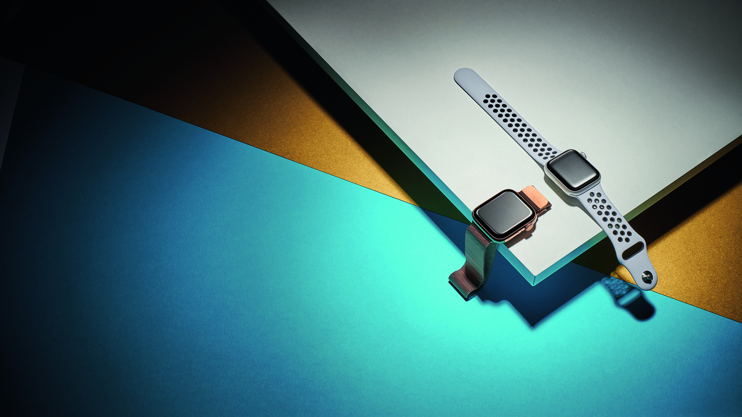
The Apple Watch 4 brings some significant upgrades over the Series 3. For one, we have a slimmer casing, slightly bigger screen size and improved pixel count, offering much better screen visibility. While some things are missing, such as the no always-on display, however (this came for the first time in the Series 5) the Apple Watch 4 is still a relatively amazing smartwatch compared to what else is on the market right now. Even over two years after release. BUT we'd opt for the newer Series 5, 6, 7 or SE, instead.
-
+
Big, bright screen
-
+
Good battery life
-
+
Impressive health features
-
+
Better fit in thinner body
-
-
No always-on display
-
-
Running data still behind Garmin
-
-
New flush side button is harder to press
Why you can trust T3

When it hit the market in 2018, the Apple Watch 4 was one of (if not the) best smartwatches you could get your mitts on and definitely the best Apple Watch. Compared to the Series 3 which came before it, the Series 4 brought a slightly bigger screen size with nicer, more rounded edges, a thinner body, and an upgraded new heart sensor.
Having been superseded not only by the Apple Watch 5 but by the Apple Watch SE, Apple Watch 6, and even the Apple Watch Series 7 – the Series 4 is getting on a bit now. That doesn’t mean to say it’s not a device worth owning, though. The Apple Watch 4 is definitely still a robust smartwatch. Okay, so there’s no always-on display as you’d find in newer Apple Watch offerings - meaning you have to flick your wrist in order to see the time - but there are still a bunch of upgraded features over the Series 3.
So now that it's been replaced by the newer models, does the Apple Watch 4 still have what it takes to compete in today’s modern world of wearables? Read on to find out…
Apple Watch Series 4 review: design and feel
Instead of 38mm and 42mm heights, you have 40mm and 44mm versions, with bigger screens that nearly reach the edges (it's very iPhone XS, just without the notch).
The Series 4 is also a tad thinner, meaning that the overall volume of the Watch has decreased. We have the 44mm version, which does feel a little different on the wrist compared to the 42mm Series 3.
The extra width and height is noticeable on a device you're used to looking at day after day. On thinner wrists, it can tip it over into feeling maybe even too chunky. Given that the screen on the smaller 40mm model is actually larger than the one on the old bigger 42mm model, we think some people who previously went for the extra readability of the bigger screen might prefer to stick to the smaller model this time.
The change in thinness is only a tiny amount (not even a millimetre), but the new Watch does feel less hefty when you bend your wrist. We think Apple may have changed the curve of the Watch's rear at the same time as thinning it, giving your skin a little more room to manouevre before it hits the case. The difference is subtle, but noticeable – this is good for sports.
As part of the changes to the back, the entire underside is now ceramic, instead of just the heart-rate sensor. This is great in terms of making it as hypoallergenic as possible, and with the new extremely sci-fi-styled heart sensor, looks pretty badass. Not that you'll ever really see it. It feels the same as before – very comfortable.
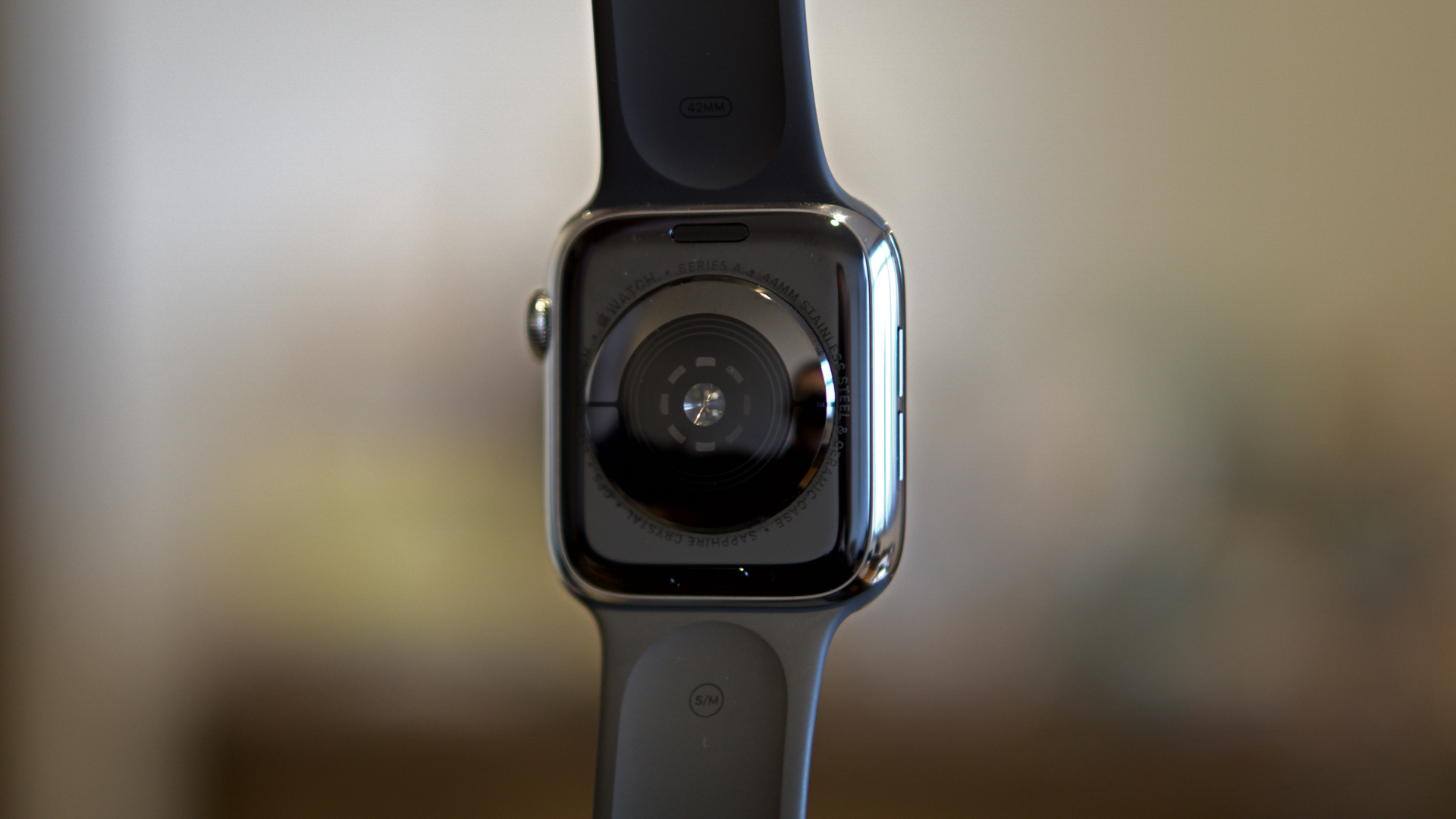
The ceramic back of the watch is black on every model
Even the Apple Watch's buttons haven't escaped the changes. The Digital Crown has been thinned a tad, and the grooves that help you grip the slippery case to turn it extend all the way across the side, meaning it's no harder to rotate.
Apple has added haptic feedback to the Digital Crown too, so when you're scrolling through items on-screen, you feel a little click for each item, which makes it easy to navigate at speed if you know how far you should be going. It's a really nice little quality-of-life addition. When you're scrolling something that doesn't divide so neatly, it makes rapid clicks, just to give you some feedback.
One change we're not so sure about is that the side button is now essentially flush with the case. It's easy to press (it clicks in a tiny amount, but enough to comfortably feel), but is a little harder to find without looking, and to press rapidly or in motion, since your finger can't use the edge for purchase any more.
It's not hard to find (it takes up most of the edge that isn't Digital Crown, after all), but you're just more likely to slip off it instead of pressing it if you're doing it awkwardly. If you're trying to quickly double-press for Apple Pay while carrying bags or something, it definitely doesn't feel like an improvement, even if it looks nice.
And, in a somewhat less common occurrence (hopefully), this is also the button you use to trigger Emergency SOS, so making it more difficult to press in any way for the sake of aesthetics isn't ideal.
We've got the silver stainless steel Apple Watch Series 4, complete with cellular connectivity built-in. It also comes in 'Space Black', which is a great super-dark finish that's a lot like looking into an ethereal abyss, but in a good way.
Most importantly, there's now a gold stainless steel finish that's absolutely gorgeous. This isn't gaudy gold, like the, uh, actual gold watch Apple used to make. It's somewhere in between traditional gold and brass, and when paired with the matching milanese loop, it's striking without being OTT.
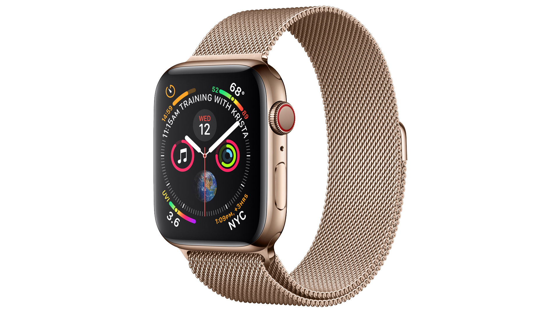
We are massive fans of Apple's showy, but not too showy, new gold finish
You've also got three colours of aluminium-bodied Series 4 watches, too. These are silver, black and gold as well, they're just all a lot more matt and muted than the steel versions (and less expensive). We like the black most – it feels like the most techy possible version of a classic Casio look.
Apple Watch Series 4 review: screen and speakers
Even with all these aesthetic changes, the screen is the stand-out improvement, which isn’t surprising, since it’s the single most important part. The actual displays are around 30% larger than those in the older equivalent models.
Apple referred to the old models as 38mm and 42mm, while the new models are 40mm and 44mm – however, these refer to the case size, not the screen size. So, the screen in a 40mm Watch is 30% larger than that in the 38mm Watch, despite the increase in body size being much less than that.
In fact, the end result of this is that the new smallest screen size is now bigger than the old biggest screen size. Good news all around – the 38mm Watch was always important for being one of the few smartwatches that fit the average woman’s wrist, but it did feel limiting in how much it showed compared to the 42mm. Now there are no compromises.
In previous models, the display had a sizeable bezel around it, but Apple’s use of lots of black in the UI meant it blended in with the glass and didn’t look too wasteful of the space.
Now, the screen reaches much closer to the edge, and has rounded corners to allow it fit in the overall shape of the body. Apple still uses lots of black to blend the screen, but text and interface elements are very obviously closer to the edges.
To show off the display, though, Apple has included some Watch faces that have animations that not only fill the screen with colour and life right to the edges, they actually play with the borders – one is called ‘Liquid Metal’, and you see silver liquid sloshing around, splashing when it reaches the 'sides'. (Apple shot video for these faces in a structure the exact shape of the Series 4 screen…)
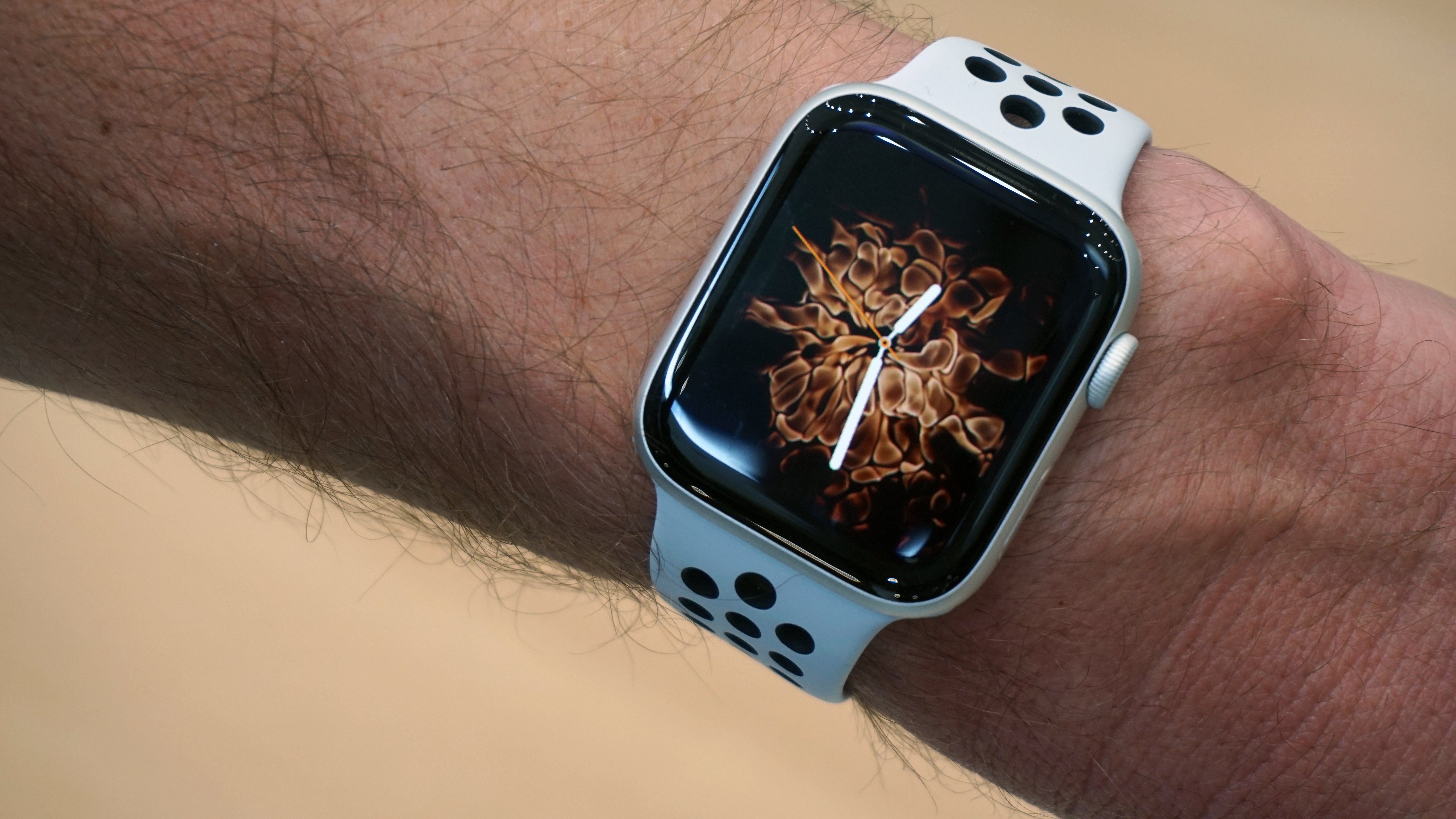
Yes, Apple recorded a video of fire bursting in a box the exact shape of the Series 4's screen. No, we don't know how you apply for that job
Apple mostly uses the extra space to pack in a bit more information. New watch faces feature more complications than before, packing in up to 10 different functions, and showing a bit more information, potentially. We’re big fans of the ability to see the current UV index in particular, even if we’ve kind of missed summer.
We weren't convinced that ‘more information’ is what the Watch was lacking, and honestly we could get by with the original, less packed, Watch faces (which are all available of course), but the new Watch faces won us over quickly. We split the difference in the end: a modular face with seven complications, including a nice clear five-hour view of the weather.
In a lot of apps, the extra size currently mostly just means you can see a few more buttons on-screen at once. Developers could try to make more of it, but actually we don’t think they necessarily should – most Watch apps are best when they’re simple ways to access commands, so more commands that are a single tap away is already an advantage.
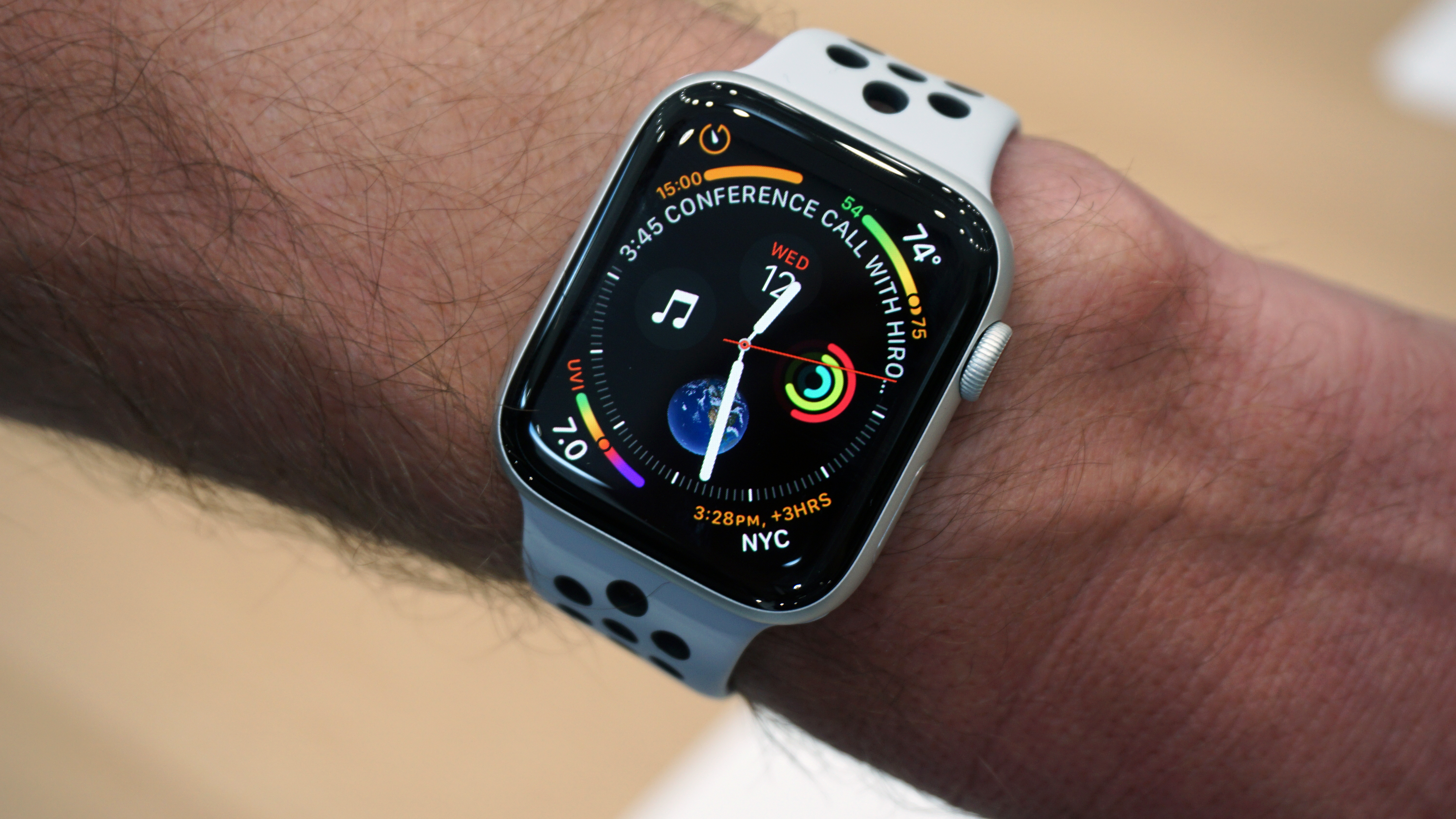
The new infograph watch face fits in nine complications (plus the time)
The only (very minor) downside to the new design is that the screen now reaches where the glass front starts to curve, meaning that it can catch the light there and make it hard to read something at the very edge of the screen (particularly text). But actually it’s pretty rare you’ll need to see something right at the edge, so it's not really a problem.
In general, it’s worth noting how impressive the lack of reflectiveness on the Watch is. Considering how many screens use a bunch of black behind glass, you pretty much never see your mug staring back at you, and it’s readable even in bright sunlight. It’s only ever the brightest of lights that’s even noticeable as a reflection.
One small thing about the new screen is that Apple’s using a new technology to underpin the OLED display, called LTPO. The main effect of it is that the screen can now vary its framerate to save battery, so a static digital watch face can refresh at a slower rate than when you’re scrolling through a Messages conversation. Animations and swiping stay smooth, but energy is saved when it can. Clever.
Apple says the speaker is 50% louder on the Series 4, and coupled with moving the microphone away from the speaker to the other side of the device (to avoid them interfering with each other), it makes this a pretty good calling device now.
Voice are super clear from the new speaker in normal situations, and can be heard well enough even somewhere noisy like a kitchen mid-cooking.
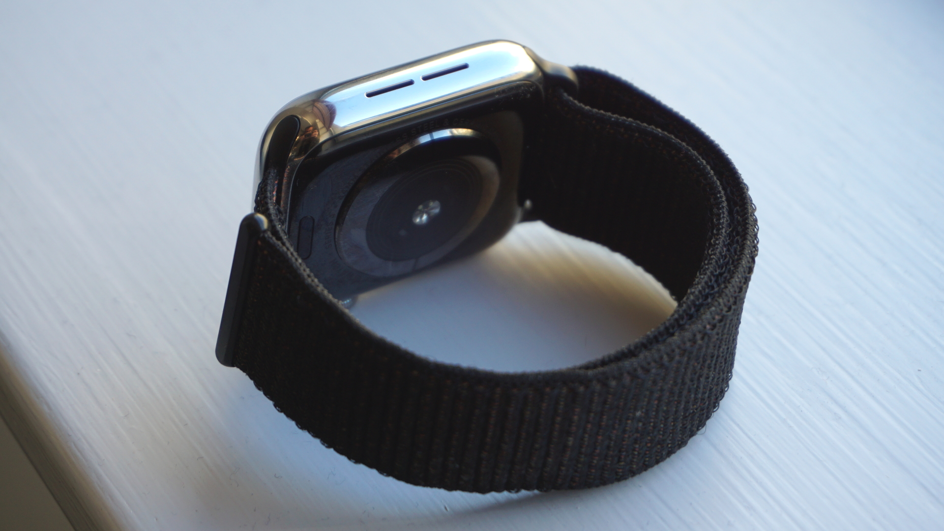
The speakers on the Apple sit on the left edge (if you have the Digital Crown on the right)
People on the other end can hear you clearly too – it takes the Watch as a ‘use it when you have to for calls’ device to ‘take it on your watch, why not?’ You don’t need to hold the Watch up to your mouth to be clear, but obviously try not to stuff it in your pockets…
One thing is that Siri’s responses are pretty loud at the default setting of full-volume, and it’s not obvious how to turn it down – it’s not in the Sounds & Haptics section like you might think, but Settings > General > Siri. You're welcome.
Apple Watch Series 4 review: smarts and watchOS
Speaking of Siri, let's go into the smart features of the Watch Series 4. Anticipation is a big area of improvement for smart features in watches and phones (and tends to be touted as AI, even though it isn’t really), and feels especially useful on smartwatches, where you only really want to be tapping to accept or reject something, rather than diving into apps all the time.
Apple has done a load of work in this area in watchOS 5, and this is mostly visible in the Siri watch face. It’s not really a looker or especially exciting on the face of it, but it does things like warn you that you need to leave early for your next appointment because the traffic is bad, or display when rain is due to start, so you’re not caught out.
The travel stuff is actually just part of general work Apple does when you put an appointment into its calendar with a location, so it’s not unique to the Watch – but the point of the watch is to make it easy for you to be warned that you might need to leave early, and not miss the notification because you left your phone while in a meeting or something.
More importantly, the Siri face learns about other habits over time. If you have a driving playlist for your commute home, it will suggest that when you come to the end of work. It will suggest HomeKit scenes as you near home, so you can turn all the lights on before getting into the house.
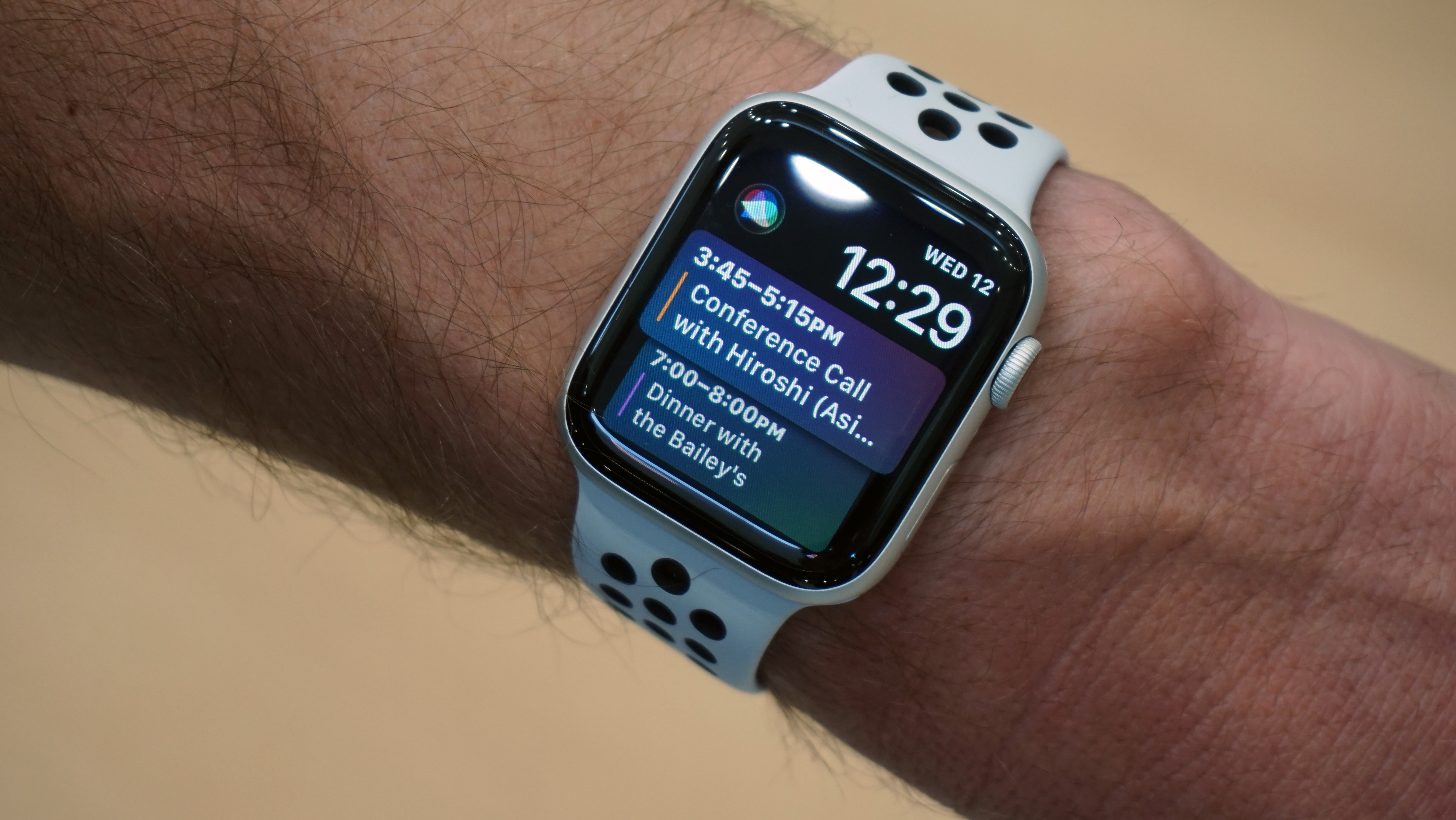
The Siri face isn't a looker, but it's damn handy for organising your life
It can also do this kind of thing with third-party apps, so CityMapper could help with commute information Apple doesn’t have, or the fitness app you prefer can nudge you, instead of Apple’s own Activity system.
You can ask Siri for information on the Watch, of course, and like the Series 3, Siri can talk back (earlier models only showed responses as text or images on-screen). What Siri can do natively hasn’t changed much this year, but there is one huge new feature, called Shortcuts.
This is basically a way for apps to tie into Siri, enabling expansion a little like the way Alexa’s Skills work, except more flexible, because you can set any phrase you like to trigger them.
You can even automate it so that a series of these all trigger one after another based on a single phrase (so, you could say ‘Good morning Siri’ as a way of telling your lights to come on, your smart coffee machine to make a cup, and a pump-up playlist to start playing on the bedroom speaker, all at once).
You don’t create or manage these on the Watch at all (just through your phone or iPad), but any you create on your phone should work on the Watch. We say should, because actually it’s been hit and miss for us so far. Some worked perfectly, but for others Siri claimed not to recognise the command on the Watch, even though the same phrases worked on our iPhone.
The whole point of a smartwatch is that it helps to smooth things out in life – that it acts as a kind of remote control for your phone when that’s handy, or just as a way to get useful information in front of your face as quickly as possible.
A big part of the Apple Watch is notifications, which can be simple pings to tell you something, or can be actionable. In the case of the latter, it can just a button press to snooze a reminder, or lead to the ability to compose a message reply, or even to view a live feed of a security camera.
So far, the bigger screen of the Apple Watch Series 4 isn’t being used especially cleverly for this over previous models. There is scope for it to be used better: watchOS 5 allows for more flexibility in what kind of rich options notifications can include, but apps actually have to put this into practice, and we haven’t seen much of that yet (though it hasn't been long since watchOS 5’s launch).
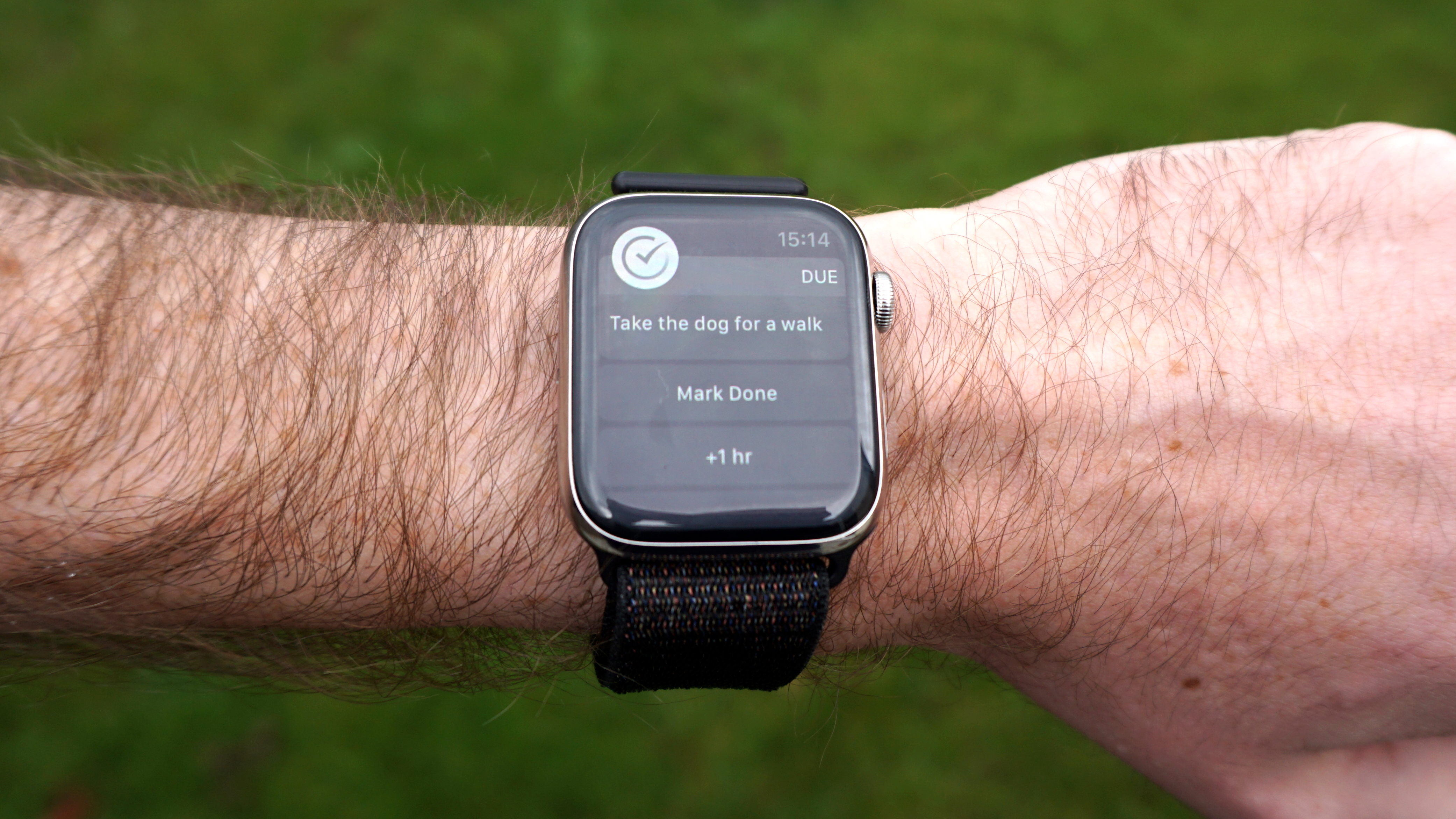
Not all notifications make good use of the screen just yet
The existing notification design, with a message followed by a bunch of buttons, does tend to allow for an extra bit of information to appear on the larger screen, you also often end up with wasted space at the sides. None of this is a bad thing, but just don’t expect the new model to suddenly change the way you’re interacting with notifications.
Apple Watch Series 4 review: health and fitness
One new, very useful, smart feature in watchOS 5 is automatic detection of workouts. If you start jogging without remembering to start a Workout in the app, it will pop up with a message saying that it thinks you’re out for a run, and would you like to start a Workout? Say yes, and it will turn out to have been tracking you since the start, so you don’t lose the first few minutes.
It worked for us for lots of things that have a consistent movement element, but didn't spot when we were doing weights-based exercises, even though it obviously had spotted our elevated heart rate when we looked a the data later. So it can be very handy, but not universally smart just yet.
There are lots more upgrades when it comes to health and fitness, though. For a start, there are better running features, which start to nibble at Garmin’s lead in this area. Pace alerts are great for those in distance training, helping you avoid drifting away from your target as you get tired and lose focus.
Cadence (AKA steps per minute) is also a really useful metric, since it helps you hit the most efficient levels for longer runs, and avoid over-exerting yourself (keeping injuries at bay).
They’re both great to have for people who are really getting into their running, but they’re still fairly basic as far as ‘advanced’ running data goes. A Garmin system can include ground contact time, stride length, vertical oscillation (i.e. ‘bounce’) and loads more the provide upgrades to your entire technique.
It’s nice that Watch models get closer to this, and for a lot of people it’s probably a good balance for the amount of data (enough to help them improve, but not enough to be confusing), but it’s still not at the front of the pack.
Other new fitness features include specific workout tracking for yoga and hiking, and more competition options with your contacts.
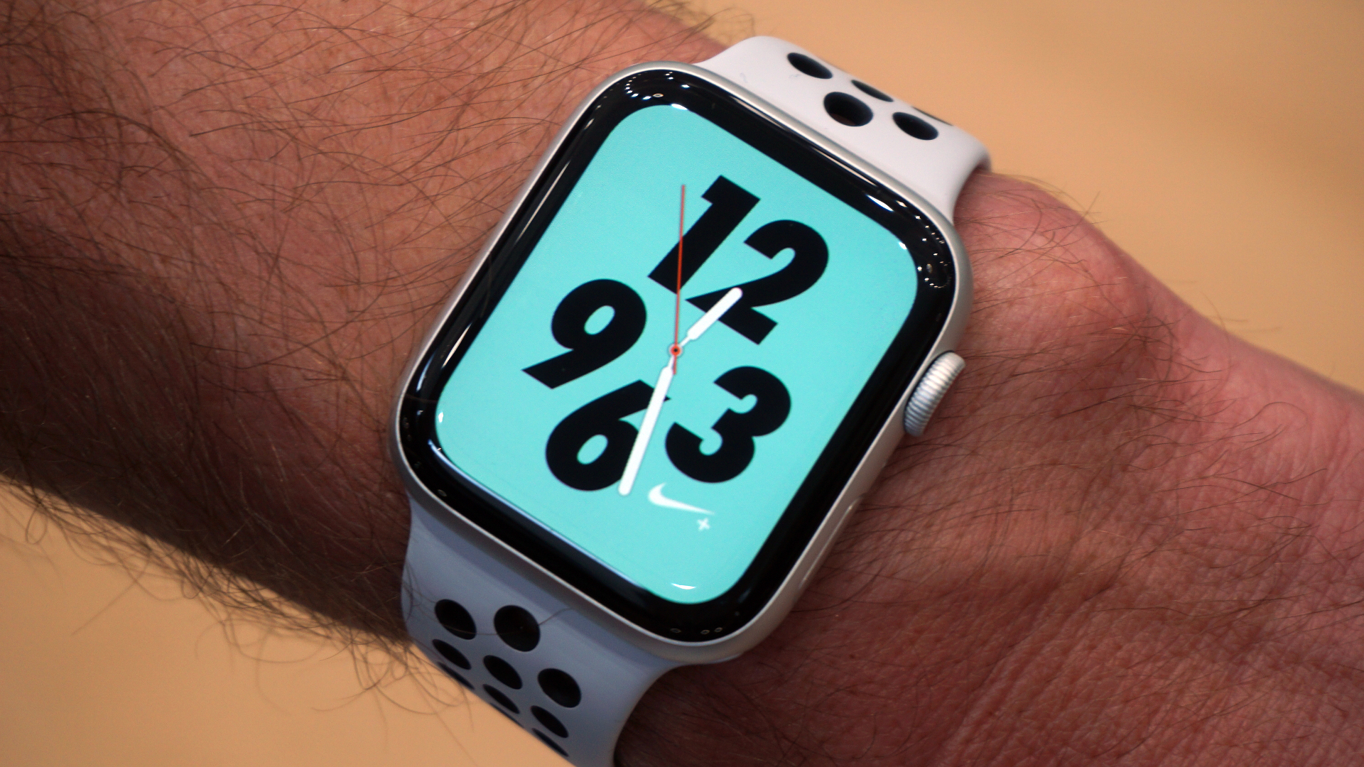
The Nike+ version of the Apple Watch is back, pre-loaded with the Nike+Run app and some exclusive watch faces (that show off the display quite nicely)
In terms new features in the Apple Watch Series 4 itself, there’s a smaller heart-rate sensor that works in the same way as before (using light to detect the flow of blood through your veins), but the big new addition is an echocardiogram.
This is a much more precise way of measuring heart activity, using the electrical signals of your body, but you can’t use it while exercising. You can take an ECG using the built-in app, then by holding a finger on the Digital Crown while the Watch is on your wrist.
The Crown now has a conductive pad on it, as does the underside of the Watch, so you end up forming a complete circuit. The point of this is to look for irregular heart beat rhythm: specifically, atrial fibrillation, which can cause (and be a symptom of) serious problems.
When you take an ECG, the Watch will either tell you you’re in sinus rhythm (normal), atrial fibrillation (see a doctor), or it will say that it couldn’t come to a conclusion (Apple says this will be very rare, but is also in the ‘see a doctor’ category).
The thing is, you will be able to do all this… at some point in the future. Medical-grade equipment needs medical-grade approval, and Apple only has that in the US so far. The Watch Series 4 is with the appropriate EU regulatory body, but it meant we couldn't even try out the feature.
It still takes your heart rate the other way, though, and we found this to be a tiny bit more accurate than the Series 3. Using both together for the same workouts, we found that the Series 3 would sometimes record outlier high and low rates well beyond the overall range for the rest of the minute, while the the Series 4 didn’t.
Other than that, the recorded heart rate ranges were essentially identical, but the reduction in little errors is nice. It also seemed to be able to follow rapid increases in exertion more quickly, but this will only be of use if you look at the data in a more fine-grained way than Apple’s Health app offers by default.
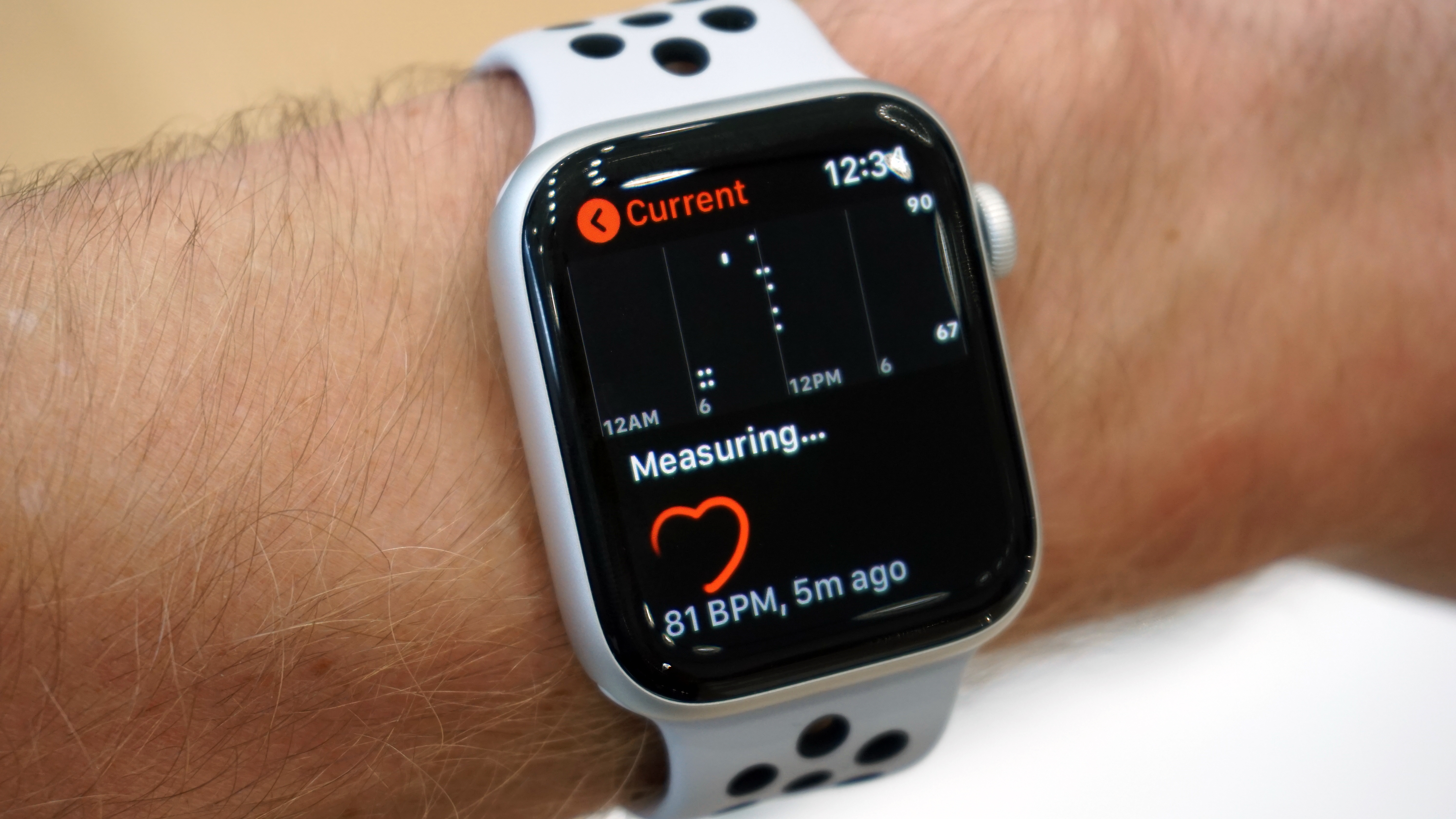
The heart-rate tracking during exercise feels like it's been gently refined
The Series 4 is also the first Apple Watch model to include fall detection, which offers to call the emergency services if you hit the ground hard. If you don’t respond when it asks whether you’re okay, it will call an ambulance automatically after a minute, and sends your location to an emergency contact.
It detects a fall based partly on the motion of your arms as you flail, and party based on how hard you hit the ground. We’ve had some fun attempting to spoof it through prat falls, but we don’t want to state anything definitively about it in this review: a failure to activate the feature from a fake fall doesn’t mean it wouldn’t go off during a real fall, and vice versa. There are plenty of videos of people doing that online if you want to sate your curiosity, though.
Let’s just say we trust it to work as intended, and for people vulnerable to slips and broken bones, the moment it enables them to get help when they might not have been able to otherwise is the moment the Watch might become the best buy they ever made.
Apple Watch Series 4 review: performance and battery
Apple says that the new processor in the Apple Watch Series 4 is around twice as powerful as that in the Series 3, which never exactly felt like a slouch to us, given how light most of the tasks you actually do on a smartwatch are.
Predictably enough, then, the Series 4 is super-snappy in use. Switching between different watch faces with a swipe is instantaneous, and bringing up the app switcher or main menu of apps is equally quick.
Scrolling through giant Messages conversations is totally smooth all the way – no stuttering, no waiting. You can zoom in and out of photos with no judder at all. At no point does it feel like you’re on an underpowered computer, which the early models definitely could at times.
Opening apps tends to show a little loading screen, but only for about half a second. It used to be a big problem with the Watch that, while the dream was that having apps on your wrist let you do things faster, actually it was quicker to just get your phone out of your pocket. Now, the only thing holding you back is the size of the screen (though even that’s been improved, of course).
Really, the only waiting you’ll do on the device is likely to be network related, but even that feels a little faster. The new ceramic back of the Watch is made to provide better signal for its antennas, and the connection between our Series 4 and our iPhone XS Max does feel more seamless than ever. Calls come in instantly on both, and something you do on one reflects rapidly on the other.
Opening the Maps and telling it to load our current location took about four seconds for everything to appear, but then it was much quicker after that – zooming out, it took about half a second to load the county, then zooming back in and scrolling around, everywhere we looked took under a second to fill in points of interest and so on.
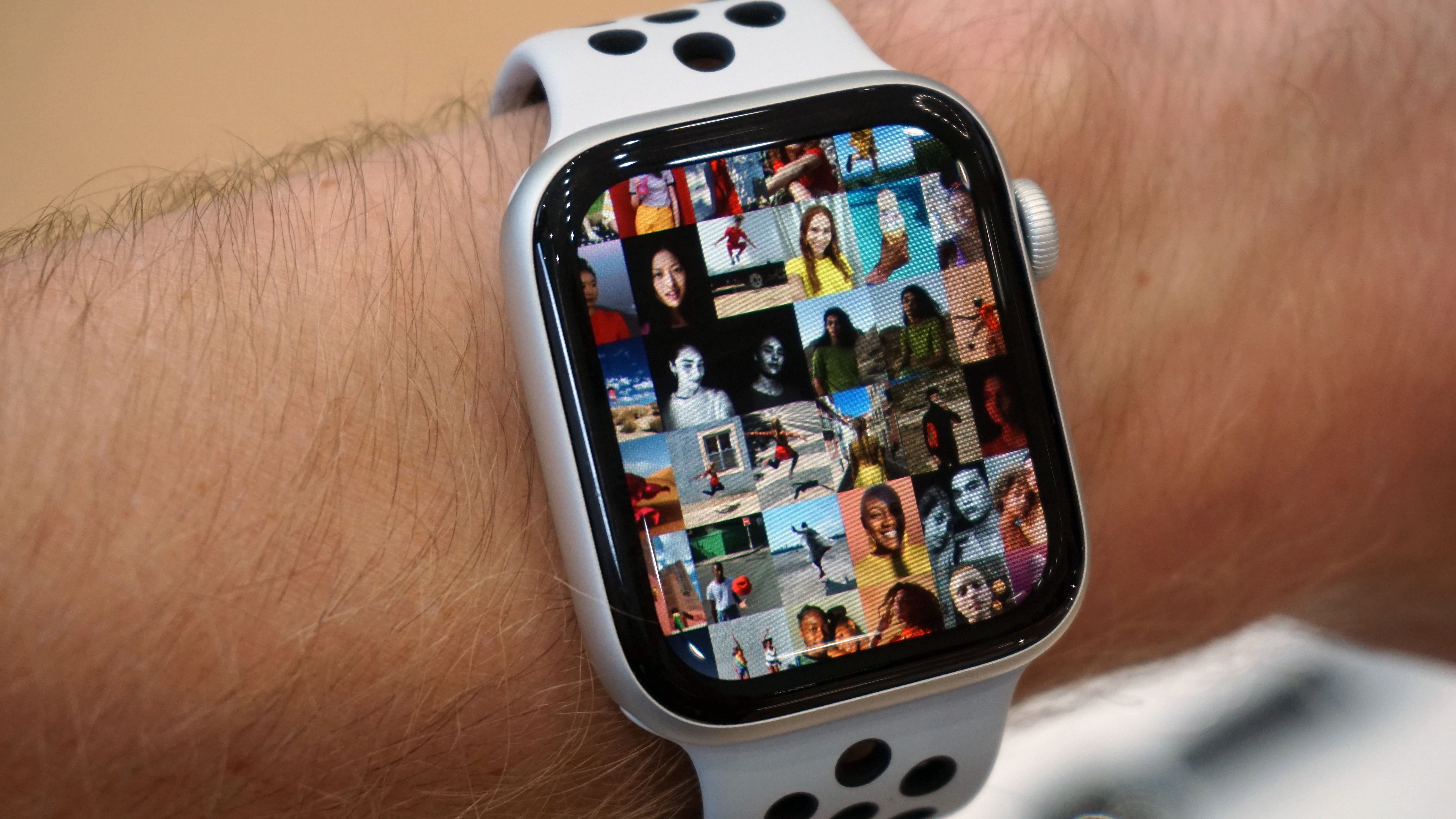
You want to scroll through lots of tiny images? Go for it – the Series 4 can handle it, as long as your eyesight can
We fired up the Home app to look at a stream from our living room video camera, and it took less than a second to connect, giving us a really clear live video right away.
When it comes to battery, we find that Apple takes a weird tack. It claims 18 hours for the Apple Watch Series 4’s battery life, which is the same as the Series 3. But we have regularly gone for three or four days without charging the Series 3 before it’s died (turning it off overnight, though).
Apple says that the 18-hour battery life is based on a particular user profile that it’s come up with, and assumes things like an hour of cellular-only use with no phone (which won’t apply to every owner anyway), some GPS usage, and generally a bunch of things that would actually make it a hardcore day of Watch use compared to the average person.
If you have a much more common day that includes, say, about an hour of active workout time (where it’s constantly measuring heart rate, instead of just periodically in the background), and then for the rest of the day it’s just sending notifications a few times an hour, and you’re using it for a bit of music remote control and, well, checking the time, you can expect to use about 30% of the battery in a day.
This is about the same as the Series 3 under watchOS 5 (which seems to be using a little more power than watchOS 4 in our experience, but only by a few percent).
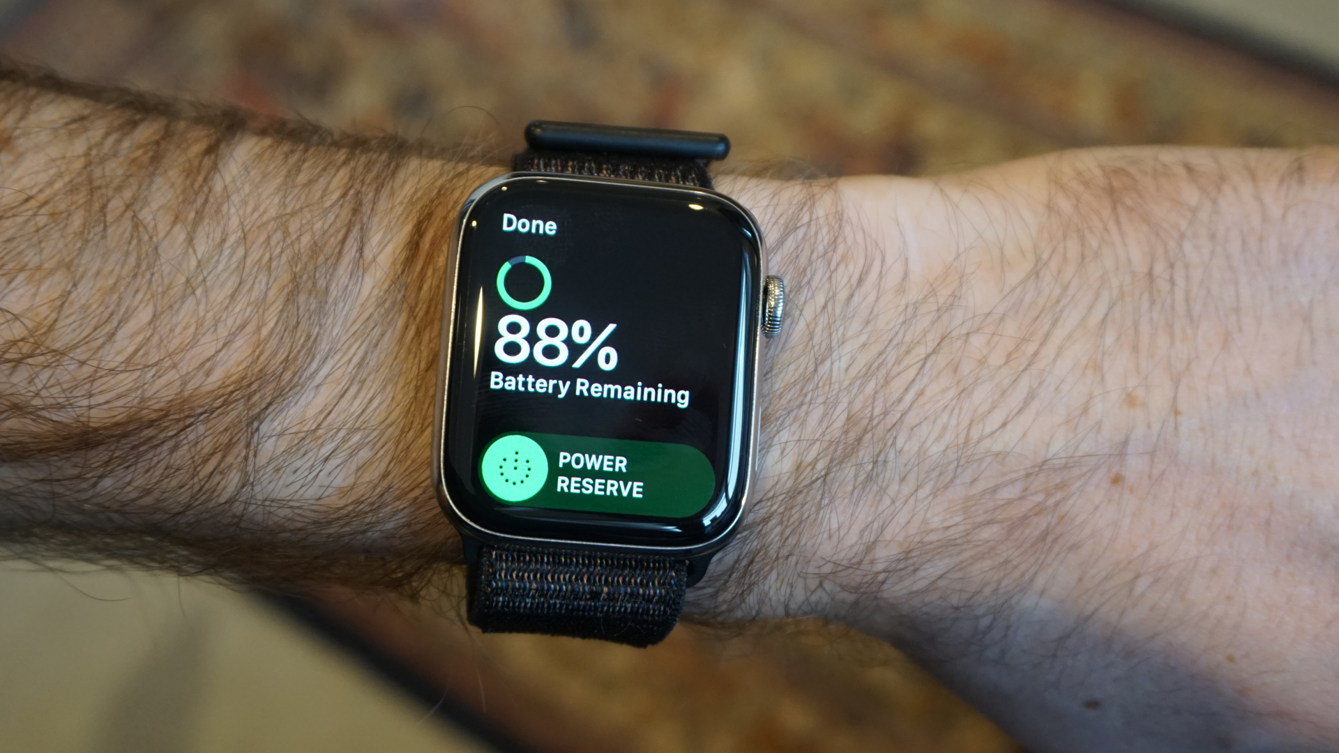
This was after half a day's use, including half an hour of workout tracking
So, yes, in this kind of use, you can get a few days out of the Watch Series 4 before it needs charging. If you also go for a GPS-tracked run (and especially if you then also play music from it streaming to Bluetooth headphones), you’ll cruise to more like the 50% mark in a day, depending on how long your run is.
One thing Apple noted was that the Watch can now last for longer when tracking running data and GPS – it can now hit six hours, whereas as previous models were more like five.
Apple specifically wanted to reach this target, because it means it can now last the distance for most marathon runners. Lots of marathoners will end up with times between five and six hours, and so some of them were finding the Watch didn’t quite make it to the end, whereas it should now for the majority.
We haven’t run any marathons since getting the Watch, and don’t have any plans to in the next two days, so we’ll have to trust Apple on this.
Apple Watch Series 4 review: verdict
While it might not look like it from the offset, the Apple Watch 4 brings some significant upgrades over the Apple Watch Series 3. For one, we have a slightly bigger screen - one that laid the foundations for the Series 5 and Series 6 that came after it - boasting a new 40mm or 44mm size over the Series 3’s 38mm and 42mm screen options.
There’s no always-on display yet, however (this came for the first time in the Series 5) but an increased pixel rate means that visibility is more improved. The slimmer casing is also very welcome.
Storage here isn’t as impressive as in newer models, though. The Series 4 was the last model to tout 16 GB of in-built storage before it was upgraded to 32GB in the Series 5 and SE. Other things missing are the sleep tracking and decent battery life,
Saying that, these aren't huge negatives, more like little niggles. Despite its age, the Apple Watch 4 is still a relatively amazing smartwatch compared to what else is on the market right now.
Of course, Apple has now released the Apple Watch 6, so, if you're after the latest and greatest Apple Watch that's the one you'll want. Considering it's only £50 / $50 more expensive than the Series 4, this is the one we'd go for.
Or you could opt for the more affordable Apple Watch SE, which has the same design and a newer processor (simply lacking the ECG).
Apple Watch Series 4 Review: News & Updates
27 March 2019: Apple has enabled the ECG function and irregular rhythm notification in 19 European countries, including France, Germany, Italy, Spain and the United Kingdom.
The function is now CE marked and cleared in the European Economic Area, as well as cleared by the FDA in America.
The new feature comes as part of the watchOS 5.2 update.
We've tried the Apple Watch ECG function and found it easy and slick, only taking a few seconds to take a reading. There are no weird hiccups, and the way you hold the Watch feels natural.
You'll be happy to know, it told me I do not have fibrillation, and it takes you through the possible results are before you start, so there’s no confusion.
You can go back and see any ECGs you've taken in the Health app on you iPhone. These even shows a detailed snapshot of the rhythm, allowing you to share a PDF of the results with your doctor.
Sign up to the T3 newsletter for smarter living straight to your inbox
Get all the latest news, reviews, deals and buying guides on gorgeous tech, home and active products from the T3 experts
Matt is T3's former AV and Smart Home Editor (UK), master of all things audiovisual, overseeing our TV, speakers and headphones coverage. He also covered smart home products and large appliances, as well as our toys and games articles. He's can explain both what Dolby Vision IQ is and why the Lego you're building doesn't fit together the way the instructions say, so is truly invaluable. Matt has worked for tech publications for over 10 years, in print and online, including running T3's print magazine and launching its most recent redesign. He's also contributed to a huge number of tech and gaming titles over the years. Say hello if you see him roaming the halls at CES, IFA or Toy Fair. Matt now works for our sister title TechRadar.
-
 New Tiffany & Co Bird on a Flying Tourbillon watch is like nothing you've seen before
It's a stunning, summery watch
By Sam Cross Published
-
 I love the Murderbot books, and Apple TV+'s first trailer has me excited
Murderbot is a series I can't wait for
By Max Freeman-Mills Published
-
 I did the unthinkable and subscribed to Paramount+
Hear me out: Paramount+ is worth paying for right now
By Mike Lowe Published